
The Edelkrone StandPLUS Aims to Make Your Tripod Look Outdated
Edelkrone is positioning its StandPLUS as a "revolutionary" camera positioning tool that will make traditional tripods a thing of the past.

Edelkrone is positioning its StandPLUS as a "revolutionary" camera positioning tool that will make traditional tripods a thing of the past.

Leica has announced that it has redesigned the Summilux-M 35mm f/1.4 ASPH lens in several ways to make what it says is one of the most versatile M lenses even more flexible.
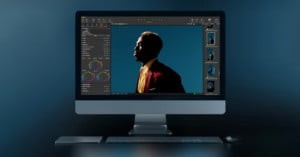
Capture One has announced version 15.3.0 which it says brings new levels of efficiency, flexibility, and mobility for a modern and collaborative workflow.
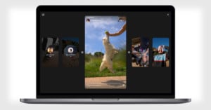
Instagram is rolling out a new design for Stories on desktop to make the feature more immersive and easier to navigate. Users will be able to view stories in full-screen with a carousel containing previews of already-played and upcoming Stories.
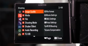
Moments ago, Ted Forbes over at The Art of Photography uploaded a video that you probably saw coming: a deep-dive on the brand new menu system that Sony debuted with the Sony a7S III. If you're wondering how the menus have changed, and what Sony did (and didn't) address, this is a great resource.

The design of the iMac hasn't changed much since the aluminum unibody version was announced in 2009. They slimmed down the design in 2012, and added a retina display in 2015, and that's about it... but that definitely doesn't mean Apple isn't innovating behind the scenes.

The New York-based camera gear and electronics superstore Adorama has rolled out a revamped logo and new modernized website design.

Instagram is rolling out a redesign to its profile view. The goal is to make it "easier and cleaner to use," but the new look will also deemphasize follower counts.
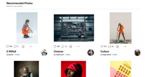
500px has unveiled a redesigned Home Feed that's designed to show more photos and provide more exposure. The "cleaner and more contemporary design" was inspired by photobooks.
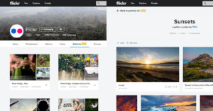
Flickr has announced a major new update to its photo galleries that brings a redesign and new tools for helping you "tell your visual stories with new tools to facilitate your creativity."
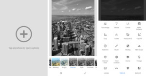
Google today rolled out the latest version of its Snapseed photo-editing application. Version 2.18, available for Android and iOS users, features a fresh new user interface and new presets.
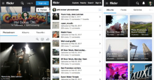
Over the past several years, the Web has been moving away from having separate website URLs for mobile and desktop versions and toward having a single "responsive" website that changes its look depending on what device you're visiting with. Flickr today announced that its main website has finally caught up to this trend.

The Internet has not been kind to Instagram's redesigned logo. Adweek called it "baffling" and "a travesty," and some went so far as to call it "an abomination." But if you hate the logo as much as these folks do, you're in luck: there's a hack to get the old one back... sort of.

Instagram has just announced a total redesign of its app. Everything from the logo to the look of the app interface itself has been retooled to put more emphasis on the photos and videos themselves.

We launched a major redesign of the PetaPixel website this week. Thanks for all the feedback you've provided thus far, from the angry complaints to the happy compliments -- we appreciate hearing them all. Now we'd like to hear more of your thoughts on what you'd like to see.

As you can probably tell, last night we launched the biggest site redesign so far in the history of PetaPixel. While change is often hard and controversial, there are some big ones that we've made in response to reader feedback and needs over the years.

500px today unveiled revamped profile, photo, and discover pages that aim to deliver a better experience to the 6+ million member community. The company says the new designs are based on user feedback, have been tested over the past few months, and have the goal of "enabling and rewarding visual creativity."

On the heels of Flickr's major redesign, Instagram has launched a new look of its own. The photo-sharing social network has revamped its website, replacing its old style with one that's simple and sparse.

Flickr today officially launched a major redesign of its service across all platforms and rolled out some powerful new features that improve the viewing, organizing, and searching of photos and videos.
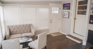
My name is Eric Brushett, and I'm a full time wedding photographer based in Hamden, Connecticut. I recently redid my home office space for the 2015 wedding season. Here's a look at the process and the final result.

Aperture is about to leave the RAW image organizing/editing game, and OnOne Software wants to tempt users over to their ranks before they all give in to Adobe. To that end, OnOne just announced an impressive new version of its Perfect Photo Suite.

In the ongoing effort to reach a happy medium between beauty and functionality, Flickr is yet again tweaking the layout of its photo pages. A number of users are reporting an updated layout complete with a few minor adjustments that seem to be making at least some formerly disgruntled users happy.

Flickr's new "photo experience," which has been in beta for the past few months, is finally live for everyone to see. While this isn't the full-on redesign that we mentioned might be on the way, this update completely overhauls the photo pages in particular -- bringing speed, functionality and aesthetic improvements.

According to a report by Re/code, Yahoo! is getting ready to redesign Flickr yet again. Said to be coming "within the next few weeks," the updates won't be as dramatic as the last revamp, but it's definitely going to bring some welcomed changes that focus on the smaller details.
The overarching goal this time, it seems, is to simplify and unifying the mobile and web browser Flickr experiences.

Flickr's recent attempt at a major website redesign didn't go over very well with many of its users, so now the Yahoo-owned company is taking the feedback it received to try again. A help page on the Flickr website reveals that a new photo page is currently being rolled out across the service.

With Google+ constantly working on making things better for photographers -- most recently by incorporating better RAW-to-JPEG conversion -- the other social networks are trying to do their part to entice the photo community as well. For Twitter, that means revamping embedded tweets so that photos are more prominent.
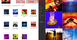
As higher resolution photography (and photography in general) has become ubiquitous, photo sharing and storage websites have had to adjust to keep up. From increasing storage capacity and file-size limitations to launching "spectacular" redesigns that offer beautiful browsing experiences, everybody is adjusting in their own way.
The latest player in the photography sharing game to make some big changes is SmugMug, who announced and launched a major overhaul earlier today.
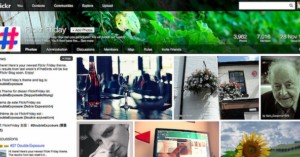
When Yahoo! launched the new Flickr at the end of May, not every part of the website got the "spectacular" treatment. One of the sections of the site that has been lagging behind the rest were the Groups pages, and Flickr has finally decided to bring them up to speed.
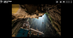
It wasn't long ago that Flickr rolled out its massive redesign -- met by both boos and cheers -- that entirely changed the way you experience the photos sharing site. Now it's 500px turn. The premium photo sharing platform just announced its own redesign, focused around larger photos and a Focus Viewer feature that offers a "stunning full screen experience."

Yahoo's recent Flickr redesign has been met with mixed reviews. After the release, a large number of users took to the Flickr Help forum and tore into everything from the look and feel to the team responsible.
General opinion at Yahoo, however, is that this is a just a small subset (albeit a very vocal one) of users, and the company is displaying its commitment to the new Flickr with the first ever (to our knowledge) Flickr TV commercial.