Flickr Redesigns Groups Pages to Match the Site’s New Look
When Yahoo! launched the new Flickr at the end of May, not every part of the website got the “spectacular” treatment. One of the sections of the site that has been lagging behind the rest were the Groups pages, and Flickr has finally decided to bring them up to speed.
In a post on the Flickr blog, the photos sharing website is announcing that Groups pages — both Group home ages and the Your Groups page — will now look a lot more like the rest of the website.
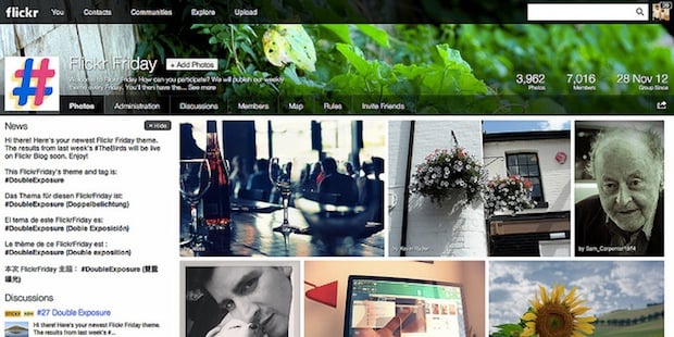
“With this update, we’ve given your Groups a look that’s more consistent with the larger site design changes we introduced in May,” writes Flickr employee Georges Haddad. “The new Groups is easier to use, better showcases group photos and discussions, and gives group admins more ways to customize their groups’ appearance.”
The design is based around making both of the Groups pages more photogenic. Group home pages now feature a high-res buddy icon as well as a cover photo, where the admin can showcase some of the group’s best work. Additionally, the design also adds an all-new “About” tab, and makes it easier for users to submit photos and browse through group content.
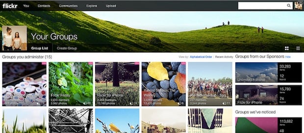
These improvements translate over onto the Your Groups page as well, which now features “a beautiful tiled view of the groups you belong to and administer.” You can organize those tiles (created using the group’s cover photo) by name or recent activity. And if you have a lot of groups and want to go back to a standard list view of buddy icons, you can do that as well.
To learn more about these improvements to the groups pages, head over to the Flickr blog or sign in to your own Flickr account and check out the new view for yourself.