Instagram Reveals Redesigned Logo and Minimal New Look
Instagram has just announced a total redesign of its app. Everything from the logo to the look of the app interface itself has been retooled to put more emphasis on the photos and videos themselves.
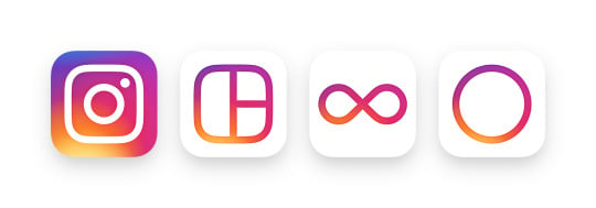
First, let’s talk about the new logo, or rather logos since Instagram, Layout, Boomerang, and Hyperlapse are all getting a redesign.
As many already know, the original logo was inspired by the Polaroid OneStep Land Camera:
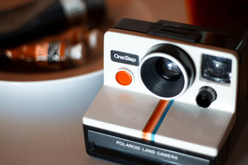
The new logo has almost nothing left of that inspiration. The famous “rainbow” that appears in the middle of the OneStep and the top right of the Instagram logo has now been turned into a gradient that makes up the background color of the new logo.
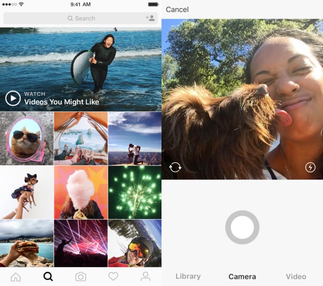
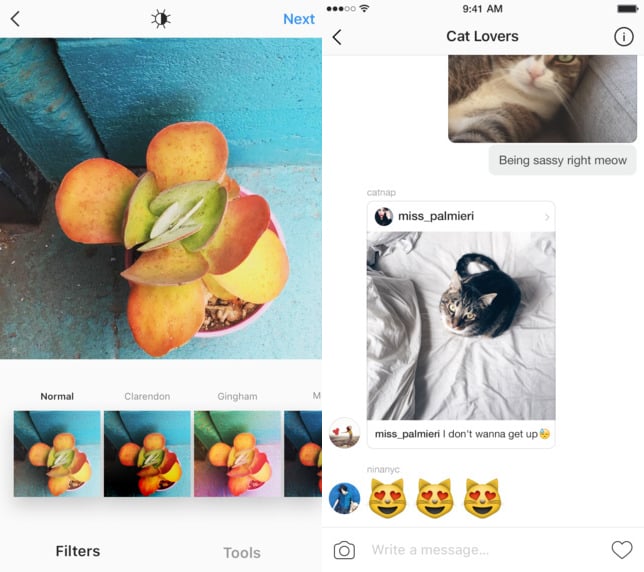
But while this might be the most obvious change on the front end—anyone else going to struggle to find Instagram on their home screen now?—the changes on the inside are more substantial.
Here’s a video intro to the new, more minimalistic look of Instagram:
The simple, black and white interface that Instagram had been testing has come to fruition. As Instagram put it on their blog:
The simpler design puts more focus on your photos and videos without changing how you navigate the app.
The only color left on the app comes from the photos and videos you post, your profile picture, and the occasional little red number to let you know you have a new interaction or direct message:
Not much has changed about how you use Instagram; in fact, nothing has changed about how you use Instagram. But the new design and app logo are bound to receive a response from the many millions of users who post to IG every single day.
What do you think of the new logo and look? Let us know in the comments down below.
Image credits: Polaroid Land Camera by Simon Carr