Positive Developments and Negative Attitudes: A Word on Color and Conversion
Color is complex. Achieving great color can be cumbersome, both in analog and digital workflows, and developing and researching it has been as hard as rocket science.
The truth is both simple and incredibly complex at the same time: Different films render color differently, but not as drastically different as many presets or simulations often suggest. A large part of how a final image will look like is defined by the whole process, and not only by the film. The colors a certain film can produce are somewhat predetermined by the emulsion and the dyes forming in each of its layers during development.
But contrary to many factoid assumptions about analog photography and “film looks”, the color can be altered by different process parameters to an extent, as well as during the finishing, or to put in more digital terms, the postproduction. Additionally, to a degree, color is subjective and a matter of personal taste.
This doesn’t mean, however, that different films don´t have different characteristics, because they actually have. Generalization, though, is almost impossible because the differences are subtle and can either be emphasized, or equalized, depending on how you work.
While there is no one “true” rendering of a film’s color that would render everything else “false”, there are better and worse conversions, just as there are better and worse prints. In the case of scans, this depends on the equipment used to capture the scans, the quality of light or a lack thereof, and the software used to process them, as well as the users themselves.
If a converted image needs drastic editing to achieve a pleasant result, something might be wrong, and by simply keeping editing drastically, you might risk equalizing the more subtle differences that different films indeed have.

In the end though, color mostly is a decision you make as a photographer. You may strive for boldly and brightly, or subtly and temperately colored images; the pathways to color are manyfold, and that road only begins with the choice of film and then continues through development and finishing. Be it through necessary filtering in the color darkroom, or digital postproduction, or the decision to outsource the scanning and finishing to a lab altogether.
The decision for color can be made either beforehand, or afterward, or in between, depending on your requirements, planning, and personal taste. The notion, however, that film has an apparently distinct and most importantly “true” color, and therefore, that images can be either right or wrong, is to be taken with a large grain of salt.
Scans from different devices look differently, and those, in turn, might look different to how a wet print made in the darkroom would look like. And to even confuse things further, different photographers can produce different prints from the same negative as well.
In most cases, the right color is the color you find pleasing and that falls within your own expectations. Of course, certain work requires color to be as accurate as possible, for example in reproduction work or when specific colors need to be faithfully reproduced. In those cases, the quality of color is dependent on a great many variables though – too much to discuss here.
Back when most commercial photography was shot on film, many photographers, editors, and art directors preferred slide film and the resulting transparencies for that reason, because when properly shot, processed, and scanned, slide film can be very neutral, color faithful, and above all, leaves no room for interpretation of the resulting colors. Otherwise, slide film can produce incredibly bold pictures, if exposed and developed accordingly. Contrary to that, every negative, be it color or black and white must be interpreted in some way or another.
Today, we have several options to help us interpret color negatives. Because of the orange mask of the film, a “straight” inversion, even when color corrected with white balance afterward will result in a blueish image with bad color. While manual inversions with proper color rendition are quite an easy thing to do, once mastered, they require a bit of a learning curve as well as patience because sometimes getting good color can be cumbersome. Especially with near-perfect files from drum scanners, manual inversions are reliable and relatively fast. When files are less than perfect though, working manually can quickly become very frustrating.
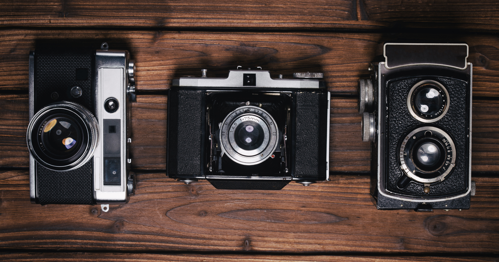
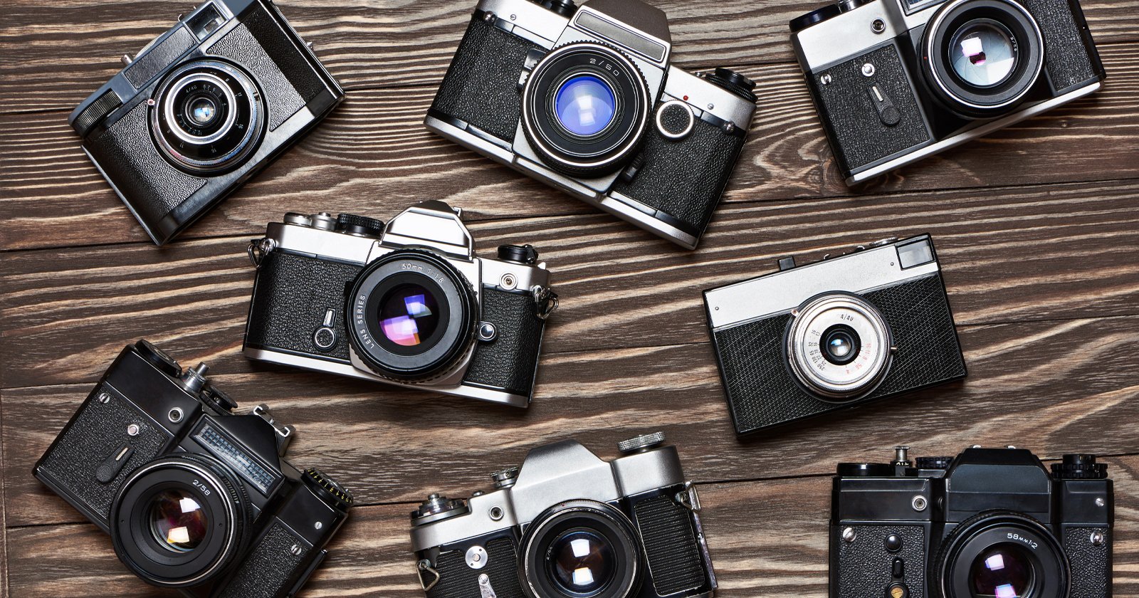
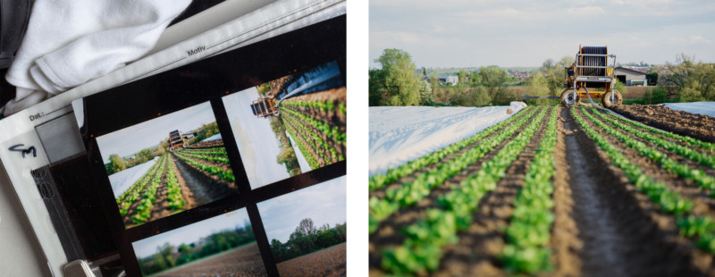
In the last years, with a general uptake in interest for film photography and a plethora of new products, ranging from print journals about analog photography like SilvergrainClassics to new films and supporting gear being introduced, scanning, once mostly done by trained scanner operators has become a photographic mainstream task. Especially the so-called camera scanning method, the reproduction of a negative or a slide using a DSLR or DSLM with a macro lens has become a very popular and affordable option to scan film for both amateurs and professionals alike.
Since 2018 and the introduction of Negative Lab Pro, a plugin for Adobe Lightroom Classic, converting camera scanned color negative scans at home has been made considerably easier, and in the meantime, NLP has been regularly improved and updated and continues to do a great job converting negatives into pleasing positives. Aside from the aging Colorperfect plugin, there has been no elegant solution for negative conversion in Photoshop so far though, aside from a few actions and scripts scattered across the Internet.
While Lightroom is a great piece of software for individual photographers and can be a help in organizing and maintaining a catalog of your images, Lightroom is not everyone’s favorite software. Many professionals, especially studios, but some single photographers as well, may prefer to use a Bridge and Photoshop workflow paired with their own file management structures. For those, NLP and Lightroom may be more of a hassle than anything else.
While there are other automated options for Photoshop which work okay with some negatives, these have so far always had some major downsides, and have for example unnecessarily compressed a scan’s tonal range, or clipped color channels, and so on.
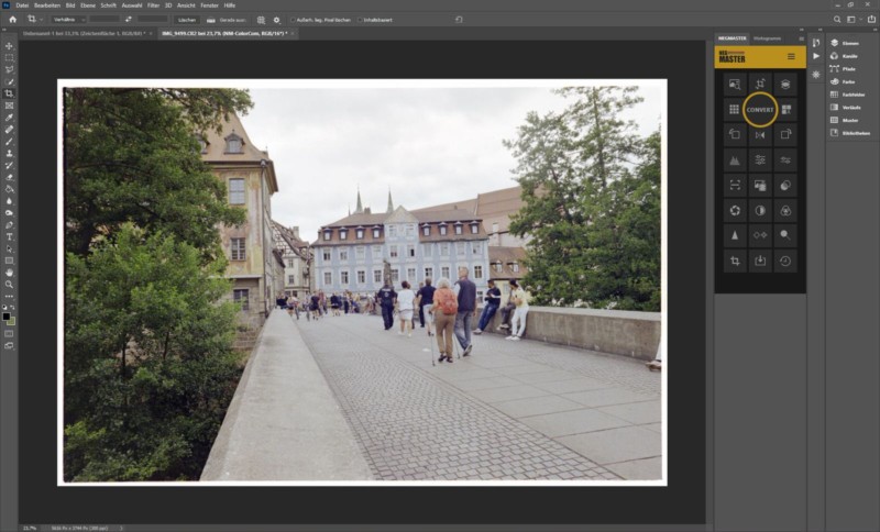
In early 2020 a new plugin for Photoshop, and built with a Bridge workflow in mind, Negmaster, became available and quickly proved to be a formidable option for negative conversion for both professionals, enthusiasts, and total beginners alike. Of course, Lightroom users can work with Negmaster as well, although in this case, the whole workflow might be a fraction slower than just sticking to NLP. The results, however, may justify this based on individual taste.
Since color is subjective to an extent, and everyone may perceive it a bit differently, general statements of “X is better than Y in all cases” are a dead end. Ultimately, the right software for you is the software that best fits your workflow and delivers results you are happy with and that meet your demands.
Since its inception, the plugin has undergone several drastic improvements and new features, with no end to further functional updates in sight. In terms of functionality, Negmaster pushes the boundaries of what Photoshop can do, even exploring the possibilities for AI-supported dust removal in the future.
On the technical side of things, the plugin works within its own color space and has introduced a positive workflow in which the image is actually inverted prior to treatment by the plugin. Due to the Negmaster’s Invertrue profile, the resulting positive files are neutral and very flat, with the orange base largely removed. This enables Photoshop to work in a positive image environment for which the software was developed, hence allowing for better finishing without requiring HSL adjustment.
Additionally, the plugin offers various emulations of scanners and analog papers as well, for which the actual ICC profiles of devices and papers normally used for soft proofing are employed.
Generally, the functional scope of Negmaster is very large. The plugin is offering everything from basic and very neutral conversions, which are an ideal starting point for further editing, alongside a fully configurable negative converter allowing for batch conversion, too. If configured accordingly, Negmaster might be all you need though, creating positives that need little to no additional editing and no further HSL adjustments to the file which could meddle with the film’s subtle characteristics more than necessary.
For those more experimental and with a taste for quite drastic edits, on the other hand, the plugin provides intricate device and paper emulations and even several stylized simulations, including, for example, an Aerochrome stylization. While this of course is no necessity to have, and due to its characteristics and the nature of infrared light itself, color infrared films like Aerochrome simply cannot be sufficiently and authentically simulated, the plugin does a nice job trying to do so. Using these options can be fun, but of course, this is up to personal preference.
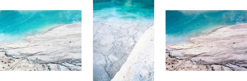
A strong point of Negmaster is the color rendition the plugin is able to achieve, especially with negatives other options have considerable problems to achieve good color with, and notably so with green and yellow tones. Due to the aforementioned orange mask, most camera scans are a bit underexposed in the blue channel and often slightly in the red channel as well, which subsequently can lead to an unnatural and unpleasant color rendition in the positive. Negmaster, working in a positive environment, seems to handle these very well, producing colors straight out of the plugin that come close to the actual analog contact prints, thus being an excellent starting point for further edits.
Another factor to consider here, of course, is the quality of light used to reproduce a negative. The better the light, the better the color. For the best possible color rendition, light sources providing a CRI of 100 like Xenon bulbs used in enlargers, or electronic flashes are recommended. Additionally, Negmaster offers an extensive post-production panel with options for high-pass sharpening, microcontrast enhancement as well as auto doge and burn options, for those interested in it. Again, using these options is not a must, but a rather nice addition to the overall package.
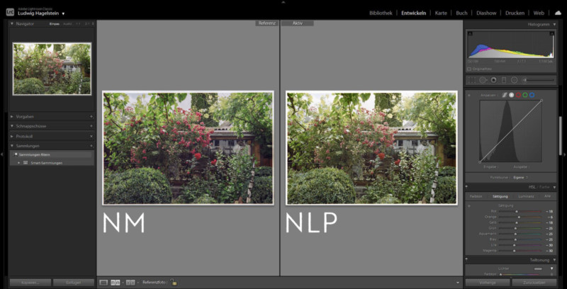
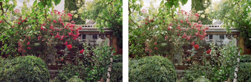
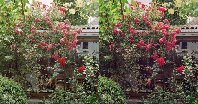
Carefully comparing Negmaster with Negative Lab Pro, the differences in most images converted with both tools are subtle in the beginning, but of course, can be amplified during further editing. While both tools provide pleasant color, with many images and especially those with much green and yellow in them, Negmaster has in most cases delivered incrementally better and more accurate color straight out of the plugin, that would otherwise require a further adjustment of either Hue or Saturation of individual colors in Lightroom if NLP was used.
In the end, the decision is up to you though. Ultimately, Negmaster is a great new addition to the palette of tools available to us and can either be used on its own, or in combination with Lightroom and aims for the most accurate conversions, doing its best to retain the subtle differences of various films without doing too much.
Overall, there is no “right” and “wrong”, and the options to finish an image, be it in a darkroom, or with digital means are multifarious and perhaps a bit overwhelming to keep track of in their entirety.
As with so many things in photography, in the recent and more distant past, photographers have grouped themselves around certain gear, or brands and thus slowly fallen to a modern and quite commercialized tribalism, which in the end may be detrimental to the cause of photography itself. Pick your own example: Nikon vs. Canon, Film vs. Digital, Full frame vs. Crop, Lightroom vs. Photoshop.
The sheer existence of diverse possibilities and options to produce images is a luxury and not a threat to existing solutions. Imagine being stuck with only one option that just you don’t like, but all others do. Not a very pleasant thought.
Thankfully, the world is wide enough, after all. For both film and digital, and Lightroom and Photoshop.