Camera Makers Need to Lean Into Their Brand Colors Again
When Nikon added the gold ring to the lens mount of its 28-135mm f/4 PZ earlier this year, I was ecstatic. Finally, Nikon was leaning into its brand color. I was saddened to learn it would only do this on select products moving forward. That got me thinking: every brand is leaning away from color when they should be leaning into it. For a tool designed to create art, the camera tends to be dreadfully boring.
Nikon is not the only company I want to see more color from: it’s everyone. That said, it was kind of a slap in the face to see the first push of gold into the company’s product line coming in the form of a filter late last year. If we didn’t see it on the 28-135mm f/4 PZ, I was willing to riot. That said, I’m still not satisfied.
Canon, Sony, and Fujifilm are just as guilty. Canon, Big Red as I like to call them, does use its brand color more than everyone else, but only on its optics. The iconic “red ring” on the L-series glass is one of its signature trademarks, but I argue the company should go harder. Give us more red, and do it on the cameras. No, the record button does not count.
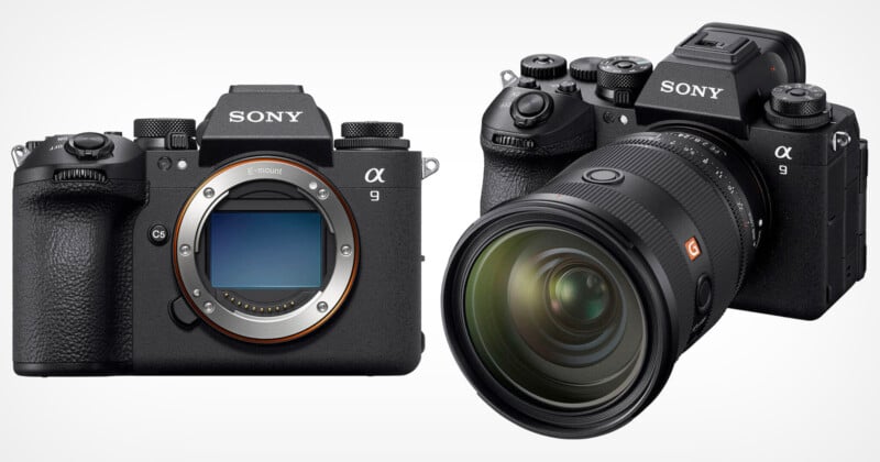
Sony is doing the opposite, and it’s confusing. If you were to close your eyes and picture a Sony Alpha camera, you probably see some orange accents, right? That’s because Sony was doing that and making it obvious. The original a7, for example, had a bright orange ring around the lens mount that really stood out. It is less obvious, but still there as recently as the a7R V.

But look at the a9 III. While yes, there is an orange ring still on the lens mount, as soon as you mount a lens to the camera, it all but disappears. Why? Why downplay the orange?
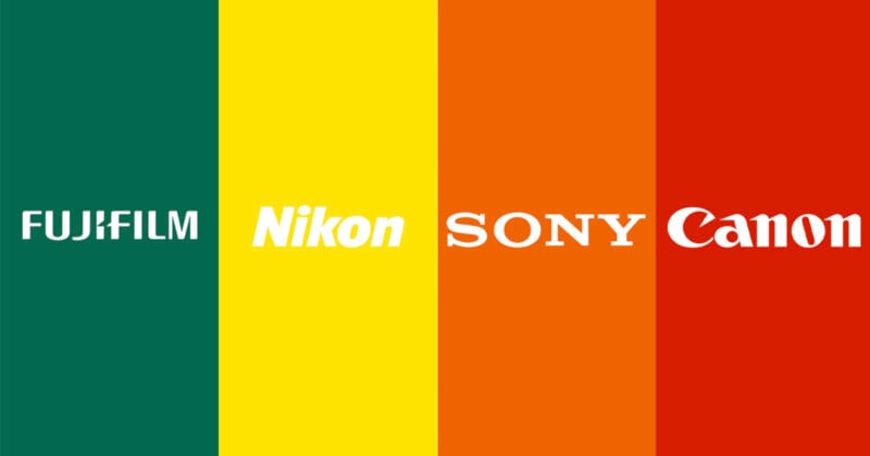
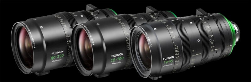
You could probably poll 10 die-hard Fujifilm photographers and maybe two of them would be able to tell you that Fujifilm’s color is green. Yes, Fujifilm also uses red, but the dark green is, arguably, more iconic of the brand — or, at least, it was.
Look at this beautiful livery:
Casey Mears – Fujifilm (Dodge)
2003 Tropicana 400 (Chicagoland Speedway) #NASCAR pic.twitter.com/ovjS7Cu7Fb
— NASCAR Paint Schemes (@NascarPaint) April 4, 2020
That’s drop-dead gorgeous, and I want more. But for some reason, Fujifilm shies away from showing its green-colored heritage on anything other than its Fujinon lenses. Gratefully, Fujifilm’s Fujinon website is very green and its latest lens, the 32-90mm T3.5 for GFX, has that lovely green ring shining brightly on the lens mount and the focal range is also painted that same metallic green. Why wouldn’t you want to put that on the camera body too?
For some reason, all of the camera brands collectively decided that photographers want their cameras to be bland, colorless, black rectangles. I’m not asking for full color camera bodies a la Pentax (although Leica’s Safari green cameras are probably the most beautiful cameras you can get right now), I’m just asking for brands to remember they have iconic colors and to use them to accent their cameras and lenses more. If I’m a Canon shooter, I want it to be obvious I’m on Team Red. The same goes for Team Orange Sony, Team Green Fujifilm, and Team Gold Nikon.
Rep those colors, don’t shy away from them!