Kodak Portra 160 Might Be the Best Fine-Grain Color Negative Film
We stated in our Film Friday review of Kodak Portra 400 (and again in our Portra 800 write up) that it is pretty much a perfect color film, so you’ll hopefully understand and forgive us if we start off this Film Friday by insisting that Portra 160 is a more perfect film.
One quick note needs to be made here to help alleviate confusion. In early 2026, Eastman Kodak (aka the original Kodak company and not to be confused with Kodak Alaris — trust us, it is confusing) released its Portra films rebranded under the Ektacolor Pro name. We are not going to go into the lengthy explanation as to why, but suffice it to say that they are the same films in different boxes and under different branding. For this review, though we are going to just keep referring to it simply as Portra.

As the lowest ISO of all the Kodak Portra films, it has all the wonderful qualities of Portra 400 but with significantly finer grain. We are getting ahead of ourselves though; first let us delve into Portra’s history just a little bit.
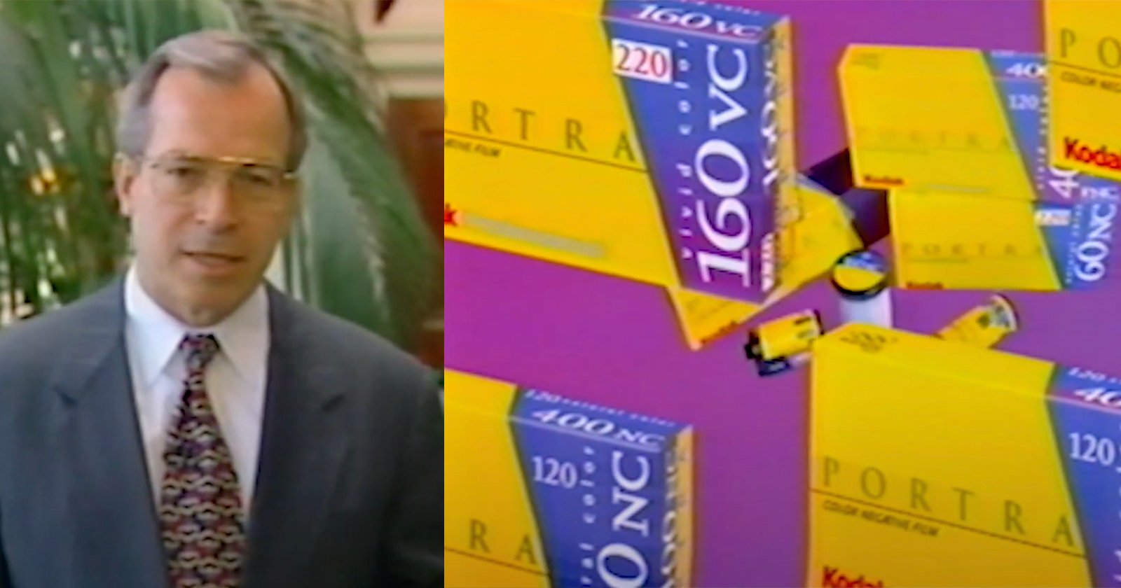
Kodak gifted film photographers of the world the Portra films in 1998. All three speeds (160, 400, and 800) were introduced together and that is the range we still enjoy to this day. Originally the Portra films were broken up into two variations. A photographer could choose between Portra NC (for neutral or natural color) or VC (vivid color). Later, and only briefly, a UC (ultra color) joined the family. As you might deduce, these variants allowed photographers to match the right Portra film to their preferred subject matter based on contrast and saturation preference.

Heading out to photograph a wedding in direct sunlight? You probably wanted some Portra NC. But taking a trip to see some fall foliage? In that case Portra VC or UC would likely have been your choice. Film technology is an ever-evolving science, though, and in 2010/2011, Kodak made the decision to combine the NC and VC branches into a single film (UC had already spun away from the Portra family as a standalone film for a short while before being discontinued). This combined film split the differences between NC and VC. The new version of Portra now had more contrast and saturation than NC, but less so than VC.
At the same time, new film grain technology was incorporated that made Portra even smoother, more detailed, and cleaner of grain. The updated Portra also benefited from optimization for film scanners. And that is where we are today folks. Over twenty years after its introduction, we have a Portra film that is at the peak of its game. It does everything well and can be used for virtually any subject matter.

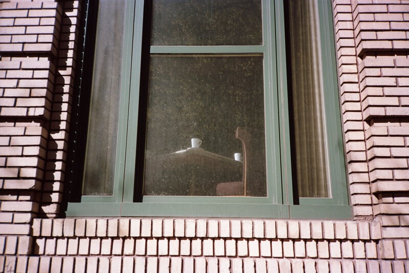
The best place to start in praising Kodak Portra 160 is with its rendition of color and overall color palette. As its name implies, this is the film for portraiture work. Want pleasing, accurate, even, predictable, gentle, smooth skin tones? Load your camera with Kodak Portra and be done. Mission accomplished. That is why Kodak Portra 160, along Portra 400 and 800, are the most popular films for wedding, fashion and lifestyle photographers. Your subjects will look their best with Portra film, and when you have the pressure of a wedding bearing down on you, that is an important reassurance to have.
But portraiture isn’t the only thing Portra 160 can do well — it is pretty good at everything else, too. Landscapes? You bet! While Portra 160 is not nearly as saturated or fine grained as Ektar 100, it nonetheless holds its own doing landscape work. And while not as brilliant as Ektar or Fujifilm Velvia, it still has great richness and vibrancy. This is true with cityscape, street photography, still life, product photography… you name it. In all these cases, Portra 160 will deliver consistently accurate color redolent with nuance and depth.


After praise for Portra 160’s color, its next selling point is its fine grain. Portra 160 has a print grain index of 28 when measuring it in a 4×6 print, placing it just over the visual threshold of 25. Compare this rating to Portra 400’s 37 and Ektar 100’s of <25. Portra 160 isn’t quite as fine of grain as Ektar, but you’ll be hard-pressed to find a film that is.
On the other hand, it has significantly finer grain than Portra 400 and is approaching the limits of visual threshold. Can you see Portra’s grain in a small print? Sure, but you are going to have to look very, very close to do so. All of this is to say, if you want smooth images, unmarred by the texture of grain, shoot Portra 160. And this benefit only gets even better if you are using 120 or 4x5 film where Portra 160’s grain is unmeasurable being as fine as it is.
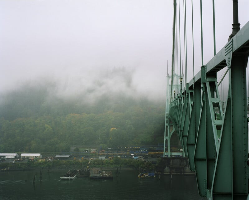
[caption id="attachment_886383" align="aligncenter" width="800"] Photo captured on a Horseman SW612 | Photo by Zeb Andrews[/caption]
And then there is Portra 160’s latitude and contrast. In regard to the latter, Portra 160 is a pretty soft film. It is not going to lose you in deep shadows or blinding highlights but rather give you smooth and nuanced tonality. Personally, we prefer this because it is always easier to add contrast after scanning than it is to remove it.
But sometimes Portra 160 can feel a bit flat. In those cases, one easy solution is to shoot it at box speed and have it pushed in developing by a stop. This will add a nice amount of extra punch to the film.


In regard to its latitude, the film is pretty amazing. It is a perfect film for direct, sunny, harsh light kind-of-days. On more than one occasion we have found ourselves photographing an outdoor summer wedding with nary a cloud in sight and Portra 160 has made the job so much easier every time. It is a great film for tricky light or guessing your exposure. Like most color negative films, it forgives overexposure more readily than underexposure and because of that we generally meter biased toward our shadows to make sure we have good exposure there and let the highlights fall where they will, which is generally somewhere well within a usable range.
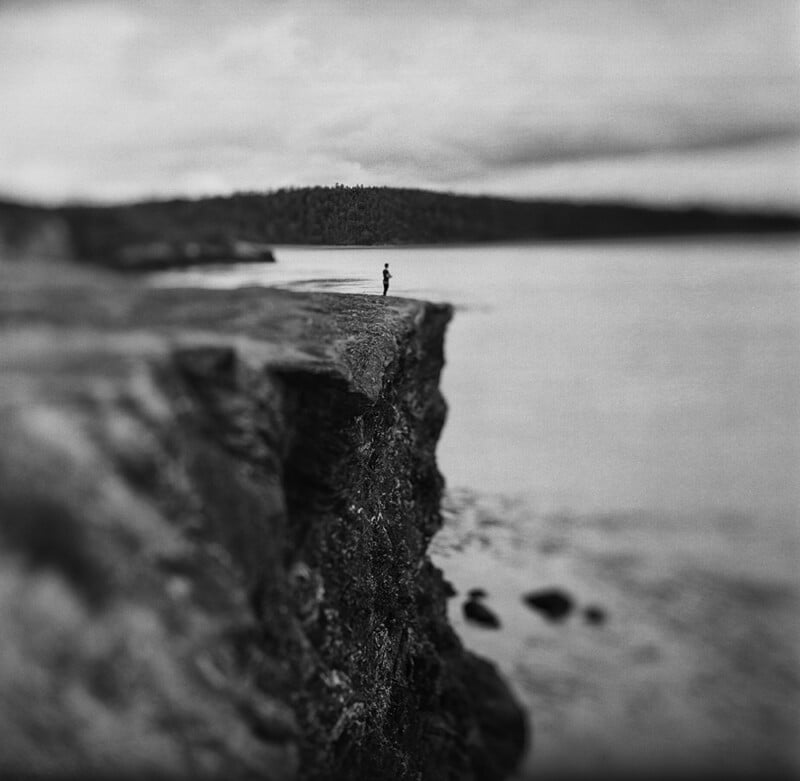
If you want an extreme example of how forgiving this film is, we once overexposed a frame by nine stops (we had metered for a heavy ND filter that we forgot to put on the lens prior to exposure). Ouch, right? Unsurprisingly when the roll was developed that frame was a black, dense square of exposure. But buried in that density we saw detail, so we scanned it using our Nikon Coolscan 9000 which excels at scanning dense negatives and amazingly enough we recovered a usable image from it. Its colors were heavily skewed and it had lost a bunch of its contrast, but after converting the image to grayscale and tweaking the image curve we were amazed at what came out:
Not that we recommend trying this yourself, but you know: stuff sometimes happens.
At this point we wouldn’t blame you for feeling a bit like you have Portra overload. We understand, but we have just a bit more to touch upon when it comes to this film’s strengths. It is worth pointing out that Portra 160 is not only available in 35mm and 120, but also 4×5 and 8×10. Film For Classics even respools Kodak Portra 160 onto 620 and 127 spools. You can truly use this film across a wide variety of cameras.
Also, it is engineered to be very consistent with Portra 400 and 800. If you have to mix and match rolls of the 160 and 400 during the same job or outing, you will get very consistent results. Sure, there will be very slight differences such as the amount of film grain, and some say the color palettes are a bit different, but for all intents and purposes, Kodak has made these films easy to swap out with one another.


It is worth pointing out that your Portra images will only be as good as the weakest part of your process. Yes, this is an excellent film but wonky metering can affect your results, just as sub-par developing or scanning. In this era of color film and at-home scanning, remember that your mileage with a film can vary substantially based on how good your scanning technique is (or your lab’s). If you are going to invest in using an excellent film like Portra, make sure that your processing and scanning/printing are up to those high levels of excellence as well. Just throwing that out there. In order to really get the most out of this film, treat it the best you can at every step of the process.

So after all that, is there anything Portra 160 doesn’t do well? It is not especially good at reciprocity failure and long exposures. Kodak’s data sheets claim no need for compensation up to one second exposures. It’s not hard to get beyond one second exposures, though, especially if you are using this film at night or in a pinhole camera. Our experience with Portra 160 suggests a reciprocity correction rate that looks about like this:
- Up to one second – No correction necessary
- At 10 seconds – Add 1 extra stop
- At 60 seconds – Add 2 extra stops
- At 2 minutes – Add 2.5 stops
This puts it about on par with Kodak Ektar and what we would consider an average performance. It is nowhere near as good as Fujifilm Acros II but nowhere near as bad as Fujifilm Velvia 50.
But that is honestly about it. Otherwise, as you would expect of a film bearing the “Portra” name, Portra 160 simply rocks it. This is a color film to always have in your bag and if you have not had the experience of trying it out yet, we cannot recommend you do so nearly enough.
We will have Portra 160, as well as Ektacolor Pro 160, on sale for Film Friday today. Hit our website, or pay us a visit at our shop in Portland, Oregon and buy a few rolls to use this weekend! Have fun and we will see you next Friday for a Film Friday newcomer!
Image creditsAll photos are individually credited and come courtesy of Blue Moon Camera and Machine.
This story is brought to you by Blue Moon Camera and Machine in Portland, OR. Blue Moon offers film, development services, printing, and even an ever rotating line of film cameras and lenses. PetaPixel Members receive 10% off all lab services with Blue Moon: Join today! This story is also published here.
Affiliate Disclosure PetaPixel articles may include affiliate links; we may earn a commission if you buy through one.