Dunes and Clouds: Photographing Symmetry in the Desert
In 1991, near the end of some book projects that took me on some lengthy photographic journeys through the American West by car for two years, I came up with the idea of creating posters of some of my black and white images for a few of our western National Parks.
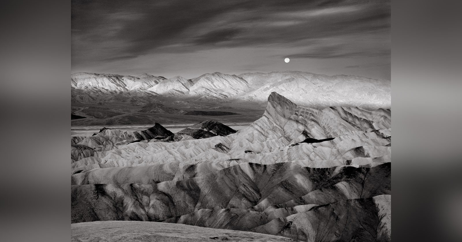
My original attempts were met with great interest by the various Natural History Associations. Most were already familiar with my photography because of various photographic projects such as magazine articles, gallery/museum shows, or word-of-mouth. I had completed a color slide show for Capitol Reef National Park a few years before, and my black and white work was already known by some Natural History executives of Canyonlands and Death Valley National Parks.
In this four-part series written for the ELEMENTS Magazine, I am discussing most of these posters (Read parts one and two). I’ll give technical information where my memory serves me correctly, aesthetic considerations and some highlights of making the photographs on the scene. Please join me on this journey through the past!
Dunes and Clouds
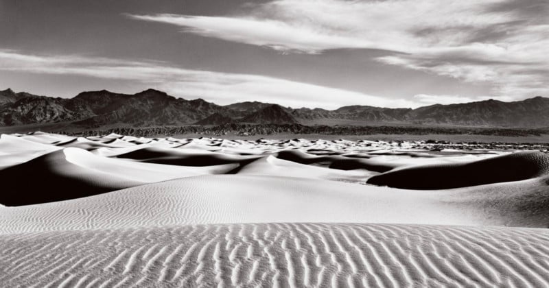
The third poster I made for Death Valley is Dunes and Clouds. This was the second dunes image that was made into a poster. The Park thought my first image did not show the expansive range of the dune environment, so I proposed making a new image. I got up before sunrise at the Stovepipe Wells campground, drove a short distance, packed up my 4×5 camera which I routinely fit into my backpack for short to medium distance hikes (with the front and rear stages disconnected to fit), set my heavy Bogen tripod across the top, hung my trusty viewing cut-out card from the tripod head, and trekked into the dunes.
Shortly after sunrise I found this interesting symmetrical composition. The dunes were not sufficient to make this an expressive image but the clouds, filling the sky with patterns contrary to the foreground sand ripples, and even some clouds echoing the sand ripples, immediately made this the image I had to make. My records indicate I used a graduated ND filter in the lens shade hoping to reduce the brightness of the sky and clouds, bringing them under control in the negative. I made the exposure on TMax 100 film just as a slight breeze got up. I decided to expose a sheet of Ektachrome 4×5 color transparency film. Just as I finished the color exposure, the wind became fierce, whipping sand into my face and onto the camera. I hastily put the camera into my backpack, which was no easy task in the now raging sandstorm! I could barely see, squinting to prevent the sand particles from getting in my eyes. On the way back to the car I had to lean against the blowing wind and sand to maintain my balance.
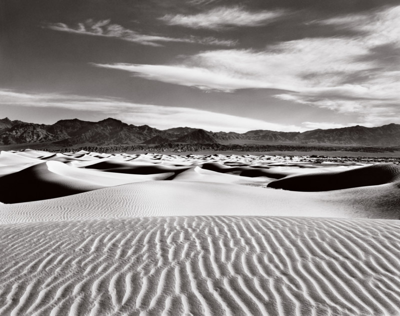
I developed the negative N+1 (over-develop) to increase contrast, knowing that the graduated neutral density filter would prevent the clouds from blowing out and losing detail. I was surprised to see minimal dust spots on the film, and the exposure was excellent! All the desired image values were recorded well on the film. Even so, this was a difficult print to make. The values were uneven, so substantial burning and dodging had to be done to achieve a well-balanced clean image (something I feel is necessary for a symmetrical composition like this).
I showed a mock-up to the Park personnel and was given the “thumbs up” for a sand dunes poster. Fortunately, the poster was relatively easy to print. Using a high-density black ink and pms409 grey ink (which the printers nicknamed “Radeka Grey”), on glossy paper, it was mainly a matter of printing with enough black density to yield a visually satisfying image. My trilogy of posters for Death Valley was complete!
The article is courtesy of ELEMENTS Magazine. ELEMENTS is a monthly magazine dedicated to elegant landscape photography, insightful editorials and fluid, clean design. Inside you will find an exclusive and in-depth articles and imagery by the best landscape photographers in the world such as Bruce Barnbaum, Christopher Burkett, Chuck Kimmerle, Christian Fletcher, Charlie Waite, Rachael Talibart, Erin Babnik and Freeman Patterson, to name a few. Use the PETAPIXEL10 code for a 10% discount off the annual subscription.