Moon Over Zabriskie Point, or: Seeing Photos in a New Light
In 1991, near the end of some book projects that took me on some lengthy photographic journeys through the American West by car for two years, I came up with the idea of creating posters of some of my black and white images for a few of our western National Parks.
My original attempts were met with great interest by the various Natural History Associations. Most were already familiar with my photography because of various photographic projects such as magazine articles, gallery/museum shows, or word-of-mouth. I had completed a color slide show for Capitol Reef National Park a few years before, and my black and white work was already known by some Natural History executives of Canyonlands and Death Valley National Parks.
In this four-part series (originally written for the ELEMENTS Magazine), I am discussing most of these posters. I’ll give technical information where my memory serves me correctly, aesthetic considerations, and some highlights of making the photographs on the scene. Please join me on this journey through the past!
Moon Over Zabriskie Point
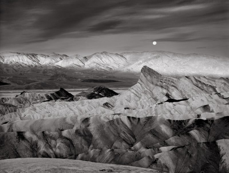
In 1980, there was hardly anyone else at Zabriskie Point, a high spot on a hill overlooking the fantastically eroded mud hills including the landmark Manley Beacon, when I arrived before sunrise. The intense moon was slowly descending over the Panamint Mountain range and the entire scene had a lunar-like feeling. Although there was a considerable amount of haze, I set up my 4×5 Super Cambo view camera hoping to make an interesting composition of the moon and the mud hills.
By the time my camera was set up, and I had taken some basic meter readings, the sunlight had already begun hitting the crest of the Panamint Range. My visualization changed, as now there was a different brightness element in the scene. I decided to wait for the sunlight to bathe the mountain range. Fortunately, I made the exposure just in time before the sunlight touched the mud hills. In addition, moments – literally seconds – after the exposure, the clouds began to cover the moon, obscuring the clear intensity of the bright, detailed lunar surface. There was no point in making a duplicate shot. I had already realized the decisive moment!
After returning home I developed the Tri-X 4×5 negative in Kodak HC-110 and examined a proof print. I wasn’t happy with the horizontal composition thinking it too cliché, so, using cropping “Ls,” I decided to make a print with a vertical crop instead. I lived with this vertical print on my home gallery wall for many months but could not talk myself into liking it. I considered the image a failure and filed the negative away, erasing it from my mind.
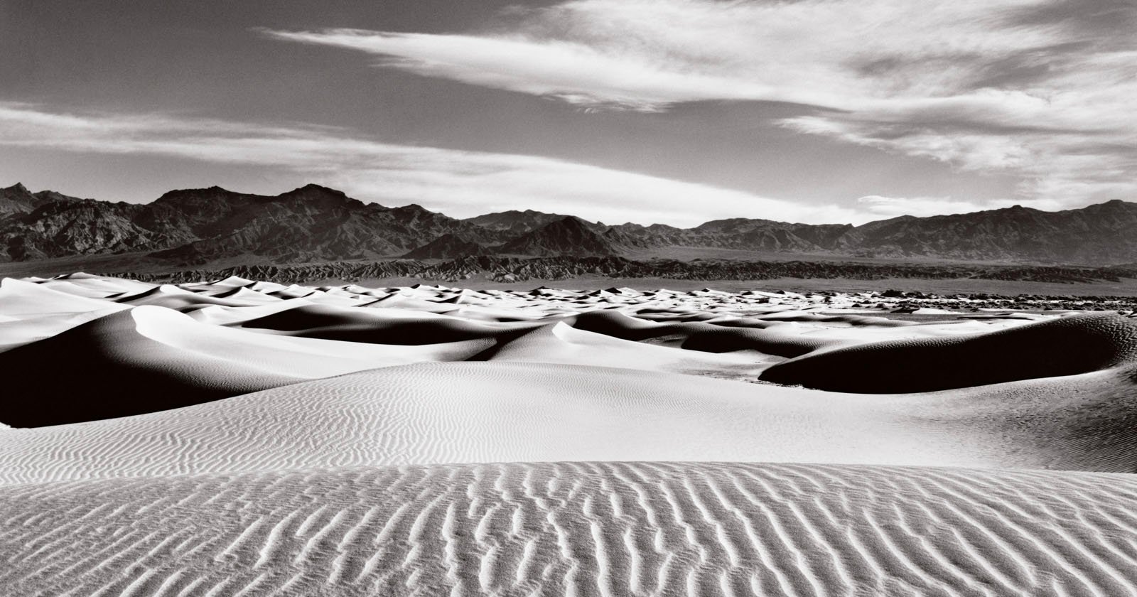
Then in 1990, I had a discussion with Esy Fields of the Death Valley Natural History Association. She was interested in my desire to produce a black and white poster for the Park (still a National Monument at that time). She said she needed posters of Zabriskie Point, and possibly a series including the Mesquite Sand Dunes and the Racetrack. My assistant, Al Callju, reminded me about the moon image I had shot a decade earlier, which I had forgotten about. I located the negative, looked at it with fresh eyes and no preconceived notions, and immediately saw new and exciting interpretations of this perfectly exposed negative. Thanks to various new contrast control tools I had learned in recent years, and more printing experience in general, I approached this image with newfound enthusiasm.
I was able to make a good 16×20 print to be used for the scanning process. I brightened the sunlit mountain range, making it more intense than one would see at the scene. I was after the aesthetic effect, something that would separate this image from the commonplace dull or overly contrasty “documentary style” renditions often seen in black and white. I kept the foreground relatively middle key with enough local contrast to enhance the tactile quality, yet not so much to compete with the brilliance of the sunlit mountains and the smooth, darkened sky. The moon had beautiful detail and still glowed against the rest of the image. It tied in nicely with the lunar-like landscape, creating a visual metaphor. Further, I noticed the alternating horizontal bands of bright and dark and attempted to accentuate that. The photographic print was a success! The poster, on the other hand, posed difficulties.
The first poster run of this image proved to be another learning experience, to put it mildly. By this time, I had chosen pms409 as the “grey ink” color (a slightly warm brownish-grey) and a glossy paper. The color was fine but the blacks in the image were very weak. I learned afterward to use a high-density black ink (instead of Process Black) which allowed for better black values. In addition, I had to ask the pre-press people to lighten the mid-tone range of the curve, which meant having them remake the film used for the presses, so we had leeway in pushing the black ink down for greater density (in press terminology it meant “coming up with the black”).
Finally, in 1994 I began using Photoshop Version 2.5. I could work with the black and grey duotone curves to tweak everything myself, but because of different results from different printing facilities, there was still some trial-and-error involved. In the end, my most recent printings are the most satisfying.
Part one of this four-part series can be found here.
The article is courtesy of ELEMENTS Magazine. ELEMENTS is a monthly magazine dedicated to elegant landscape photography, insightful editorials and fluid, clean design. Inside you will find an exclusive and in-depth articles and imagery by the best landscape photographers in the world such as Bruce Barnbaum, Christopher Burkett, Chuck Kimmerle, Christian Fletcher, Charlie Waite, Rachael Talibart, Erin Babnik and Freeman Patterson, to name a few. Use the PETAPIXEL10 code for a 10% discount off the annual subscription.