Tweak Your Curves for Another Way to Save Your Highlights

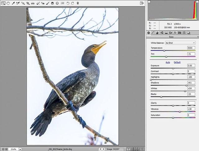
Lightroom has many adjustments and in general, they work reasonably well. I bet the most widely used sliders are the Highlights and the Shadows sliders. There seems to be a general tendency to make sure that the highlights are not blown and the shadows are not blocked.

Before going any further, you may want to right-click and save the above image and import it into Lightroom.
Note: The following steps can be performed in Photoshop as well probably with greater ease. There is a tool in Photoshop curves that will do what the targeted adjustment tool does in Lightroom. It is called the On-image Adjustment tool and looks like a finger with arrows up and down. And, instead of pulling the top end of the curve down to 98%, you pull it down to 248-250.
The Step Wedge
I prepared the above image in percentages of luminance rather than using RGB values. The numbers at the top of each band represent the luminance percentages which Lightroom displays in the tone curves, although it still uses 0-255 internally.
Highlights Slider
In order to provide smooth tones, this slider actually adjusts a range of tones. Sometimes this is welcome, and other times it breaks the crispness of the image.
To see it in action, select the step wedge and look at the histogram in Lightroom. You should see 11 spikes, both ends being attached to the edges.

Now, use your highlights slider and observe what happens to these spikes. The entire curve starts moving to the left. While the high values move faster, the low values also get somewhat compressed.

Also note that as you move it to the left, some tones actually merge into each other lowering local contrast. All the while, the main intention may only be to make sure the very bright values do not become pure white.
Tone Curve To The Rescue
Using the tone curve, it is possible to save the highlights without pulling down all the bright values which give sparkle to the photograph. The general idea is to pull down the top of the curve by a certain amount without impacting the other parts. Unfortunately, moving a point on the point curve in Lightroom can be a challenge where it is a breeze in Photoshop. The step wedge will become handy there as well!
Highlight Protection Curves
Although each image may need different curves adjustment, it makes it easier if we have a quick starting point depending on the image content. The typical preset choices in Lightroom are Linear, Medium Contrast, Strong Contrast. I will show you how you can modify those curves and save them as highlight protection curves.
Before you go any further, make sure that your curves panel is in point curve mode rather than parametric. Look at the lower right corner of the curves panel and note the little square. You can click on it to switch from one mode to the other.
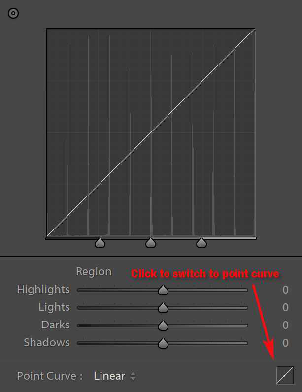

Parametric curves are adjusted by using sliders, like other Lightroom sliders. An advantage of this mode is that it prevents extreme and potentially dangerous curves adjustments.
Just like its counterpart in Photoshop, point curves in Lightroom can be adjusted to extreme points if necessary. The important thing to remember is that the points on the curve can be adjusted as needed.
Adjust the Preset Curves and Save
When the step wedge is displayed, move your cursor over the strips to see the RGB values changing below the histogram. You will notice some percentages are showing a 0.2 difference, like 90.2 instead of 90. I believe this is due to Lightroom displaying luminance from 0-100 but internal values being from 0-255. This will not be a significant number to impact the end results
Start with the Linear preset. Let us adjust it to keep most of its linearity but protect the highlights by 2%. The target is to lower the top right corner down to 98% while keeping most of the curve intact. To do this, we need to “pin” some values to keep the shape of the curve.
Activate the Targeted Adjustment Tool (TAT) by clicking on its icon on the top left corner of the curves panel.

We will use this tool to move the points on the curve with greater precision than dragging them with the mouse.
Start With The Linear Curve Preset
- First, move your TAT cursor to the slice of 50% luminance and click once. This will put a point on the curve. It will be one of our pins
- Now, move the TAT cursor over the 80% luminance slice and click, then to the 90% and click
- Next, move the TAT cursor to the 100% luminance, or white slice and click
- At this point, you can use the down-arrow on your keyboard and drag that point down in small increments; do so until the numbers under the histogram read 98.0
- This “Linear” curve now protects the highlights by 2%. Now is the time to save it for future use
- Click on the label that reads “Custom” next to “Point Curve” and select Save. Give it a name like Linear 2% PHL
Now The Medium and Strong Contrast Curves
To protect the highlights on medium and strong contrast preset curves, you only need to click on the 100% slice as there are other points on the curve to keep its shape. Simply click with the TAT on the 100% luminance and use the down arrow until you read 98% for the R-G-B values. Save this preset with a suitable name, say Medium Contrast 2% PHL.
While at it, you might as well do the same for the Strong Contrast preset.
To Use Highlight Protect Curves
Select the image you want to adjust, move down to the Tone Curve panel, from the drop-down, select the preset you want like Linear 2% PHL which will not change anything other than lowering the brightest areas by 2% and the effect will not be as wide-spread. Look at the histogram to see that tones are not merging into one another.
Of course, if the image needs a broader highlights adjustment, the Highlights slider is always ready and able to work for you. Or, you may want to use a combination of these methods. Every image is different!
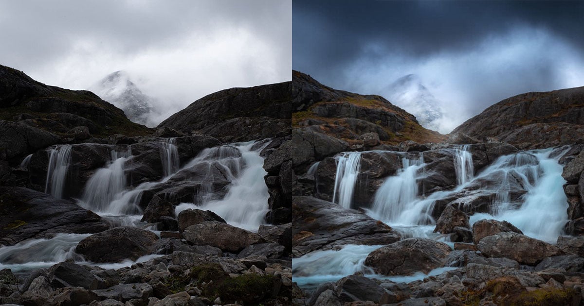
Here are a couple of photographs showing the blown highlights before the PHL curve is applied and another one after the curve is applied. Click to see them larger.


A few more thoughts. First, the 2% is not a magic number. You can create another set of curves for 5% highlight protection in your collection. Second, while you are at it, why not create a few presets that may be deployed as needed. I created a few more like Luminous Contrast which opens up the highlights more than medium contrast. There are three different versions of that among my curves presets. I also have a midtone contrast, not to be confused with medium contrast. The last one leaves the high and the low values but applies a gentle contrast to the midtones where much of the action usually is.
And, finally, I could have provided these curves for you to download and add to your Lightroom curves presets. But I chose to show you how to do it yourself; teaching is my karma! Also, this will kill more time for you and may even give you new ideas to explore.
For your information, those curve presets are actually text files that can be edited in a plain text editor if you know what you are doing.
About the author: A. Cemal Ekin is a photographer based in Warwick, Rhode Island who has been shooting for roughly 60 years. The opinions expressed in this article are solely those of the author. Ekin retired as a professor of marketing emeritus from Providence College in 2012 after 36 years of service there. Visit his website here. This article was also published here.