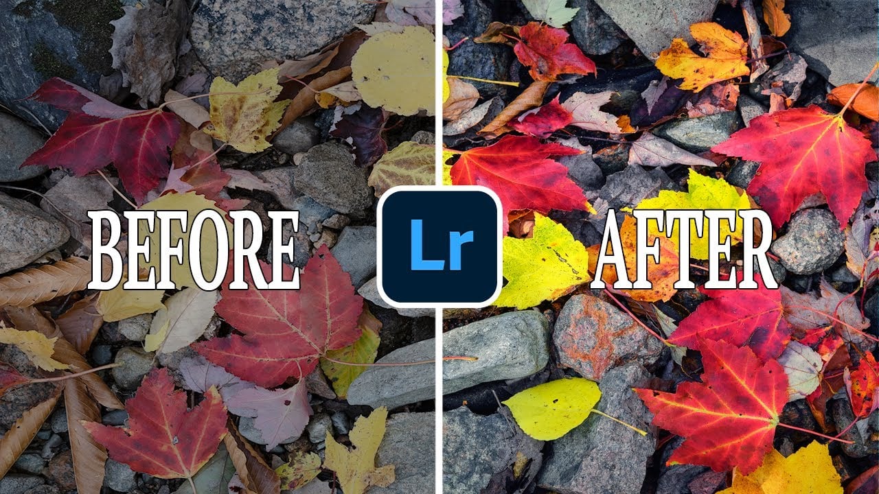
6 Beginner Lightroom Color Grading Tricks To Elevate Your Photography
Color Grading in Lightroom is a lot of fun, but for beginners, it can be a bit overwhelming. This often leads to people thinking you need to adjust all the sliders there are, but often this just leads to a strange-looking photo.
I tried to compile a list of tips and tricks to help get you through the color grading process. These are in the order I personally do the color grading but, of course, there are many different ways to approach it.
Pick a Profile
Color Grading isn’t something that happens in an instant. Lots of subtle little changed will lead to a great image. The first thing I do after opening the RAW file is to check the different profiles. Do I want more saturation? Then, I’ll go with Adobe Landscape. Do I want to have a more neutral look to start with? Then I’ll go with Adobe Standard.
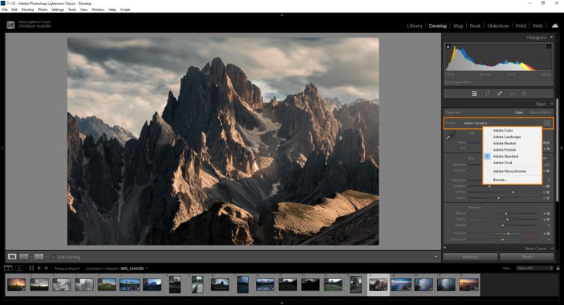
Setting up the profile is my starting point for all the editing that comes after. By the way, there are many more profiles to choose from when clicking on browse in the dropdown menu.
Adjust the White Balance
One of my most favorite tools is the white balance. Some people like to set it correctly in camera, but I prefer to play around with the temperature and tint sliders in Lightroom – both are viable options!
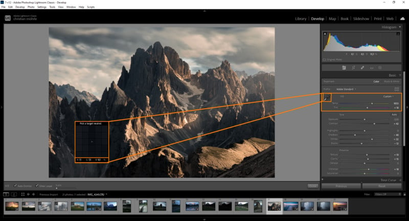
By making use of Temperature and Tint you can basically set up the photo to go in three different directions:
You can use it the “intended” way to get a neutral look / neutralize the color cast. This can be done manually, but for an accurate result, I suggest using the eyedropper tool on a neutral area where the red, green, and blue values are almost identical.
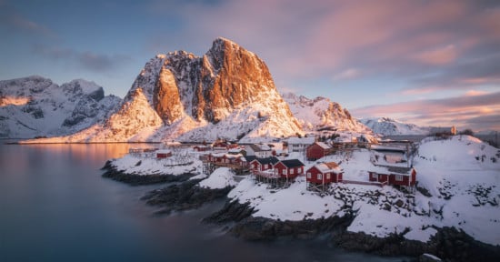
I, however, usually prefer to be a bit more creative with the white balance. As an example, for sunsets, I like pushing the temperature some more to give the overall shot more warmth.
Bringing up the tint can help intensify sunset colors as well in certain cases. Bringing the temperature down in the other direction works great for dark pictures. I love this cold look, especially on foggy winter scenes.
Try Masking
While Color Grading in Lightroom is mostly done globally for the whole image, don’t overlook the power of masking. After the profile and white balance adjustments, this is usually my next step in the color grading process.
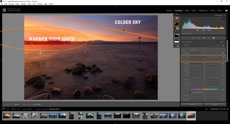
With masking, you can adjust colors in targeted areas of your photo. To me, that’s especially helpful when working with sunsets or sunrises with warm and cold colors present in the frame.
Both the radial and linear gradient masks are a big part of my workflow here. Using the linear gradient, I can make sure to keep the colder colors towards the darker sides by playing around with the temperature. With the radial gradient, I can enhance the bright sunset light, making it warmer by bringing up the temperature or even adding a more specific color tone.
Tone Curve
One thing that’s often overlooked when it comes to color grading is the tone curve. Firstly, it’s a great tool to add contrast but going into the specific color channels the tone curve helps to create awesome colors. Again, I want to take a sunset shot as an example: I can make the image warmer by going into the red channel and simply drag the point for the highlights slightly further to the left. This gives the brighter parts a subtle red color cast. Going into the blue channel and slightly dropping the point for the highlights adds more of a yellow color cast.
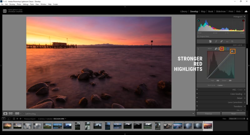
Of course, this can also be applied to the shadows by manipulating the black point of the tone curve. The cool thing here is, you can always guess the result before any adjustments since the colors in the corer indicate what will happen!
HSL Adjustments
HSL adjustments are another thing I regularly use when color grading. These tools are straightforward: with hue, you change a color tone. Saturation makes colors more vibrant, and luminance affects the brightness of a color.
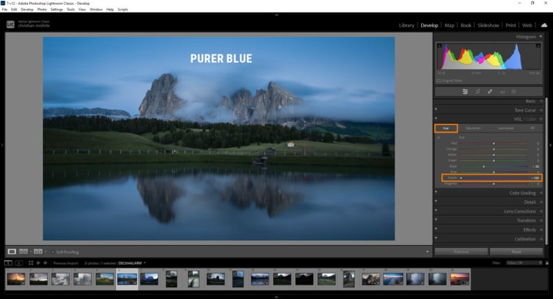
However, there are a few tricks which helped me over the years. When shooting landscapes, there will most likely be sky in the image and at blue hour, sometimes the sky has a slightly purple color cast. This is something that really bothers me, but fortunately, its easily fixed by bringing down the purple hue to result in a purer blue tone in the sky.
In the luminance tab, I often bring down the blue luminance to make the sky darker and thus add a bit more contrast. However, bringing down the luminance of a color will also increase its saturation. At the same time, bringing the luminance up reduces the saturation.
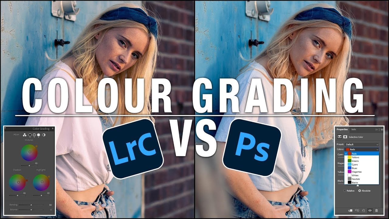
Split Toning
Now on to the greatest tool that ever existed: Split Toning! I absolutely love this tool because it is super easy to use yet it hugely improves the colors of an image. At this point, the split toning isn’t named split toning anymore, since a few versions it can be found under the color grading tab. At the very top you’ll find the most important settings: the highlights, midtones, and the shadows. We also have a more compact overview and a global color setting which I only rarely use.
Let me show you another sunset because here we’ll get the best results. When working with a sunset image, the highlights and midtones tend to be the warmest part. We can enhance that by simply adding more warmth on top and thus really bringing out the colors.
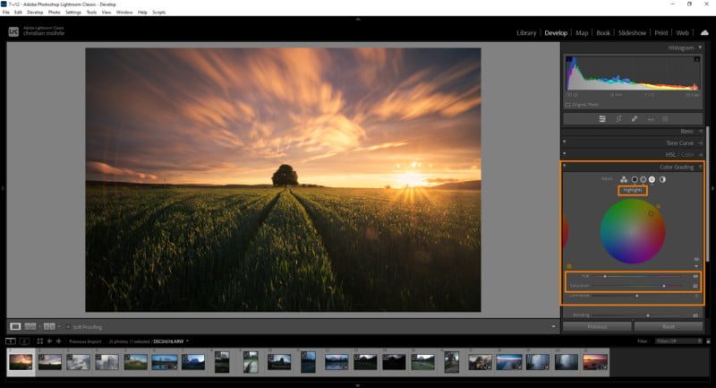
So, for most of my sunrise and sunset shots, I use pretty much the same setting. Choose a warm color for the highlights and the midtones. Then, for the highlights, I’m using a higher amount of saturation, while I tend to go softer on the saturation for the midtones. At that point, we can add some nice color contrast by going into the shadows and applying a cold, blue color tone with a very small amount of saturation.
At this point, you might be wondering: what are those other sliders doing? Luminance, just like in the HSL tool, affects the brightness, which means by adjusting this slider you can further tweak the exposure and contrast.
The Blending and Balance sliders are a little more interesting although I also rarely use them. Keep in mind there is just one Blending and Balance slider for Highlights midtones and shadows unlike the hue saturation and luminance sliders for each tonality.
Increasing the blending will simply make the effect stronger. The balance slider tells Lightroom to put more weight into the shadows by bringing them down or the highlights by bringing them up.