How to Use Curves in Photoshop
When thinking about the Curves tool in Adobe Photoshop, the phrase “With great power, comes great responsibility” is a thought that comes to mind. Curves is the most powerful tool in Photoshop for adjusting brightness, contrast, tonality, and color.
Table of Contents
The Curves Panel(s)
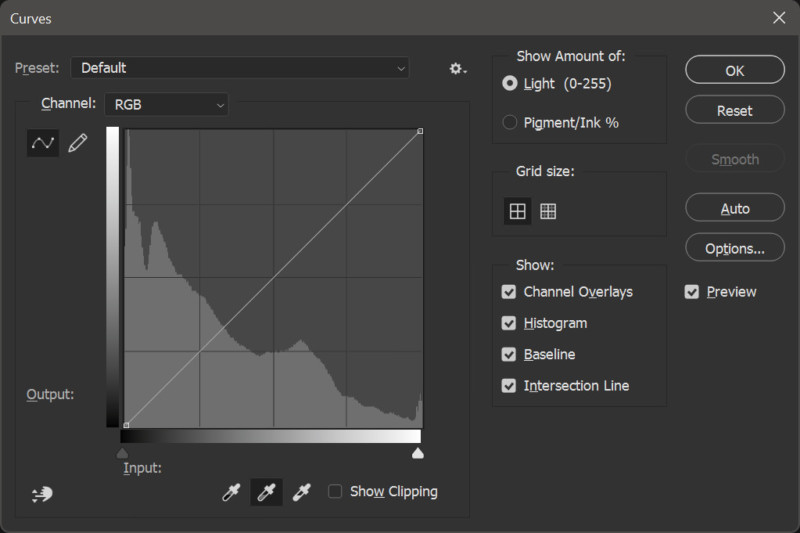
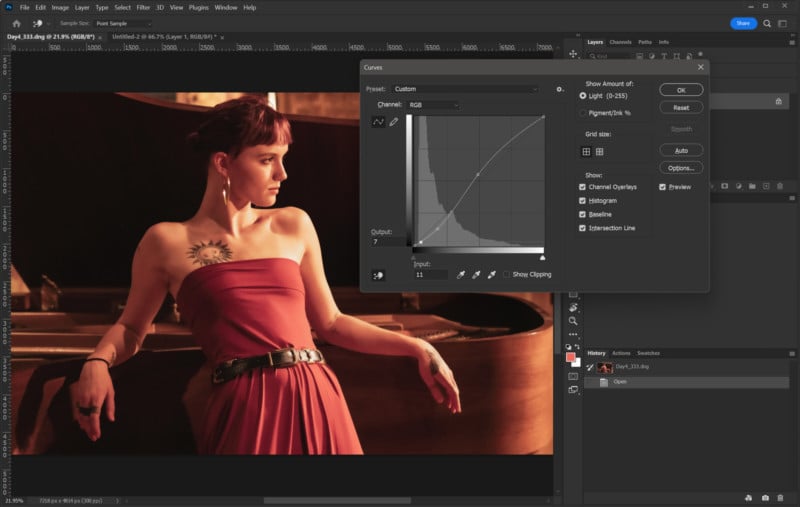
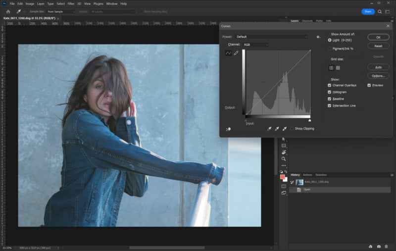
Shown in Figure 1 is the Curves panel as it appears in Photoshop v.23. I’m going to refer to this as the “Classic” Curves panel. This is the one that appears when applying the Curves adjustment to an individual layer. It is accessed from the main menu under Image>Adjustments or by pressing [CTRL+M] on PC or [CMD+M] on Mac.
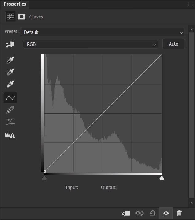
Figure 2 shows the Curves adjustment layer properties dialogue box as it appears when called from the Adjustments panel. As you can see some options aren’t visible when compared to Figure 1 but they are there if you know where to look.
Note: When using the Curves Adjustment layer, you interact with the controls through the properties window. Most of the controls seen in Fig 1 are visible. Options such as light vs pigment, small vs large grid, and options to view/hide the histogram, baseline, etc are available using the menu in the upper right corner of the properties box. It is important to understand that the adjustments are the same but there are times when you might want to use an adjustment layer versus the classic implementation.
Working with Curves
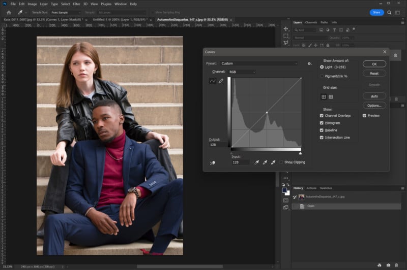
In order to make best use of Curves, you need to understand how this adjustment works. In both Figures 1 and 2, you will see a diagonal line running from the lower left to the upper right of the displayed grid. This line represents the relationship between the tones present in the image/layer (input) and how they are to be adjusted (output).
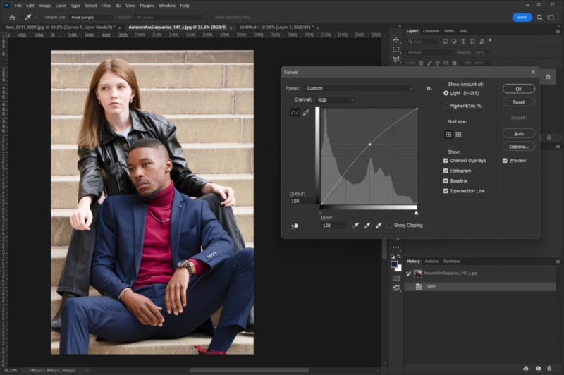
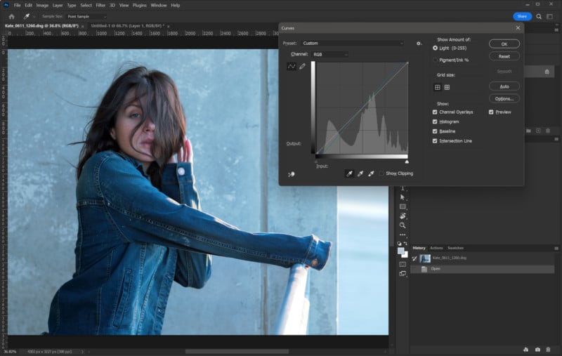
In this example (using RGB mode) the center of the grid the value is 128 (out of 255). By Clicking on that center point and dragging that point upward, the output values will increase. Making this change will have the effect of lightening the mid-tones of the image as can be seen in Figure 3.
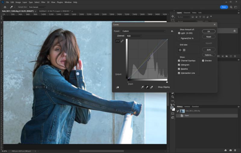
As adjustments are made, the nearby values are also adjusted but to a lesser degree as you move away from the adjustment control point. This creates a gradual change resulting in a curved line from which the Curves tool gets its name.
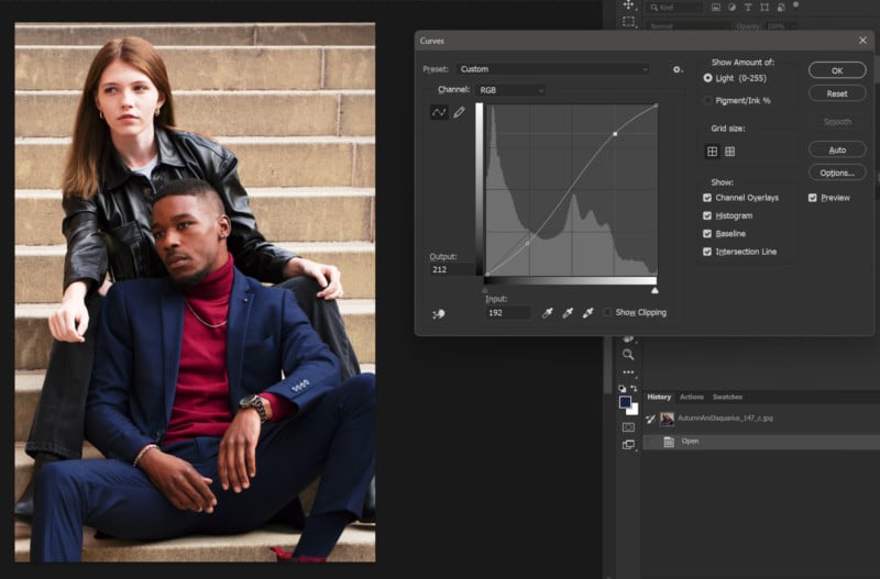
It doesn’t take much adjustment to create very noticeable changes to your image. In Figure 4 I’ve raised the light tones and lowered the darker tones to create a curve that raises the highlights and deepens the shadows. This correction is often referred to as an “S” curve as the resulting shape of the curve resembles an “S”.
You can see the adjustments don’t appear to move the control points all that much in relation to their original positions. The resulting image shows how the darker tones are very compressed (crushed) and the highlights are “blown out” and have little to no detail.
Since it is very easy to “wreck” an image using Curves, adjustments should be made in small increments. I recommend using the direction (arrow) keys for making adjustments. After clicking on the curve and creating a new control point the arrow keys can be used to move the control point. This is very handy for creating precise changes.
When a control point is created on a curve, that point becomes an anchor. Wherever it is placed on the line that point will remain fixed and as a by-product will affect the shape of the curves to the left and right of it as they will bend to maintain the value at that control point. This can be very useful in protecting certain values from being changed.
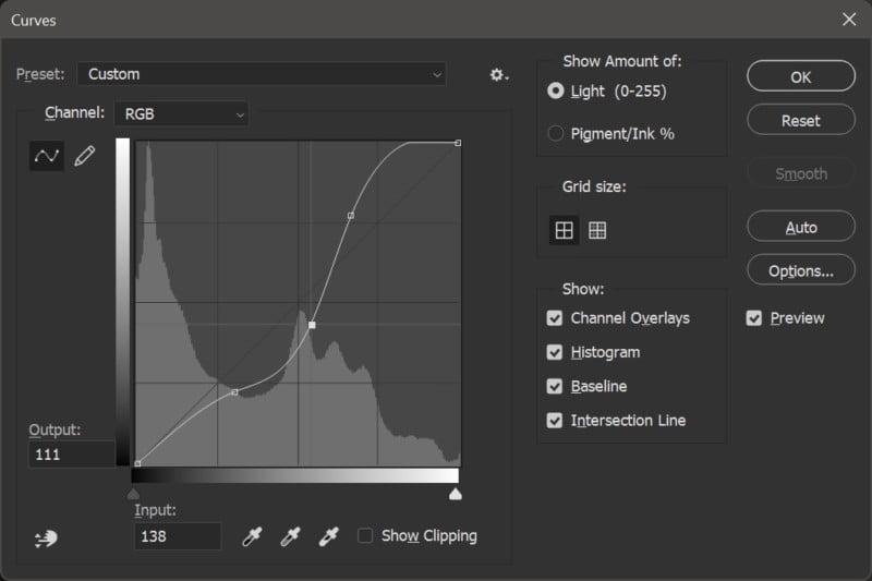
Figure 5 shows how the curve shape is affected by multiple control points. The position of the point closest to center affects the overall curve shape and not just the space between two points to the left and right of center. This is done to keep the changes as smooth as possible along the entire curve. Keep in mind I’m only using this curve as a demonstration and I can assure you the image to which I applied this curve looked terrible when I made it.
In Photoshop, you have the option of drawing out the new values using the draw tool (pencil icon). This can create a set of very specific tone changes but, like any Curves adjustments, can create drastic changes resulting in a less-than-optimal final image. Thankfully, both Curves panels provide an option to “smooth” a drawn curve making the changes less drastic.
In the case of the classic panel (Figure 1) there is a “smooth” button that becomes clickable after drawing a curve with the draw tool. In the properties panel for the Curves adjustment layer (Fig 2), there is an icon under the draw tool that will smooth the drawn curve. The smooth function is also cumulative so additional clicks on the smooth button/icon increase the smoothing applied.
With this high-level view of how Curves work, let’s look at some practical uses. I’ll also point out some other ways to interact with the Curves panel.
Note: Before moving forward I want to point out that anyone who has spent time using Photoshop likely knows that there are often multiple ways to approach a particular issue. While in the following examples I’m demonstrating my approach to reach the desired effect, I’m not saying this is the only, or even the best, way to reach the end result.
Adjusting Contrast and Brightness
I tend to reach for the Curves panel when I need to make adjustments to the contrast of an image. There are other tools that can do this such as the aptly named “Brightness and Contrast” adjustment under the Image>Adjustments menu but that tool is a blunt instrument compared to Curves. Levels is also more versatile than Brightness/Contrast but it’s still wanting compared to the power of Curves.
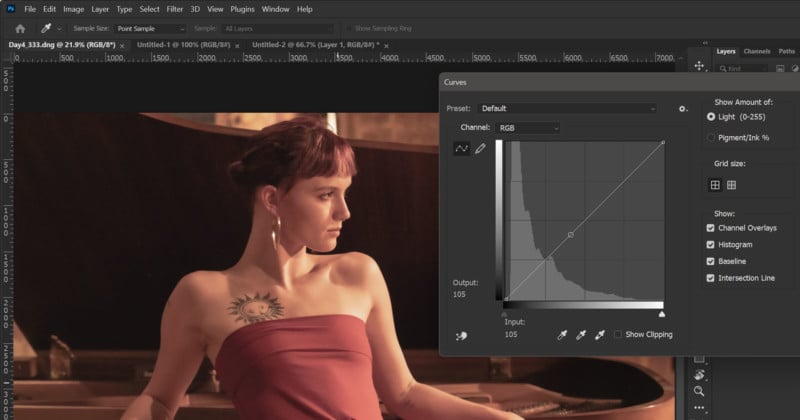
An easy way to think about contrast adjustments in Curves is that steeper angles provide more contrast and shallow angles flatten out contrast. In Figure 6 we have an image that I specifically developed out of raw with low contrast to make it easier to see the effect for this demo.
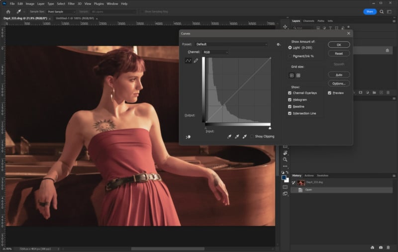
You can see the histogram shows a lot of information is present in the lower tones (shadows). This is coming from the large area under the piano lid as well the shadows to the left of Madeline’s hip. I want to drop those shadows a bit but the part that concerns me most here is how flat the lighting is on Madeline’s skin and dress. Since that’s the area that will require the most adjustment I want to start there as adjustments made there will have an effect on the other areas.
I could just click in the curve and start moving around the control point to find where those tones are located but there is a better way, two in fact. Once you have opened the Curves panel using [CTRL+M] on PC or [CMD+M] on Mac you can move your cursor into the image and you’ll see your cursor is now an eyedropper. It’s important to note that this option is only available using the classic Curves option. That’s OK though as you can use the Click and Drag tool to achieve the same result in either the classic Curves panel or the Adjustment Layer version as I’ll show shortly.
By left-clicking (or just clicking on Mac) your mouse and holding the button down you can move across the image. You will see a small circle appear on the line in the Curves box (highlighted by the blue box for reference). In Figure 7 I have selected Madeline’s dress just left of center of her stomach.
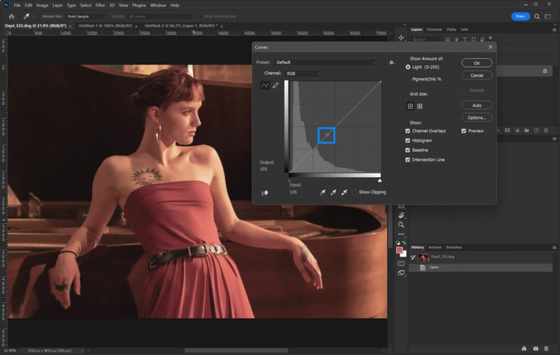
Now that I know where that particular tone is located on the curve I can go and start my adjustment in that area. Likewise, I can drag to other areas to find the points on the curve I want to adjust. This is a good way to find a starting point but I did say there are two ways and the next way is even quicker.
In the lower-left corner of the Curves panel is a small hand icon with up/down arrows. This tool allows you to place your cursor on the image where you want to make an adjustment and simply click and drag to raise or lower the values. This skips the step of finding the control point and then moving back to the curve panel to make the adjustment. Also, this same option is available in the Curves adjustment layer whereas the previous method is only available in the classic Curves adjustment panel.
In Figure 8 I have made three adjustments to the image. The lowest point is where I adjusted the underside of the piano lid to deepen the shadows, The next point up was sampled in the shadows of the left side of the dress. The third point, left and just low of center, is from the right side of the dress where I raised the curve to brighten the tones there.
You can see what would appear to be subtle changes made to the overall curve make a noticeable difference between Figures 6 and 8. I personally use the click and drag adjustment tool to set a point on the curve and then I use the arrow keys to make the final adjustment. This allows for more fine control versus trying to drag a point with a mouse or graphics pen.
The result in Figure 8 has more “pop” than the flat version in Figure 7 and overall I think it looks OK but, I think it could look even better. I’ll show you how.
Let’s Go to the Lab
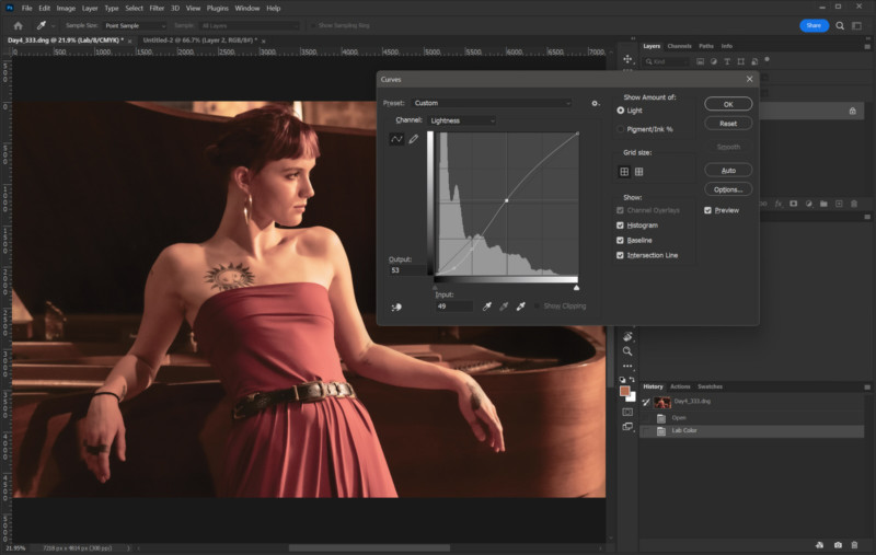
In Figure 8 the image has improved contrast but making curve adjustments like this in RGB mode can increase the saturation of colors. While this might be fine for some subjects I don’t care for the way it can render skin tones. What I really want to do is affect the lightness/darkness of the tones without affecting the color. Doing this requires a trip out of the RGB colorspace.
By going to Image>Mode in the main menu and selecting Lab color we move into a color space where the image is separated into two color channels and one lightness channel. Using the Lightness channel we can adjust the contrast without affecting color.
Figure 9 shows how I’ve used Curves to adjust the Lightness channel in a more drastic amount than I did in Figure 8. The color has remained more true to the original image and hasn’t increased saturation in the reds and oranges. It can be argued that a bit more saturation to the color would look good and I agree. The point is that by using this technique, I can address the contrast and lightness separately from the color.
The Lab colorspace opens up new and impressive aspects to an already robust adjustment tool. I should mention that if you use sharpen tools in Photoshop, you may find it worth your time to switch into Lab mode and apply your sharpening to the lightness channel as opposed to using it in RGB mode. It will reduce color artifacting that can occur when using sharpening tools.
Note: The above is just a small peek into the world of Lab color and the vast possibilities it opens up for color and contrast correction. If your interest in Lab color has been piqued I highly recommend you look into it further. The topic of Lab goes well beyond the scope of this article and one could write an entire book on the subject.
Adjusting RGB Channels Individually
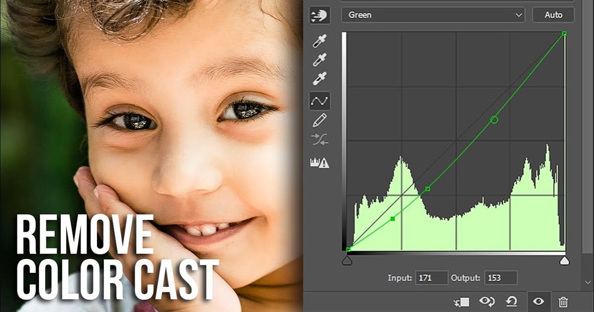
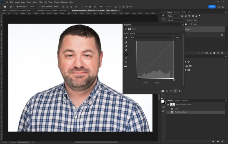
Now let’s look at ways to apply Curves to individual RGB channels for color correction. Figure 10 is a nice-enough-looking headshot but the skin tones have a reddish cast to them. This could be addressed in Camera Raw when first developing the out-of-camera file or using the Camera Raw filter but that isn’t always intuitive and this article is about Curves.
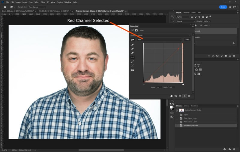
I’m going to reduce the reddish cast by selecting the Red channel from the pull-down list and then use the click and drag tool to select the reddish area on the cheek. The value selected here is 225. Lowering the output just 5 points to 220 has lessened the reddish cast but still leaves enough red in place to give the skin a healthy look.
I should point out that in this example I used the Curves Adjustment layer instead of the Classic Curves panel. The results are the same but with the adjustment layer mask, I could narrow the adjustment to just his face and keep the original color of the shirt if desired by leveraging the mask.
I should point out that you could duplicate the layer and use the classic Curves tool to affect this change and then apply a layer mask to that layer. This would achieve the same result but if you wanted to return to this image and adjust that curve later, you’d be starting with previously adjusted data versus being able to freely make changes with the original data from that layer.
This is just a quick example of how you can fine-tune color using Curves and individual channels. There are a lot more possibilities so I recommend exploring making changes to individual channels in RGB as well as trying out the channels in other colorspaces.
Eye Dropper Tools
The Curves panel for both Classic and Adjustment Layers includes three eyedropper tools for making quick adjustments to the overall color and contrast. These are found at the bottom of the Classic Curves panel and on the right-hand side of the Properties panel of the Curves Adjustment layer.
The eyedropper icons look like this:
![]()
Sample Black Point is used to select an area in the image that will have the darkest value. Likewise, the Sample White Point eyedropper is used to set the brightest point in an image. I’ll get to the Sample Gray Point shortly but I want to explain how the black and white sample tools work.
In Figure 12 we have an image that is very low contrast and it has a bluish cast. The image looks flat and you can see the darkest tones are well above zero by looking at the histogram in the Curves box. Using the Black Sample Point I’ll select the dark tones in Kate’s hair just above her right ear. Next, I’ll select the Sample White Point eyedropper and click on the handrail where the highlights are almost blown out. This lifts the highlights and blows out some areas that were already close to peak brightness.
Figure 13 shows the results of these adjustments which could now be fine-tuned using what we learned earlier. Eagle-eyed readers might notice a slight divergence of color channels after using the Sample Black and White eyedroppers as indicated by the colored lines that have appeared outside the baseline.
This is because the area sampled had some degree of color cast. Instead of just adjusting all the channels the same amount, the adjustment has corrected the channels so that they all combine to create a neutral tone in the shadow and highlight areas. The image still needs more correction as the overall bluish cast is still there.
I’m going to use the Sample Gray Point eyedropper to bring the midtones into balance. Fortunately, this tool doesn’t need to be placed on a precise “middle” gray area but rather any place you know should be neutral, or at least one that you want to be neutral.
I clicked on the gray wall behind Kate’s back first and while it made the wall neutral gray, I felt like it warmed the skin tones too much. After trying a few different places I ended up clicking on the sclera of Kate’s right eye and the result can be seen in Figure 14.
Before moving on I want to point out that it is also possible to adjust the black and white points without making any changes to the color. Clicking and dragging on the pentagons at the left and right bottom of the Curves graph can be used to adjust the black and/or white points all the same amount. If you are wondering if you can just drag the endpoints on the adjustment line left or right to make the same change the answer is yes. In fact, you’ll see making this adjustment with either control moves the other control.
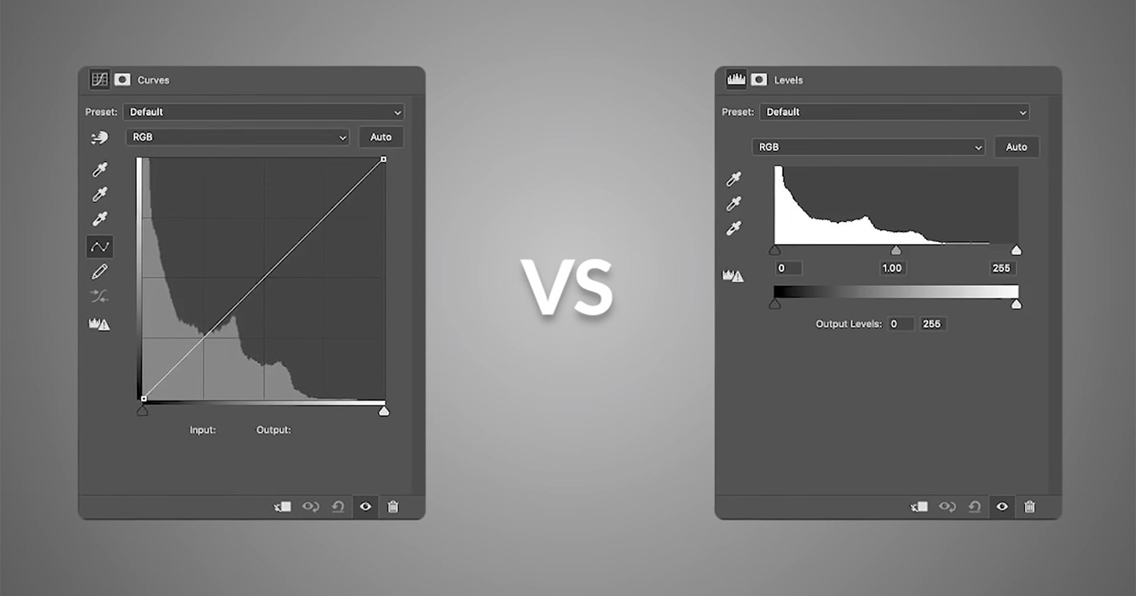
Curves vs Curves Adjustment Layer
When I started working with Photoshop back in version 5.5 there was only one Curves option and it is found under the Image>Adjustments menu or pressing [CTRL+M] on PC or [CMD+M] on Mac. Several versions ago, around Photoshop CS4 I believe, the Adjustments panel was added to Photoshop. Both options can achieve similar results but the way they’re applied is different.
The original or “classic” Curves adjustment is applied only to the layer selected. When selecting Curves from the Adjustment panel, the changes made to the curve will apply to all layers below that adjustment layer or it can be set to only affect the layer directly below using the “clip” option highlighted in the yellow box in Figure 15. This is an option for all adjustment layers.
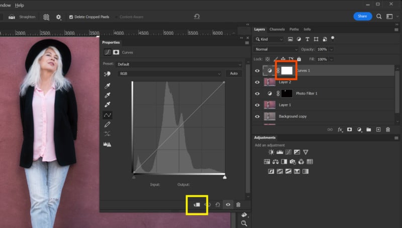
Whenever an adjustment layer like Curves is implemented it is accompanied by a layer mask visible in the red box in Figure 15. You can use this mask to apply adjustments to only certain parts of an image. Adjustment Layers also have the advantage of being a non-destructive and re-adjustable edit. This allows you to return to an adjustment layer and make changes without losing any original information.
Applying a change to a layer using the classic Curves tool permanently changes that layer. Additional curve adjustments will start from the previous edit and as such will be limited in how much a new edit can do before it creates banding and other artifacts. This is why I highly recommend creating a duplicate layer, or layers, when using the classic Curves adjustment so the original image/layer can still be accessed.
Layer Panel Options
Common to both Curves panels are a set of options that are all visible in the classic panel (Figure 16) while some are hidden from view in the Curves adjustment layer and are accessed from the menu shown in Figure 17. By default Curves are shown with dark tones to the left and light tones to the right. People involved in printing often think in “density” or “ink” and prefer to have the panel display with ink percentage increasing to the right. This can be switched using the “Show amount of:” option in the Curves panel.
The grid shown in Curves defaults to a 4X4 grid but this can be changed to a 10×10 grid (my preference) to give some more reference points. The grid setting has no effect on the output.
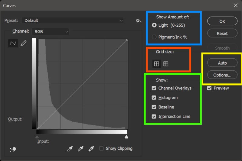
The Curves panel provides options to hide or show channel overlays which allows you to see any individual channel adjustments that fall outside of the combined curve. Also, the histogram that is displayed within the grid can be turned on or off as can the baseline. The baseline is simply a thin black line that shows the straight, original path of the curve before adjustments are made. The thin gray lines that appear when a control point is selected can be turned on and off using the checkbox in the options area of the classic Curves panel.
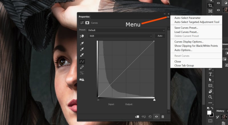
In the yellow box in Figure 16 are Auto and Options buttons. The options button pertains only to the parameters surrounding how the Auto function operates. Click the Auto button and Photoshop will make Curves adjustments based on how it “thinks” the image looks best. Feel free to try it and change the options to see what you get. The Curves Adjustments properties panel has an auto button in the upper right area and its options are available through the menu shown in Figure 17.
Conclusion
I hope this article provides a good start for beginning the journey of mastering Curves, but there is a lot more that you can explore — topics like combining multiple Curves correction layers through masking, using the CMYK colorspace to correct colors, and creating “imaginary” colors in Lab color, just to name a few.
Good luck using the Curves tool in Photoshop!