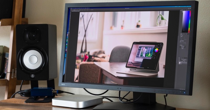
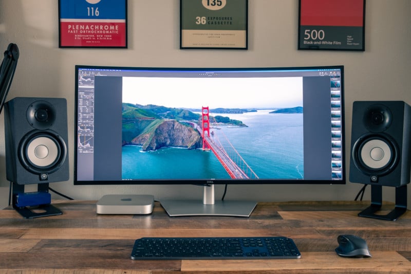
Why Do Photographers Spend So Much on Monitors?
One of the most important tools in a photographer’s toolkit is something many may be surprised by – a color-accurate monitor. But why are they so expensive, and why should a photographer spend so much on one?
Regardless of the camera system, lighting brand, and type of lenses that a photographer has in their hands, in the age of digital photography, having a top-tier monitor that is calibrated precisely is integral to creating a perfect image. Editing a true-to-life reproduction of the colors seen through the lens will require a display that can show the full spectrum of colors to ensure that the photos being worked on are not off-balanced and over or under-saturated. A lower-end monitor will not be able to render the colors in the high contrast zones of an image, leaving creatives at risk of their images looking “off” when printed or seen on different higher-end devices.
Speaking from personal experience, there is no worse feeling after having finished editing an image to present to the world only to discover the skin tones and colors look entirely off once it is displayed on devices other than your own screen.

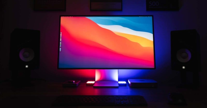
This is why finding a professional-grade display that has been designed with photo and/or video editing in mind is critical to creative work. These monitors will ensure the screen has uniform brightness and color precision edge to edge, and typically are larger to allow for a wider viewing angle and more screen space to truly “pixel-peep” the image being worked on.
If the work is being done on a large, calibrated, and color-accurate monitor, photographers can be at ease knowing that the images they produce will look consistent from their screens to the printed page.
While the video below from Linus Tech Tips mainly focuses on a specific monitor, Linus does make some good points about why a color-accurate monitor is necessary to begin with. For example, he says that “there are two types of displays: Those for consuming content and those for creating it.”
The key difference between them is the Color Gamut they can display.
Effectively, most consumer-grade displays have a limited sRBG (Standard Red Green Blue) color space available. To put it in a visual perspective, think of the whole color spectrum like a rainbow, and sRGB is a small sampling of the available colors. As we explore higher-quality displays, they start adding more and more colors to that selection.
As an example, Linus explains that a monitor that supports the DCI-P3 color space can display a color gamut about 25% wider than a normal sRGB monitor, allowing for smoother transitions between colors.

The problem that pops up from these color space variances though, is when an image or video is created using one color space (DCI-P3) and then is displayed on a device that does not support it. In those cases, we end up with visuals that are oversaturated and have unnatural and blotchy-looking colors.
For creatives, it is critical to ensure the colors on the screen look accurate to the way the camera captured it so that it will look right on a big print and high-fidelity screen. Colorists who work in cinema will often require the best screens available which can easily break $35,000 each. Granted, that kind of budget is out of range for most freelance artists but there are still many viable options for photographers and videographers sitting around the $5,000 and under range.
But why should photographers spend money on expensive color-accurate monitors if they can’t control what their clients are using to view those same pictures? This is a common question, but the answer is pretty straightforward. Basically, if a photographer knows that the colors are correct and accurate to the creative vision, they know how it is supposed to look and can be confident in that. If a client isn’t using a good display and asks questions about the color, the photographer can then know that their view is correct and can help either guide the client to a way to calibrate their devices to see it correctly or assure the client that the colors are correct when viewed on a proper display or printed.
Basically, it comes down to confidence that you as the photographer and creator are right and gives you the right perspective to help guide the client in the right direction.
Some Things to Look For In A Great Monitor
Panel Technology
While the technology is changing rapidly, the safe bet is to focus on a display with a good quality IPS (In-Plan Switching) panel as they provide some of the best support for various color spaces, contrast ratios, and color shifting. Additionally, if the plan is to make prints, a 10-bit panel that can support Adobe RGB will provide the best color reproductions and print simulations possible. The “bit depth” in display context, refers to the range, or colors, it can display. The more bits per channel means more colors a screen can display, and with 10 bits you end up with about a billion colors.
An 8-bit monitor, or 8-bit with Frame Rate Control (FRC) simply cannot achieve that level of color depth. Some can get close, but oftentimes users are left with very noisy transitions between the colors. For example, an 8-bit display will show 256 different shades of color per color channel, whereas a 10-bit monitor gives 1024 different shades per color channel.
OLED (organic light-emitting diode) displays are some of the best-looking and extremely color-accurate that can be found for consumer use. They are also getting more affordable, though they are still quite expensive. Many laptops, tablets, and smartphones now use OLED displays, but they aren’t perfect: they can suffer from what is colloquially referred to as “burn in” but is more accurately described as pixel burnout. Basically, OLEDs can control each sub-pixel individually which means that blacks can be truly black (since the display can actually fully turn pixels off when they aren’t in use) and colors can be exceedingly accurate, but the technology wears out over time, exacerbated by how bright the display is set — brighter means faster burnout.
For now, we recommend most stay away from OLEDs as a daily-driver display for photo editing. OLEDs are fantastic especially for televisions, but there is still some debate as to whether they are a good choice for computers that tend to have a lot of static elements on the display, especially for those who don’t like the idea of having to buy a new one every year or two.
Screen Size and Resolution
As a visual creative, the goal is to be able to see your work as large as possible, while still having room for all of the toolbars and plugins to edit the work. A minimum size of 24 inches is universally recommended, but obviously with more screen size comes more real estate to work with, especially if it is capable of displaying in 4K or higher.
Color Space and Accuracy
There are a lot of variables within this category, but one of the most important is the Delta E-Value, which is the measurement of how well the human eye perceives color differences. To meet critical color needs, the Delta E numbers represent how well a displayed color on a screen correlates to the “perfect” color value. Therefore, the lower the number, the better the true-color reproduction.
Calibration
Most high-end monitors will ship “factory-calibrated” including a calibration report, but like everything we use, things wear out and change over time. So users should re-calibrate their screens often regularly to ensure the most accurate colors are being displayed. Investing in a calibration tool from Datacolor or X-Rite will allow users to ensure their screens are in peak performance levels, as well as providing detailed reports of the actual visible colors and accuracy being provided through the screens.

The Bottom Line
A high-quality monitor is critical for the final appearance of any images or video files being worked on. As such, most professional photographers will spend top dollar to ensure they have a screen and system that can display those colors as accurately as possible so they can share their creations with the world with the best possible accuracy. The advanced panel technology displays will provide higher image clarity and quality, providing editors with much more creative control. If your work involves photo editing and you don’t use a monitor capable of displaying the right colors accurately, it’s probably time to think about investing in a monitor that features the mentioned factors.
On that note, if you’re not sure where to start when it comes to selecting a monitor, make sure to check out our suggestions for the best monitors for photography and photo editing. That list is regularly updated and provides several categories that should give just about any photographer a solid set of options for selecting the monitor that’s right for them.
Image credits: Unless otherwise noted, photos by DL Cade for PetaPixel.