colorspace

Two versions of the same image of a girl in a wheat field with drastically different colors.

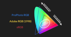
What is Color Space and Why Does it Matter?

For most photographers, color is a crucial component of their images. As a result, it only makes sense to want the colors that you envision to come through in the same way when others view your photographs. That can be easier said than done, however.

Soft Proofing Your Photos to Get the Most From Your Printer

As photographers, one of the most exciting parts of our job is to print the fantastic photos we capture. As eager as we are to get the prints, we need to ensure we follow the entire pre-printing process to the T to ensure you have realistic prints. One crucial step in the process is soft proofing.

Why Do Photographers Spend So Much on Monitors?

One of the most important tools in a photographer's toolkit is something many may be surprised by - a color-accurate monitor. But why are they so expensive, and why should a photographer spend so much on one?

Explaining Color Space and How It Can Screw Up Your Photos After Export

If you're new to digital photo editing you've probably had this experience: you export a perfectly edited photo, but the JPEG looks all "wrong"—the colors are totally different! Actually, they not. As Unmesh Dinda from PiXimperfect explains, you just haven't sorted out your color space properly.

BenQ SW270C Photo Editing Monitor Review: Worth the Upgrade

BenQ has finally launched the SW270C monitor, the successor to the best-selling 27-inch SW2700PT model, which has been a favorite among budget-conscious photographers. I had the pleasure to be one of the first European photographers to test the new SW270C, and made sure to properly put it through its paces for one whole month before writing this review.

sRGB vs Adobe RGB vs ProPhoto RGB: Color Spaces Explained

Have you ever exported a photo, uploaded it to the Web, and then noticed that the colors looked off on your monitor? The reason is likely the color space of your photo. Here's a helpful 15-minute video by PHLEARN that provides a crash course on color spaces and how to use them.

Using LAB Color in Photoshop to Add Color and Punch to Photos

The LAB color space is particularly useful for boosting colors and definition in images due to the way it handles colors when compared to RGB and CMYK. Rather than describing how colors should appear on a screen or in print, LAB is designed to approximate human vision. Colin Smith of photoshopCAFE shows in this video how this color space can be utilized in Photoshop to easily improve your images.

How JPEG Handles Colors and Compression

Want to understand the math and science behind how JPEG files store your digital photographs? The YouTube channel Computerphile has a new series of videos on the JPEG. They're a bit long and heady, but you may find them interesting if you've ever wondered about the technical details behind one of the world's most popular image compression methods.

The Photographer’s Introduction to Color, from Color Space to Monitor Calibration

If you're a photographer today, you're probably sharing your photos everywhere from Facebook to Flickr. Your photos are being seen on every device possible: iPhones, Samsung Galaxys, crappy Dell office monitors, and Mac Retina Displays. Each online service, each device, even each web browser handles color differently. If you're putting your photos up online, you really need to think about how you output files for the web. If you accidentally save to the wrong color space, you can really change people's perception of your photos.