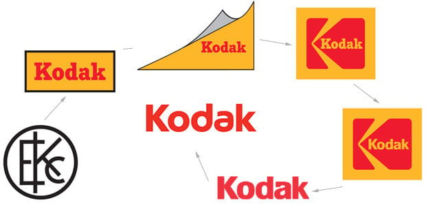
Kodak’s New Logo is a Return to the Classic 1970s Logo
Kodak got the photo world talking this week by announcing its new photographer-focused Ektra smartphone. Along with the camera, the iconic camera brand has also unveiled a new logo… one that’s a rebirth of an old logo.
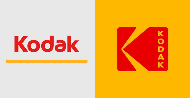
The new logo looks strikingly similar to the classic Kodak logo used between 1971 and 2006. That one was designed by graphic designer Peter Oestreich and features a red and yellow shape that’s reminiscent of a camera shutter and yellow beams of light:
As you can see, Kodak’s new logo uses Oestreich’s iconic shape, except the brand name has been moved to the right side with vertical lettering to look like the sprocket holes on the edges of film strips.
Here’s what the updated history of Kodak’s logo now looks like:
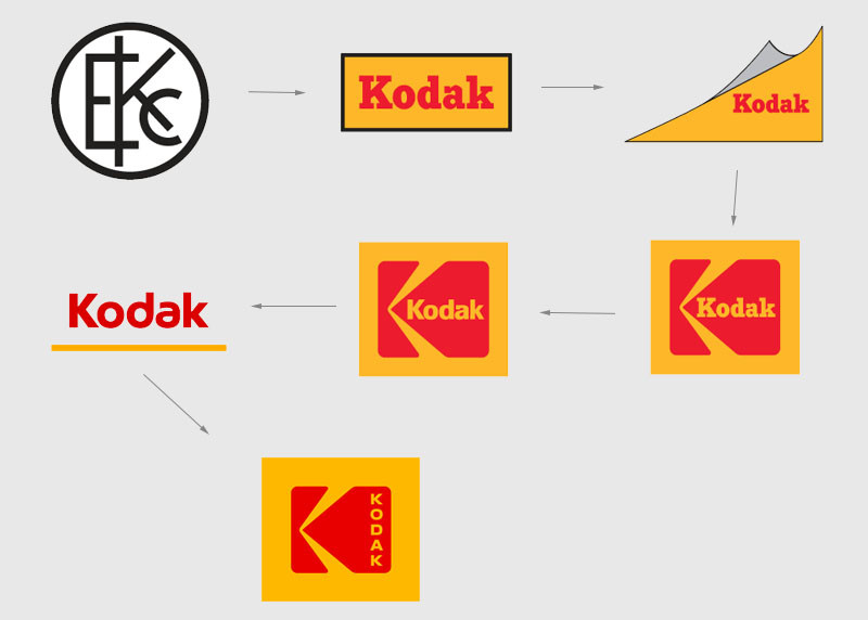
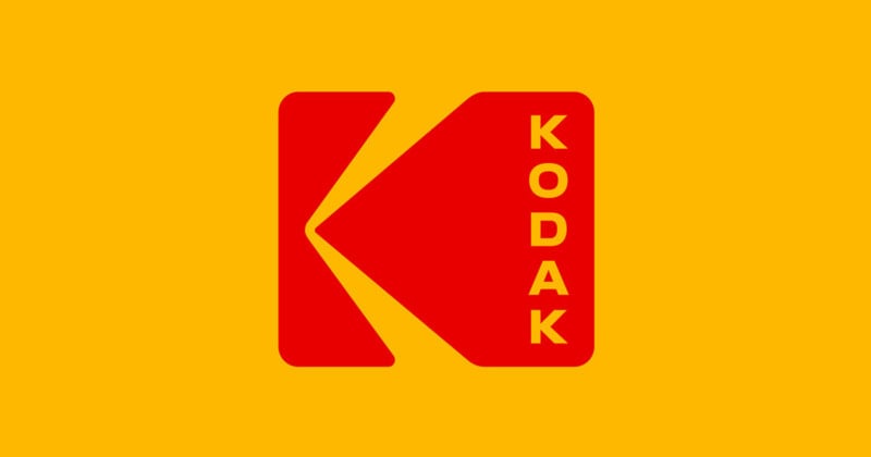
The new logo is the one that appears on the front of Kodak’s new Ektra smartphone.