
How to Use Vectorscope in Lightroom
The vectorscope has finally arrived in Lightroom, and it is one of the most useful color tools a photographer can add to their editing workflow. The vectorscope showed up in Adobe Camera Raw a few months ago, and the examples below were shot there. So, in the video, I was still using a third-party solution called Scopes3 for my edits, but now that it has finally arrived in Lightroom as well, it’s time to talk about it.
What is the Vectorscope?
The vectorscope is a tool that visually maps out the hue and saturation of every pixel in a photo, the same way a histogram maps out the exposure. The tool looks like a circular chart with dotted lines for the six main colors around the color wheel, along with dots that show you the values in your images. The closer a color’s dot is to the edge of the circle, the more saturated it is in the photo. There is also a seventh line for skin tones, which I’m going to talk about a bit later. In short, the vectorscope is a tool that turns subjective color perception into exact graphics and eliminates the guesswork when color grading your photos.
There is one more thing to keep in mind. Even though the vectorscope only displays hue and saturation, the way colors appear on it is still influenced by the exposure level of the image. This isn’t because the vectorscope itself reacts to exposure, but because of the HSL color model Lightroom uses to display our photos. In the HSL color model, the colors in the midtones appear much more saturated than colors in the shadows and highlights.
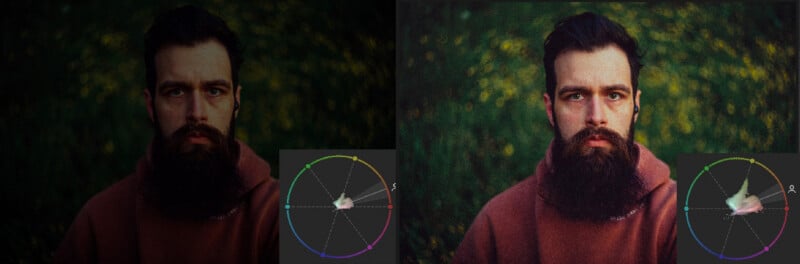
For example, in an underexposed photo, the vectorscope displays pretty much everything right around the middle of the circle. But if you push the exposure up significantly, it will show much more color because we now have more information in the photo.
Proper White Balance Using the Vectorscope
On the vectorscope, neutral gray or desaturated colors appear at the center of the circle. So, to set a proper white balance, I aim to make my colors originate from the middle of the vectorscope. This works because when the white balance is off, everything gets skewed to the point where the middle of the scope is no longer centered on the circle. But this is a fine adjustment; we don’t want to make the vectorscope balanced overall. All I want is to make my colors originate from the middle of the circle. The vectorscope displays every color in my image, so having a blue sky, green vegetation, or warm sunset light will naturally create a distribution that spreads unevenly in different directions, and that’s perfectly fine!
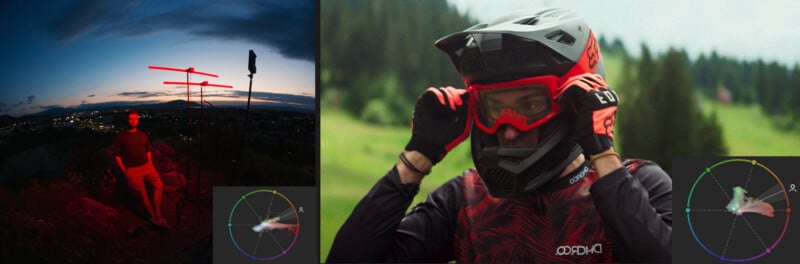
Important note: Don’t confuse white balance with color grading. Both of the photos above have proper white balance. In the first one, we can see that the blues and strong red light in the photo are originating from the middle of the vectorscope. However, in the image on the right, you’ll notice two separate points appearing closer to the center of the circle. This happens because I’ve applied a Color Response Curve as a color grade, which shifts the color of my white point and causes the almost completely blown-out sky to take on a cyan tint. So, make sure to fix the white balance before applying any color grade to your images; otherwise, you will be correcting against the colors you just added to your photos.
Better Skin Tones using a Vectorscope
This one is simple, and honestly, it is one of the easiest ways to make sure skin looks right in a final edit. Whenever we have skin in a photo, we can check the vectorscope to make sure the skin color sits along the skin tone line, ensuring we have the right hues and that the people in our images look great.
The only problem is that, by default in Lightroom, we only see the vectorscope for the entire image. However, we can hover our mouse over the skin of our subjects, and the vectorscope will display a crosshair for the tones underneath. This can be super useful for situations like an autumn portrait, where lots of elements in the photo could be interpreted as skin tones on the vectorscope. Alternatively, we can create a mask over a person’s face so the vectorscope only renders what’s included in that mask.
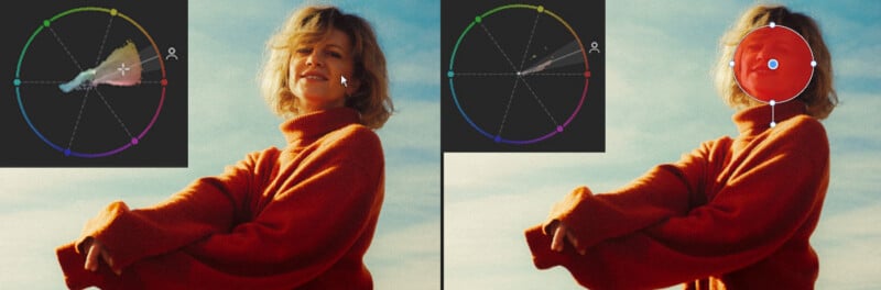
This way, we can easily target our adjustments to mitigate a green or magenta tint coming from inaccurate lighting, or eliminate the green color cast from portraits where light filtered through foliage above the subject.
The key is to use the vectorscope as a guide for your corrections rather than trying to force every skin tone to the same hue. For this, I suggest creating a mask that isolates only the skin tones in your photo (Select People → Facial Skin + Body Skin). Then, use the White Balance, Tint, and Hue sliders to gently adjust the selected areas until they align more closely with the skin tone line on the vectorscope. This way, you have a much more controlled correction while keeping the color grade intact in the rest of the image.
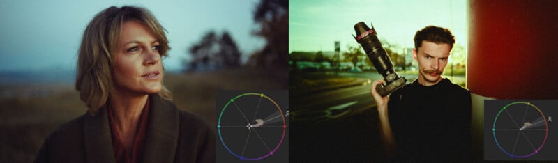
Keep in mind that not every image needs to have its skin tones perfectly aligned with the skin tone line. For example, the photo on the right has a strong color grade applied to it to simulate cross-processing and hue drifting. In this case, it’s perfectly fine for the skin tones to sit slightly off that skin tone line. This is especially true when working with more stylized edits, where the overall color palette and mood of the image take priority over technically accurate skin tones. The vectorscope should be used as a reference, not a strict rule. As long as the skin tones look natural within the context of the image and the overall color grade feels consistent, there’s no need to force them into perfect alignment.
Color Grading Adjustments
You can also use the vectorscope to fine-tune an existing color grade or make an image fit better within a specific color palette. This is very useful when you’re trying to achieve a consistent look across a series of photos or when you want to match the colors of an image to a specific color palette reference.
For example, if you’re going for an analogous color palette, where you use colors that sit next to each other on the color wheel, you should see most of your color information concentrated within a relatively small section of the vectorscope. Think warm oranges, yellows, and reds for a sunset-inspired look.
We can also use the vectorscope to fine-tune a complementary color palette. Since complementary colors sit opposite each other on the color wheel, we can use the HSL sliders to make sure the two dominant colors in the image sit perfectly across from each other.
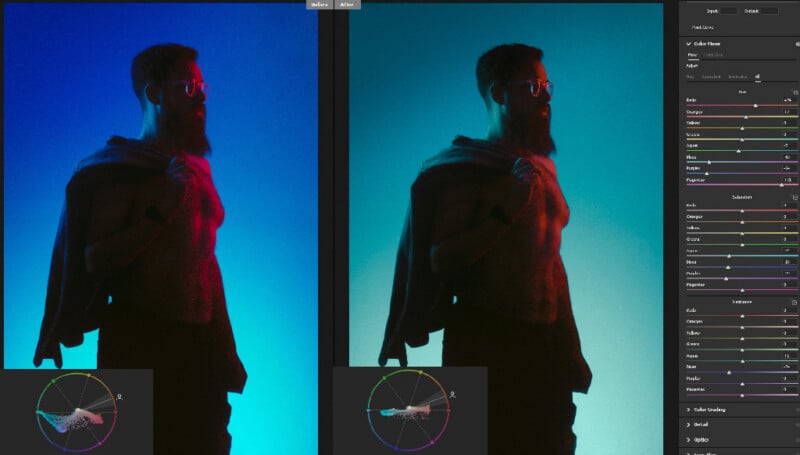
The nice thing about using the vectorscope for this is that you don’t have to guess whether your colors are actually following the palette you’re aiming for. You can see their distribution in real time and use the Hue and Saturation sliders, or the color grading wheels, to gently push individual color ranges toward their desired positions. Of course, you don’t need to force every color into perfect alignment. Think of the vectorscope as a visual guide that helps you build more intentional color relationships while keeping the overall image natural and cohesive.
Color Calibration Using the Vectorscope
As a bonus, I like to use the vectorscope paired with a Spyder Checkr Video as a reference for how my cameras reproduce colors under specific lighting conditions.
I start by taking a photo with the color checker in frame at the beginning of the shoot, making sure the chart is properly exposed without clipping any of the patches. Then, I bring it into Lightroom, correct the white balance, and now I can easily see how the light in the environment has skewed the color rendition of my camera.
To calibrate the colors, I will now use the HSL panel in Lightroom to make sure the readings on the vectorscope show a hexagon where all the corners are equally spaced (using the Saturation and Luminance sliders) from the middle of the circle and aligned with their specific target colors (using the Hue sliders).
One important thing to keep in mind is that this process is more of a scene-specific color correction than a permanent camera calibration. In other words, the adjustments you make are meant to compensate for the particular lighting conditions in which the photo was taken, rather than permanently changing how your camera reproduces colors. That’s why I recommend doing this as one of the first steps in your editing workflow, before applying any creative color grading or stylized adjustments. You’ll also get the most reliable results when working with daylight or other relatively neutral light sources, rather than heavily colored or RGB lighting, where certain wavelengths might be missing or exaggerated.
Affiliate Disclosure PetaPixel articles may include affiliate links; we may earn a commission if you buy through one.