3 Steps to Creating a Dramatic B&W Infrared Photo in Photoshop
Like most photographers, I love black-and-white infrared images. There is a purity and intensity to a well-crafted monochrome image, and there are many software options out there to help convert an image to black-and-white.
I prefer to convert each image manually, taking into consideration the unique characteristics of the image.
I’ve developed an easy, three-step process in Photoshop that works well with infrared images.
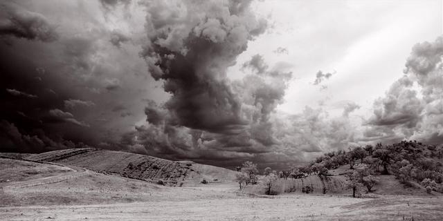
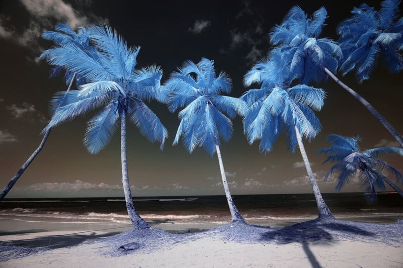
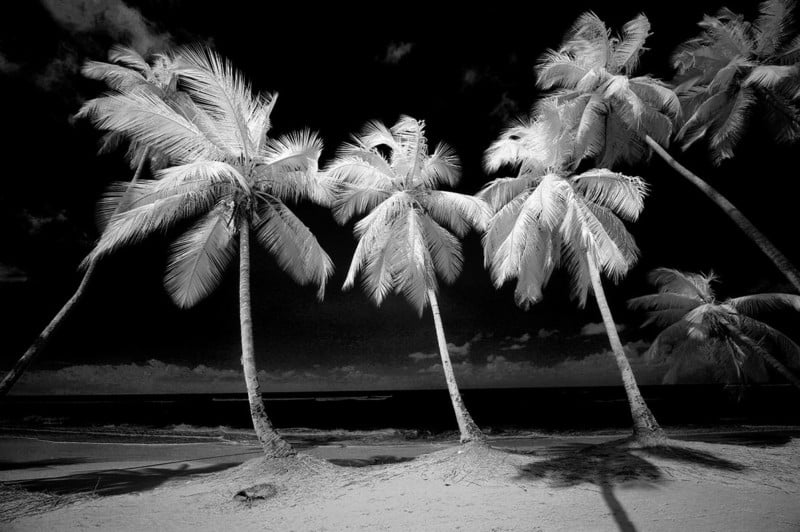
Let’s start with this image.
Step One: Balance Your Image
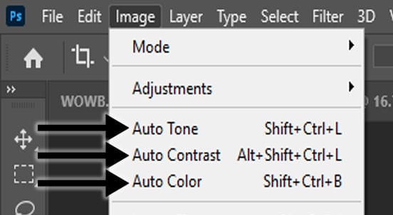
We want to start with an infrared image that’s been corrected for exposure and color, so begin by making these basic adjustments. If you are not proficient with levels and curves, consider using Photoshop’s auto-corrections under the Image menu: Auto Tone, Auto Contrast, and Auto Color.
Then complete a red/blue channel swap. If you aren’t comfortable doing that, watch this YouTube video of mine.
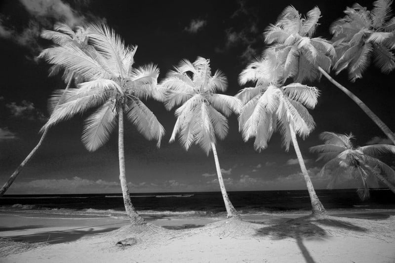
Now you have an image that looks like this.
This completes step one.
Step Two: B&W Conversion
Once you have an infrared image that looks natural and properly exposed, select Image / Adjustments / Black & White.
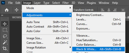
This opens the Black and White dialogue with six color channel sliders: Reds, Yellows, Greens, Cyans, Blues, and Magentas.
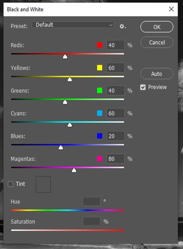
These sliders control how each color will be rendered in your black-and-white conversion. By moving a slider to the left, you darken that color, and by moving the slider to the right, you lighten that color. Here you’ll begin to create a unique interpretation of your image based on your personal artistic preferences. Take your time with this step and remember that each color will become a different shade or tone.
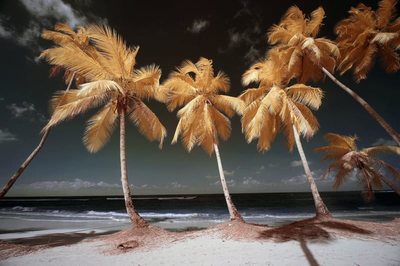
As is the case with Super Color Infrared, we have four color tones, Red, Yellow, Blue & Cyan. I chose to darken the Blue and Cyan tones to add intensity to the sky. I then proceeded to lighten the Red and Yellow tones in the foliage to make it pop out against the darker sky. There’s no right or wrong amount of adjustment here—you’re simply experimenting to find the look that you want. When you’re done, click “OK”. Now the image looks like this.
Now for the last step.
Step Three: Fine Tune With Selective Color
The last step is to fine-tune your monochrome Infrared image for even more control over the tonality.
For this, we’ll use Selective Color: Image / Adjustments / Selective Color.
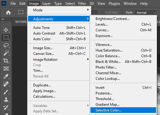
This step really makes a big difference in the final look of your image.
In the Selective Color dialogue, you’ll see four sliders: Cyan, Magenta, Yellow, and Black. We’re going to use the Black slider exclusively.
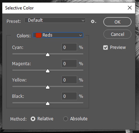
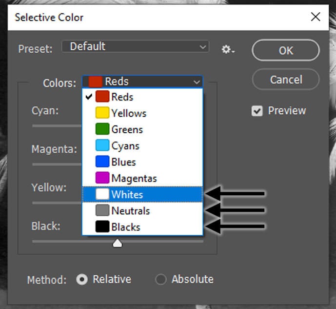
You’ll also see a Colors drop-down menu. This menu allows you to select the colors and tonal ranges in your image and adjust them individually (Figure 8). Since we’re adjusting a monochrome image, we’ll only be working with Whites, Neutrals, and Blacks.
Select these from the drop-down one at a time and then move the Black slider to make your adjustments. Moving the slider to the right adds more black and moving it to the left reduces the amount of black.
When adjusting your Whites, reducing black will make the whites pop, but you lose detail. If you add black, you’ll see more detail in the highlights. Adjusting your Neutrals will have more of a global effect, lightening or darkening the image overall. Finally, increasing the Black in your Black channel will produce intense, deep shadows which is what creates the drama in a black-and-white image that most people look for, especially with infrared images.
In my example image, I chose to increase the Black in the White channel to bring more detail into the palm fronds. Next, I increased the Black in the Neutral channel to slightly darken the image overall. Then, I increased the Black in the Black channel just a bit to add a touch more contrast.
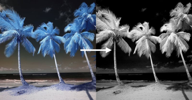
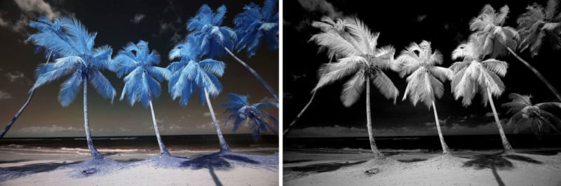
Here’s the finished image.
And here is a side-by-side comparison, before and after.
Now, wasn’t this easy?
Creating dramatic black-and-white images doesn’t require a difficult process. Examine the colors and tones present in your original image, decide on what elements you want to emphasize, and then use these quick steps to create images with visual impact.
About the author: Dan Wampler is a digital artist specializing in digital infrared photography. You can find more of his work on his website and Facebook. This article was also published here.