The Photographer’s Introduction to Color, from Color Space to Monitor Calibration
If you’re a photographer today, you’re probably sharing your photos everywhere from Facebook to Flickr. Your photos are being seen on every device possible: iPhones, Samsung Galaxys, crappy Dell office monitors, and Mac Retina Displays. Each online service, each device, even each web browser handles color differently. If you’re putting your photos up online, you really need to think about how you output files for the web. If you accidentally save to the wrong color space, you can really change people’s perception of your photos.
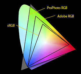
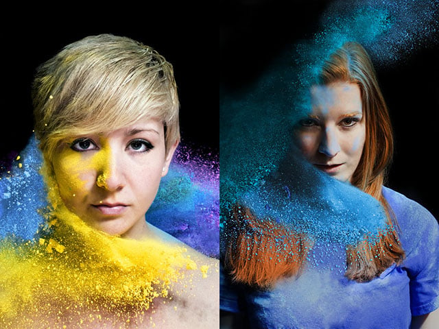
As you can see there’s a pretty substantial difference between them, especially sRGB and ProPhoto RGB. This can become an issue for your photos when uploaded to the web. Chances are if you upload a photo exported to ProPhoto RGB, you’re going to have an issue when people see your photos.
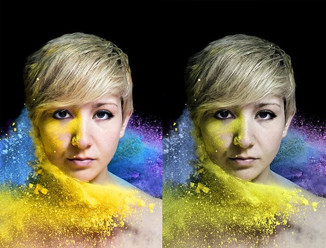
I was stupid when I set up Lightroom years ago… I thought “Well, it does have PRO in the name. It must be for professionals. So I’ll use it”. Well, I uploaded this to Flickr, Imgur, shared it on Reddit, Facebook, etc… I didn’t even realize what happened until someone commented on how they loved the gritty editing to it. I had no clue what they were talking about. I looked at it on my phone and what I saw was what you see on the right. It looks awful compared to the original, and that was seen by over a thousand people.
I don’t know how many saw the correct version and how many saw the terrible version, but I know anyone looking at that on a mobile device saw the bad one. The problem with most mobile phones is screen quality. Not every phone has a retina screen and even if they do, they still won’t have the same display quality that a decent monitor would have.
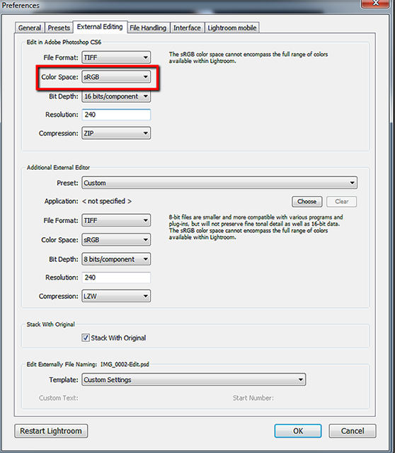
So now you’re wondering what you can do to make sure you don’t make the same mistakes as me. Convert to sRGB when uploading to web. Simple as that. In fact, I tend to make my edits in the sRGB color space because my customers usually just want digital downloads anyways. If you’re not sure how to make sure your photos are being converted correctly, here’s a couple tips.
Calibrating Your Monitor
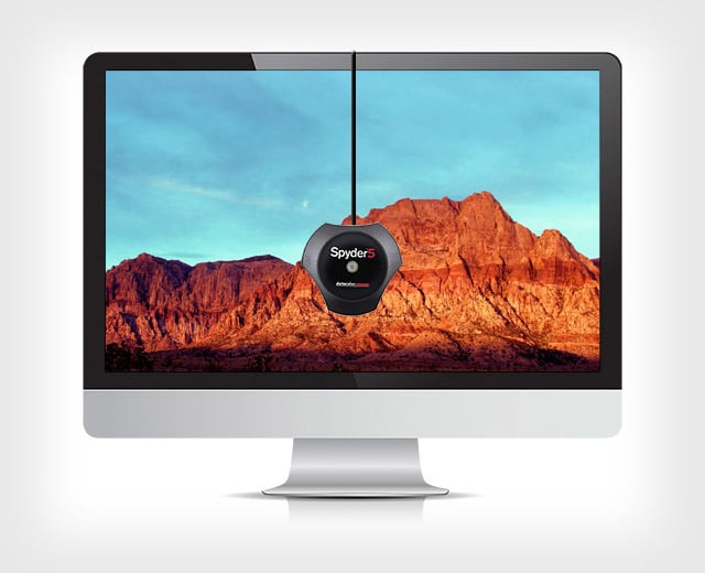
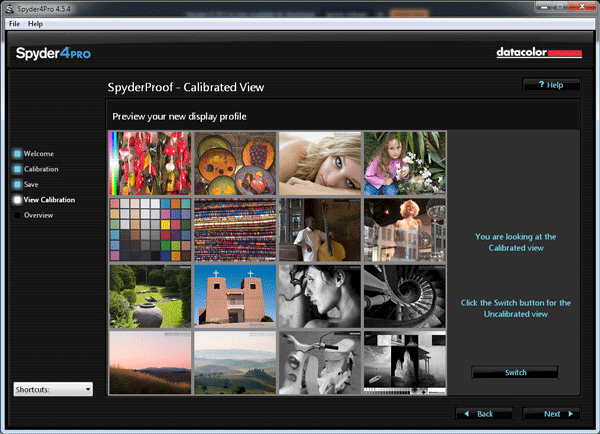
If you’re a working photographer, you should be calibrating your monitor. It is a matter of professionalism, it shows you’re doing everything you can to deliver the best product to your clients. It also ensures that your clients are seeing your photos correctly on their (most likely) uncalibrated screens. Calibrating your monitor is pretty easy and cheap for the most part and after you do it once, it only needs to be done every month or two.
So this is what my monitor looked like before and after. I used a Spyder 4 Pro with the software it comes with to achieve these results. It took a few tries to get the settings right and it was worth it. My photos were too blue because I was compensating for the yellow I thought was there.
After calibrating, I started thinking about what my images looked like on other screens before calibration. I used a Dell U2211H monitor that had obviously been too red. I looked at the image that was still too blue and compared it to what I was seeing on the other two monitors. The gif below is a comparison of what the image should look like, what it looked like before it was calibrated, and what it looked like on the Dell monitor.
Now, there’s nothing I can really do to fully fix this. I can’t force people viewing my website to calibrate their computers. What I can do is minimize this error on my end. Using the Spyder 4 or the ColorMunki I can make sure that on my end, the colors are what I want them to be. This is also especially important for printing.
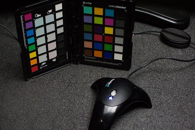
Another tool I am starting to use is the X-Rite Color Passport. I’ve been doing a lot more outdoor work and to make color correcting easier, I purchased this. It makes sure the tones are correct and that the whites are actually white and the black’s are actually black. I take a shot of the passport in the same lighting conditions that I’m shooting in and in post-production I can go in, select the white square and get a perfect match for the white balance.
Now, these are all tools that make it easier for myself and my workflow. They aren’t necessary and there’s alternatives like the Display Calibrator Assistant on a Mac, or Color Management Settings on Windows. The problem with those is that it goes off your eye and not a device that’s calibrated to determine the exact colors. There’s also cheaper alternatives the the Color Passport (I only got mine because it was 50% off). There’s this one by DGK Color Tools and this one by WhiBal. There’s also a cheaper Spyder called the Spyder Express if you only have 1 display to measure.
Gamut Comparisons
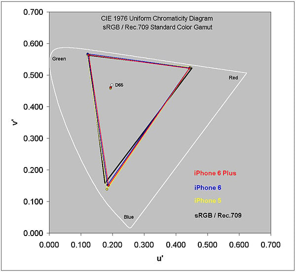
I have gamut comparisons of all the monitors I use on a weekly basis. The results were… surprising. The monitors used were a cheap Asus 21.5″ that’s 4 years old, a Monoprice IPS 27″, a Mac 30″ Cinema HD Display, and a Dell U2211H. These are the gamuts of all of those displays compared together. The larger the shape, the more colors it is capable of reproducing. They’re a lot closer than I originally expected them to be.
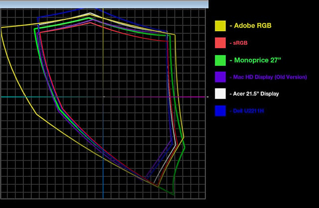
I thought the Mac display would have beaten out the rest of them, but it looks like my new Monoprice display still reigns as the supreme monitor in my weekly workflow.
About the author: David Justice is a commercial and portrait photographer based in New Britain, Connecticut. Visit his website here. This article originally appeared here and here.