What is Color Space and Why Does it Matter?
For most photographers, color is a crucial component of their images. As a result, it only makes sense to want the colors that you envision to come through in the same way when others view your photographs. That can be easier said than done, however.
Unfortunately, each platform, device, and program handles color differently. The photograph you spent hours tweaking may look totally different when you upload it to a website or Instagram. Luckily, paying specific attention to the color space of your photos can help avoid such situations.
Table of Contents
What is Color Space?
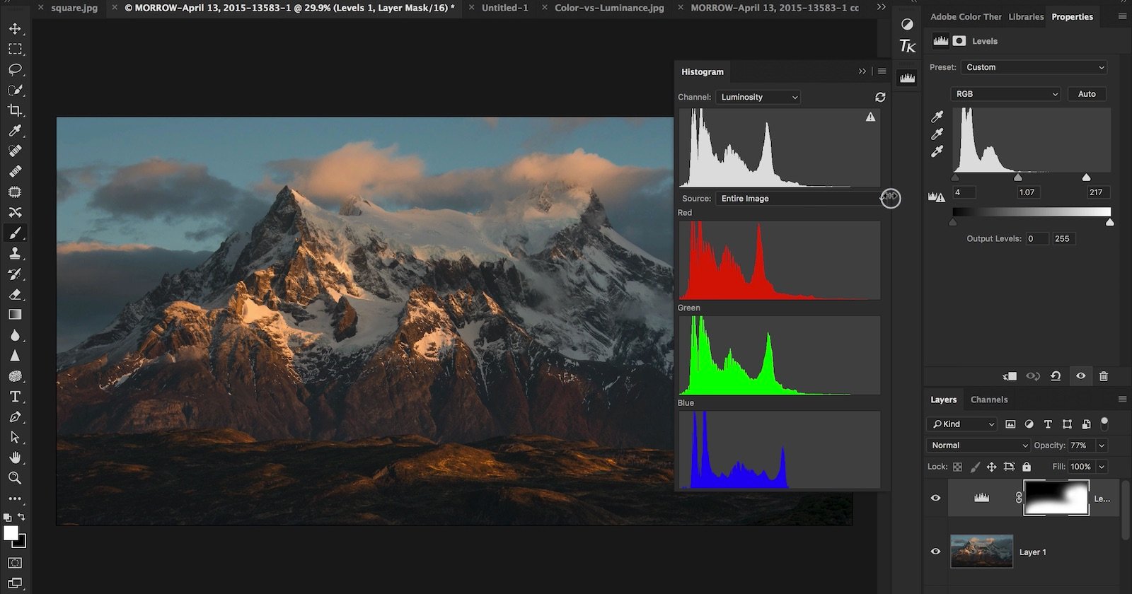
Without getting too into the weeds, color space is a mathematical model that describes how colors are represented using numbers. It is a measurable and fixed range, which is why it is depicted in a graph with a three-dimensional shape.
Put simply, a color space refers to the range of possible colors within an image. You can think of it like buying different packs of crayons. The eight-pack of Crayola crayons offers only basic colors, while the Ultimate Collection with 152 crayons provides a much more expansive range of colors, including many “in-between” colors.
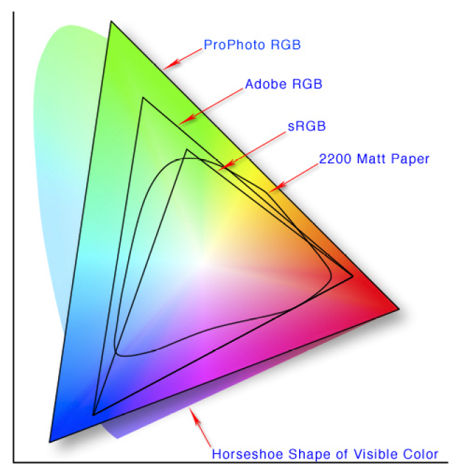
In learning about color, you’ll likely also come across the term “color gamut.” Color gamut is similar to color space but refers to the entire range of colors a system or device can handle. For example, your monitor has a limited color gamut, or a limited range of colors, that it can display. A color space can contain multiple color gamuts, while each color gamut exists within a particular color space.
What are the Different Color Spaces?
There are multiple color spaces, but the most common for photographers are sRGB, Adobe RGB, and Pro Photo RGB. Each color space offers a different range of colors, with sRGB offering the smallest range (the basic pack of crayons), followed by Adobe RGB. Pro Photo RGB provides the greatest variety (the Ultimate Collection level of crayons), covering even more color than what your camera’s sensor captures.
Each of these color spaces serves a different purpose. Most web-based platforms only support sRGB. Basic printers and budget commercial printing companies typically use sRGB, while higher-end printers support Adobe RGB, and some even go slightly beyond that. Pro Photo RGB is where things get interesting, as no devices currently support the entire Pro Photo RGB color space. But it enables you to get the absolute most out of your images and offers some level of future-proofing.
Why Does Color Space Matter?
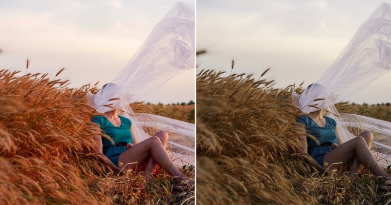
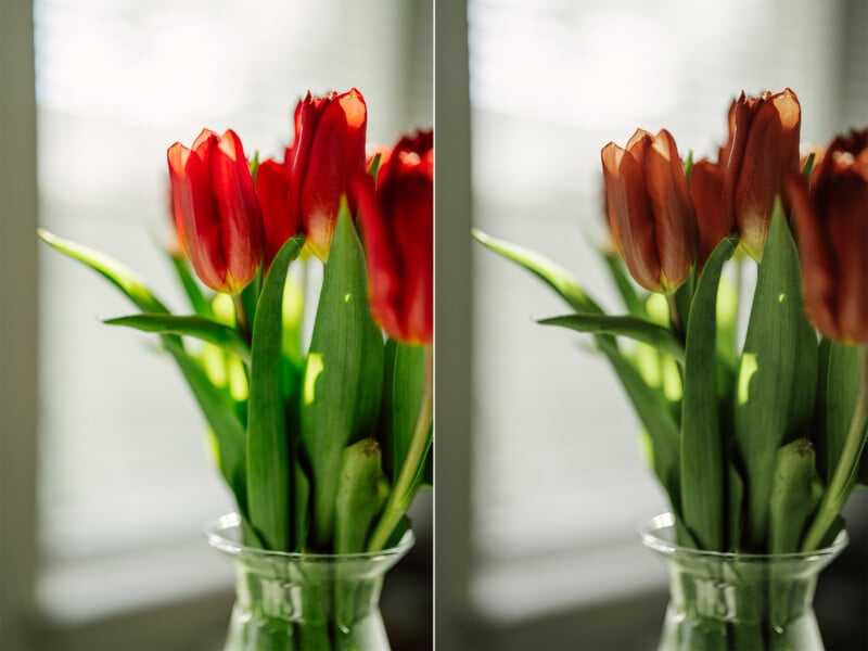
Knowing what color space means is fine and well, but why does it actually matter? There are a few reasons. Since each color space supports a different number of colors, they will each display color differently. So, if you work in one color space and unknowingly save the file as a different color space, there’s a good chance that the colors will look quite different from what you were after in your edit. That can be extremely frustrating, especially if you don’t know why it’s happening.
In a similar vein, applications support different color spaces. If you upload a photo with a Pro Photo RGB color space to a website that only supports sRGB, you will notice a shift in color. Typically, this shows up as very dull colors. Likewise, using the wrong color space when printing images can result in colors different from what you expected. This color inconsistency gives viewers the wrong perspective of your work. It could also lead to clients’ complaints if they first view files online and then receive prints that look drastically different.
For those who post online (which is most of us), fully controlling how people view your work is impossible. Different displays, such as an iPhone versus Samsung Galaxy versus an entry-level computer monitor, all offer different color gamuts, which can lead to different colors on each device. Even individual websites, browsers, or apps can handle color differently.
By paying specific attention to your color space, you can achieve greater control and consistency over how colors appear in your images. That consistency in color will lead to a more consistent brand style, which is a must if you are hoping to develop an audience and client base. And it will also reduce client complaints if you offer digital files and printed images.
What Color Space is Best for Shooting?
If you are a photographer shooting in RAW, you don’t need to worry about in-camera color space. That’s because RAW files are uncompressed files with no embedded color space. For RAW shooters, color space only comes into play during the editing process.
However, if you shoot JPEG files, color space is important to consider when shooting. Most cameras offer two color space options: sRGB or Adobe RGB. Adobe RGB is the wider color space, and as it is typically best to go with the larger color space for more flexibility down the road, we recommend shooting on Adobe RGB. Most cameras default to sRGB, so this is a setting that you’ll need to change if you want the more expansive color space.
What Color Space is Best for Editing?
For many, the next step in the photography process is editing. Keeping the color space consistent throughout the editing process is the best way to ensure consistent and accurate colors. Although no monitors can even display the full Pro Photo RGB range, editing in Pro Photo RGB is still recommended. As mentioned, this allows you to squeeze the most out of your files, which, for most of us, is a good thing. It is important to note that you will need to use 16-bit files when editing using Pro Photo RGB, as 8-bit files will result in posterization (pixelated colors).
There are some exceptions to this, of course. First, using Pro Photo RGB does require a good understanding of color. For those who want to avoid getting too into the weeds, Pro Photo RGB may be overkill and complicate things more than necessary. If you are a casual photographer shooting for fun and don’t care about any future applications of your photographs, Adobe RGB will be plenty.
The other caveat is for JPEG shooters. Those who shoot JPEG will be importing files in either sRGB or Adobe RGB. While certain programs allow you to convert to a wider color space, you won’t actually get any more color out of your images from what you captured. So, if you shot in Adobe RGB, it would be best to edit in Adobe RGB.
What Color Space is Best for Printing?
After the editing process, printing is one destination for some photos. Color space is especially critical when printing, as the wrong color space can produce drastically different results from how you edited the image. If you drop ship your work (shipping directly to clients from a printing company without seeing the prints first), that can be a huge issue.
Most commercial printing companies rely on the sRGB color space. This includes budget options like Walmart or Costco. If you opt for a more professional printer, such as White House Custom Color, you can take advantage of the wider Adobe RGB. The same is true of printers you buy for your home; budget options will likely only support sRGB, while photography-specific printers may provide support for Adobe RGB and beyond.
The key to printing your images with accurate color is to verify the color space the printer supports. Most companies will offer that information in the FAQs. If you can’t find that information, sRGB is the safe bet. No matter what, though, be sure to have a color space embedded in the file, as without that, one will be assigned to it, and that change can cause inaccurate colors.
What Color Space Is Best for Online Use?
While the other steps of the process all had various answers regarding the best color space, the best color space for photographs posted to the web is much more straightforward. Most websites and apps only support sRGB. As a result, if you are posting online or to apps like Instagram, be sure to convert your files to sRGB (after editing).
How to Assign or Change a Color Space
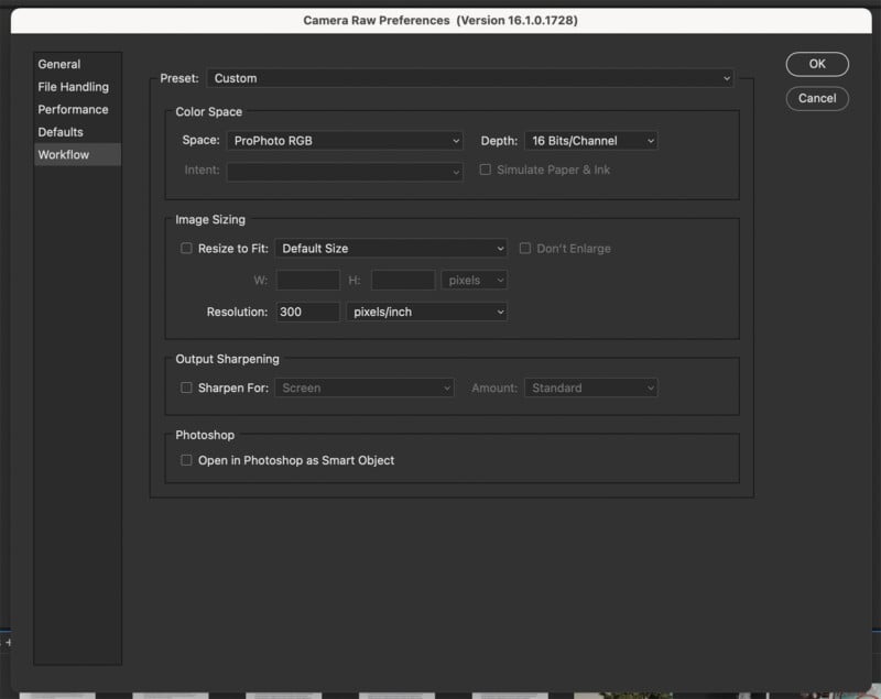
Now that you know that you will, at some point, need to either assign or change the color space of your photos, it’s important to understand how to do that. Of course, this depends on the editing program you use. Lightroom automatically assigns RAW files to the Pro Photo RGB profile. That default setting cannot be changed. However, if you use Adobe Photoshop, you have other options, and the default may not be what you want. You’ll need to open the Camera Raw Preferences menu (either via Photoshop or Bridge), and under the Workflow tab, select which color space you want.
Before converting to a lower color space, we always recommend saving a file at the widest color space available to have it as a backup should you want to re-edit down the road. For Photoshop users, it’s worth noting that you should convert flattened images without layers (or convert files that won’t have layers anyway). Converting to a different profile can change the layers’ transparency, blending modes, and styles, significantly altering the look of the image.
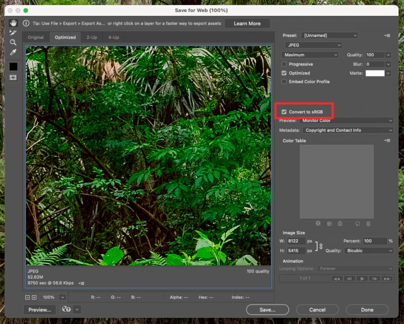
When you decide on the appropriate color space for how you’ll be using the photo, it’s time to convert. In Photoshop, there are a few options. If you are exporting the files for web use, you can check a box in the Save for Web (Legacy) menu to convert to sRGB.
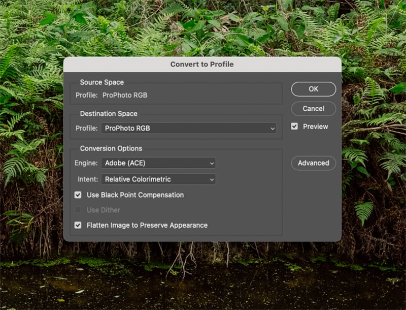
If you want to change the color space before saving a JPEG file (which is the likely choice for printing), you’ll need to navigate to Edit > Convert to Profile. There, you can choose which color space you want. You may also notice an “Assign Profile” option in the edit menu. That option is only for files that do not already have a color space assigned. Be sure to use the Convert to Profile option if you are changing from one color space to another. Then, when saving the file, ensure that the “Embed Color Profile” box is checked to actually save the color space to the file info.
Practical Color Space Advice for Photographers
Color space information can get extremely complicated and confusing if you want to get into the weeds. But that isn’t necessary for most. The general rule of thumb is to take and edit photos using the widest color space available on your device or program. For images headed to the web, convert files to sRGB. If you are printing your photographs, you’ll likely use either sRGB or Adobe RGB, but be sure to verify which color space the printer uses first.