
Instgram Head Says It’s Going to Be ‘Challenging’ to Design App for iPhone Duo
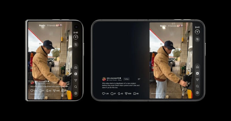
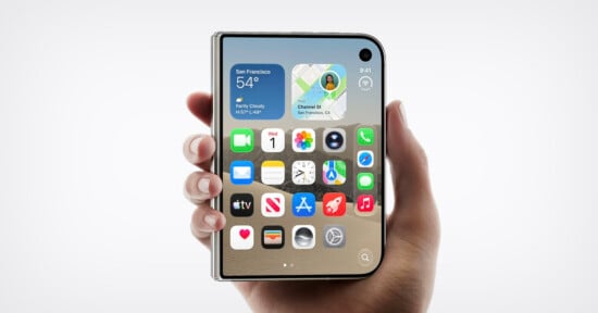
The Head of Instagram Adam Mosseri has declared that, judging by the look of the iPhone Duo, “it’s going to be pretty challenging” to design the app for the unusual format.
Apple released the Duo last month, the company’s first-ever folding phone. The first-generation device has come under criticism for not being optimized for apps like Instagram.
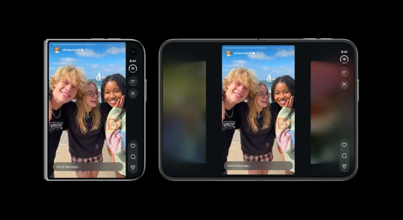
Taking to Threads yesterday, Mosseri says, “Having spent about a year with a foldable as my daily driver, I’m actually excited about trying the Duo once I can get my hands on one. That said, the more I look at the details of the device, the more I think it’s going to be pretty challenging to design Instagram in a way that feels great for this format.”
View on Threads
Replying to a comment on the post, Mosseri agreed with one user who said the best experience currently comes when the phone is unfolded and rotated vertically into portrait orientation. But Mosseri adds that the company wants to “make the experience in other orientations better.”
Replying to another comment, Mosseri elaborated further on the challenges posed by the Duo.
“I’m not criticizing the format,” he says. “It’s just very different than today’s format and so much about Instagram has been designed for the tall vertical screen.”
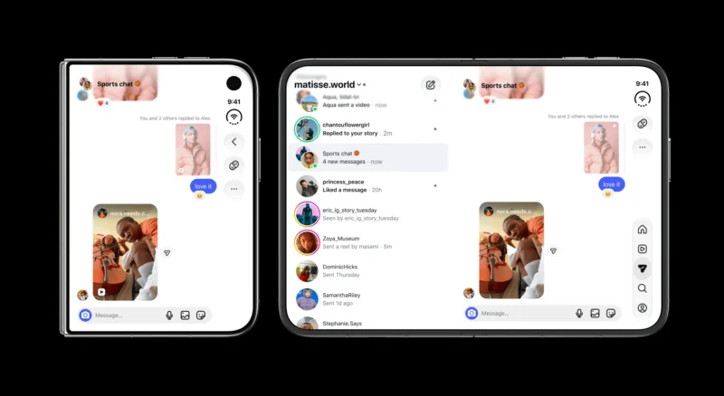
Since the Duo’s release, Instagram users have complained that the app simply doesn’t look very good on the foldable device, pointing specifically to what Mosseri calls a “double stack of buttons” on the right-hand side of the screen.
“It makes total sense to me that the nav goes on the right-hand side of the Duo when it’s closed because it’s ergonomically effective, but that’s where the like, comment, and share buttons go in the Reels viewer,” he points out.
Instagram has rolled out a more optimized version of the app, saying in a blog post that it is “continuing to adapt the Instagram experience for Apple’s first foldable iPhone.”
It took Instagram a very long time to release a version of the app that’s native to the Apple iPad.
Image creditsInstagram
Affiliate Disclosure PetaPixel articles may include affiliate links; we may earn a commission if you buy through one.