Visual Balance: The Composition Technique That Changed My Photos
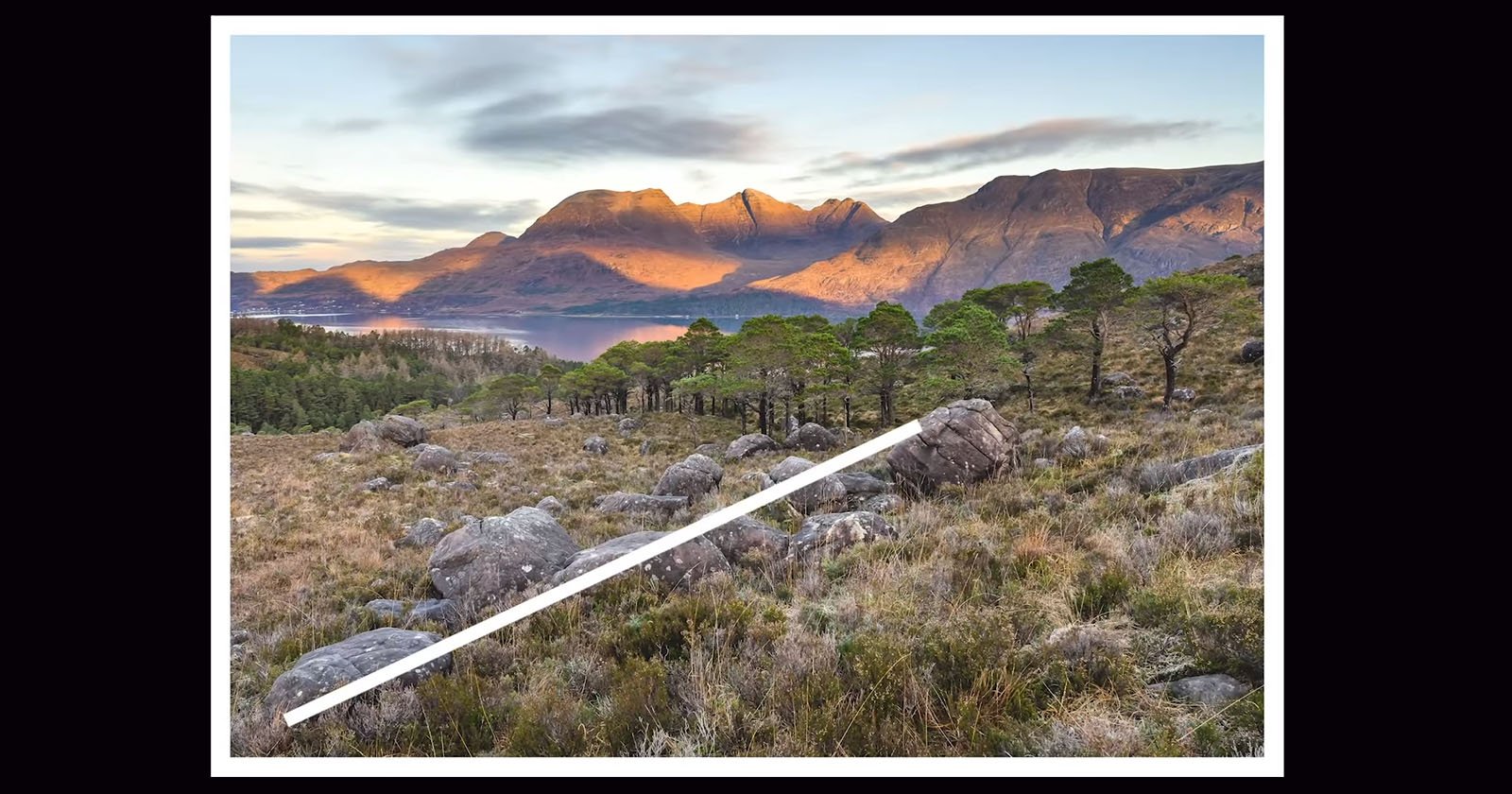
This landscape image has most of the ingredients that can make it a great photograph. It has a clear subject and focal point, the lighting is great, and a nice edit and mood, but… don’t you have the feeling that there is something off, and at the same time you can’t really tell what it is?
That feeling that makes you think “Yeah, I like it, but I’m not sure what is missing”. And then you start debating “Is it framed correctly? Should I crop it a little bit? Or maybe, should I change the edit? Did I use the wrong lens? I don’t know!”.
At this point, you start messing around with sliders, only to find out that your image ends up looking worse, and you feel confused and overwhelmed and you really don’t know how to improve it.
If that’s something that happened to you, no worries, it’s a common problem. And it’s not related to your editing skills or the gear you used. The reason is that you’re probably missing one of the most important compositional aspects: Visual Balance!
In addition to lighting, composition is the single most important thing that will enable you as a photographer to create great photos. Composition is a massive subject. I’ve created a few videos about composition on my YouTube channel, and it is definitely the topic I love the most and where I invest a big chunk of my time with my students during my workshops.
In this article, we’re going to be exploring six different ways of organizing elements within the frame to create visual balance in your compositions, which is in my opinion the most fundamental decision we make when composing a photograph.
As compositional techniques, we have several tools, such as the rule of thirds, which I personally feel is too rigid and usually leads to compositions that feel forced rather than organic. We also have leading lines, diagonals, triangles, and many others.
However, when considering a composition to be appealing or balanced, it is often difficult to explain what it is about the composition that works. So, the tools I’ve just mentioned are surely useful but not enough to get successful compositions.
The key component to putting order and harmony into a composition is to develop our eye to recognize how to organically arrange elements in the frame, and this process is based on analyzing the so-called ‘visual weight’ or ‘compositional weight’ of everything we want to include in our shots.
What does it mean? ‘Visual weight’ in photography refers to how the elements in an image relate to each other and it depends on many factors that include the position, size, color, brightness, contrast, texture, shape, and inherent interest.
A visually balanced composition has interest in every part of it. Every element of a scene or subject is of equal importance or close to it.
As you become more comfortable with this process, it becomes a habit, and that’s when you shift from thinking about a composition to instinctively feeling it.
Without a balanced composition, it’s quite difficult to convey a clear message or story. That’s one of the main reasons the viewer might feel confused.
Visual balance is in many ways comparable to physical balance, and making this comparison can help you to understand how it works.
Let’s use the seesaw analogy.
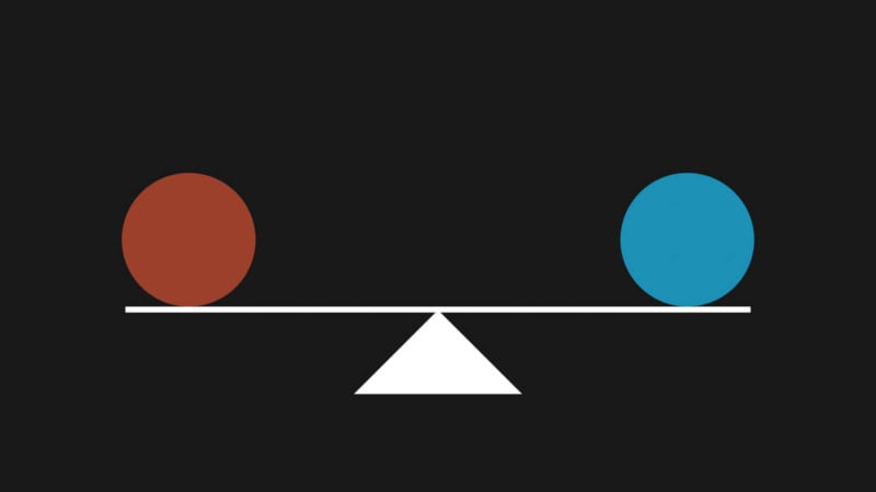
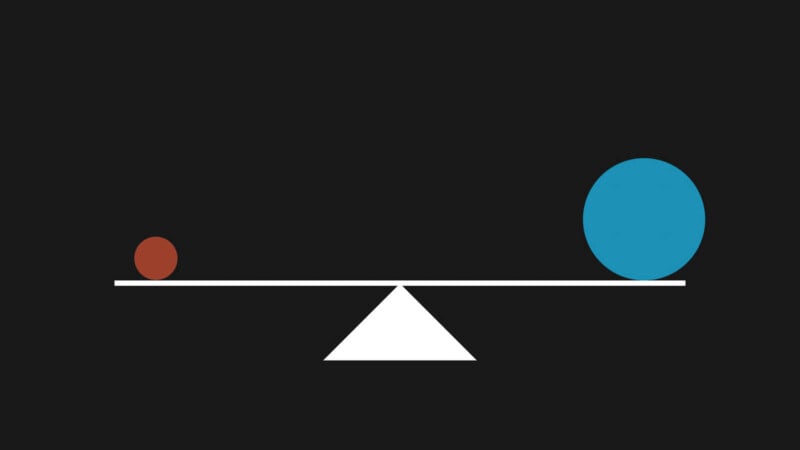
A seesaw has a fulcrum, which is the point where it can tilt up or down. To make the seesaw balanced, you need to have equal weight and distance from the fulcrum on both sides. This type of balance is called symmetric balance, and that’s what people usually equate with balance. But symmetry is just one of many ways of achieving balance in a composition.
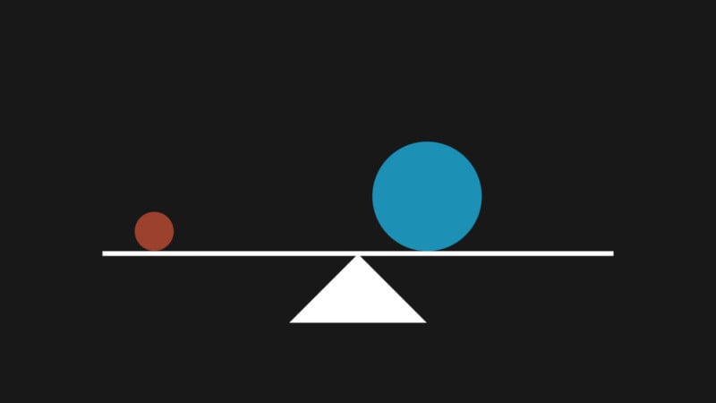
You can also balance the seesaw by having different weights and distances from the fulcrum on each side. The lighter object will need to be farther from the fulcrum than the heavier object to balance the seesaw. This type of balance is called asymmetric balance.
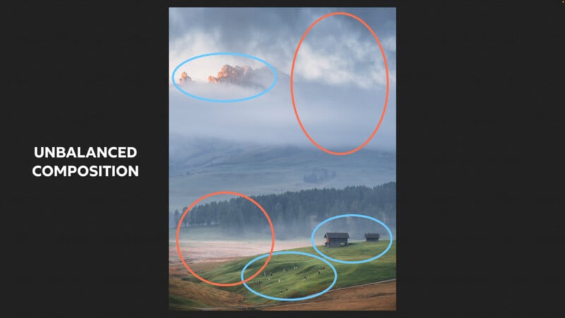
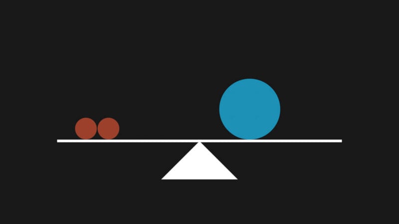
For example, if we had something like the image below, it would appear incorrect because we can tell that the seesaw shouldn’t be in balance.
Now, you may be asking: how do we incorporate these principles into our photography?
Let’s have a look.
Tip #1. Small Object vs Large Object
Example 1
A small object further away from the ‘visual fulcrum’ will balance a large object closer to it, and here is the first example.

I’m going to divide the image into two equal sections, and then I’m going to relate each element to the middle axis.
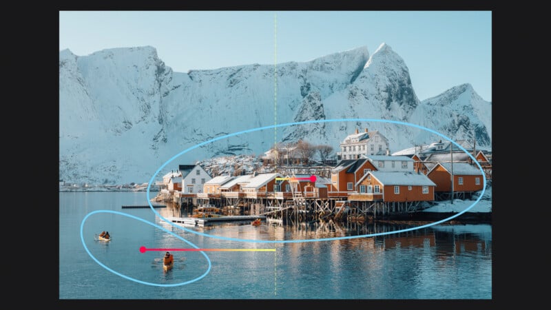
What makes this composition balanced?
There are two clear points of interest balancing each other in this image – the group of cabins and the two canoes – which contrast in several ways: size, simplicity/complexity of shape, and texture. But, to start and keep things simple, let’s consider only how much space they take up in the frame.
The entire group of cabins is larger and of course has a more complex texture, whereas the canoes have a similar brightness level, a more simple shape, and are much smaller. It seemed natural to place the group of cabins closer to the center of the frame and have the canoes further from it.
Because of their position, size and shape the canoes have a lot of visual weight, so it is better for them not to be too close to the edge or center of the frame.
Making an analogy with the seesaw, we have this kind of relationship between the two.
So, we have two small objects that counterbalance this group of cabins that work as a single and large element in the scene. Does it make sense?
Example 2
Let’s take another example.
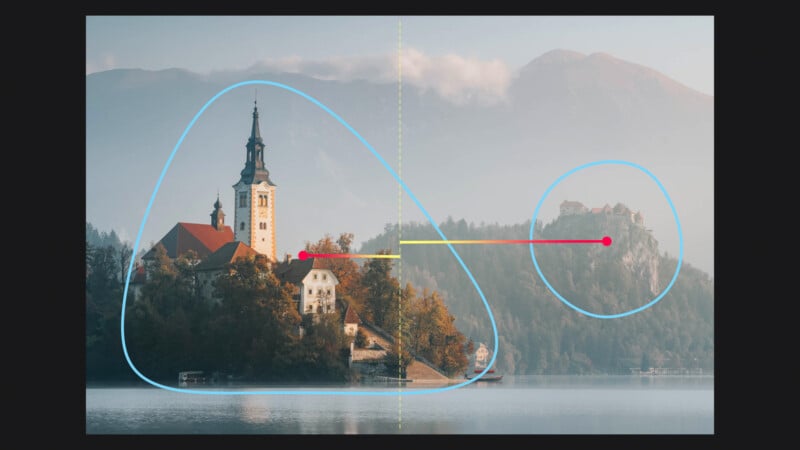
The castle on the cliff on the right-hand side of the frame, even though it takes up a small portion of the frame, with its off-center position nicely counterbalances the weight of the larger church on the left which is of course less off-centered.
Example 3
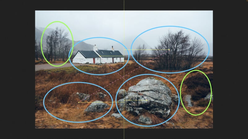
Here is another image.
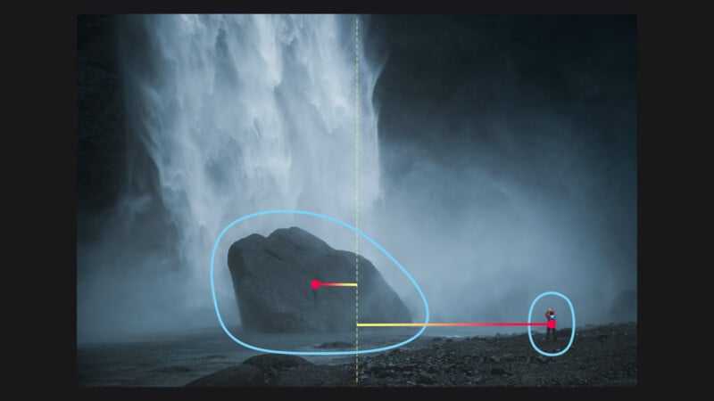
Again, same concept. The big rock on the left is counterbalanced by the off-centered tiny figure on the right. Additionally, there’s an interesting color element (the red jacket) that further enhances the visual weight.
Without the figure, the entire image would feel unbalanced, tipping the visual weight too much to the left.
So, when framing a scene, look at the center axis and ask yourself: “Considering the size of the elements, how close or far from the central axis should I position them to counterbalance each other?”
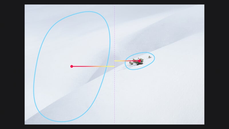
Tip #2. Low-Contrast vs High-Contrast Area
Example 1
Another great principle of balance is using small areas of high contrast to balance big areas of low contrast.
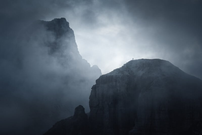
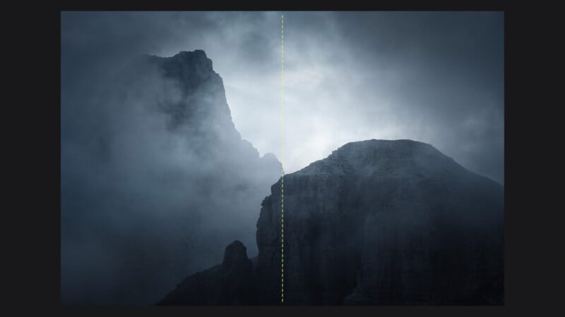
Here I’ve got a great example. This shot is all about the hiker.
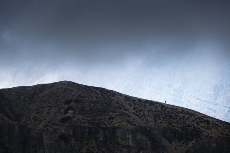
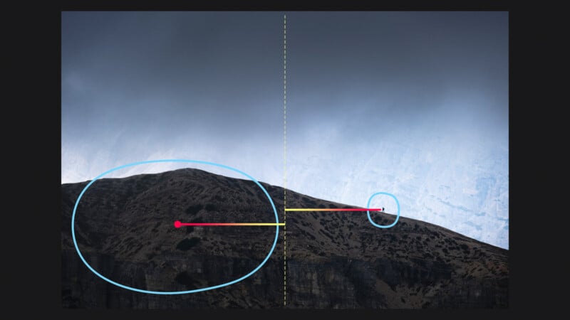
The two elements are equally spaced from the center of the frame. And, even though the figure is really tiny compared to the vast landscape, placing it against the bright background makes it stand out and creates a high-contrast area. This effectively counterbalances the weight of the much larger, low-contrast portion of the mountain on the left side of the frame.
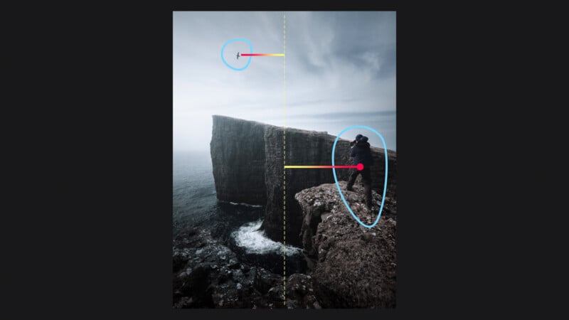
Example 2
Similarly here, with the two mountains dominating a significant portion of the frame, the addition of the tiny photographer on the right provides the necessary visual weight to balance the composition.

Let’s examine the image without the figure.
To me, it seems like something is missing. In this version, the subject of the photo could be the mood, and in a certain way, the shot remains quite balanced. However, by introducing that additional element, the image now looks just right and more harmonious.
Example 3
One more example. The overall arrangement of these dunes of volcanic sand is quite organic.
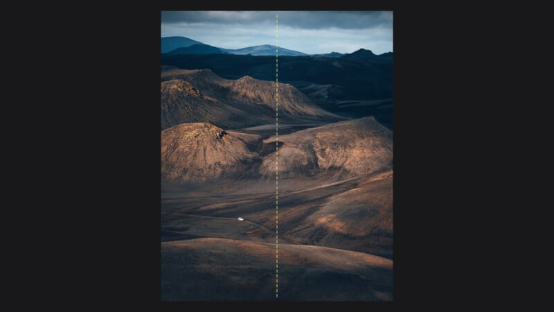
Starting from the top, the dark area on the top right is balanced with these dunes. The central dunes are very similar in shape with an equal visual weight.
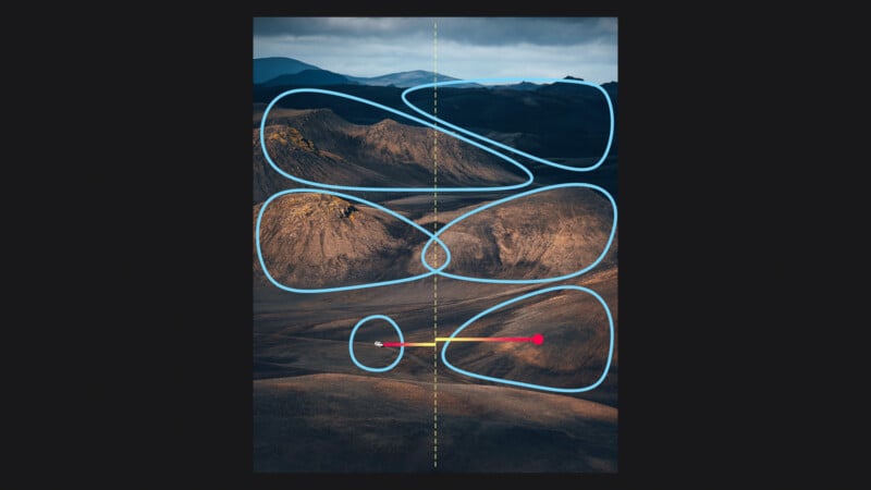
As you can see, the balance in the low-mid of the image is created by the tiny white jeep that, even if smaller in size, because of its brightness creates a high contrast area that effectively counterbalances the large dune on the right, and I would say it also provides an additional counterpoint the dark area on the top right.
Once again, if we hypothetically remove the car, you can immediately perceive a slight visual imbalance.
Tip #3. Bright/Saturated Colors vs Low-Saturated Areas
Example 1
Colors are another important tool to enhance visual balance. Our eye is naturally drawn to bright, saturated colors, which tend to stand out more than neutral or less saturated colors. This means that a small area of bright color can visually balance a larger area of neutral or less saturated color, creating a contrast that adds interest and dynamism to the image.
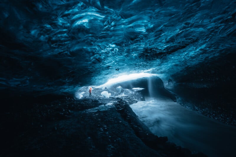
This is a perfect example. Here I was in an ice cave in Iceland with the workshop group, and I tell you, these ice caves can be quite claustrophobic. My goal was to capture as much ice as I could using the wide-angle lens. The challenge here was that without a human element, it’s impossible to give the viewer a sense of the scale of the scene.
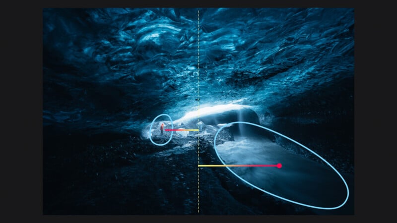
So, I decided to take advantage of our guide and asked him to stay right at the entrance of this stunning ice cave, carefully considering where to place him to get a visually pleasant balance. I thought it would be nice to have him at the same distance as this tiny cascade.
The saturated flashy orange rain jacket works amazingly well to balance the large portion of the water stream. The figure instantly adds a great sense of scale and anchors the image to the main subject.
So, we caught two fish with one bait.
Example 2
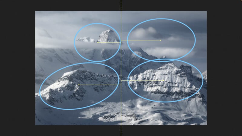
Let’s take one more example.
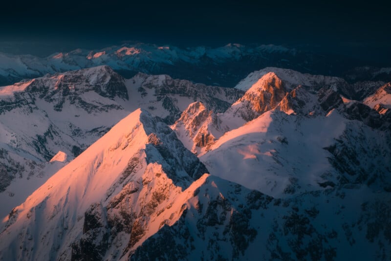
This wintery mountain scene was captured at over three thousand meters in the Dolomites, and I took advantage of two main colors – kind of reddish-pink and dark blue. These colors balance each other out. Complementary colors, which are opposite on the color wheel, work beautifully to create a strong contrast and harmony.
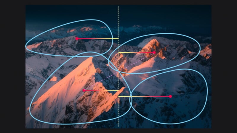
The dark blue covers a big part of the right side of the picture, and it helps to show off the warm highlights on the little peaks at the top right. These highlights grab our attention and balance out these peaks on the left, and the big peak on the left side in the front.
It all works together to make a nice and balanced picture.
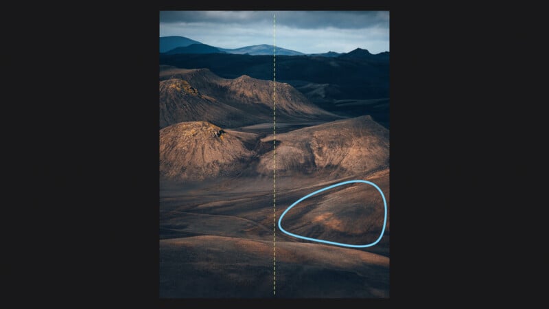
Tip #4. Small/Complex Shape vs Large/Simple Shape
Example 1
Small, complex shapes can balance large, simple shapes.
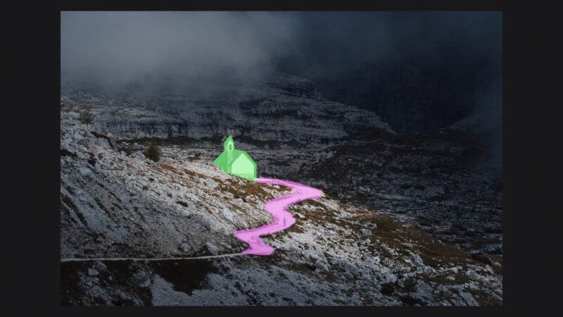
Let’s look at the central small busy area with the chapel and hiking trail in Tre Cime di Lavaredo. These two elements have more complicated shapes, and also a higher level of brightness, than the rest of the scene.
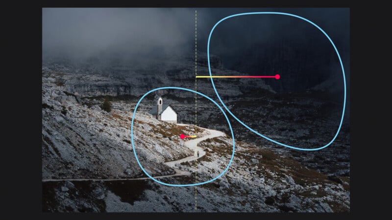
So, despite their much smaller size, these two elements carry enough compositional weight to balance out this larger, dark, and flat space.
Example 2
Here is another interesting example that shows how effective this principle is.
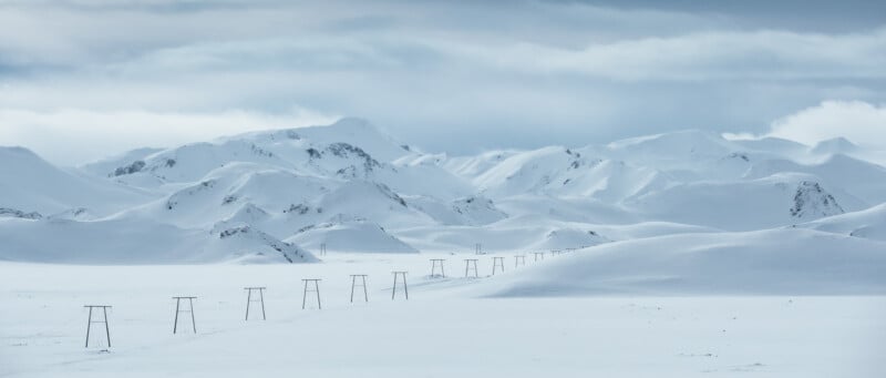
This is a wonderful scene I captured in the Icelandic highlands. I intentionally included in this panoramic composition this series of electricity poles, taking advantage of their particular shape and the diagonal arrangement.
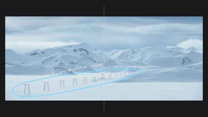
These elements not only add visual interest but also beautifully lead the viewer’s eye toward the lovely mountains in the background, bringing significant visual weight to balance the right side of the frame.
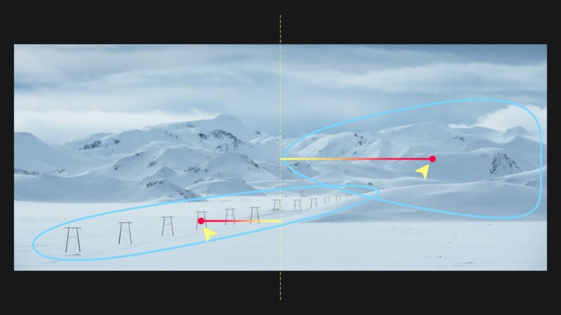
Of course, the whole set of electricity poles is less off-centered than the mountain group, as it carries a higher compositional weight.
Tip #5. Small/Complex Texture vs Large/Smooth Texture
Example 1
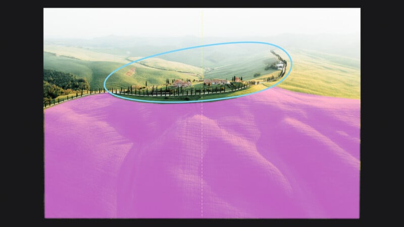
Complex, high-contrast texture on a small object can balance a large object with a smooth texture. For example, in this aerial shot I took in Tuscany we have a small area with these cypresses and the farm that balances the large, uncluttered area of beautiful rolling hills.
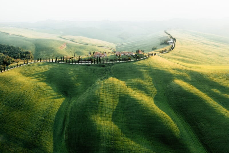
This small group of elements has a more complex texture and definitely a higher level of contrast, whereas the lower 2/3 rds of the frame texture is much smoother.
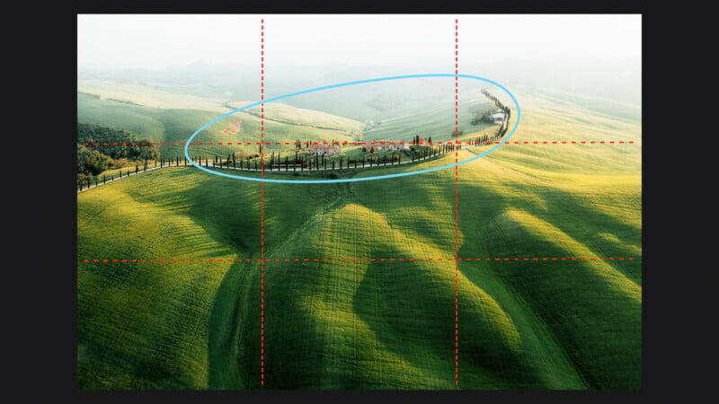
This is a central framing, and when we consider the rule of thirds, it becomes a clear example that clearly references the principle. Yet, it’s the interplay of the compositional weight of the two primary elements and the use of the rule of thirds that genuinely contributes to establishing the desired visual balance.
Example 2
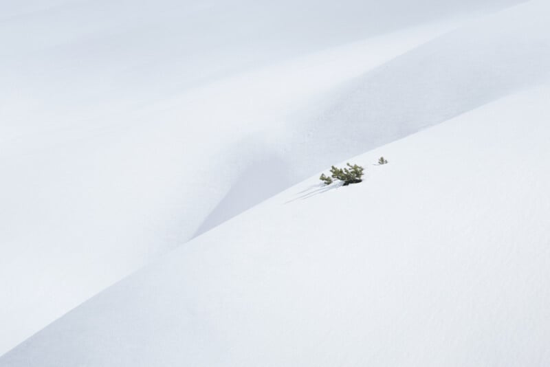
The second example speaks for itself—a simple and minimalist composition where the small bush, with its intricate texture, stands out against the expansive, clean white snow canvas.
Although it occupies only a tiny part of the frame, its unique structure provides enough compositional weight to effectively counterbalance the entire area on the left.
Tip #6. Objects on the Top of the Frame
And now, let’s have a look at the sixth and last variant. Objects towards the top of the frame have more visual weight than those near the center. The top edge of the frame can therefore be a good place for a counterpoint that has less visual impact than a point of interest closer to the frame’s center.
There is a psychological concept called the “visual gravity center.” This refers to the idea that our perception is influenced by the force of gravity, and we tend to perceive objects as having more visual weight if they are placed higher in the frame.
Example 1
In this image, the figure on the left is very off-centered, and together with the rock, carries a lot of visual weight. The elements on the left lower part of the scene are not enough to counterbalance it. So, including this little bird up here in the top left is a great way to rebalance the entire shot and give the composition a nice sense of harmony.
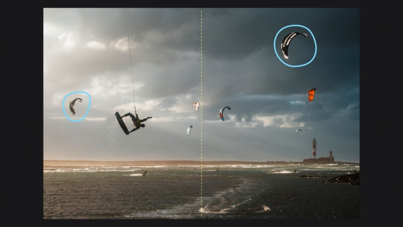
Example 2
Here is another cool example.
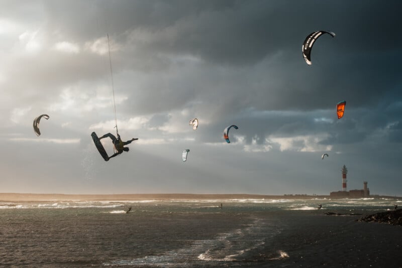
The main thing you notice is the guy literally flying around. The kites all around him, intentionally framed in this way, help to visually balance the entire composition. Specifically, the kite on the top right and the one on the extreme left, make a big difference.
Let me show you why. Let’s try for a second removing the kite on the top right.
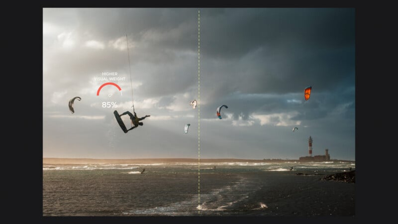
Well, as we’ve seen before, because of the shape and the higher level of contrast, the main subject now gained too much visual weight and, to me, the composition is biased too heavily to the left side of the frame.
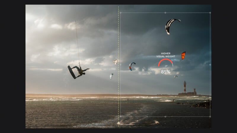
If we remove the kite on the left, we get exactly the opposite effect. Now, it’s too weighted on the right side.
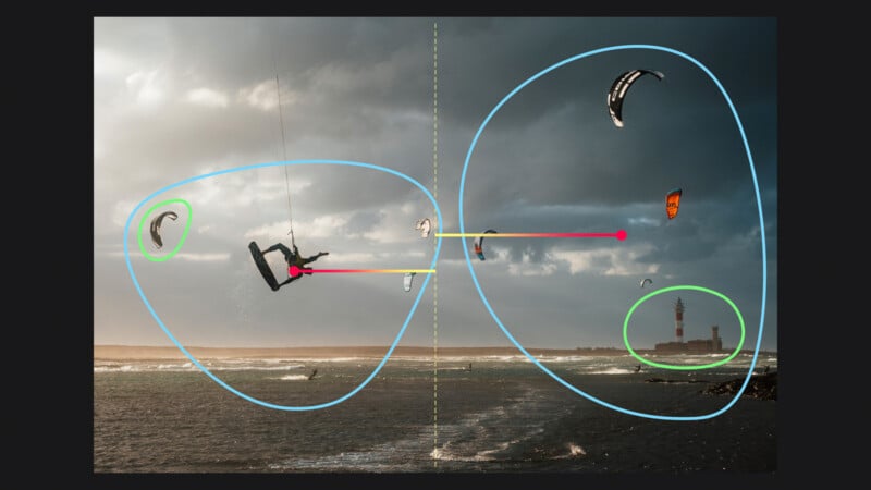
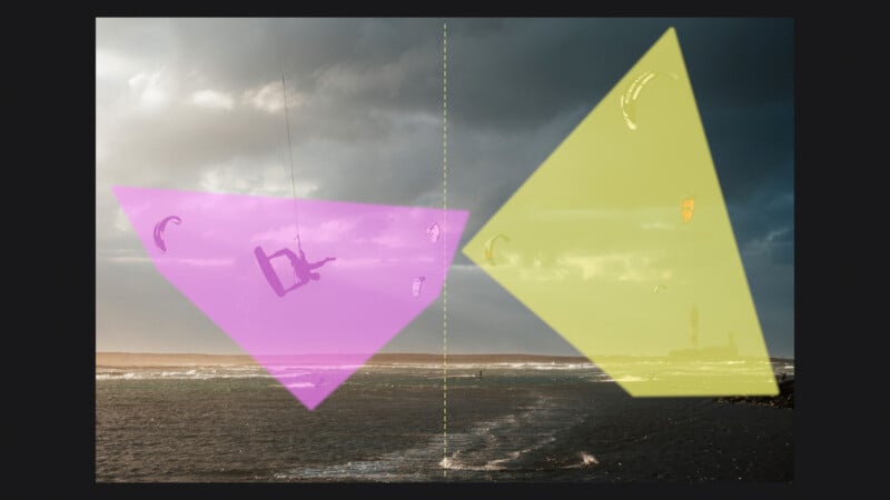
The arrangement on the original shot works much much better. The kite on the left balances the lighthouse on the right, and the one up in the top right counterbalances the flying kite surfer.
Wrap Up
I hope you found the article useful, thanks so much for reading. And, don’t forget to let me know in the comments what’s your favorite technique to create balance in your photos.