Shooting a Luxury Watch Photo… with a $5 Watch
The cheapest watch I could find, that was my mission! I decided I wanted to create a magazine advertising image using a really cheap watch. My goal was to replace the luxurious and expensive aspect of the image with an unknown brand but still maintaining that feel of expense and luxury in the final shot. It was also to focus on the photography and the importance and impact it has on advertising.
I always sketch out my ideas. It’s a great way to visualize the final shot and keeps me focused on creating that vision. You can see from my first couple of sketches the concept/idea changed in the final image, but for the better. I thought it would have more impact by creating the waterfall and splashes.


With the sketch, I have a great start. Sourcing the materials was straightforward. First, a handful of plum slate from the garden (don’t buy it if you don’t have to!).

To form the shape I had in mind in the sketch, I used a hot glue gun and glued the slate into place.


Once I have the slate in a form I am happy with, I need to clamp it to a light stand to have it floating mid-air. I use clear acrylic rods to do this that are hot glued to the underside of the slate.

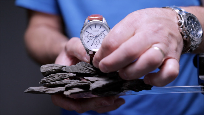
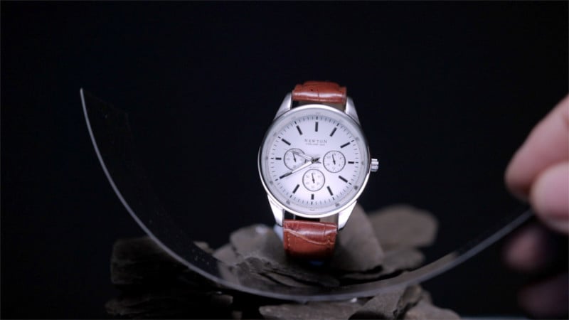
The next step is to glue the watch to the stones but before I do I need to make the strap rigid so it holds its shape and also making it easier to fix to the slate.

Simply cutting a thin strip of plastic and taping it together so it pulls the watch strap tight allows me to keep the form. Now I can use Blu-Tack reusable adhesive to fix the watch to the slate.
With the watch in place, I can start shooting. Now with most product photography, using a scrim is a must as it allows for a better gradient of light which just can’t be replicated with a softbox. And scrims are super easy to make.

You can use tracing paper on a 20×1-meter roll.
Overflow pipe and 90-degree bends for the frame. No need to glue — gaffer tape will hold it all in place.


Cut it to your required size, fit the 90-degree bends, then tape the tracing paper to the frame, and that’s it!


With the scrim in place, I can now start positioning my strobe above the scrim and moving it until I am happy with the position of the light and specifically the way the light is falling on the watch.

I now need a light source from below and the easiest way is to use a piece of silver mirrored card. Simply positioning that under the watch will bounce that light back and fill in the shadows. I won’t get this in one take — working in such a small space, it’s difficult to work around too many light stands, so taking a few frames and combining them in Photoshop is going to be how I create this image using just two lights.

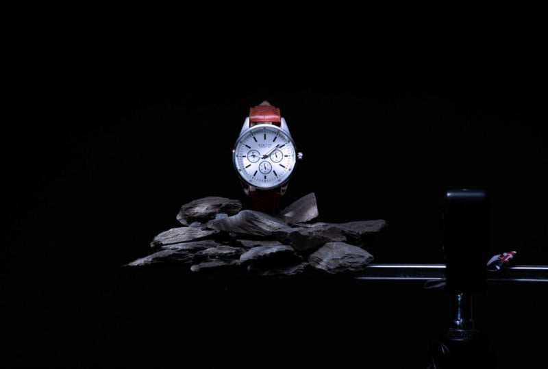
Happy with all of the images for the watch, I now want to add a little interest to the stones. To do this, I will use a Pika 200 and the optical snoot. Using a scatter gobo, this will add dappled light to the slate.


Next, I want to add a defined ball of light on the background. Again I will use the optical snoot and the spot gobo to achieve this. The snoot makes this very easy to achieve that sharp circle of light.


The only element to add to this image now is the water. There is definitely a technique to creating those lovely sheets of water that the light bounces off! I got lucky and 25 shots in, I nailed a great shot of the water falling behind the watch.

I am running solo here so my wireless trigger is my best friend at this point — well, that and some good timing! I now need to create the water splash through the stones and the process is the same. This will also take a few frames that will be combined in post.


I made sure I had buckets in place to catch the falling water, but water gets everywhere so be sure to cover everything!
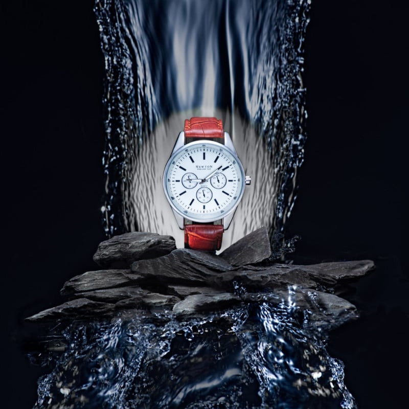
So now that I have all of the frames I need, I can now combine them all in Photoshop. This is the image all combined:

Now I run it through Topaz Labs add some contrast, saturation, sharpening, and a little blue tone to the water for the final image. f/16, 1/125s, ISO 100.
So that was the whole process of how I created this image. I loved creating it and really hope you get something from this article. I am going to head back into the studio now and tidy up my mess!