An Explanation of How Computers Handle Color
MinutePhysics just released this interesting (and somewhat math-y) explanation of how cameras and computers deal with the concept of color. The video is titled “Computer Color is Broken.”
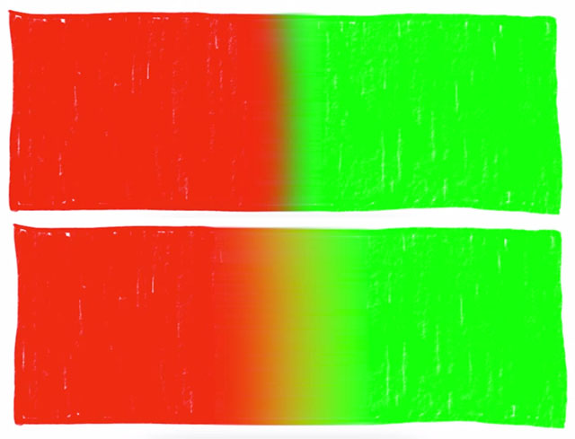
When manipulating images and colors, programs could most accurately do so by working with the “real” values of colors rather than their encoded values, but many programs don’t. Those that don’t (iOS, Instagram, and default Photoshop settings are given as examples) may show “a weird dark boundary between adjacent bright colors” when things are blurred.
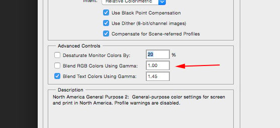
To have Photoshop handle colors the “correct” way, you can go to Edit→Color Settings→More Options and make sure “Blend RGB Colors using Gamma” is checked and set to 1.00.
Here’s how a Peachpit article describes this option in Photoshop:
To see the effect of this option, paint a bright green stroke on a red background with the check box turned off, and then again with the check box turned on and the value set to a gamma of 1.0. With the check box turned off, the edges of the stroke have a brownish hue, as they would if you were painting with paint. With it turned on, the edges are yellowish, as they would be if you were painting with light. You can think of the behavior with the check box off as artistically correct, and with it turned on as colorimetrically correct.
In his book “Color Confidence: The Digital Photographer’s Guide to Color Management,” photography educator Tim Grey writes:
Although photographers use light in some way at every stage of the process of producing their images, they tend to think about the dyes or pigments that produce the final result on paper when they think about the final product. For that reason, when editing an image they tend to think of colours blending with each other as if they were ink on paper. By default, Photoshop blends colours with a result that matches what you would expect when mixing inks.
The Blend RGB Colours Using Gamma option allows you to change this behaviour so that colours blend as if they were light rather than ink […] Based on the way most photographers tend to think about the blending of colours their images, I recommend leaving this option turned off.
So the option may be very useful for you if you work with graphic design, but it’s generally recommended that photographers keep this unchecked.