Creative Applications of Color Theory in Landscape Photography
Discussions of many photography topics have the potential to veer deep into complex technical territory that may appeal more to scientists than to artists, and color theory is certainly one of those topics that can become rather arcane quite easily. What follows is a guide for landscape photographers who are more artistically inclined, those who are primarily interested in applying color theory to achieve creative goals.
In producing my own landscape photographs, I rarely dwell on technical nomenclature or try to adhere rigidly to theoretical constructs, so this guide dispenses with most of the terminology and many theorems that I have learned about color in decades of studying art and its history. Rather than laying out a summary of relevant science and terminology, I am sharing the principles that I find most valuable in my own work, all derived from color theory but distilled down into some straightforward advice for getting creative with color.
Many of the following ideas may be helpful in the field, but they become especially useful during the development of a photograph, and so each section below includes specific post-processing tips that you can put to use right away.
Keeping it in the Family: Shifting Colors to Create Harmony
A palette of hues grouped closely on the color wheel is likely to appear harmonious. More saturated colors tend to work best in landscape photographs when they cover only small areas of the total image.
Most landscape photographs benefit from a sense of harmony, which they gain through colors that have strong relations to each other. If your goal is to produce a discordant effect, then unrelated colors may be effective for your purposes, but such situations are rare, and knowing how colors work together will help either way. Harmonizing colors is a lot easier with fewer distinctly different hues to balance, and also when saturation levels across the palette are relatively low and equal. The more saturation that a color has, the more power that it will exert, so very saturated colors tend to work best when they appear in small or dark areas of an image.
Adjusting the saturation of a color is relatively straightforward, but finessing hues requires more consideration. Despite what you may read in thorough analyses of color harmonies, there are essentially only two types of color schemes that harmonize easily:
1. Colors that are similar to each other. Similar colors include those based on a single hue and combinations of hues that are next-door neighbors on the color wheel, such as blue and violet. Any two or three hues that lie near each other on the color wheel will tend to hold together harmoniously.
2. Colors that complement each other by being opposites. These colors are based on hues that lie across from each other on the color wheel, and they tend to work best when the colors fall into a line running straight through the wheel or else when a couple of neighboring hues oppose a third one directly opposite them (forming a Y-shape).
Theoretically, it is possible for colors to harmonize when they are very spread out on the color wheel, but such combinations are far more difficult to balance, as they are likely to pull the eye in multiple directions at all at once.
In general, if the main hues in an image are related through one of these two broad schemes, then the colors are likely to appear fairly harmonious—but the extent to which they balance will still depend on relative coverage and positioning within the frame. Again, with fewer distinctly different hues and with lower saturation levels, you will stand a higher chance of producing a pleasing palette.
Processing Tips: Identify the most dominant colors of your photo and then map them onto a color wheel mentally or else with an automated visual aid (see the last section of this article for tips). Decide which of the schemes described above is the closest match to your starting palette, and then see how far you can shift your colors towards a pure presentation of that scheme. If shifting a color compromises the level of naturalism that you wish to achieve, then consider a reduction in colors instead: remove hues, lower saturation, or both (see below for tips about simplifying a color palette and about naturalism).
Less is More: Simplifying Your Palette to Reduce Distractions
Although this twilight scene started off with a relatively cool palette, there was still enough warmth and saturation in certain areas to make them pull apart the composition and to compete with the subtle textures. Simplifying the palette helped to emphasize the image’s zig-zag composition as well as the delicate ripples and textured background.
When a wide variety of hues are dispersed around an image, they are likely to compete with each other for attention, causing a photograph to lack impact. An impactful photo is one where some feature or quality of the image registers clearly and draws a viewer in to appreciate it more closely. It may be a distinct element, an emphasized area, or an all-over patterning that stands out, but whatever it is will gain visual force by virtue of its prominence. Patterns tend to stand out more clearly when their forms do not have to compete with colors, and the same is true for individual elements or areas. Therefore, simplifying a color palette can help to de-emphasize less important areas and thereby allow the most interesting features of a photo to ‘carry the frame’.
Processing Tips: Look for any colors in your photo that are not repeated elsewhere in the image. If there is an anomalous color anywhere in the picture, ask yourself if this is an essential part of the photo. An anomalous color will demand attention and will amount to a distraction if it’s not in an area where you want the eye to linger, so it is usually an effective choice to remove a distracting color, no matter how pretty that color may be on its own. Solutions for ‘removal’ include:
• Desaturating the color.
• Shifting the color to a cooler hue.
• Darkening the area.
• Changing the color to match others in the image.
• Cropping or cloning out the element entirely.
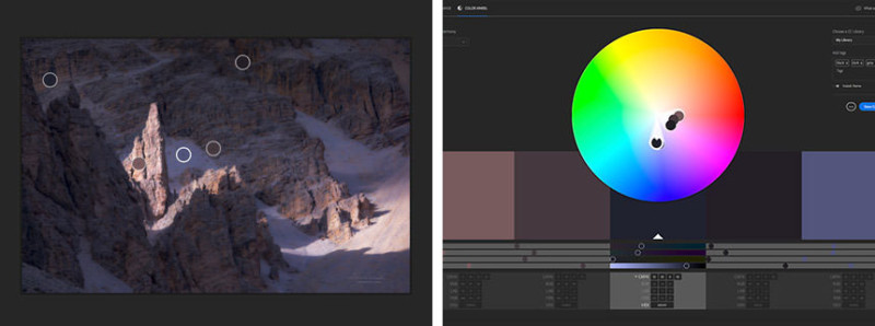
Keeping it Real: Editing Colors Selectively for Greater Naturalism
I had to target many separate regions of this image to even out the colors that were thrown off by tonal adjustments. The sky alone had five different small areas that became too unnatural in saturation or hue simply through a single adjustment to the entire sky, and each of those areas required its own targeting and special treatment to make it all hold together again.
In trying to accomplish any of the goals mentioned above, it is very possible that you will introduce colors that look unnatural or that exceed your personal threshold for stylization. Sometimes efforts to adjust one color will throw off others in the image, a common side effect of global adjustments. A palette that is highly stylized with unnatural colors can have a special sort of appeal to some viewers, but a single bizarre color within an otherwise natural landscape image will usually detract from the photo’s appeal. If your editing has caused a color to go rogue, then you will need to target it selectively for special treatment.
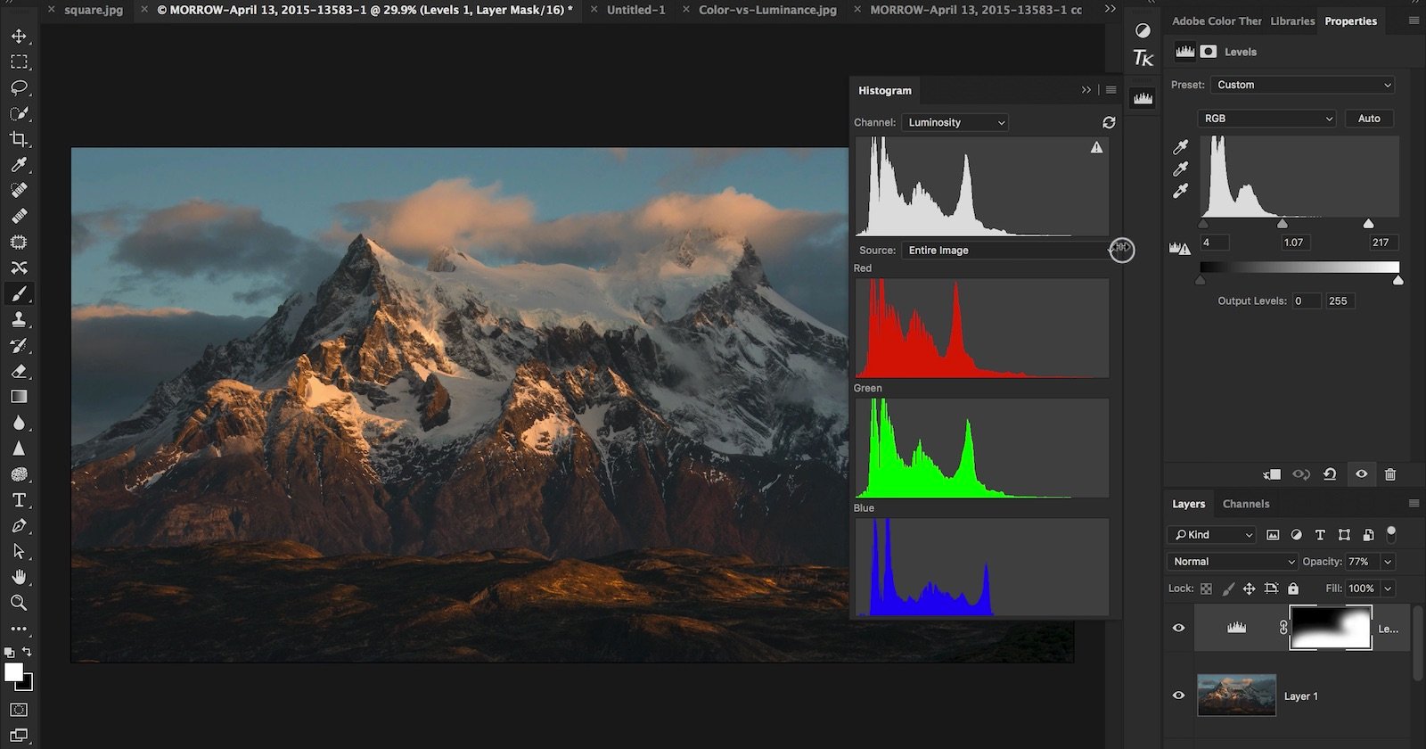
Processing Tips: There is a wide variety of options for editing colors selectively in Adobe Lightroom, Photoshop, or similar applications. Targeted masks in Photoshop provide the greatest amount of control, especially those based on color or luminance values in an image, such as luminosity masks. Regardless of whether or not you use masks, the following options are very useful for editing specific colors:
• The HSL panel (Adobe Camera Raw/Lightroom).
• A Selective Color adjustment layer (Photoshop).
• A Hue/Saturation adjustment layer set to a single color rather than the “Master” setting. (Photoshop).
• A Curves adjustment set to a single color channel rather than the composite channel (Lightroom and Photoshop).
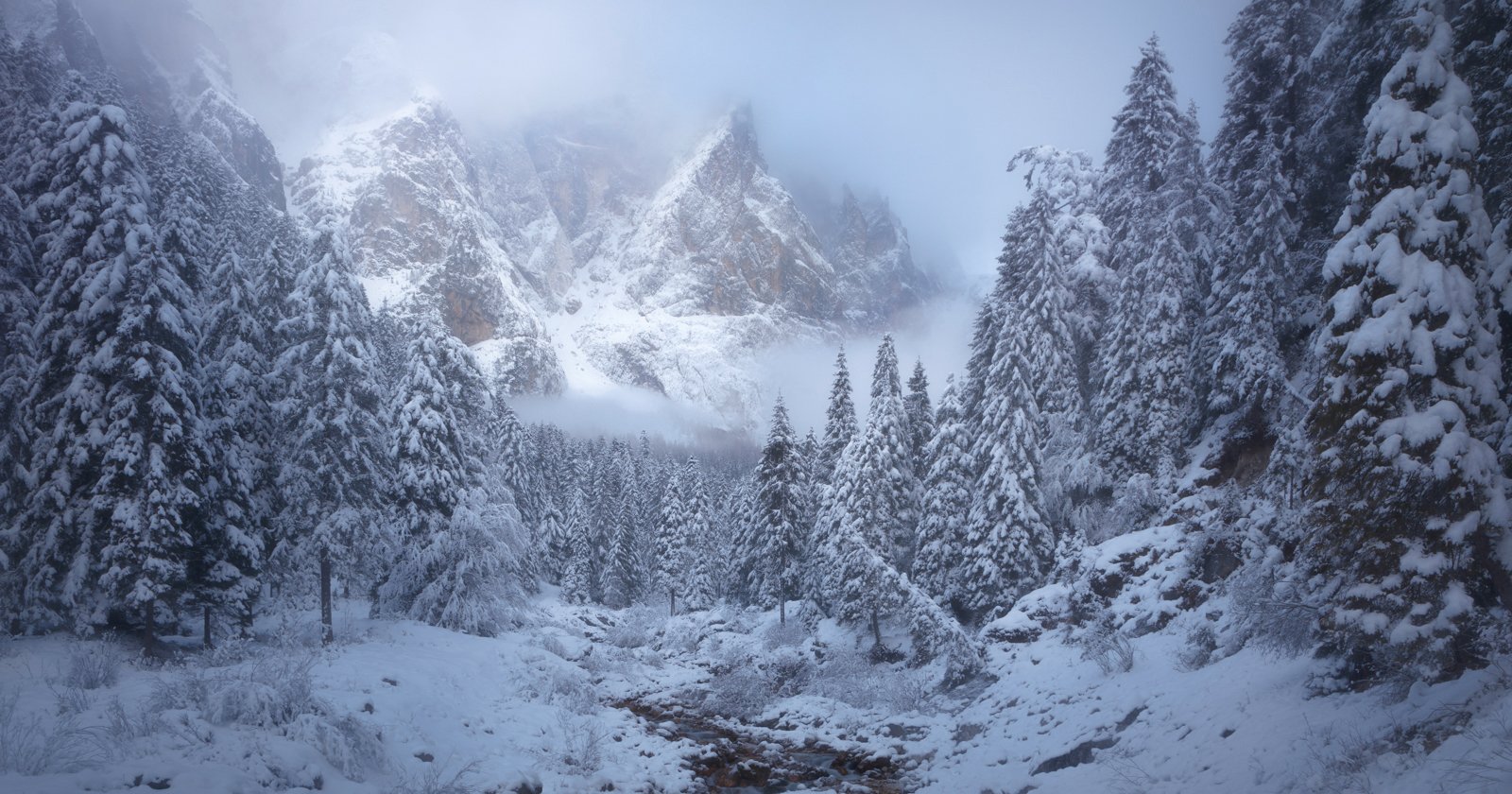
Easy Does it: Subduing Your Palette for Greater Subtlety
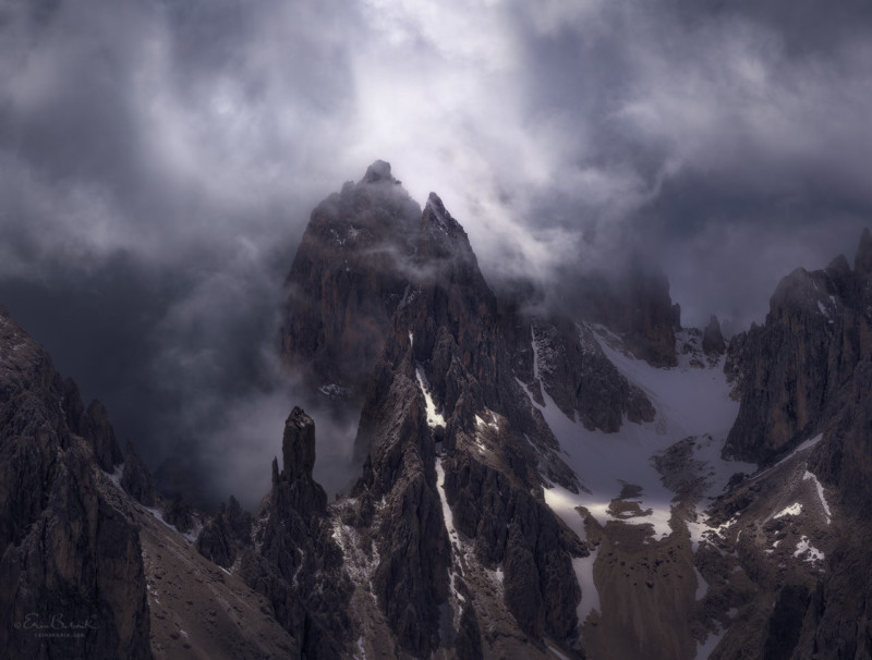
For this image, I used only enough color to convey the mood that I wanted because the impressive textures of atmosphere and rock would be drowned out if strong colors took over the frame.
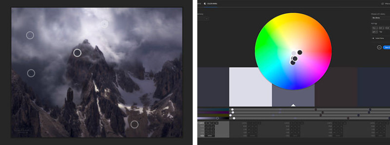
Saturated colors can overwhelm an image quite easily, thereby limiting the extent to which tones, textures, and delicate details might contribute to a photograph’s overall character. Keeping color saturation in check can allow the more subtle qualities of a photo to show their charms instead of being drowned out.
Processing Tips: Measure the most prominent colors of your image in any application that will allow you to sample a color and view it in a color picker that shows saturation values. If the sampled color is falling at the extreme end of the saturation scale, then it is a candidate for reduction, especially if the color has substantial coverage within the frame. Try reducing its saturation within the image and then wait a while to evaluate the new version with fresh eyes. Because our eyes tend to be very adaptive, they will desensitize quickly to the effects of high saturation, making it difficult to assess colors immediately after desaturating them.
Let ‘er Rip: When Color is Everything
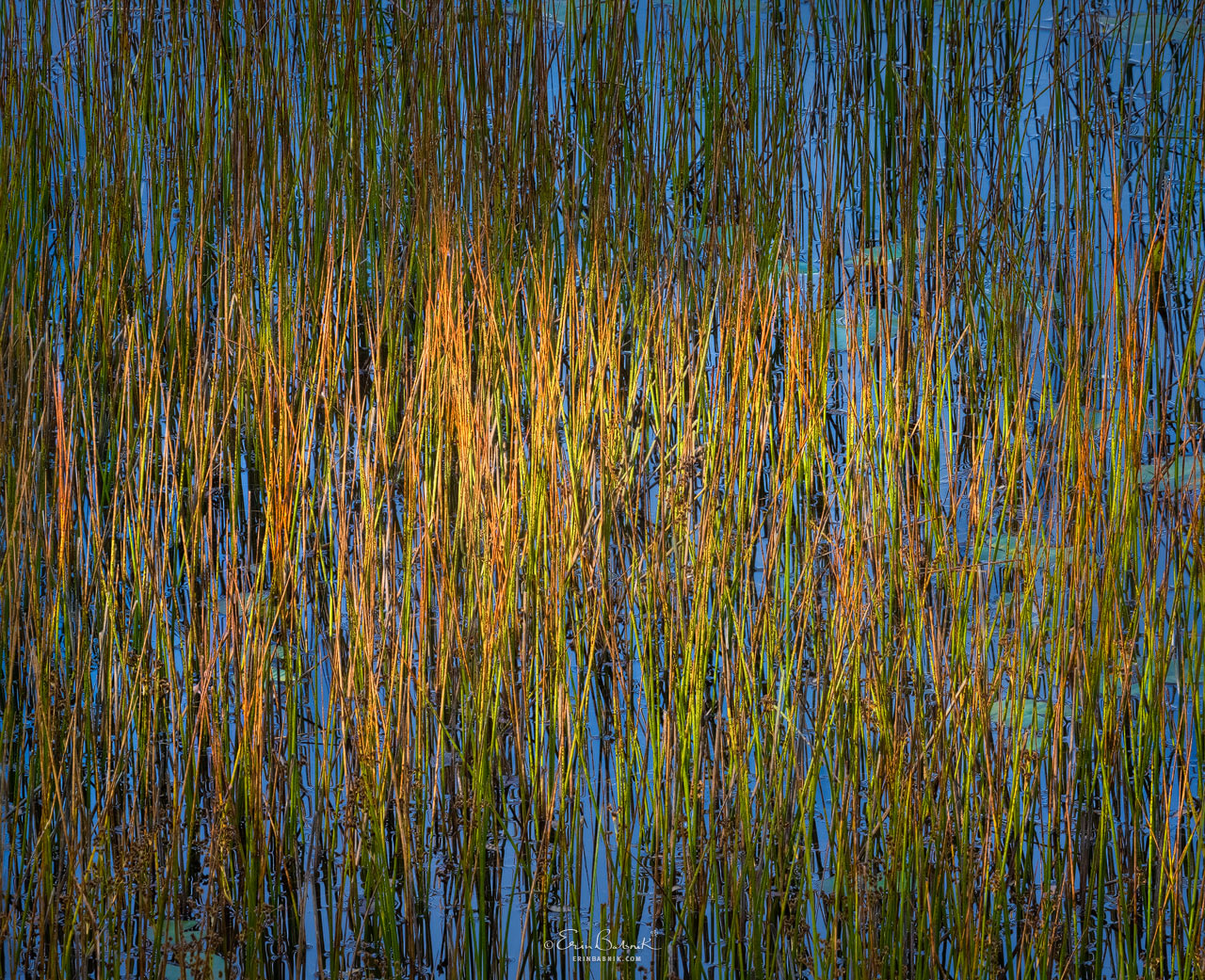
Dappled light on this pond caused the illuminated reeds to remind me of flames, and the vibrant colors made the whole image evoke the rough impasto of an expressionist painting. The image is all about color, and I therefore allowed the hues to have plenty of power.
Sometimes a photo is, above all, an expression of color rather than form. When removing all color would remove the very essence of a photograph, then it falls into this category. It is important to distinguish between using color as a crutch and using it to suggest ideas. Bold color that is introduced or pushed randomly often looks superficial and incongruous with its subject matter. Conversely, strong colors that are connected to an idea can be very engaging, even if they depart from naturalism. Abstract nature images are especially ‘flexible’ in this regard because sometimes a color treatment can have the charming effect of causing an abstract image to evoke a subject other than what it actually represents.
Processing Tips: Try converting your photo to black-and-white with whatever color filters best bring out its grand forms. If the converted version has lost all appeal without color, then ask yourself if its colors suggested an idea that is no longer coming through in black-and-white. How bold do the colors need to be in order to convey that idea? Is the photo still quite effective in black-and-white? If so, then bring back the colors only insofar as they aid the composition and add character; sometimes bold colors detract more than they add.
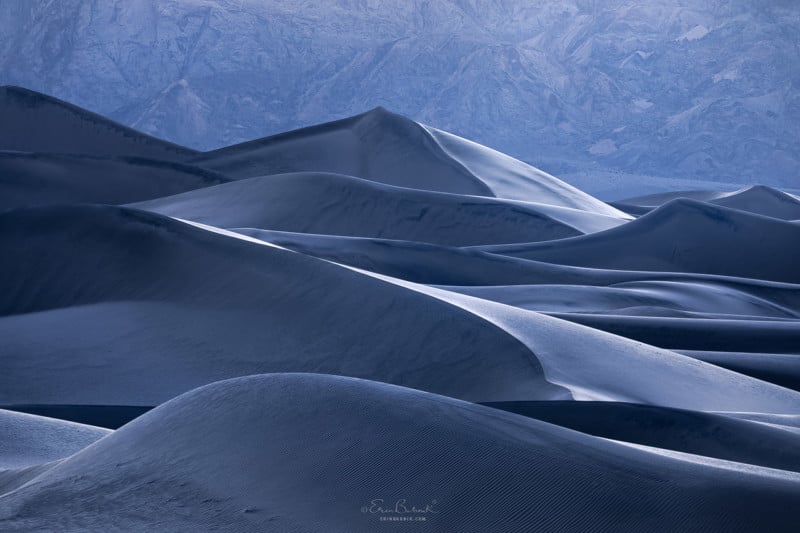
Push and Pull: Tinting Your Tones for Greater Depth
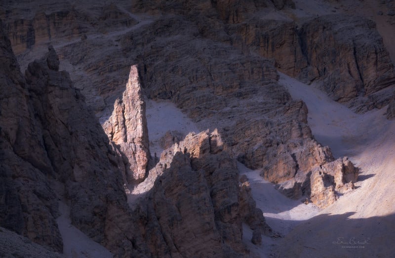
I gave the sunlit spire of rock in this scene better separation from the lighter tones in the background by tinting the less important areas with cool hues.
One of the simplest principles of color theory is the optical tendency of warm hues to advance and of cool hues to recede. This tendency is very similar to the effects of light and shadow in that the eye will be attracted to warm hues in the same way that it is attracted to light. Therefore, it is generally effective to use light and warmth for leading the eye, while using shadows and cool hues to ‘push back’ and obscure areas of lesser importance. Adding even slight hints of color to certain areas can dramatically affect their presence in a photograph, sometimes helping to counteract tonal values that are working against a particular creative goal. For example, tinting a bright area with a cool hue can sometimes help to subdue that area without sacrificing desirable tonal contrast.
More often than not, however, photos typically benefit from having cooler shadows and warmer highlights because these color separations further differentiate tones and create more depth. While some photographs lack impact because they are overloaded with color, others lack it because they do not have enough color complexity. Typical examples include scenes with a distinct color cast, highly atmospheric scenes, and environments with limited color variations.
Processing Tips: My own approach to tinting tones comes from my days as an oil painter, when I would mix a transparent glaze medium with oil paints and slowly build up semi-translucent layers of color until I had the effect that I desired. I still employ what is essentially the same method when I build up colors in Photoshop using layers and masks. My specific technique is a bit complex, but it takes me only about 15 minutes to demonstrate it in my workshops. Nonetheless, a full explanation would be an article in itself, so I will suffice it to say that it is essentially an advanced split-toning technique. Alternatives include:
• The Split-Toning feature of Adobe Camera Raw/Lightroom. This panel can achieve results similar to my technique when applied moderately.
• A Curves adjustment that targets specific tones within an individual color channel (Lightroom and Photoshop).
• A Selective Color adjustment layer set to target Whites with warmer shifts and to target Blacks with cooler ones (Photoshop).
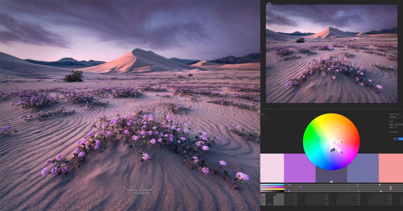
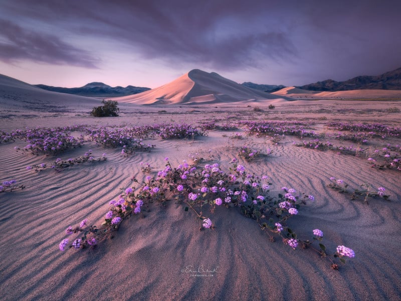
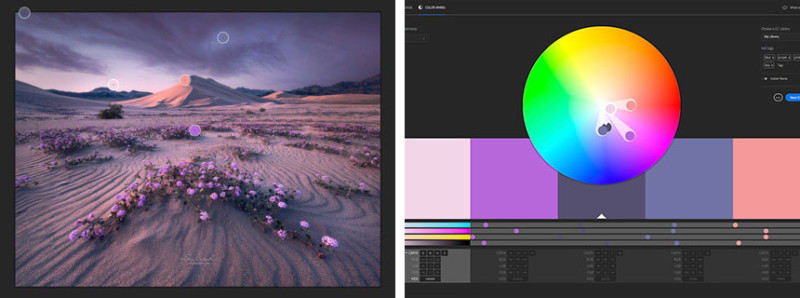
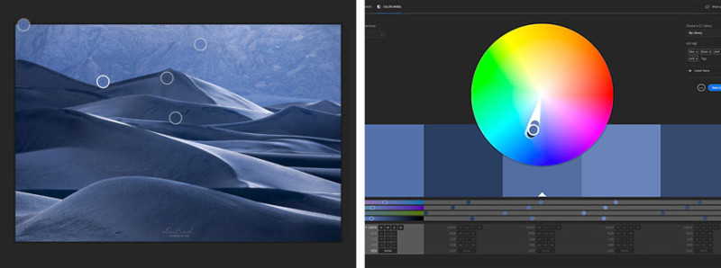
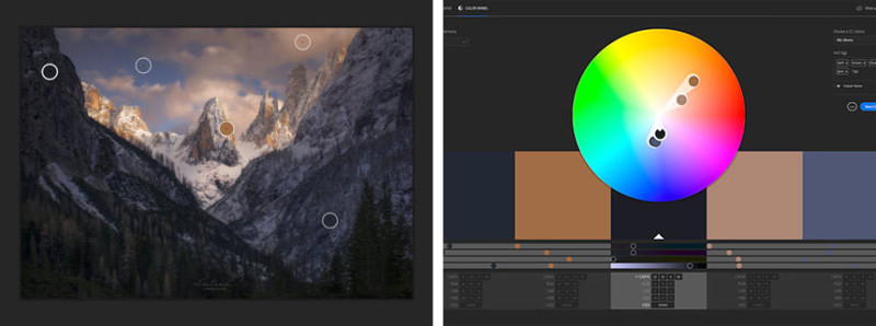
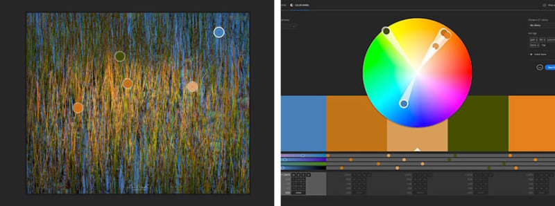
How to Get an Automated Analysis of Your Photo’s Color Palette
I first described this method in the December 2016 issue of my ThinkOutside Newsletter, and since then, Adobe has made slight changes to the layout of the online application called Adobe Color CC. The functionality of the application is still the same, however, and the palette analysis process remains quite simple. Here is how it works in a nutshell:
1. Open Adobe Color CC in your browser and click on the option to “Import Image”.

The application will default to finding a “Colorful” theme, placing five circles on the image that indicate a range of colors that appear in high quantities within the image.
2. If this initial selection leaves out some important colors, drag the circles to change the colors that they target. The selected colors should represent the range of hues that are distinctly different from each other, that cover a lot of area, or that are very vibrant. You want to target the dominant colors in your photograph, which are not necessarily the five that Adobe Color CC will first pick out. (If you feel as though you need more than five circles to cover all of your distinctly different colors, then your photo might benefit from some color reduction.)
3. Next click on the “Color Wheel” option. Now the same circled colors will appear mapped onto a color wheel showing their relation to each other in hue and saturation.
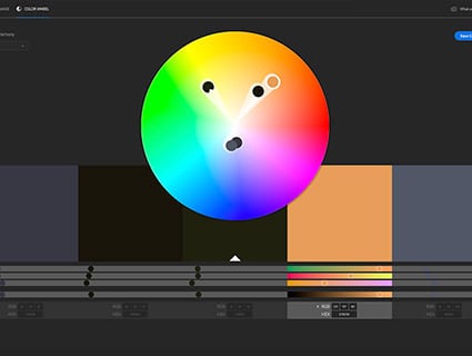
Colors near the outer edge of the wheel are more saturated, and these are the ones that you need to evaluate most carefully. What you will not see is how the colors differ in brightness, however. Keep in mind that any very saturated color will appear as a circle near the outer edge of the color wheel, even if it is very dark. Because dark colors will have relatively little ‘power’ in the overall palette of your image, they have to cover a lot of area to be of much concern.
4. Now evaluate the pattern formed by the circles on the wheel. Are the circles tightly grouped? Do they fall into a nearly straight line or a Y-shape? If there are any outlying circles, are they sampled from areas that are dark colors or that appear in small quantities of important areas? Ideally, you should be able to answer “yes” to these questions.
5. If your palette looks like it might be too scattered, try using the drop-down menu for “Change Color Harmony” at the left to force the circles into the absolute values for a particular color scheme.
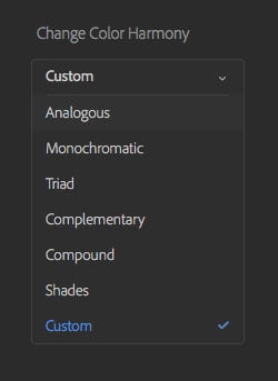
Find the scheme that produces the least amount of movement in the circles on the color wheel, and then see what you can do to edit your colors and shift them towards that palette.
I hope that you have found this article helpful.