Photos Contain ‘Layers of Mind’, Study Finds
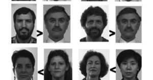
Photographs contain "layers of mind." That's according to a new study, which found that people are considered to be "less real" and have "less mind" when they're seen in photos of photos rather than photos themselves.