Are You Still Chasing ‘Perfect’ Color?

It’s my belief that color is actually one of the most subjective elements that we as humans all understand, yet we actually have no real way of enforcing or translating it to one another.

Maybe I could say the words ‘Deep Blood Red’. Now we’re getting closer to talking about the same color, but we’re still far from us both talking about the exact same color.

To be more precise then, I could use the term #b90012. This is the exact hex code for a color that’s part of an entirely fabricated language. With this new made-up language, we can now communicate exact colors to one another….. or can we?

The issue I have here is that you and I will see different versions of those reds. We’ll never know how different, but each individual human has their own understanding of color that is unique only to them.
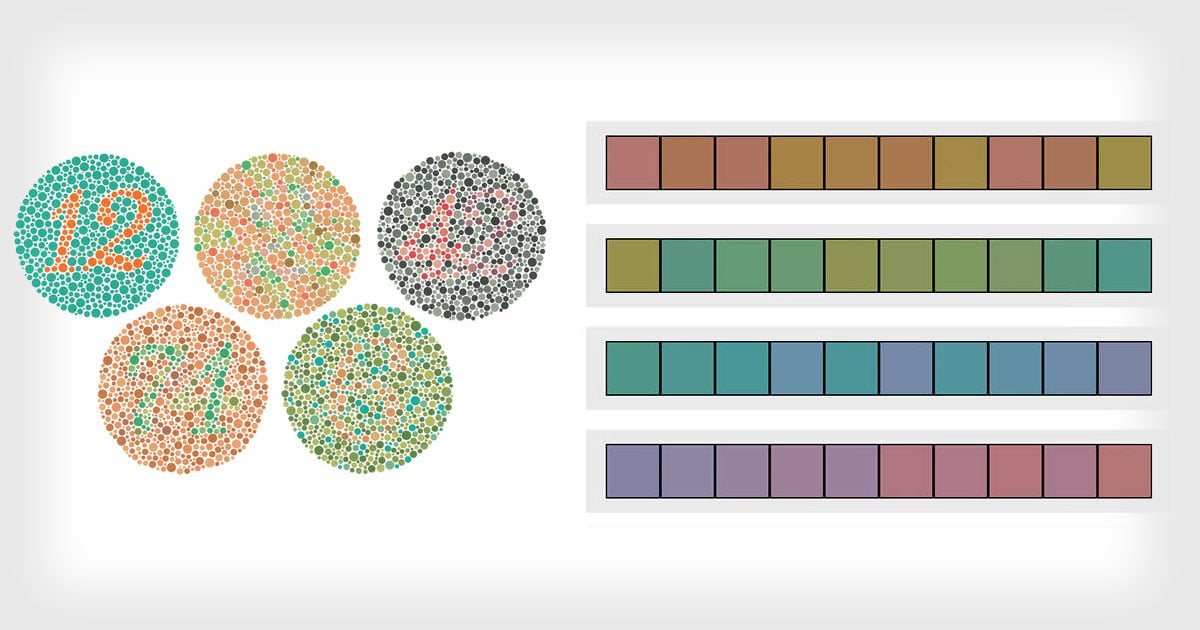
Remember, a colorblind person doesn’t know they’re colorblind until someone else tells them they are.
color is utterly subjective and ultimately relative to the individual and color only has relevance when we want to interact and communicate with one another.
I’ll bring you back to the language analogy from earlier. I could say the hex number b90012 to you in a northern Irish accent and you could say the same b900012 color in a south London accent. It’s the same color, but they’re still unique in a personal way to the individual. color is unique to you and your interpretation of it.
But So What?
This topic of defining color originally started rattling around in my head many years ago. What is this ‘accurate color’ our photographic industry keeps telling us we need to achieve?
We’re told that we should aspire to some predefined version of perfect color in our images, but I’m just gonna come out and say it, ‘this is a fool’s errand’.
Spoiler alert: Perfect color doesn’t exist!
It’s totally understandable for you to want to get accurate colors in your shots, but I would urge you to consider not only why you want them, but more importantly, what that looks like when you achieve it.
We’re told to ensure we use a grey card or even a color checker when we shoot. We’re told to check our white balance to ensure the most ‘natural’ tones. We’re told to constantly check the color calibration of our monitors and we’re told that we should edit our images in a color-neutral color space. Do all this and we’ll have ‘perfect color’ for sure, right?
Sadly no. Remember, perfect color simply doesn’t exist.

I’m sure I’ve already triggered a few of you and trust me, this is not my intention. My only goal with this article is to try and encourage you to relax a little when it comes to chasing this ‘perfect color’.
It’s my belief that this fool’s errand of chasing color accuracy is a recent phenomenon too, one that is likely perpetuated by commercial sales rather than a desire to hone our craft. You’ll no doubt have noticed that spending money is often the only sure-fire way to fix poor color and this doesn’t stop with grey cards, color checkers, monitor calibrators, and so on.
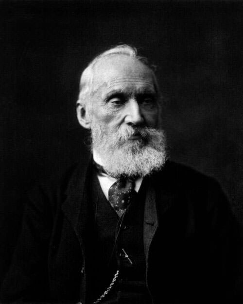
Baron Kelvin
So where do some of these illusions of perfect color come from?
One huge area we’re told to constantly monitor as photographers is white balance. White balance is adjusted within our cameras via Kelvin, but let me briefly introduce you to where Kelvin actually comes from.
Note: I’m going to give you some very broad strokes of Kelvin here. If you’re interested in the finer details, I’d urge you to research its history further.
In the mid-1800s, Scottish physicist William Thomson, 1st Baron Kelvin was the inventor of the Kelvin Scale.
The Kelvin scale was brought about as a thermodynamic scale as although you and I commonly use Celsius and Fahrenheit to measure temperature, physicists were after a temperature scale that didn’t have negative numbers. As you know, both Celsius and Fahrenheit have minus values and negatives play havoc with math, so Baron Kelvin brought about the Kelvin scale that started at absolute zero and worked its way up from there (absolute zero is the absence of all heat at -275.150 Celsius and therefore the true baseline for all temperature).
Temperature of Light
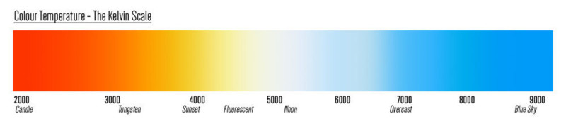
Here is where Kelvin dips its toe into the photography world as we use the temperature of light in our cameras to record the world around us, but what does Kelvin have to do with it? You’re probably very familiar with the image below, but if not, the spectrum of color shown is the Kelvin scale as we know it in relation to white balance. On the left, we have the very warm color of a candle, and on the right, we have the cool color of blue sky.
Kelvin has Nothing to do with Photography
But what do those pretty colors relate to? Well, Baron Kelvin came up with this scale by simply burning a block of carbon! You see at the lower temperatures, carbon glows orange, and then as the temperature increases, the carbon glows a whitish color and then ultimately blue.
Kelvin really has nothing to do with photography and we stole the thermodynamic Kelvin scale for ourselves.
Well, we almost stole it. In fact William Thomson, 1st Baron Kelvin was recruited around 1899 by George Eastman to serve as vice-chairman of the board of the British company Kodak Limited, affiliated with Eastman Kodak. The rest is history, but this is how we now have a thermodynamic scale as a way of measuring color temperature in our images today. It was certainly never developed for us and it’s far from accurate in any sense of the word. Don’t believe me? Read on.
Kelvin is Not a Universal Scale
My aim with this article is to try and highlight some of the difficulties in trying to achieve ‘perfect’ color. We’re often told by YouTubers and photography brands that white balance is key to accurate color, well I’m here to show you that although this is somewhat true in theory, the reality is very different.
What do I mean by this? Take any other scale or measurement, let’s say 10Kg or 32 degrees Celsius for example. You and I are talking the same language and we know exactly what that means to each other. Now let’s take the Kelvin (or color temperature) value for sunlight or tungsten, hell why not flash photography too. What values do we say to one another?
Not sure? Well, you’re not alone because below is what two of the world’s largest camera manufactures say to one another about Kelvin…
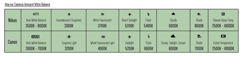
If unsure of what you’re looking at, the above diagram shows you what Canon and Nikon cameras have set as part of their white balance presets. So for example; if you set your Nikon camera to the Tungsten white balance preset, it’ll set your cameras Kelvin value to 3000K. But if you do the same on a Canon camera, your camera will be set to 3200K.
In fact looking at this, apart from daylight and a cloudy day, two of the largest camera manufacturers in the world don’t agree on any of the other Kelvin settings for any other lighting conditions.
My point here is not to say that Canon or Nikon is right or wrong, but it goes a long way to proving my point that the Kelvin scale is a shoehorned way of measuring color that has no right or wrong. You’d simply be a fool for trying to achieve perfect color with this method.
Where Does this Leave Us?
At the start of this article, I discussed a fairly philosophical and abstract version of understanding color. Our eyes change as we get older and we see the world in hues of blue as babies and then in far warmer tones as we get older. Your eyes and perception of color are unique to you thanks to other factors like semiotics and personal experiences, but color is also arbitrary when it comes to elements like white balance and Kelvin too.
Look at the three portrait crops below. They are all taken on the same day and of the same model, but look at the individual Kelvin values for each of them. Yes I am using gels and this is obviously an extreme example, but had I been playing by the rules, I would have set my Nikon camera to 5400K as I was using flash lighting in my shots. Never be afraid to play with color in your images and that can often start with the white balance and Kelvin adjustment.
Remember: there is no ‘correct’ white balance.

Don’t get me wrong, we all want to improve color in our photography and although this topic of what defines ‘better’ color is a subject for another day, there are certainly rules that you can follow which will allow you to achieve cleaner colors at least.
But what if you couldn’t see color?
Not too long ago I had the pleasure of interviewing and discussing this idea of ‘accurate’ colors with Indianapolis photographer Bradley Michael. Bradley took beautifully color balanced photos, even though he was completely color blind.
And by completely colorblind, I mean Bradley Michael sees in black and white!

Take a look at Bradley’s work for yourself and considering that Bradley sees in black and white, his color work is phenomenal. The rest of us have no excuses when it comes to sloppy color balancing by comparison.
How Does Bradley See in ‘Perfect’ Color?
For his explanation in his own words, by all means, check the full interview on our Podalamania Podcast (it’s episode 6), but in short, Bradley uses the Photoshop color picker to read off the RGB number values. If he sees a skin tone has too much green in the G value, he adjusts the color accordingly until he gets the value he knows from experience to be ‘correct’. Of course, that ‘experience’ is derived from other people advising him on what looks good, so even Bradley is beholden to other people’s perception of ‘accurate’ color.
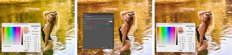
What I find most fascinating about Bradley’s way of working is his ability to color tone like this. Look at one of Bradley’s recent images above. On the right is the final coloring that he’s chosen and shared (Note: I’ve only posted the exaggerated left-hand green image for illustration purposes). Now, this isn’t “accurate” color, but it’s a beautifully ‘warm’ rendition of what the scene actually looked like. Bradley isn’t going for accuracy here, he’s going for what he knows the mood of the image calls for.
It’s not about achieving perfect color. In fact, it’s not even about achieving accurate color. It’s about what looks best for the final image.
If you’d like to see more of Bradley’s work then you can find his Instagram here.
Closing Thoughts
So I appreciate that this article has been a little conjectural and not specifically grounded in tangible dos and don’ts, but I did want it to at least get you to stop and think about your way of processing color.
Yes, color is extremely important in imagery and it plays a fundamental role in how your images are perceived. But what I want you to take away from this is the understanding that color is used in photography to tell a story and I want you to use your personal judgment a little more when it comes to choosing that final color.
Don’t get too bogged down by the grey card and color calibration crap. Yes, you can use the grey card if you like and yes, you can calibrate your screen. But, just as you wouldn’t buy a brand new car and take it straight to the mechanic, go easy on fussing over what that screen calibrator is telling you. You’ve spent a ton of money on a decent monitor, its probably pretty damn good out of the box.
Of course there will be times to calibrate all of this, but that is usually only applicable when you have complete control of the process. For example, printing from home. Yes, you will need to calibrate your monitor and your printer so that they are speaking the same color language. Doing so will always produce better results.
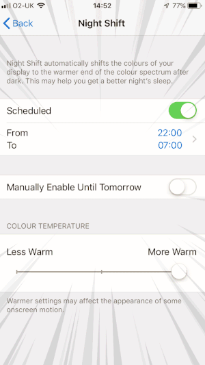
But, don’t waste time micromanaging individual Kelvins in a shot when some heathen, barbarian monkey-banger is going to look at your shots with the damn Night Shift function enabled!!!

So instead of banging your head against the wall whilst chasing that ever-elusive ‘perfect’ color, instead, start building a personal perception of color.
You can start by having a little more faith in what you believe to be the best color for the image in front of you, not what’s perfect or even accurate according to a machine.
I promise you, apart from a few niche areas of photography like product shots for catalogs, for example, perfect color is far less important than you might think. In fact with portraits and fashion, so much is about selling a feeling or a lifestyle, not reality.
It’s with this in mind that we can relax our preconceived ideas of what color should look like from a physicist’s point of view, and instead concentrate on what color should look like from an artist’s point of view.
About the author: Jake Hicks is an editorial and fashion photographer based in Reading, UK. He specializes in keeping the skill in the camera and not just on the screen. If you’d like to learn more about his incredibly popular gelled lighting and post-pro techniques, visit this link for more info. You can find more of his work and writing on his website, Facebook, 500px, Instagram, Twitter, and Flickr. This article was also published here.