500px Rebrands and Replaces Its 6-Year-Old Logo

500px today unveiled its first major company rebrand since the photo-sharing service was born back in 2009. As part of the move, 500px has introduced a “bold new logo for an evolving community.”

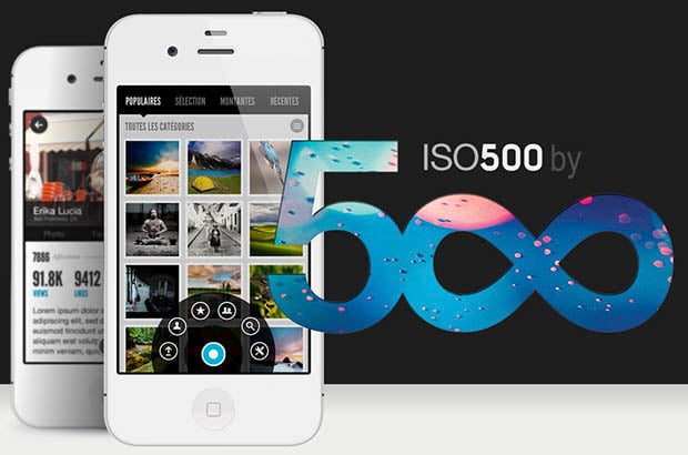
“The 5-infinity symbol has been around as long as 500px itself, but there was no story behind it, no real reason why we picked it, and no part of the 500px culture and vision baked into this representation of our brand,” the company says.
So, 500px has spent the last several months creating its new logo and image. What they came up with is “a brand identity that can continue to grow and evolve” as the company does:

The company also introduce a new “fingerprint” mark that will be used for branding:

One reason for the new logo is the fact that the old one didn’t communicate the company name (i.e. “500px”) — it was just a 500 with the zeros turned into an infinity symbol. Having a new mark will also allow 500px to represent its brand across various platforms without being restricted by space constraints.
Internet communities often resist big changes, but from the few comments in the official announcement so far, it seems people aren’t very enthusiastic about the branding shift. “It’s a shame,” writes one commenter. Another says: “Looks like an amateur did the logo.”
But it seems the change was important for the decision-makers at 500px. “Both the logotype and mark convey the attributes of quality, authenticity, and personal expression that define the 500px community, with the photographer at the center of everything we do,” the company says.