Canon Should Revisit Novel Touch Controls, and Here’s How
The maligned Multifunction Touch Bar, commonly called the “Touch Bar,” on the original Canon EOS R mirrorless camera is an excellent example of what happens when interesting, even good, ideas try to do too much. However, it’s time for Canon to revisit the Touch Bar, or at least the underlying concept of expanded touch on modern mirrorless cameras. Technology is better now, lessons have been learned, and there is still room for improvement in camera ergonomics.
Touch Controls Are Difficult, but Not Impossible, to Nail
Touch-sensitive camera controls are undeniably difficult to execute. The Canon EOS R is far from the only camera to try touch controls and come up short. Early touchscreens on cameras were routinely terrible to use, being either too sensitive or not sensitive enough, lacking precise control, and working alongside user interfaces and menu systems that were not designed for touch at all. For a while, touchscreens were forced into cameras, and photographers paid the price. I can’t tell you how many times I’ve cursed a touchscreen because it either registered accidental touches or refused to accept intentional ones.
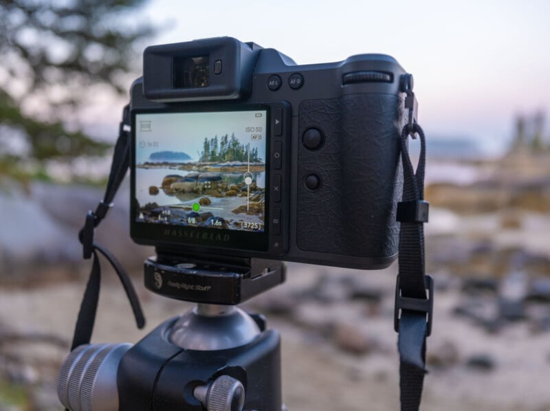
Even though camera menus have gotten better for touch, I don’t think anyone has fully nailed touchscreen menus — except Hasselblad. Even Hasselblad eventually added an autofocus joystick to its latest X2D II 100C because even with its incredible touch-based user interface, Hasselblad had to accept that touch is not always the best control input for everything.
Why the EOS R’s Touch Bar Missed the Mark
I think therein lies the biggest issue with the EOS R’s Touch Bar. It was not meant to complement established control inputs but to outright replace them, and that’s invariably a mistake when designing a new camera.
Good camera design and ergonomics are vital to the overall photographic experience, and any time the camera’s controls don’t work as expected or get in the way of taking pictures, it’s a massive issue. This is especially problematic when a control input bucks existing trends, making any challenges all the more noticeable.
Instead of a dedicated ISO button, a standard button on high-end Canon cameras, the EOS R forced photographers to use the Touch Bar to control ISO and other essential functions. If the Touch Bar worked well, that would not necessarily be an issue. But it didn’t.
When I reviewed the Canon EOS R for Imaging Resource back in 2018, I concluded that the Touch Bar, while unique and fairly customizable, proved awkward to use.
“To avoid accidental touches, you have to hold your finger on the Touch Bar to ‘unlock’ it, which is frustrating and slows you down in the field,” I wrote in 2018. “But if you disable this ‘lock,’ it is indeed very easy to accidentally touch the bar, which also isn’t great.” The lock function required you to hold the bar for two seconds, by the way, which is an eternity when you’re trying to change ISO.
“We wish Canon had instead simply added a couple of customizable Function buttons there and perhaps a joystick-style control on the back for added operability,” I concluded.
PetaPixel editor-in-chief, Jaron Schneider, who was with me at Imaging Resource back in 2018, describes the Touch Bar as a poor imitation of traditional camera controls.
“It’s imprecise and worse than a tactile dial in every way. It’s peak ‘solution in search of a problem.’ What we had before was superior and the Touch Bar made it actively harder to use the camera,” Schneider says.
“If a heavily touted new feature is at its best when it’s at least partially disabled, that’s a problem,” he adds.
It’s Okay to Take Risks Even Though They Sometimes Fail
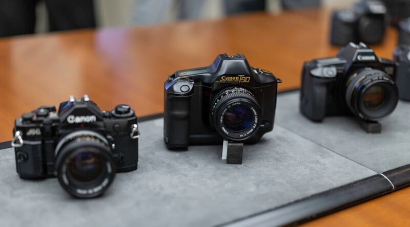
When I was at Canon HQ in Tokyo in September, the old M-Fn Bar came up in conversation with Canon’s design team. The general sentiment was that, even though it wasn’t well received, Canon won’t refuse to try something just because it is different or risky. I admire that principle.
I also got the impression that Canon was disappointed with how poorly many of the EOS R’s design changes, including the Touch Bar, were received. Even though some of the EOS R’s design choices were not good, they were the result of significant time, care, and consideration. It was not like Canon set out to make a camera anyone would dislike using. The company wanted to do something fresh and push camera controls forward.
Although Canon would hesitate to say so, I think the almost universally negative response to the EOS R’s user interface resulted in subsequent EOS R-series cameras returning nearly wholesale to more traditional Canon design philosophies. That isn’t to say the criticisms levied against the EOS R’s design were unwarranted, but some ideas that could have benefited from further revisions were discarded prematurely. The team’s desire to innovate deserves praise, and I wish that drive had survived a few the EOS R’s design missteps.
Autofocus Area Control: How Touch Could Come Back and Actually Be Useful
Further, despite how much I disliked the Touch Bar in its first and thus far only implementation, it is high time for Canon to revisit the underlying concept, albeit with significantly different goals than before.
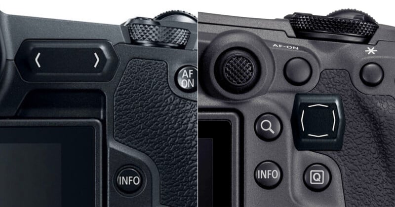
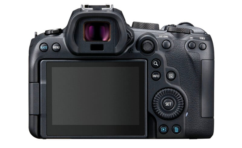
If Canon ever wants to try the M-Fn Bar concept again, it must avoid some major, familiar pitfalls. The most important of which is that a Touch Bar cannot outright replace essential camera controls. The Touch Bar should not be a camera’s fastest way to adjust ISO, for example. It was a bad idea in 2018, and it remains so now. Touch controls are not as precise as dials, so a Touch Bar should not be the primary means of adjusting camera settings that have discrete steps. Tried-and-true control methods for basic functions work. There is no need to try to reinvent the wheel.
Instead of a multi-purpose command dial, autofocus area control is an avenue where touch can meaningfully improve the photographic experience.
Touch-based autofocus control is already a thing, but it is rarely useful when actively shooting because it is relegated to the camera’s rear display. When on a tripod, it’s nice to be able to tap the screen to focus on what I want. That’s fine. But when I’m shooting through the viewfinder, the screen is basically useless.
Some cameras have experimented with “touch pad” areas on the screen, typically in the top-right corner, where photographers can move their thumb over a small section of the screen to quickly move the focus area around the image.
It can work, but there are issues with this. It means moving your thumb into an awkward position, quite far from other essential camera controls. It also means putting your thumb between the camera and your cheek. It’s not the most comfortable thing to do.
There is also no immediate tactile feedback, which makes it difficult to know exactly where you are on the image and when you have strayed too far. Yes, the autofocus point’s movement tells you something, but it should be even more immediate. The feedback loop is too slow.
Haptics Solve the Feedback Problem
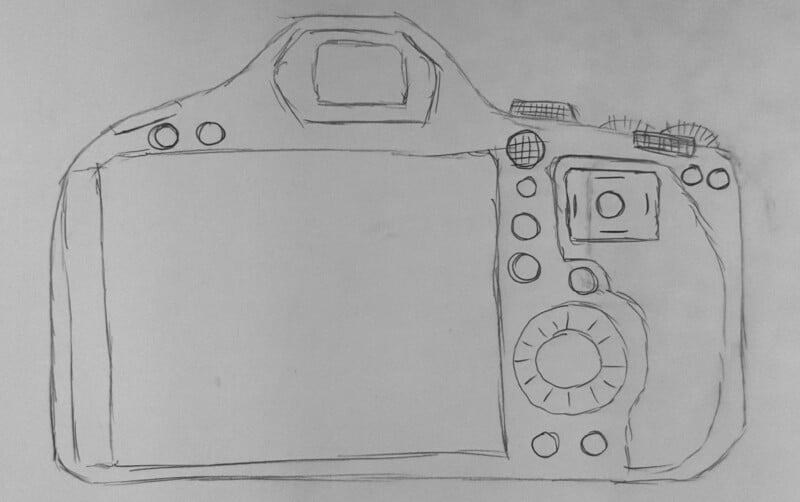
What I’m proposing instead is a small rectangular (3:2) touchpad area next to a dedicated sub-selector joystick that provides direct, 1:1 control over the focus area relative to the image sensor. To ensure it has sufficient feedback, the edges of this rectangle should be pronounced so you can immediately feel where you are on the surface, and, better still, the touch area should provide haptic feedback.
Touch technology has come a long way since the EOS R’s M-Fn bar arrived to disdain in 2018. There’s no reason why a touch-sensitive surface on a new camera in 2026 and beyond couldn’t feature force touch like an iPhone or haptic feedback like the X2D II 100C’s buttons. The touch surface could vibrate slightly when focus is acquired and support gestures like a “button” press to reset the focus or select a subject for tracking, fast directional swiping to change autofocus area modes, or slower swipes to swap between different tracked subjects.

By the way, with pronounced feedback, the touch area could also morph to support other aspect ratios, like 16:9 for video or creative crops like 1:1. The area should match the image sensor, but the usable area at any one time can be enforced through feedback along the “edges.”
I hate when cameras lack an autofocus selector joystick because it’s more useful than the current alternatives — four-way directional pads are awful — but I don’t find it all that fast to move the autofocus area around using a joystick, especially on modern cameras with hundreds of different autofocus areas covering essentially the entire image sensor. A purpose-built touch-sensitive surface could be faster and more versatile if done well. Keep that autofocus joystick, too, though. Just in case.
Image credits: Camera product shots by Canon