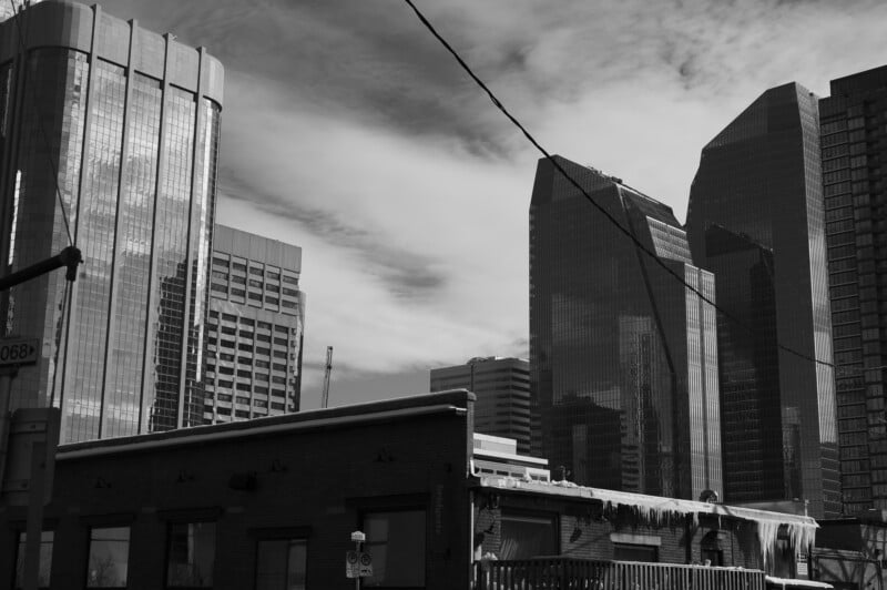
Testing Which Camera Has the Best Black and White JPEG Profile
I love the beauty and simplicity of black-and-white photography, and there’s little process simpler than setting a camera to your preferred black-and-white mode and running wild with straight-of-the-camera JPEG files. But not all black-and-white picture profiles are equal, so which is the best?
My photographic journey began in the dark room, developing my film and making prints. Nowadays, chemicals have given way to RAW files in Photoshop, and I digitally make all my contrast and tonality adjustments. Most of us prefer the versatility of shooting RAW color files and converting to black-and-white, but two things occurred to me. Not everyone knows or wants to do significant editing to their files. As a camera reviewer, I’m always curious to see what the manufacturers choose to do to the overall look of their images. I wanted to know, for my own curiosity, as much as anything else, what the manufacturer’s black-and-white profiles look like when compared to each other.
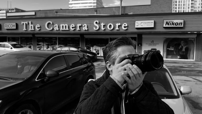
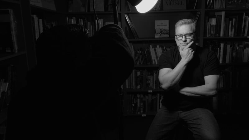
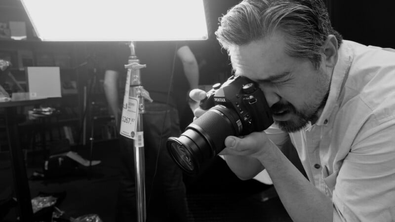
So, this was the impetus for a grand experiment. I would shoot three different and repeatable scenes: a high-contrast sunlit outdoor scene, a low-contrast tonally rich scene, and a portrait. I’d shoot each camera’s default monochromatic black-and-white profile and an additional unique profile if present. I’d equalize the exposures as much as possible in-camera and account for different sensor sizes and depth of field.
The goal was to get a good feel for the different tonal ranges and overall looks of each camera rather than some precise scientific equivalency. This is art, after all.
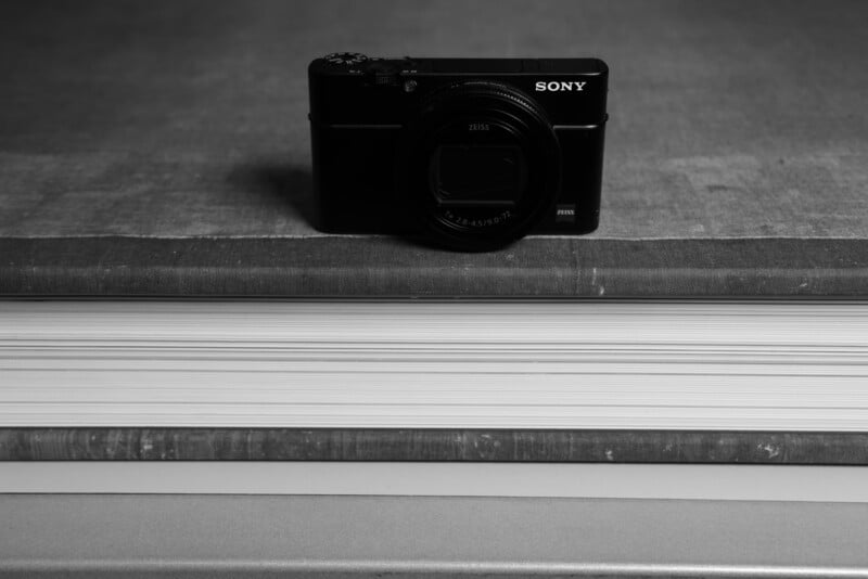
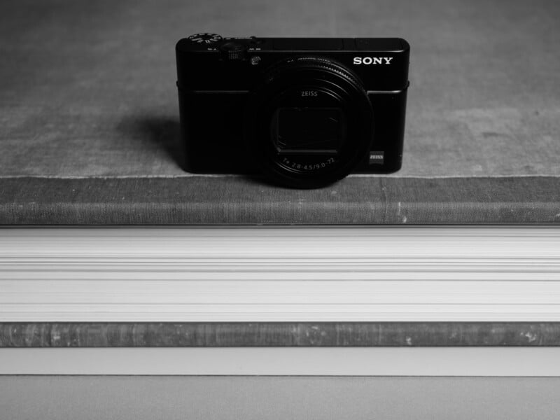
I was also torn about throwing specific monochromatic camera versions into the mix. Cameras such as the Pentax K3 III Monochrome and Leica M11 Monochrom would have been exciting but the list of cameras was already excessive, and I wanted to stick to the profiles that the vast majority of people would be using day to day. I tried to include all the major players and stick to models with the latest profiles. The list was vast: Sony, Nikon, Canon, Pentax, OM System, Panasonic, Fujifilm, and Leica.
Contrast Is Key
I’d like to preface my findings by stating that you should check out the video we made to get the most information possible. However, I can state that a few clear patterns arose from our tests. First, I found that their differences are relatively minor when a company offers multiple black-and-white profiles.
Fujifilm is a good example of this. Its standard monochrome and Acros profiles have similar tonality, with Acros offering slightly less contrast and adding an organic-looking film grain to the images. The differences are subtle.
The difference between the standard Panasonic profile and its “Leica” profile was a little more distinct, with the Leica look being very close to what Leica delivers and the standard profile being far less stylized.
Secondly, I found that the manufacturers tend to fall into three main overall looks, largely concerning how they treat the mid-tones. Everyone wants a fairly dramatic-looking contrast with bright whites and dark blacks, but where they choose to place mid-tones greatly impacts the look overall. Brighter mid-tones make the image look vivid and bright but with a flatter overall curve. Most companies, though, went with darker mid-tones, which add a lot of drama and, when coupled with crushed black tones, can look downright aggressive.
There is no right or wrong answer but I admit that my style of editing — and I’m sure the majority of others — tends to go towards the darker mid-tones kind of look. But let’s start with the manufacturers that prefer a brighter overall look first.
The Brighter, the Better
OM System goes towards lots of greys and pushed-up highlights, creating a natural and cheerful tone. The overall look has an unprocessed feel with the OM-1 camera, almost like you simply desaturated a color image. The shadows are still deep and rich, but I feel most users will want to deepen the contrast, which you don’t want to do with JPEG files. Skin tones and middle greys look very flat and lack much separation. I think most people will want to shoot RAW files with the OM cameras and edit them in post.


Pentax also chooses to go with a brighter approach to the mid-tones but the Pentax K3 III does keep highlights bright and shadows dark with better separation between the greys compared to OM System. Skin tones have plenty of tonal range, and I think many users will be very happy with how Pentax cameras create black-and-white images. Dark and moody isn’t always the best approach and Pentax does the brighter look very well.


The Goldilocks Zone
The Canon EOS R5 has a beautifully balanced black-and-white profile with deep, rich dark tones and a middle-of-the-road approach to grey tones. I liked the general purpose nature of Canon’s profile, with good separation of the black tonality, like David’s t-shirt being distinct from the shadows in the background. Brighter skin tones are rendered nicely, and yet the overall drama is still present.


The Panasonic G9 II also prefers a balanced approach, with a rendering of the outdoor scene that is very similar to Pentax but with slightly edgier mid-tones. Shadows move towards the darker side, and skin tones are handled authentically. I also tested the “Leica” profile, which closely mimics the Leica cameras. The stark clarity in the highlights is very apparent, and the mid-tones are even darker. I like the “Leica” profile when I want a more serious, punchy look, and it’s nice to have the standard profile when you want something a little more middle-of-the-road.


Fujifilm has long been famous for its film simulation modes and is arguably the most used camera system for shooting JPEGs in these modes without resorting to Raw files. I went with the XT-5 as the body for our tests. The standard monochrome profile is one of my favorites because it strikes a great balance between punchiness and tonality. The overall tonality is pleasing, with just enough of a pull-down in the mid-tones to provide some edge, but with silky grey tones and lovely skin tones, too. Shadows are rich with plenty of detail retained.
The Acros profile is designed to mimic a famous 100 ISO film stock from Fujifilm and offers less contrast than the standard profile. This is a lovely choice for many scenes and works great for most portraits. Acros also digitally adds a subtle but very natural-looking grain structure to the images, which further endears the profile to many photographers. I prefer the standard profile in most situations, but I can also see why Fujifilm gets so much credit for its film simulation modes.


Deep and Dramatic
The Nikon Z8 has a dramatic black-and-white tonality with subdued highlights, pulled-down mid-tones, and inky black shadows. This gives immediate strength to the Nikon images and has a very eye-catching look. Even lower contrast situations have punch and depth, and the final look is very close to how I usually finish black-and-white images in post.


The Leica M11 also uses deep black tones and lots of contrast. However, the way the tones are handled is subtle and nuanced. Blacks are deep without being lost, and there is a glorious handling of brighter tones with lots of contrast applied between bright areas. This gives a rich and dramatic look but with vibrant highlights and eye-catching clarity to the images.
Skin tones are gorgeous, and how Leica handles the grey tones is masterful, although the final look can border on the muddy side. The effect can be a little stylized for some people’s liking, but it is no wonder Leica’s black-and-white images are a fan favorite. I also tried out the Leica Hi-Contrast profile, and the difference is minor. Slightly more contrast is applied, but I would stick to the standard profile as it already has plenty of oomph.


The Sony a7R V is a personal favorite camera of mine, but the black-and-white mode might be too dramatic, even for me. The overall look is similar to what Nikon and Leica do, but the shadows are almost black. This extra drama might be a stylistic choice that you prefer, but the blacks are intense, whether you like them or not. In Dave’s portrait, you can see his shirt is hopelessly lost against the background. It’s not an issue for a RAW file, but it’s too dark if you are shooting JPEGs. Still, the skin tones look great, and I like how Sony treats the highlights and midtones in general.


An Enlightening Experiment
I was surprised to see how much variation was present from profile to profile. I assumed most companies would take a very balanced, similar approach, yet every manufacturer seems to have a clear and unique approach to the final look of their images.
Certainly, if you are going to do your own conversions from color images, the results of this experiment are largely moot. However, if you want to get quick black-and-white images straight out of the camera, I hope this experiment provides some clarity about the final monochromatic look of your favorite camera.