Make Your Photos Look 3D with Dodge and Burn in Capture One 23
One of the challenges of photographing landscapes is creating images that reflect the right amount of depth and dimension. But sometimes it seems no matter how hard you try and how often you hear well-meaning advice from other photographers, the photos you take almost always come out darn flat.
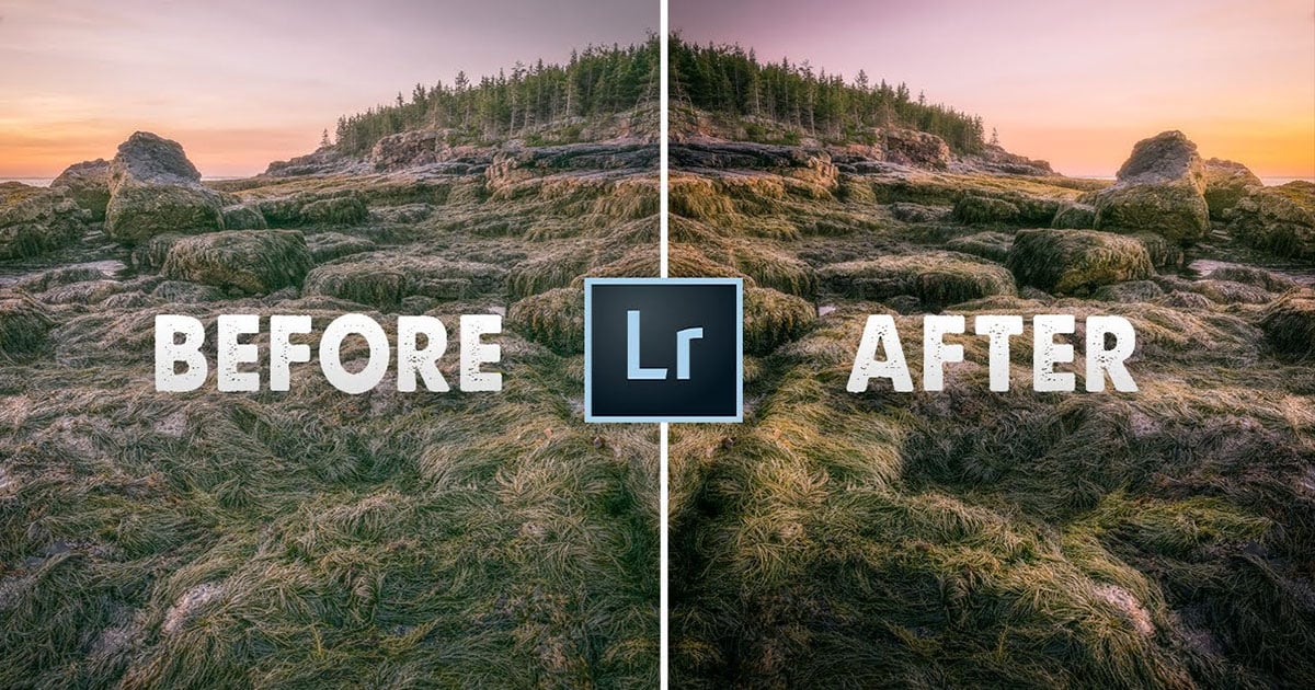
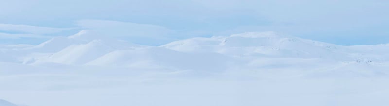
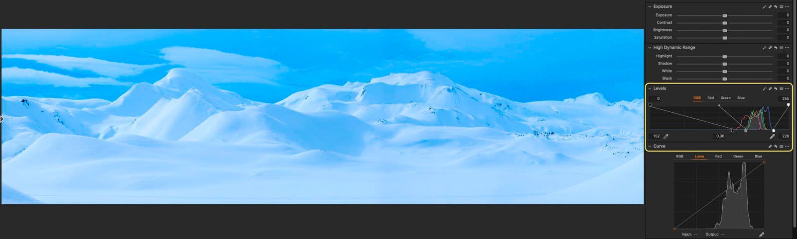
We’re going to transform this original pano shot…
…into this final image.

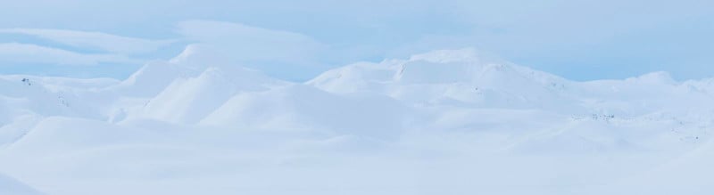
Here we have a pano shot from the Icelandic highlands made of ix horizontal images taken with the telephoto lens. An astonishing landscape that I witnessed last year during my winter workshop there.
The snow is great at filling in shadow areas by bouncing sunlight like a giant reflector and making shadows less intense. However, for this type of scenario, the contrast, sometimes, is too low and the image lacks the beautiful depth I recalled when I captured the scene.
For this scene, what we want to do is to introduce more contrast to make the snow more intense and give the image more character and oomph.
We can use different methods, such as increasing the contrast by using the contrast slider, but quite often this control is not very effective and it doesn’t make any significant difference.
Alternatively, we can work with the Levels, or the Curve tool to bring out the details and increase the dynamic range of the image. But all these methods are global and not local.
We need a different method that is more flexible, precise, and artistic. That’s why for this tutorial we’re going to be using a technique called Dodge & Burn, my favorite of all time, and it’s probably one of the most important pillars of photo editing, if not the most important.
Dodging (lightening) and burning (darkening) are a throwback to darkroom film techniques, when developers used masking tools to block parts of the image during development to change their lightness. Dodging and burning are local adjustments that can be used to fine-tune the contrast selectively over different areas of a scene, giving the image a greater impact.
For this demonstration, I’m going to use Capture One, but with a few slightly different adjustments you can apply the same process to other editing programs.
Keystoning
Before we get into the dodging & burning technique, I want to optimize the pano shot a little bit. So, let me show you an interesting strategy that I occasionally use to change the balance and proportions of the elements in the frame.
To me, these mountains are a little too small. The whole frame feels a little squashed vertically.
So, to make the mountains stand out a little more, I’m going to use a couple of sliders in the Keystone module. I’m going to set the Aspect slider to -25 to get the mountains higher. This slider basically stretches or flattens the image vertically. Then, I’m going to drag the Vertical slider to correct the verticals.
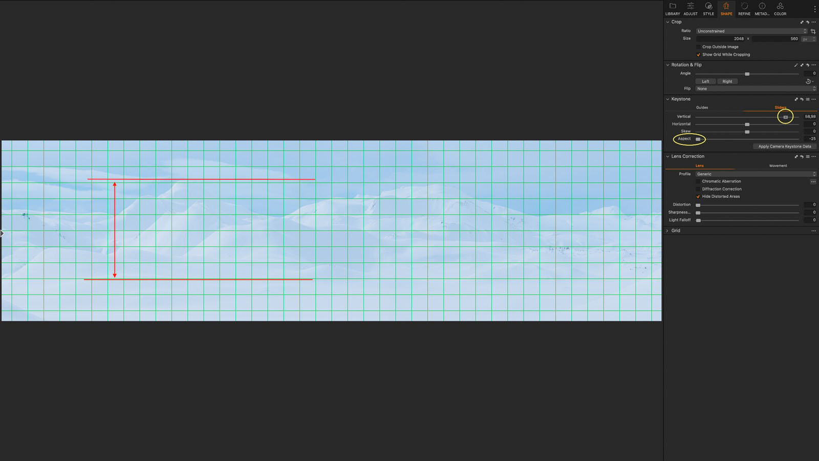
Of course, we don’t have any vertical line here, but this tool really helps create that nice effect on the mountains by stretching them enough to make them more pronounced. And that’s exactly what we want.
If you’re a purist, this setting might not be to your taste. Anyway, that’s the way I like it.
Dodge & Burn: The Analysis
Now that we have corrected the panorama, we can start post-processing the image and create a nice 3D effect on the snow.
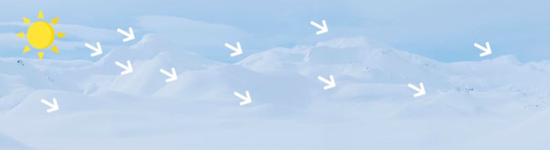
First, let’s analyze how the light hits the landscape, and we can easily see that the light is coming from the left side of the image. We have this soft sidelight which, because of its nature, is very effective at creating depth in the landscape. To use this technique correctly, it’s absolutely important to understand how light behaves.
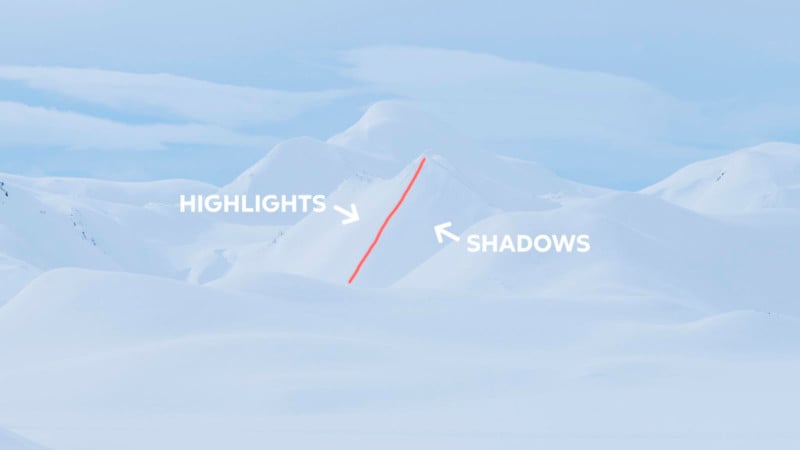
So, to add more dimension to the image, we want to adjust the relationship between the highlights and shadows on the different snowy mountains and increase the local contrast according to the actual direction of the light.
We could play with things like the Levels increasing the global contrast, but aside from the color shifting we see here, it’s generally not going to be what we want to do. Even though technically it’s hitting all the right parts of the image, the dodge-and-burn process is much more artistic. It’s not simply taking what’s in the image and enhancing it. It’s more about taking that and then adding an artistic spin to it.
So, global adjustments are generally not the way you want to dodge and burn.
Dodge & Burn: The Technique
In Capture One there are several tools to make local adjustments, such as the Gradient or Radial Mask tool. But, the stand-alone brush tool is really the best tool for the job. With this brush, when you paint, it just goes wherever you put it.
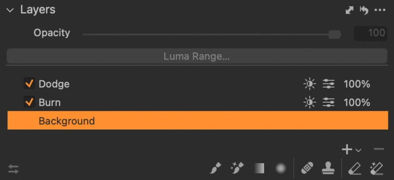
So, I’m going to create two new empty layers by clicking on the “plus” icon in the Layers tab; one for Burning and one for Dodging. I recommend you keep the two layers separate so you can control them independently and have a cleaner workflow.
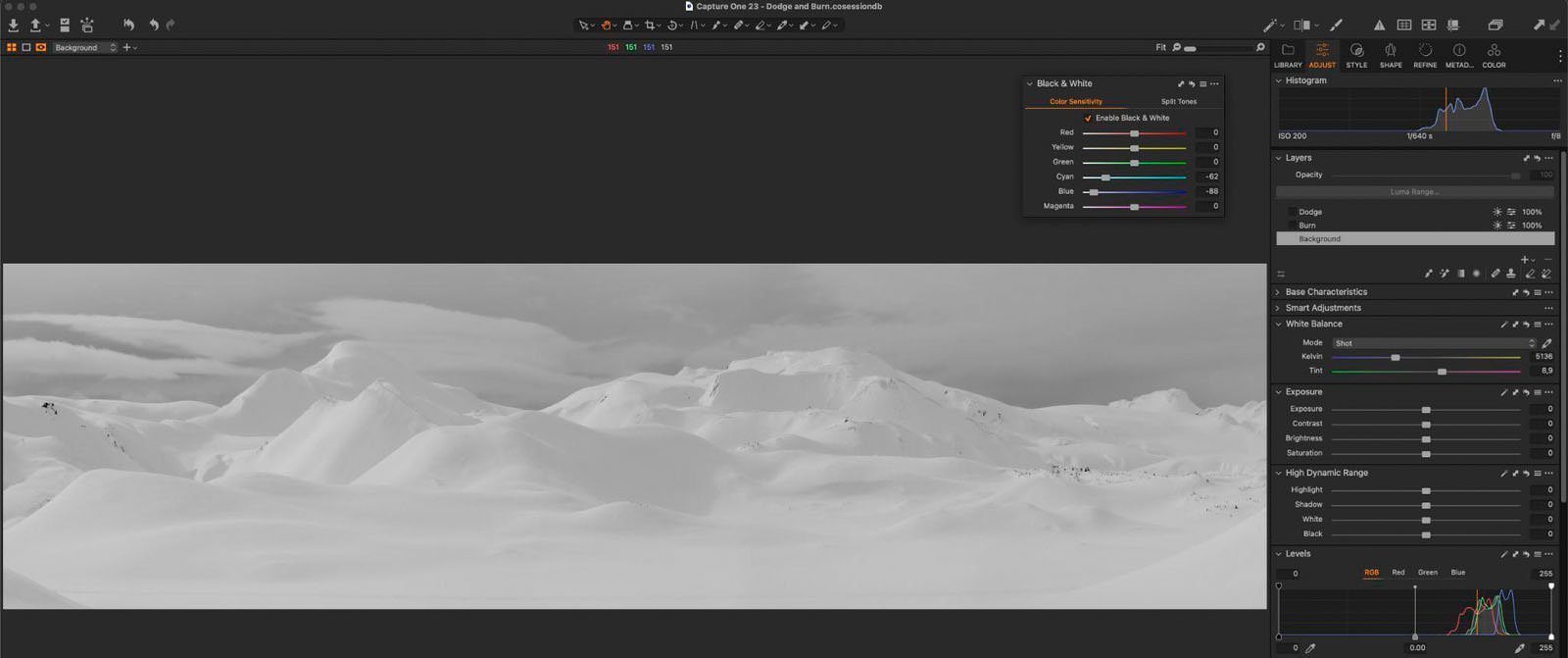
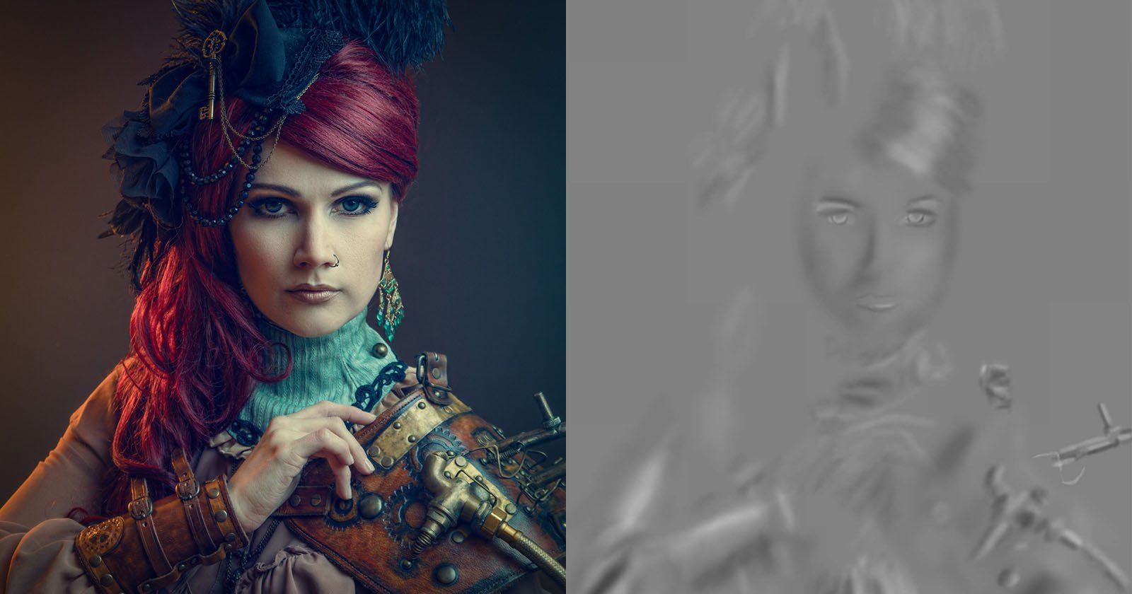
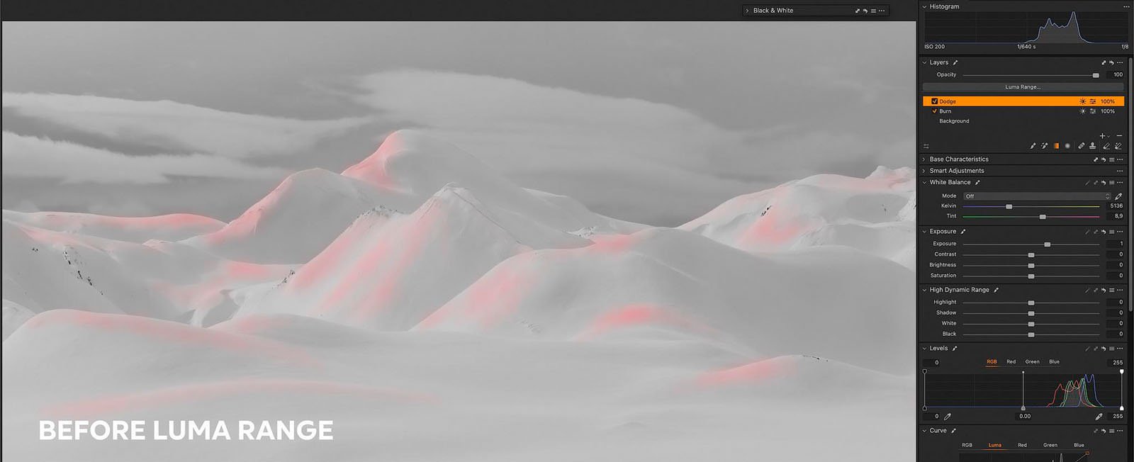
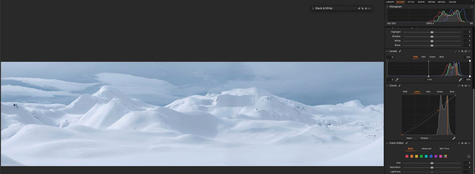
I love using the Black & White tool as a checker to have the transitional areas between highlights and shadows more evident.
When we activate the black-and-white view, we’re going to remove all the colors in the image so that we can better judge the brightness distribution in the shot.
I also reduced the color brightness of the blue and cyan channels to increase the contrast between the bright and dark areas. So, this really helps to better follow the direction of the light when dodging & burning.
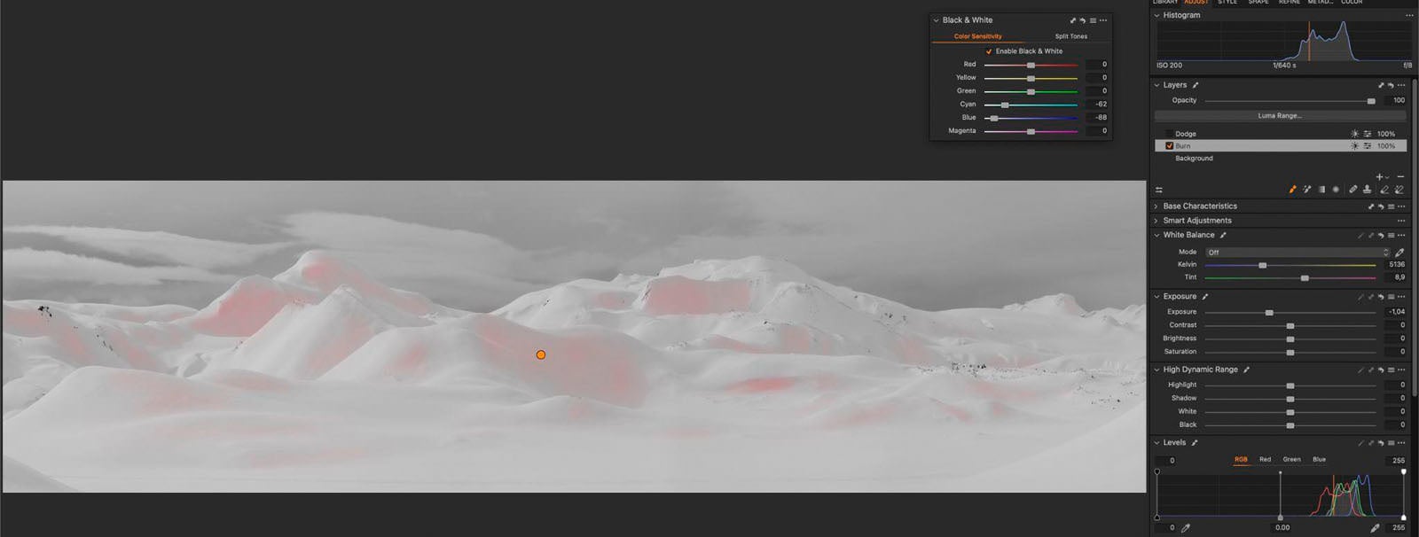
Now, we’re going to select the Burn layer. With a -1 exposure level for our Brush and a very low flow, we’re going to start painting things in and darkening the shadow areas. This process needs to be gentle and incremental. We want to build up the contrast gradually. So, I wouldn’t recommend using a high flow with this technique. That’s too aggressive.
The basic idea is that you paint freely over the dark areas you want to create a level of local contrast that suits your vision of the shot, yet looks natural and not overdone. I usually change the brush size frequently according to the size of the area I want to paint over.
For dodging & burning using the mouse is okay, but a drawing tablet has significant advantages over the mouse when it comes to performance and quality. The process is smoother, more precise, and also more enjoyable.
If in some areas the effect is too strong, just select the Eraser tool with a low flow setting to reduce the intensity.
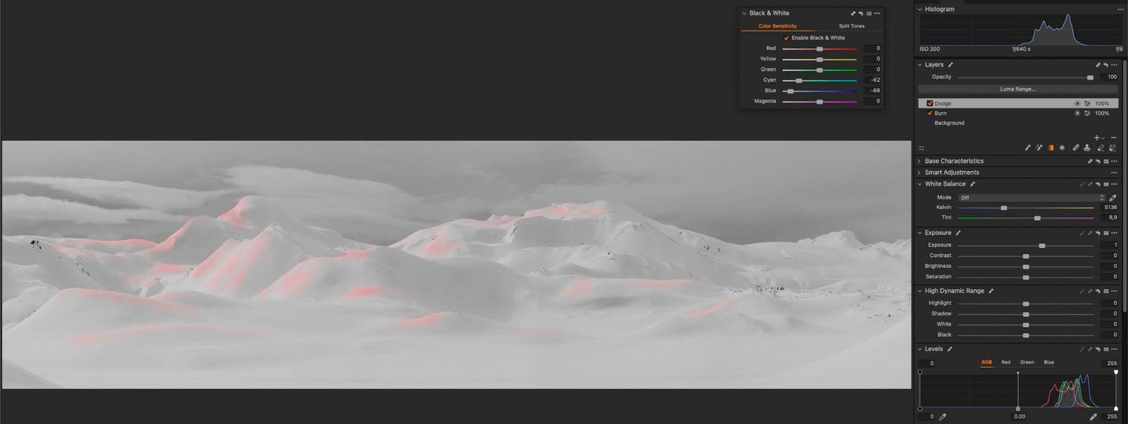
Let’s move to the Dodge layer. Now we want to brighten up the highlights. So, we’re going to set the exposure of the brush at about +1. As always, a low flow value. And we’re going to start painting following the highlights. We want to increase step-by-step the brightness of these mountains intensifying the light coming from the left. Take a look here below at how we can improve the separation in the foreground by enhancing the tiny ridges.
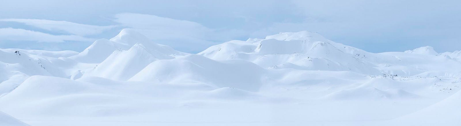
Here is the result after the dodge and burn.
As you can see, this technique is very powerful, but there is a problem with this process. And what I mean is that we can’t precisely paint freehand around the edges. Sometimes the dodging falls over the shadows and vice versa. I could activate the Auto-Mask function for the Brush, which will give me the ability to control things; sometimes that works really well. But since we don’t have well-defined edges, in this case, it doesn’t work quite effectively, and we run the risk of generating artifacts.
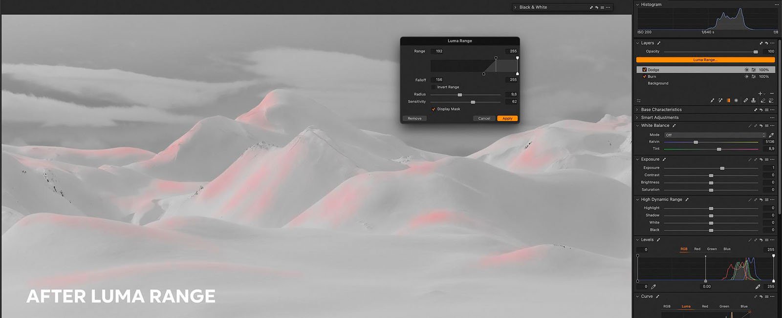
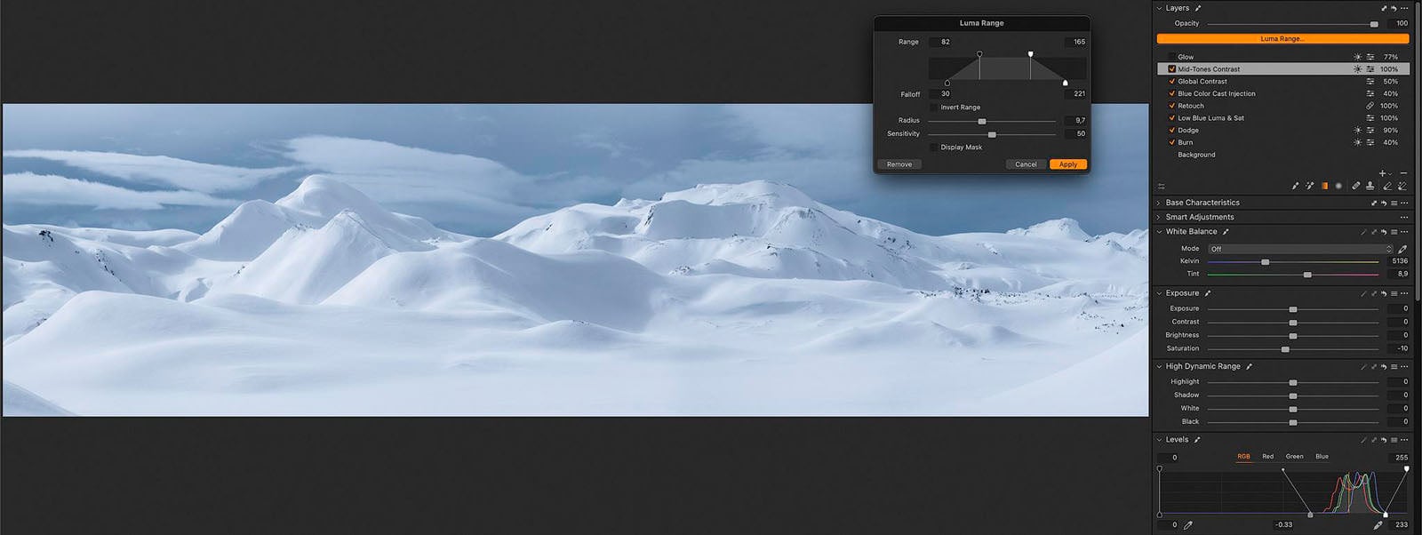
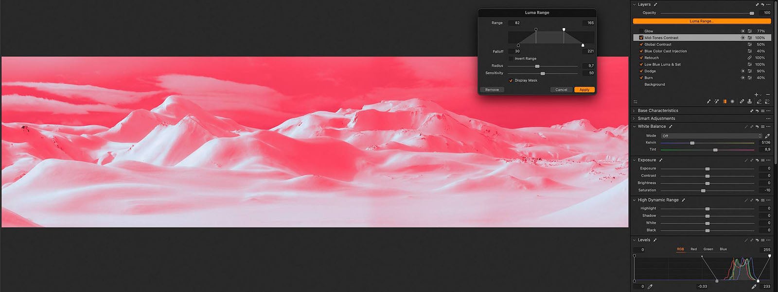
So, to solve this task, we can take advantage of a wonderful feature called Luma Range. And this is really where you’re going to start getting more local control. This tool provides a series of adjustments that allow us to control which range of tones is being adjusted. It basically allows us to create or refine a mask based on the brightness values.
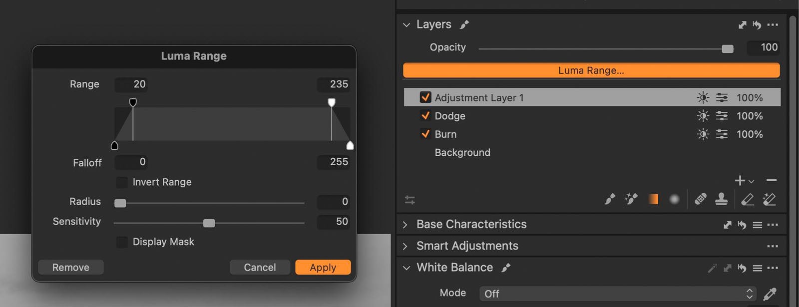
This tool may seem a little intimidating, but it’s actually quite simple to use. At the top of the bar, we have got two range handles that allow us to control the range of the brightness values you want to affect with the adjustment. So, everything between these two top-range handles is included in the luma mask.
At the bottom of the bar, you have the falloff handles that give you control over how quickly the selection fades. So, this tool gives us the ability to refine the dodging and burning we did, avoiding to get disrupted edges between the transitional areas. The Sensitivity slider controls how hard or soft is the edge of the selection. Whereas with the Radius we control the intensity of the sensitivity effect.
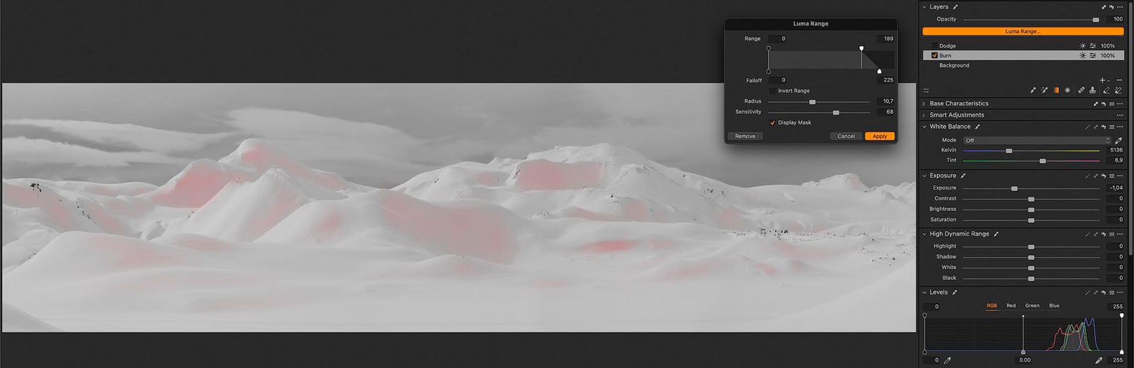
Now, let’s apply the Luma Range to both the adjustment layer to refine the Dodge & Burn. For the Burn layer, I’m going to filter out the highlights. And I’m going to fade out the selection by adjusting the lower handle. Then let’s increase the Sensitivity just a tad for a slightly harder edge, and bump the Radius up to about 10 to enhance the effect.
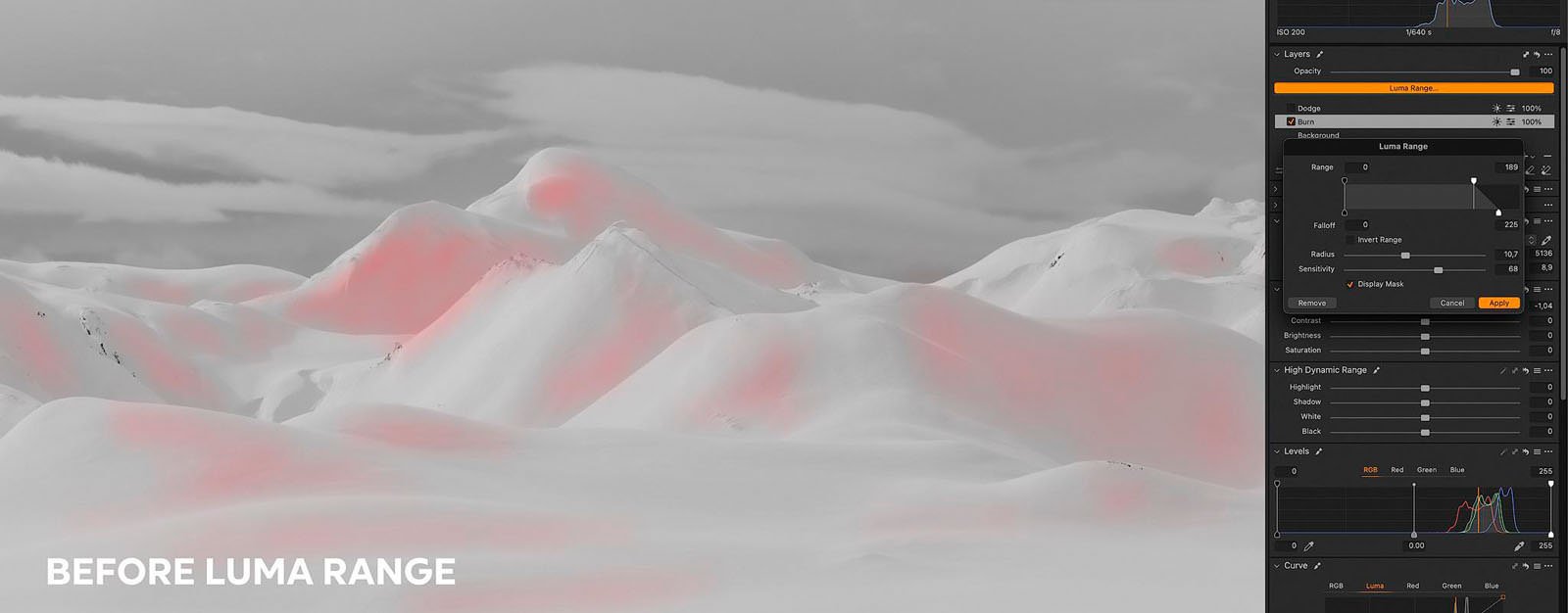
Can you see how we were able to refine the selection to better target just the shadows and exclude the highlights? This tool is incredibly powerful.
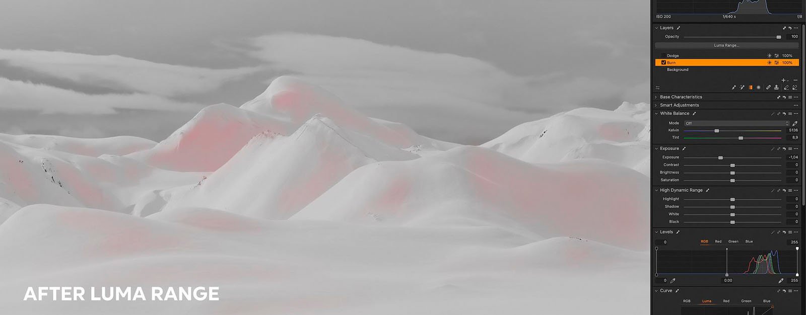
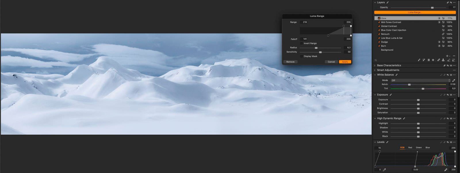
Let’s do the same thing to the Dodge level. In this case, we want to filter out the shadows. So, we want to drag the top black handle toward the right. We’re going to fade it out for a softer transition. And here you can see how we’ve corrected these areas where we brushed over the sky, for example. It’s much much better now.
Global Contrast and Grading
Let’s go over the last few adjustments for our shot. I’m generally not a big fan of bright blue tones, so I’m going to move to the Color Editor module, and I’m going to start by reducing the saturation and the luminance of the blue tones a tiny bit.
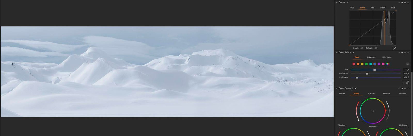
I quite love this sort of metallic blue tone, and since we’re going to increase the contrast with the two following steps, this really helps to mitigate the increase of saturation.
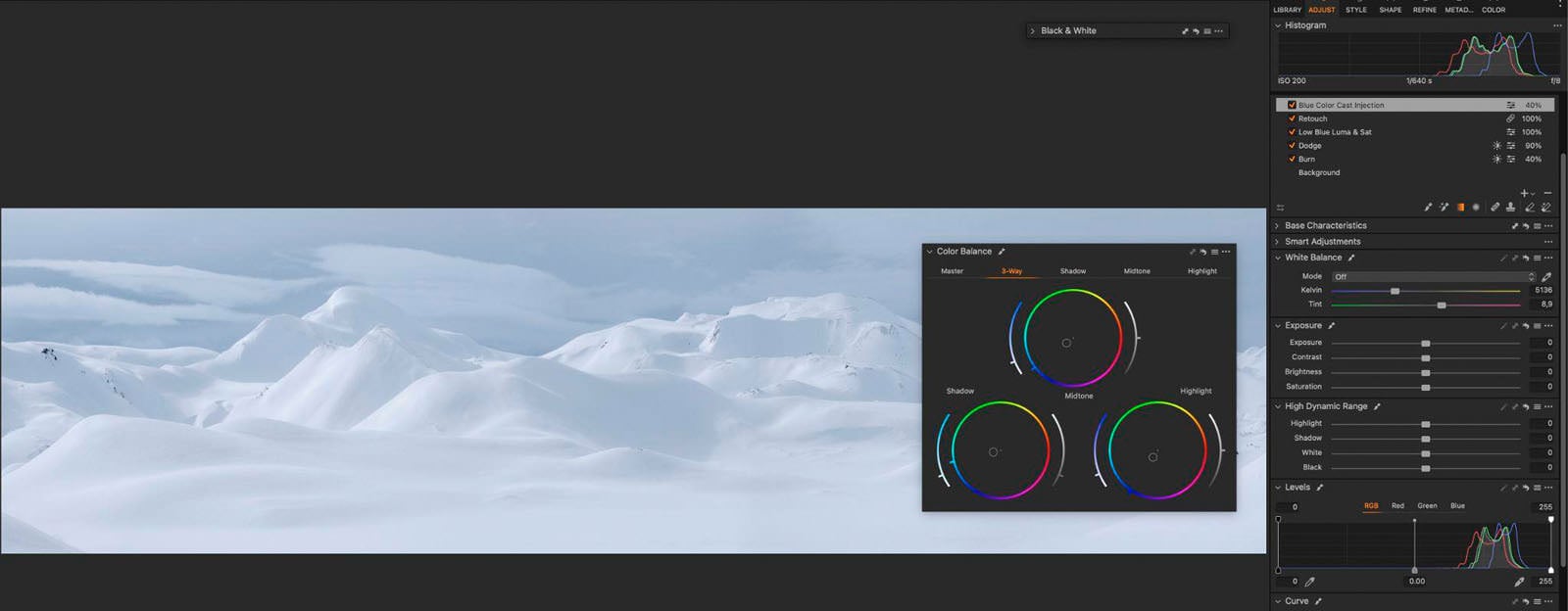
Next. I want to introduce a slight blue tint to the entire image to emphasize the overall coldness of the image. And to do that, I’m going to create a new filled layer and I’m going to use the Color Balance tool to add a slight blue cast to the shadows, mid-tones, and highlights.
Now I want to make two more adjustments to improve the global contrast, so I’m going to add another filled layer, and I’m going to use the Curve tool.
I’m going to add two anchor points. One right next to the right side of the histogram, and another one on the left side. And then I’ll drag the left point down to increase the contrast.
With the next adjustment, I want to increase the contrast only on the mid-tones. So, let’s create a new filled layer.

I’m going to use the Levels tool to increase the contrast. I’m going to drag the middle and right handles until I reach the sides of the histogram.

As you can see the effect is pretty strong and we’re blowing out the highlights.
So, I’m going to select the Luma Range, and here we’re going to set the handles so that they only affect the mid-tones.
If we activate the mask, you can see that we’re only working on a limited portion of the brightness values without affecting the very dark or the very bright areas of the shot.
The image is now much punchier, and three-dimensional, and we also protect the highlights and blacks. This technique is so powerful and I use it extensively in many of my landscape images.
Bonus Tip: Glow Effect
Finally, as a last step, I want to give you a bonus tip that isn’t necessarily related to the topic of this video, but I think it works pretty well for this shot.
I get asked a lot about my technique for creating the glow effect in Capture One. So, here it is. It’s pretty simple.

You need to create a brand new Filled adjustment level, select the Dehaze eye-dropper tool, and click on one of the brightest areas of the mountains. At this point, you need to reduce the Dehaze level to about -20. This value really depends on the image you’re working with. Then bring the Clarity slider to -100, and increase the Structure to 40/45 to soften the details and create this glowy effect.
Then I’m going to move over the Levels module and increase the upper left handle to shift the black point.
Now the image looks too dreamy for my taste, so I have to limit the selection to the highlights. To do this, I need to apply the Luma Range and adjust the black handle right about there, and set a very soft roll-off. And maybe a touch of Radius.
Now we have a lovely glow effect that adds even more character to the image. This effect doesn’t work with every image, but when you have some sort of dynamic light in your shot, it works quite beautifully.
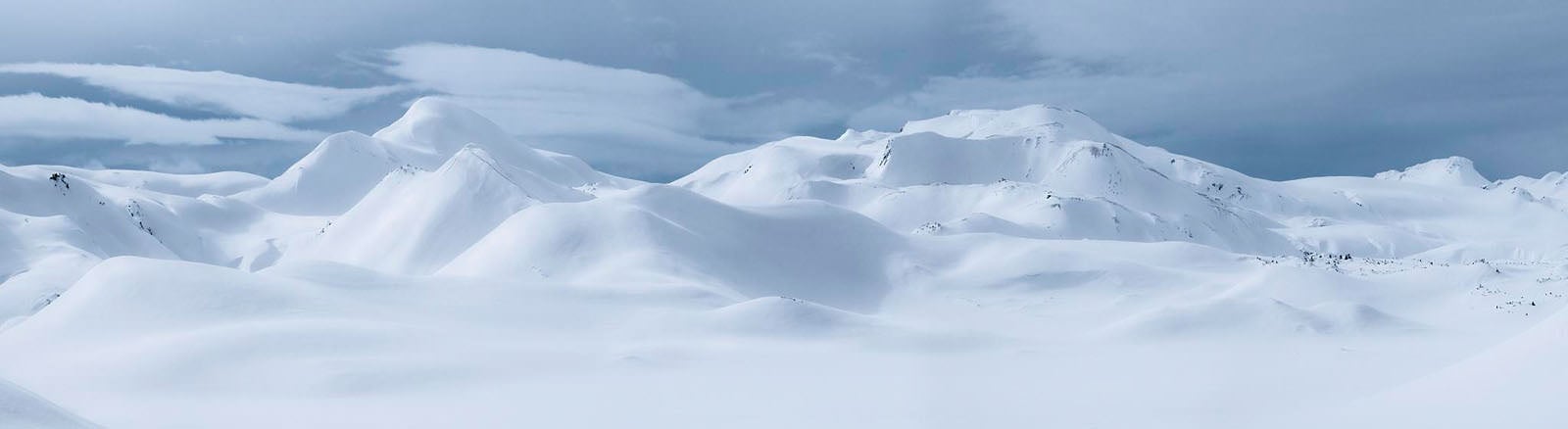
And here is the final product. Very dynamic, with a great amount of depth and dimension.
I hope you found the tutorial useful. I’m pretty sure this technique will take your images to the next level.
P.S. If you like my photography and you’re interested in joining me in one of my photography workshops, please check out my website.
About the author: Andrea Livieri is a Venice-based professional photographer, educator, musician, and spirited adventurer. He started exploring the photography medium by capturing images of fellow musicians, their families, and other friends and acquaintances in the music industry. As he continued honing his craft, he merged his love for photography and exploring the outdoors, enabling him to amass lots of photographic work of delightful scenery, rugged mountainscapes, and exhilarating terrain. He also leads photography courses, workshops, and tours to teach other photographers his methods and help them to bring out their own visions. For more from Livieri, you can follow him on his website and Instagram and subscribe to his YouTube Channel.