70 Adobe Lightroom Classic Tips, Tricks, and Shortcuts for Beginners
Adobe Lightroom Classic is an incredibly powerful raw-processing tool, but it has so many layers and features it can take a long time for users, especially beginners, to discover them all.
Many of these tools are even hidden behind a layer of keyboard shortcuts or obscure multi-level menus that can make it confusing for even a seasoned professional to leverage. But while it can be overwhelming at first, mastering Lightroom is a massive first step to creating professional quality images.
In this fourteen-minute video, photographer Christian Möhrle has compiled an extensive list of 70 tips and tricks for Lightroom beginners looking to tackle the behemoth application and make their editing lives easier which he also provided to peruse below, written in his words. Hopefully, these tips will help users learn something new or at least help save some time and energy navigating the application to find the tools they need.
Histogram
1. You can drag the histogram with the mouse to adjust the exposure of the photo
2. Clicking on the small arrows up in the corners of the histogram will make over- or underexposure visible (you can also press ‘J’ for that)
Crop-Tool
3. You can change the Crop-Tool overlay by pressing O, so instead of a 3×3 grid you get different lines to help you frame the shot
4. With the straighten tool (Round icon with a ruler inside) create a line along the horizon (for example water surface) to level your photo
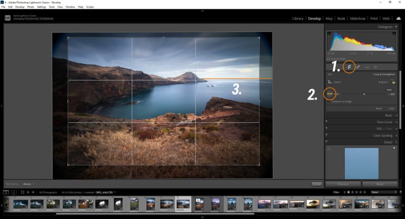
5. Clicking on the ‘Original’ Button reveals a bunch of different crop presets such as 1×1 which works great for Instagram for example
Spot Removal Tool
6. With the spot removal tool you can activate ‘visualize spots’ to make sensor spots more visible
7. By switching the spot removal tool from ‘clone’ to ‘heal’ you can remove smaller objects from your photo
Masking
8. Select Subject or Select Sky Masks try to automatically select the subject or the sky. This is a great time saver and works great, even on more complex images
9. To quickly select the landscape, I use the Select Sky mask and simply invert it
10. An inverted ‘Select Subject’ mask works great to make a subject pop by dropping the exposure for example. This works better with wildlife photos than with landscape shots
11. You can pick multiple colors with the ‘Color Range Mask’ by holding down the shift key and clicking in the photo
12. Although the ‘Luminance Range Mask’ has no eyedropper icon, you can still click in the photo to select the luminance range you want to target
13. Masks can be further modified by adding or subtracting other masks
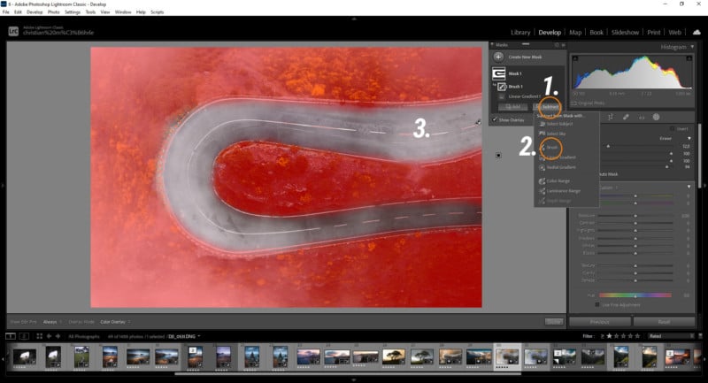
14. Quickly activate or deactivate the mask overlay by pressing O
15. The brush mask has an Auto Mask setting which helps quickly select objects
16. With the Radial Gradient mask hold the control key and double-click in the photo to create a radial gradient that’s as big as your photo
17. Invert this radial gradient and drop the exposure to create a vignetting effect
18. With a radial gradient you can add very cool-looking glow by raising the blacks and dropping dehaze
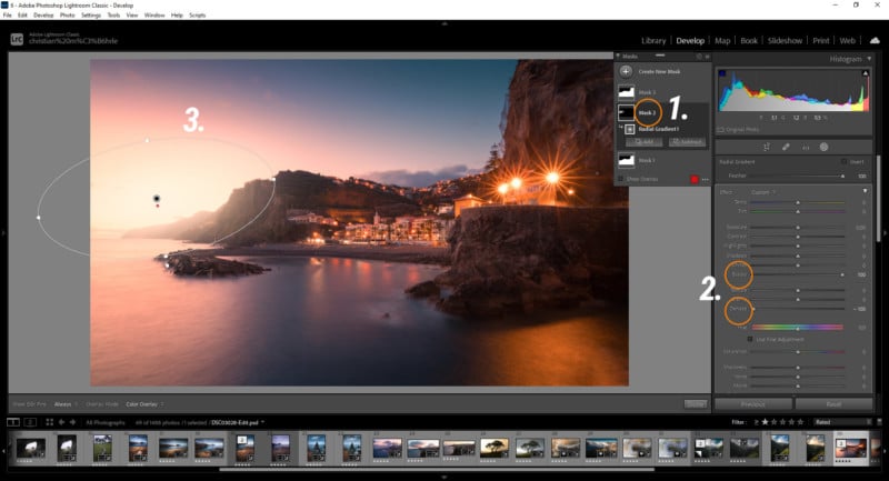
19. For a fake polarization effect, you can use the color range mask, select the blue part of the sky and then drop the exposure
Basic Panel
20. Quickly switch to Black & White by changing the Treatment
21. There are many more profiles to choose from under ‘Browse’ in the profiles drop-down menu
22. You can add new profiles to the profile drop-down menu by clicking the small star icon in the upper right corner of the profile preview thumbnail
23. The Profile’s strength is adjustable with the slider all the way up in the profile menu
24. A flat profile like Adobe Neutral might give you some more dynamic range in certain situations, I love using it on very contrast-rich sunset or sunrise shots for example
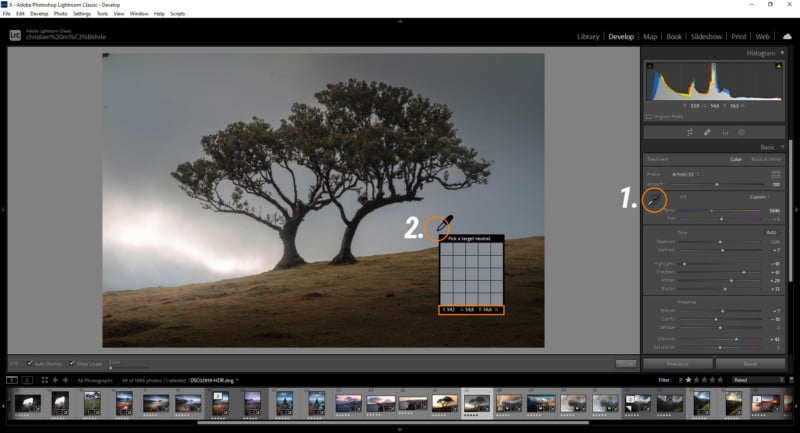
25. Get a proper White Balance using the Eye Dropper Tool on a neutral area (RGB values close to each other, those are shown in the small preview window when hovering over the image with the white balance eye dropper)
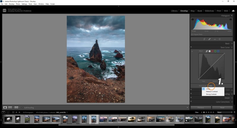
26. Increasing the white balance temperature can give your photo an awesome golden hour look (you don’t always have to use a ‘correct’ white balance)
27. Similar, dropping the Temperature can give your image a cold, spooky look
28. If you’re unsure how to expose the photo, you can click the ‘auto’ button to let Lightroom do it automatically. This might help you get a better idea for the photo you’re working on
29. When Shift-double click on a slider like blacks or whites Lightroom tries to push those as far as possible without over- or underexposure
30. Hold the alt key and drag the tone sliders to see over- or underexposure come in
31. Instead of the contrast slider, try dropping the shadows or blacks while increasing highlights or whites. This way you’re adding contrast, but you also have more control over the contrast
32. For a dreamy look, try using negative clarity, but be careful not to lose too much detail
33. Negative dehaze can be used to add artificial fog to your photo
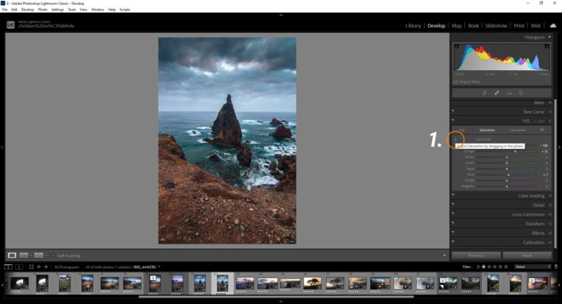
Tone Curve Panel
34. The Tone curve has two presets, one for medium and one for strong contrast. They can be found under the tone curve when clicking on the ‘point curve’ button
35. Raising the black point gives your photos a softer, low-contrast look
36. Holding down the Alt-Key while dragging a point lets you make more precise curve adjustments
37. For sunset or sunrise shots, try bringing the highlight point in the red channel to the left for warmer colors
HSL Panel
38. Looking for stronger autumn foliage? Try bringing down the green and yellow colors in the Hue tab
39. Bringing down the blue color in the luminance tab will make the blue part of the sky darker and give you more contrast, similar to a polarization filter
40. Similar raising the green or yellow luminance can make the foliage pop in certain situations
41. Keep in mind: raising the luminance will lessen the saturation of the color while dropping it, will also increase the saturation
42. Using the small pin in the upper left corner of the panel lets you control the hue, saturation, or luminance of a color directly in the photo
43. If there is a subtle purple color cast in the sky, try lowering the purple color in the hue tab to get rid of it
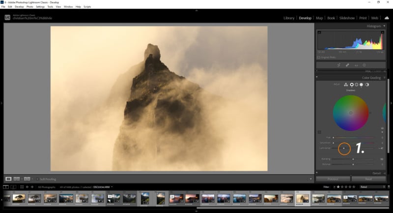
Color Grading Panel
44. Handle the Shadows, Mid-Tones, and Highlights individually for better control over the split toning by clicking on the small circles in the upper menu
45. For intense sunset or sunrise colors applying a warm color to the highlights with strong saturation and sometimes even the mid-tones work great
46. Deep Blue shadows in my opinion are perfect for dark scenes like nightscapes or forests, although green works good in this case as well
47. You can further adjust the brightness of the highlights, the mid-tones, and the shadows with the luminance slider. This might help add some more contrast
48. Once you set up the split toning, play with the blending and balance sliders. This can give you inspiration for a different look
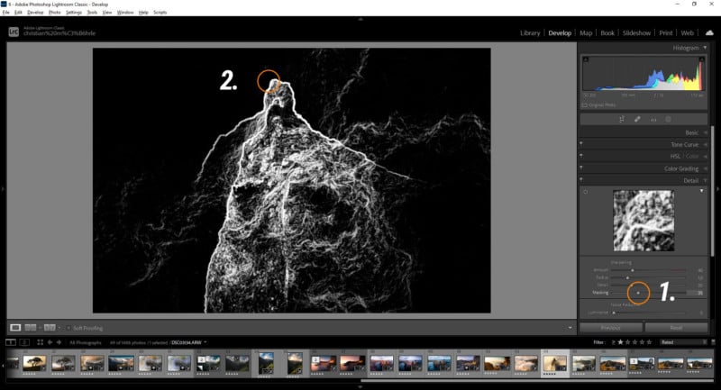
Sharpening Panel
49. Apply sharpening only on the important parts using the masking slider
50. Holding down the alt-key while dragging the masking slider lets you see which parts will be sharpened
51. For general sharpening settings bring down the radius all the way, increase the detail all the way, add masking to your liking and then bring up the sharpening amount
Lens Corrections Panel
52. Check the remove chromatic aberration box to get rid of any weird borders
53. This can also be done manually by using the fringe color selector (eyedropper icon) on those borders under the manual tab of the lens corrections panel
54. In the manual tab you’ll also find a vignetting slider if you want to add this effect (although this one isn’t really that useful)
55. Enabling the Profile Corrections will help you reduce strange lens effects like vignetting or distortion
Transform Panel
56. To further counter lens distortion, you can use the auto-button in the transform panel. Lightroom will try to fix the ‘geometry’ of the image automatically
57. There are also buttons to automatically set the level right, or just fix the vertical lines automatically
58. This can also be done manually by either using the sliders below or the guided tool by creating lines building edges for example
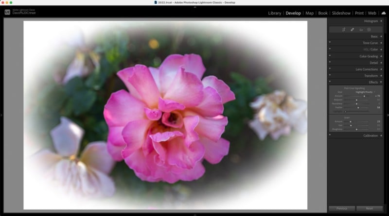
Effects Panel
59. Not much going on here, but you can get a more advanced vignetting effect in this panel
Calibration Panel
60. You can try fixing the color cast with the ‘shadows’ slider
61. You can get more autumn-ish colors by bringing down the blue primary hue and pumping up the saturation
62. Bringing down the blue primary hue also helps get more intense, warmer sunsets or sunrise shots. I use this one a lot!
63. Raising the Red primary hue may get you more intense foliage colors
General things
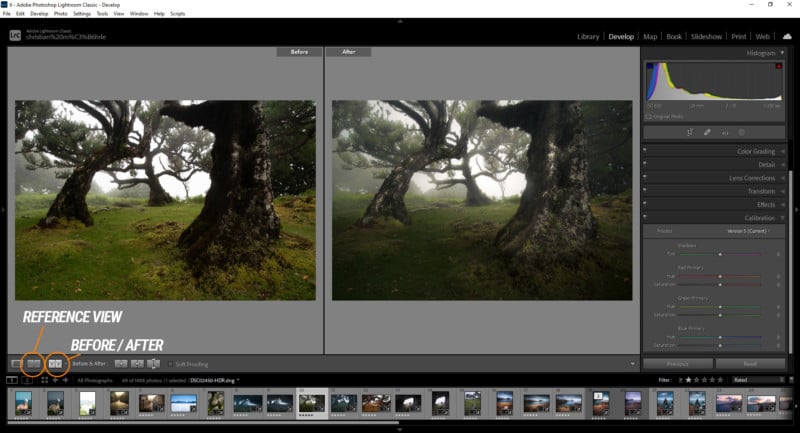
64. To get a before / after comparison, you can press the button in the bottom left corner
65. Using a reference photo helps you to get the same look on different shots. Just activate the reference view (button next to before / after in the bottom left corner) and drag a photo from the bottom into the empty space
66. Stretching the develop panel on the right gives you bigger sliders and thus they are more precisely adjustable
67. You also can hold down the shift key and move the sliders for finer adjustments
68. To quickly reset a slider, double click on the little pin
69. Hold down the Alt-Key and click on the section title to reset all the section-settings
70. To be able to edit several versions of the same photo, you can create virtual copies of the image. Right-click and hit “Create virtual copy.”
For more videos by Christian Möhrle visit his YouTube channel and website.