How the Rule of Thirds Kills Creativity and Leads to Boring Photos
The most common method to teach photographic composition to novices is the “rule of thirds” — in short, divide the screen into equal thirds vertically and horizontally, and then place your point of interest on any of the cross points for a maximally pleasing image.
The Issue

“Composition” here asserts that the photographer has some graphic design skills and that all the visual elements of an image are fundamentally objects that can be moved around — either externally (“hey Joe, step over to the right”) or internally (“if I angle the camera to the left the subject shifts to the right”).
This thirds-approach works best if the frame is generally homogeneous with a single important object set in the visually even frame — whereby you can pretty much position that subject anywhere you’d like. “I want to photograph this dog, where do I put her in the frame?”
They tell us that centered is boring and amateurish; using the rule of thirds adds sophistication, certainly. The Rule (and most advocates would prefer to call it a “guideline”) works because visually speaking, nothing much has to be composed in frame with the subject. And in that case, yes, moving the subject to the side tends to be appealing. More on that in a moment.
Beginners
While there are some interesting historical aesthetic observations about pleasing proportions, the key reason this Rule found such fertile ground in photographic education is that for decades most cameras had a little focus spot in the center of the frame, and beginners would use that spot to focus on something, and then immediately snapped their photo.
This resulted in countless images with a face (often the nose) or subject dead center in the frame and positioned somewhat awkwardly, not to mention all your shots being reasonably boring and identical. When you have to focus this way, it’s very difficult to shift your thinking and move the subject in frame after focusing.
Even advanced modern cameras that offer numerous points of focus and the ability to manage them still default to central focusing, and the autofocus feature can be difficult to manage when novices have non-centered subjects.
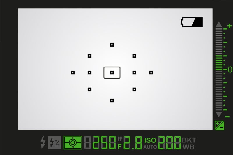
In this circumstance, the Rule of Thirds seriously helps the newbie and forces them away from the knee-jerk composition of leaving the subject’s nose centered awkwardly under the focus spot.
The Problem
I believe that this approach sets the stage for difficulty in learning composition—while it can improve some kinds of photos, more real-world scenes necessarily involve a host of objects/shapes all of which need to be composed into the frame; composition is about moving all of them around until they feel harmonious.
Painters are certainly concerned with proportion because they literally have to make thousands of decisions about what’s in their artwork and how it will be represented. But photographic composition isn’t so proscribed. And it rarely involves placing any one thing anywhere, but rather the aesthetic harmony of a group of objects in a given frame. Move any single object and it’s likely that all the objects need to adjust to re-gain harmony.
The Rule of Thirds belies what actual composition is about — compositional skills begin with having subtle control of where everything fits in the frame and then recognizing the feeling you get when they are in harmony. Teaching this “feeling” is more difficult than teaching a “rule” — so almost no one does it. And the hope is that if you shoot enough, you just come to it. But many people do not. The Rule of Thirds straight-jackets creativity, and images can be just as boring and formulaic as “dead center” sorts of compositions.
“Real” Composition
Teaching composition is beyond the scope of this essay, but I will say that in a visual frame, empty space has weight to it. Light and dark areas have weights. Your eyes go from bright areas to dark ones. Your eyes follow lines around. It’s nice when there is something strong to pull your attention to it, and then it’s enjoyable to have other less powerful forces to let your eyes explore and discover.
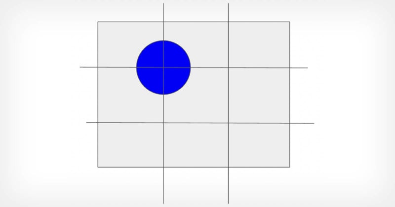
I suggest there are really only two kinds of photographic compositions — (1) center-weighted and (2) off-center. That’s it. (When subject or texture is distributed all over the frame, it’s still a center-weighted photo.) And when the Rule of Thirds is being applied, it’s really just a case of off-center composition.
All real-world objects in photos have irregular “weights” — objects aren’t big distinct geometric circles, but complex shapes and patterns of light and dark — spreading over some area of the visual space of the frame. But you can feel a photo’s center of gravity, and that energy is either in the middle of the frame, sort of balanced by other lighter things to the sides, or off-center and balanced by objects or space to the other side.
It’s not the literal balance of objects — meaning that I have something big here, so I offset it with something over there. It’s a nuanced array of visual elements and the balance is a feeling. This is why the rule of thirds works so well — people put the key subject to the side, leaving room on the other side for context, juxtaposition, or harmony.
On a neutral background, the center-weighted shot can feel dull, particularly if the subject is pretty self-evident (a face, a dog, a flower…). So there are many good reasons to move the subject to the side — but it’s not 1/3 and it’s not exact. It’s just over enough that there is balance in the frame, and that depends entirely on the subject and the other things in frame.
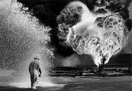
The Decisive Moment
The photographer Henri Cartier-Bresson (1908–2004) is credited with the expression “the decisive moment” in describing his shooting.
Originally I understood this as having something to do with the quintessence of the event — that there is a perfect moment to capture and you’re looking for it. Over time I realized that what Cartier-Bresson was describing was composition; about an ineffable harmony that comes and goes all the time when looking at real-world events — many things are in motion, light and form shift constantly, and tiny movements of the photographer and camera create widely disparate looking arrangements of the things you’re pointing the camera at. And that in all the chaos, there are these brief moments when the items in frame seem to coalesce, create a pattern, before devolving back into chaos.
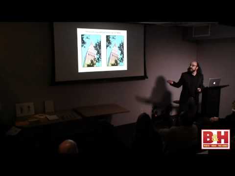
When I give workshops I use the following video as a kind of illustration for this coming and going of pattern and form.
There’s no one perfect moment of harmony, but many moments that arrive and leave, and it’s the photographer’s work to “catch” those moments, either through luck or anticipation or quick action… it is not easy. Particularly in a world of moving objects — for instance, from street photographers or photojournalists — being able to catch those is key.
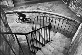
The photojournalists from the agency Magnum Photos are famously gifted at both the journalism part and the aesthetics of real-world compositions: catching those “decisive moments.” Their photography is a composition in the real world. It’s not built on a foundation of thirds.
So How Can the “Rule” Useful?
The Rule of Thirds should not be used to teach composition — it puts students in the wrong mindset about how composition is done. But it is important to get novices out of the habit of putting something they’re taking a photo of in the dead center of the frame. It’s important to begin to teach students how to move objects around in frame. Effortlessly.
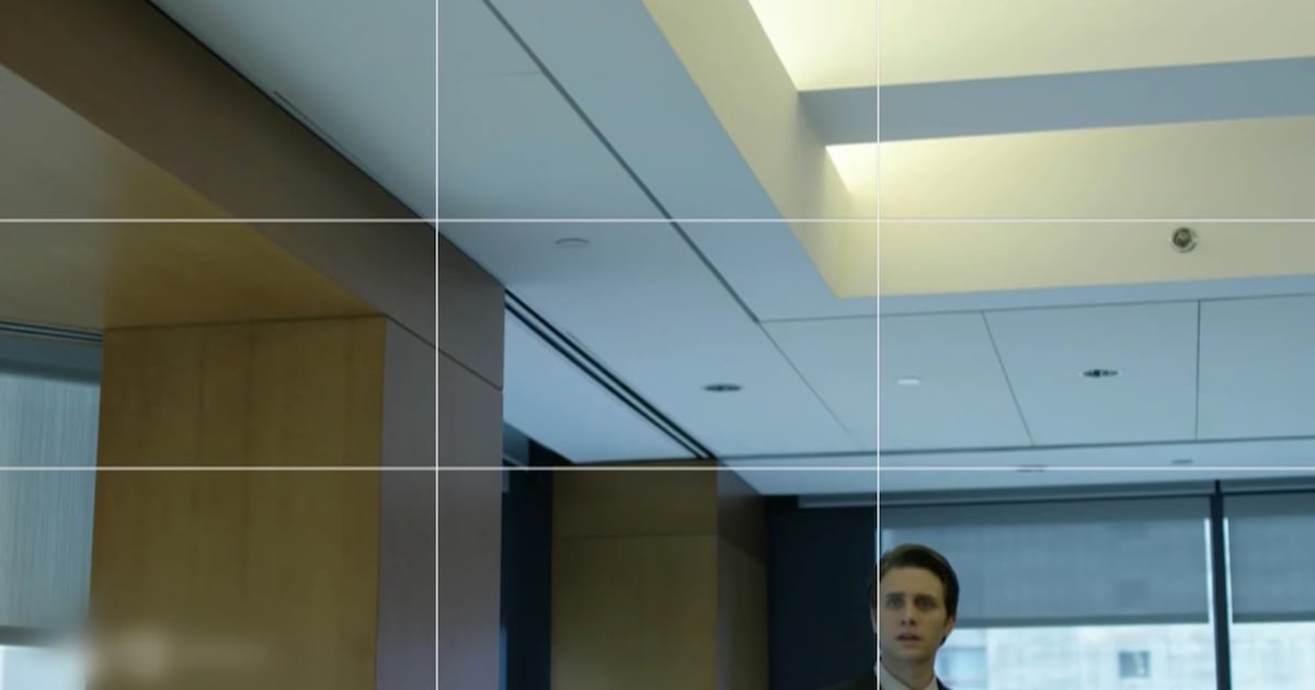
To break students of the natural instinct to wrap the rectangular frame around their centered subject, the grid of thirds is like target practice. And I suggest its best use is as a kind of drill — here is a cursory proposal:
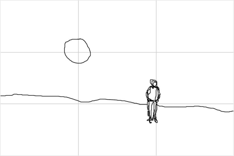
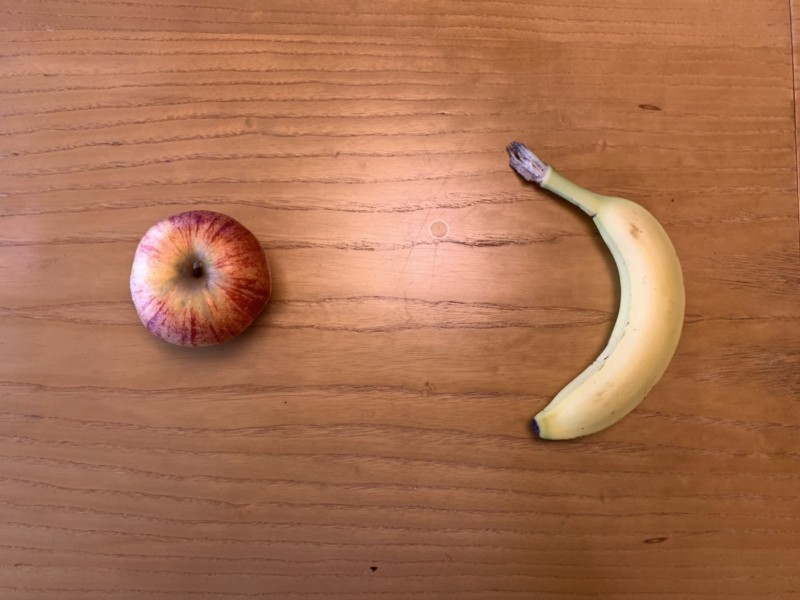
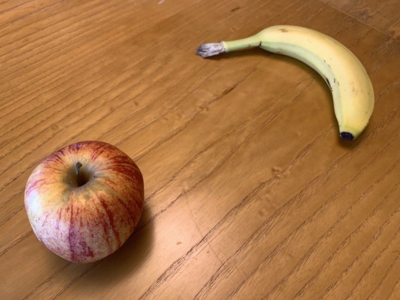
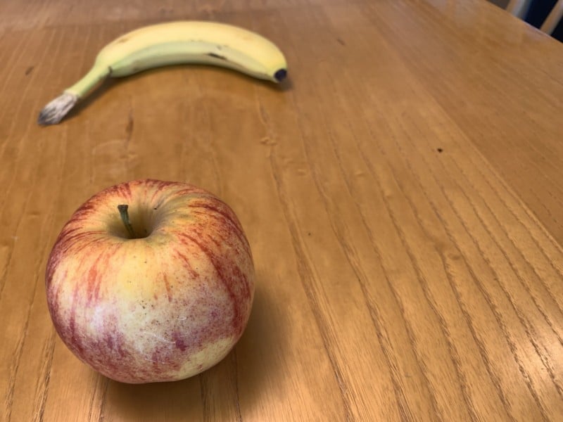
Preparation and Starting: Here’s a single apple. At the moment I present the apple to you, I’m gonna call out a position in the frame, and your job is to focus and then move the object to that spot.” Use the 1/3 grid on a screen as a convenience to talk about the targets in the frame. It’s easy work to place a single object at any given crosshair; then —
Now the challenge:
The Exercise (where it gets challenging): There are two objects and you want to place them on different quadrants. Doing this teaches how to move your body and camera, how to use parallax, and how to manipulate things in the world (photographically) without touching or interacting.
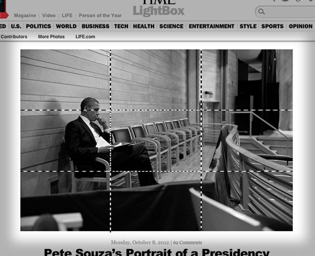
Here are examples of placing each object in different parts of the frame, without adjusting the objects:
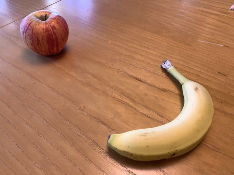
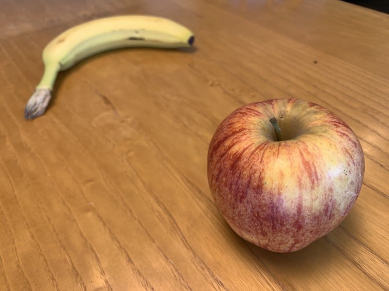
Photographers do this sort of work all day and novices need to be as facile in purposefully moving objects around the frame. It’s not a composition exercise (yet) but it is the foundational skill that composition requires.
Conclusion
The Rule of Thirds is a remarkably efficient way to improve many photos. But to teach photographic composition I believe it undermines getting students to understand how and why to move themselves and the camera, often in very subtle ways. If photographic educators would dispense of this guideline for composition and instead use it as a tool for gaining control, I think that students will have an easier time both appreciating photos more and of course, having more fun taking pictures.
And don’t get me started on the Golden Mean…
About the author: Michael Rubin, formerly of Lucasfilm, Netflix and Adobe, is a photographer and host of the podcast “Everyday Photography, Every Day.” The opinions expressed in this article are solely those of the author. To see more from Rubin, visit Neomodern or give him a follow on Instagram. This article was also published here.