How to Use a Waveform Monitor for Better, Faster Photo Editing
Thanks to everyone who read my previous article on my process as a TV show set photographer, and all of you who got in touch with questions and comments. People had a range of questions, especially about how I use a waveform monitor, so I’ll make this a fairly wide-ranging post to try and answer everything.
Why Waveform?
I don’t do a ton of camera shading (AKA video engineering, “video op”) work, but when I started and as I was learning, I kept saying that I wished I had a waveform monitor for photography. I couldn’t figure out how I could do it, but I knew it would be a game changer for me.
It’s easy using histograms to make sure that your images are exposed correctly in terms of not clipping either your highlights or your shadows, but how do you know without a doubt that your images are actually correct? That your skin tones reflect a well-lit reality? A waveform allows you to easily do this in seconds, no matter the condition of your eyes and no matter what your monitors look like or anything else.
Remember that the waveform scope deals with luminosity—I think of it as the pure light value of the image in black and white. As such, I can use this on all my images, whether color or black and white… it works the same either way, and either way it accomplishes the goal, which is to show me what the luminosity value of the image independent of my gear or my eyes.
It doesn’t matter whether my monitor is calibrated and it doesn’t matter whether I’m in the perfect viewing environment—this is a method that’s specifically tailored to allow me to work quickly, anywhere, no matter what shape my eyes are in.
As I said in the last post, at the end of every show when I’m working through the images I need to submit, my eyes are fried. Most often I start importing my images as the guest is standing several feet away getting their mic removed. As we go into the “Moment of Zen” after the guest segment, we use a lot of moving lights as keys for those positions, so I’m generally looking right into the lights before to make sure everything came up and is focused correctly. That means that I’m half blind even as the images are coming in.
I needed a tool to allow me to disregard the info that my eyes were giving me, because I was banging through images while I had ghost images of moving lights swimming in front of me and waiting until they went away to try to be able to work on everything.
How Does it Work?
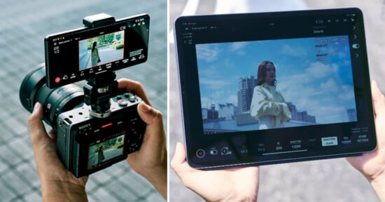
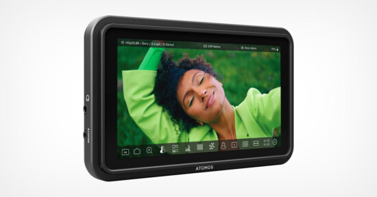
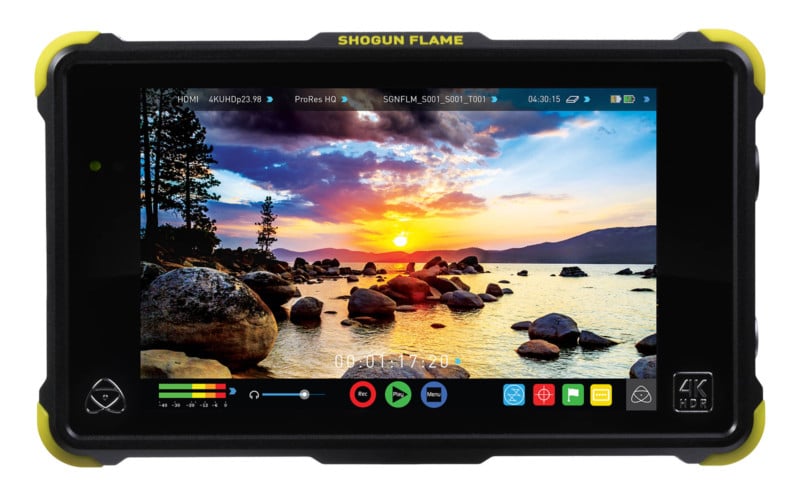
I use a 7-inch Atomos Shogun Flame recording monitor, but this will work with any monitor with the waveform scope in it. I’m also using a MacBook Pro, but I’m sure this will work with your Windows laptop as well.
It’s super easy: just run an HDMI cable from the laptop and plug it into the monitor input. At the top of the MacBook screen, make sure that the monitor is mirroring your main monitor. You want the same image on both. On the Shogun Flame, the “scopes” button is a soft key on the touchscreen at the bottom (there’s a vector scope on the icon). Find the waveform on your particular model, and put the waveform on screen and then max it out so it’s the size of the entire screen.
You’re in business. There are no additional apps and no plugins into your image-processing software.
You should now see your waveform occupying almost the entirety of your external monitor screen. I like to keep it large to keep it easy to see.
A Quick Tour
For years and years we’ve always heard how amazing and useful you should find the histogram as incorporated into the levels and curve tools. They’re handy, no doubt, to let you know whether you’re clipping your shot at either end and whether you’re successfully exposing-to-the-left, should that be your thing. But it cannot tell you where in the image your values are placed and whether your skin tones are “correct.”
Why do I have the quotes around the word correct? Well, this is photography. Nothing is ever “correct.” You have endless choices and you can make them as you wish… there will always be situations where darker is better, artier, necessary for the shot or the context.
I will say that higher than these values and skin can start to lose detail. Over time, as you work with the waveform and nail the “correct” values over and over, you will learn to see that loss of skin detail without the scope. I use that as my own personal indicator—when I see that look start to creep into the skin, I know I have to dial it back.
And, in keeping with the “not trusting my eyes” strategy, I’m not looking at the luminosity of the skin in that case, I’m looking at the detail of the skin. It starts to look smeary.
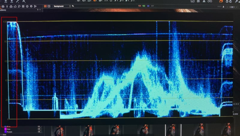
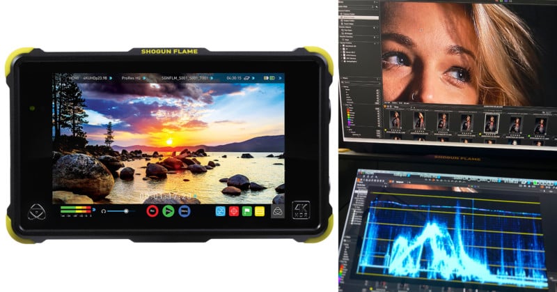
This is your waveform screen. On the left, in the red box, you’ll see numbers from 0 to 100. Depending on where you work, these numbers will be called different things: IRE, nits, units. Whatever the term, it doesn’t matter… the number is the number. I generally say “units.” Personal preference.
Ok, now that you’ve found the numbers, look across the screen. What you see on the left is what is on the left of the screen. The same goes for the right. If you want to find something in the photo, it’s on the corresponding portion of the scope.
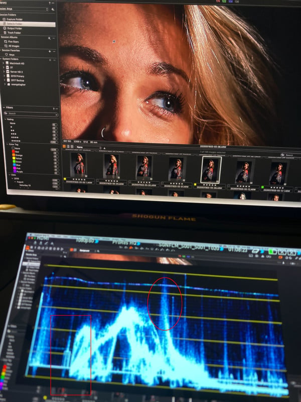
Here you can see the waveform with a photo on my Capture One screen. (This will work with Lightroom, or Photoshop, or whatever application you use. I’m happily married to Capture One). You’ll notice the image is zoomed in. I do this intentionally. I will eventually zoom in even further.
This is one thing we have over the video engineers! When you’re working as a camera shader, you have to stare into the waveform like it’s the matrix and pick out your skin tones. Here, we can zoom in.
In the image above, I put a red box around the border of the image. I use this edge to quickly orient myself—remember, generally when I’m doing this I’m rushing to submit my images for the night, so everything has been about speed. On Fridays, when we’re not locked down, I’ll work through my weekly “Week in Review” submission and I can be a little more leisurely about it.
The red oval in the image is around the brightest part of the photo, which is the highlight in the woman’s hair. If you study the waveform you can pick out the catchlights in the eyes. The regular lines you see on the right hand side correspond to the thumbnails in the Capture One browser. Don’t forget you’re looking at your entire screen, and not just your image.
If you notice, there is a gradient leading up to that highlight with the oval. This represents the gradual lightening of the skin leading to the highlight on her forehead. Here is where your eye and some discretion enters into the process. You need to make sure that you choose the most neutral part of the skin.
Choose a portion of skin that isn’t reflective at all and that is the most “normally” lit. In the photo above, you’ll see almost a white glare on the skin, right next to the hair; directly to the left of that is a nice, flat portion of skin that’s well-lit. That’s where we’ll go.
Once again, you’ll see the line at the border of the monitor to help you find where you are in the image. Directly next to that is our nice, even piece of skin. What I recommend you do at this point is to just grab sliders and start running them up and down to see what everything does to the scope.
“Exposure” is the easiest way to move the whole waveform up and down, but almost every slider will have an effect, even if it’s subtle. Even dragging the white point in on the levels histogram will have an effect.
So directly next to the border of the image we have our nice even portion of skin. You can see on the histogram as you go to the right what the speckled reflective highlights look like and why skin that appears like this is not ideal for this process. And again, as you look across the bottom of the image, the regular patterns are thumbnails in the Capture One screen.
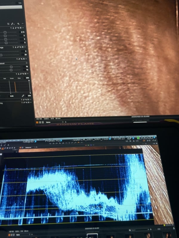
65 units is a nice spot for caucasian skin. We’re about there. Let’s zoom out and see what it looks like.
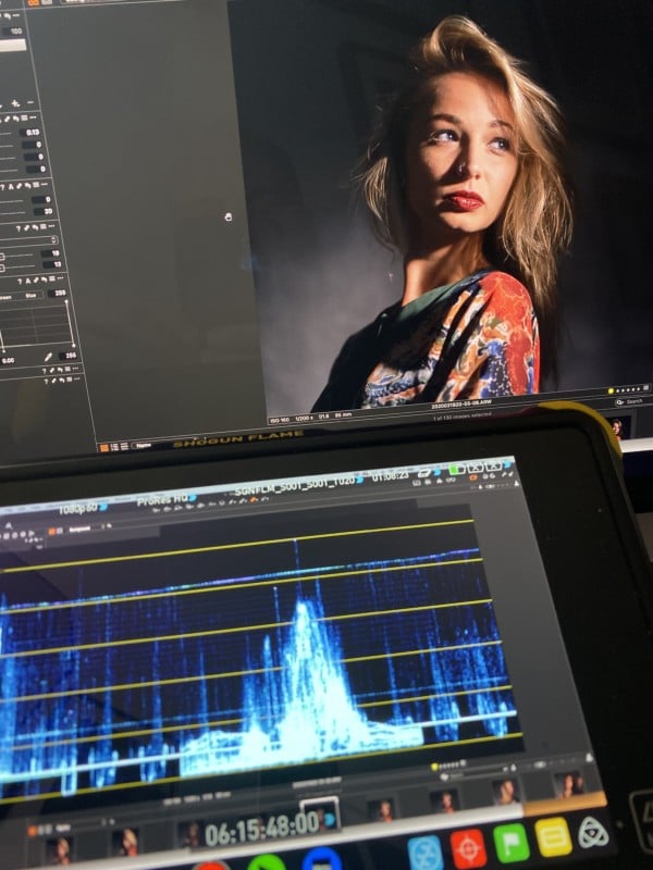
65 units, dead on the nose. This is an iPhone photo of my laptop, so it’s not a perfect shot, but she’s perfectly exposed. Her skin has great detail everywhere, and nothing is clipped at the high end. I’ve crushed my shadows ever so slightly, and you can see that tale on the bottom line; on the left, the “meat” of the data touches the 0 line, and gradually rises juuuuust above it.
Is There a Hack?
So you don’t have a monitor, or you didn’t feel like dragging it along with you, or the battery is dead or whatever. Is there a hack for this method? Yes, kind of. I should mention that this works in Capture One. I’ve never used Lightroom, so I have no idea whether there is any equivalent there.
Open the Curves tool in Capture One. If you mouse over the skin tones, you’ll notice that an orange line will appear in the Curves histogram that corresponds to the general level from 0-100.
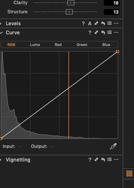
It’s not precise, and I generally kind of “scrub” the cursor over the spot to get an average. Not great, but decent in a pinch.
Just Give Me the Values Already
Here’s where I get myself in trouble. Get ten video engineers in a room and ask them about their preferred levels and you’ll get ten different answers. Heck, go Google it and you’ll get literally thousands more. So, standard disclaimer: these are not the best values, they’re not the only values, there may be more “correct” values, you may find that you prefer something different… it could go on and on forever.
I will say this: I arrived at these levels both through experimentation along with what I was taught and in addition to asking around on some of the shows I’ve worked on. I spoke with a range of video engineers who are all working on some of the highest-rated shows on television. So while no values are the absolute, most-correct values, these are from people who work on shows you’ve seen.
These are also for skin tones in a “normal” lighting situation. Think a nice, well-lit room. If you want a darker look, obviously the values would be lower.
Also, I understand that this can be a touchy subject. It doesn’t have to be. People, no matter what skin tone they are, can be lighter or darker. There is no “normal.” I happen to be an incredibly pale white guy. Black folks can be very light or very dark, hispanic people same thing. Photography itself was originally designed for white skin, and way back when cameras used to be balanced on a white woman every day. Film was built for white skin. Metering was based on white skin. Race is literally built into photography.
We no longer live in those times. I honestly couldn’t tell you which skin tones I photograph the most, and I love that fact. It’s a fun challenge to make sure that you’re representing everyone’s skin tones correctly. It’s also very important that you get it right. Everyone deserves to have their skin look like their skin.
As to the values I use…
Caucasian skin can be placed anywhere from 55-65 units—I generally put it between 63-65. African-American Skin I generally put at 55 units, but I can go as high as 60 if they happen to have lighter skin and down as low as 52 if they are darker. I tend to start Hispanic complexions around 60, and Asian complexions around 63.
Again, these are my values. You can go onto my Instagram feed to see what those look like.
I’m working in a TV studio on a show that’s meant to approximate the look of an evening news show. With “talking head” shows, whether it’s news or sports or whatever, the goal is evenly-lit, “normal” light, so these values are optimized for that situation. If you’re working on darker shots, make it darker. These are simply guideposts.
So that’s it. A lot of words for a relatively simple subject. Experiment, play around. If you have any questions, don’t hesitate to get in touch with me. I love hearing from you! If you like, let me know in the comments whether you’ve had success with this.