The Power of Color in Landscape Photography
Color is so important in landscape photography. The correct harmony of colors can make a huge difference to an image and help to create your own style. In this 20-minute video, I talk about how I create a painterly look in my photos and how I edit in Lightroom.
Here is a brief summary of some of the ideas I consider in the video.
Take a look at some of your favorite painters and see how they have used color in their photos. I like to create a painterly look with my photos similar to paintings from Turner, Gainsborough, and Friedrich.
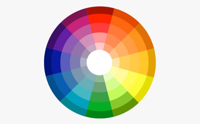
Get a color wheel on your phone and get familiar with the 2 basic relationships that create strong images: analogous and opposite colors.
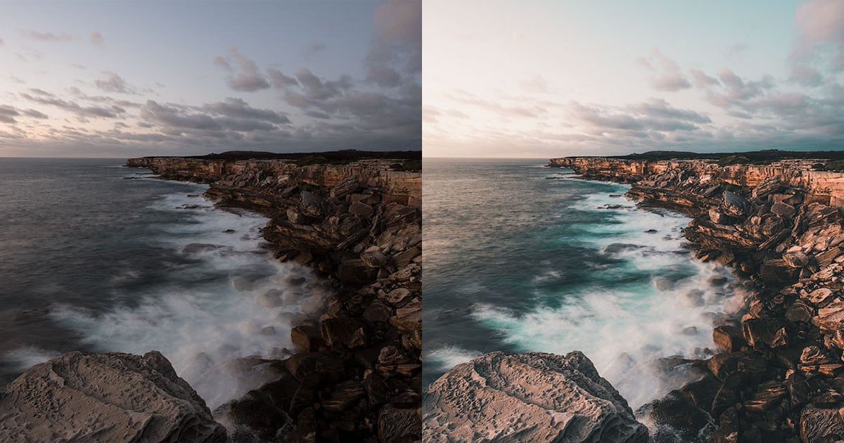
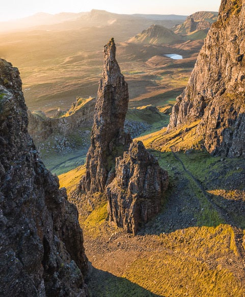
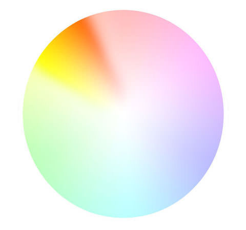
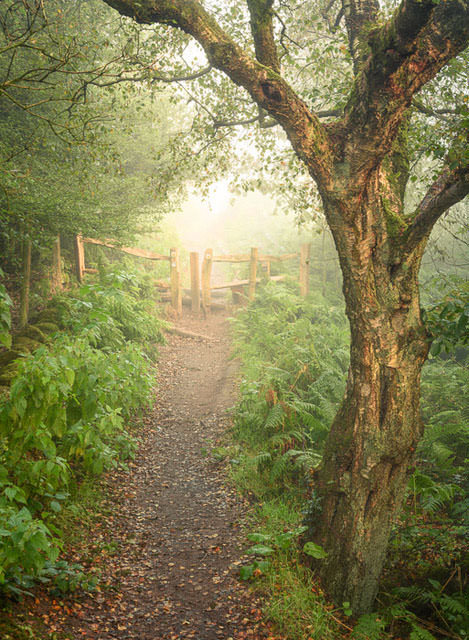
For working with analogous colors (ones that are next to each other on the color wheel), this image is a good example — I have highlighted the colors in the associated color wheel:
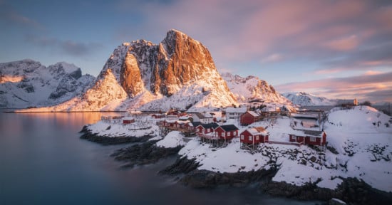
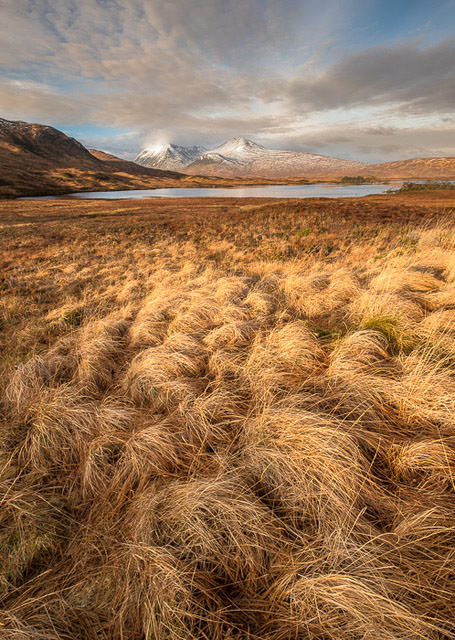
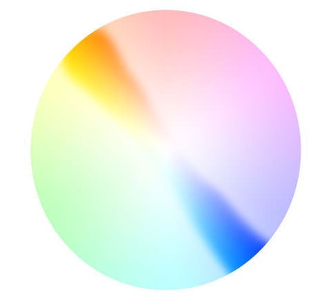
The other way of creating balanced color images is working with opposite colors such as in this image. It shows that a blue sky can work if you have the correct tones in the grass or foreground.
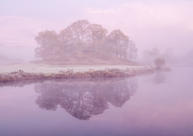
Fewer colors can lead to simple yet very powerful images. In this image, I purposely excluded the bluer sky higher up in the image to give this soft lilac tone in the amazing winter blue hour before sunrise.
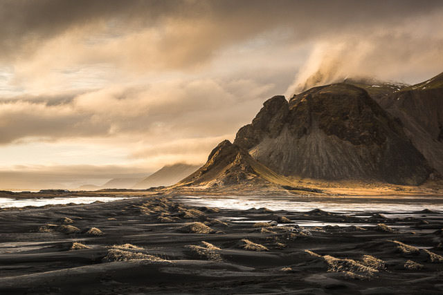
And in this image, the sunset in the sky and the grasses in the volcanic sand worked together to produce a very simple image and help to give an otherworldly look from this grand vista.
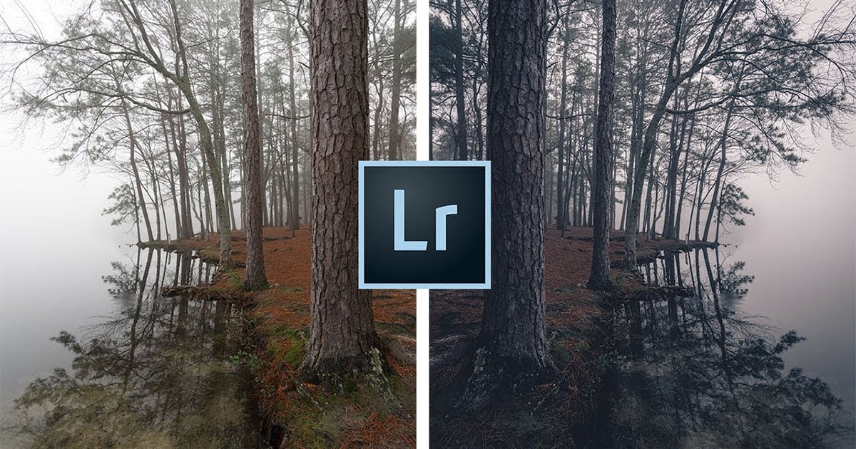
Lightroom is such a fantastic tool to help you realize this painterly effect and understanding how to manipulate color and improve your photos. Here are 3 of the tips and tricks I talk about in the video.
Selective white balance using the radial tool and graduated filter. I use this a lot in images to accentuate certain areas to draw the viewers attention. Such as the warmer highlights in this image:
The HSL slider to tweak color and help nature on its way. This is a great way to not only ensure the color balance correctly but change the saturation balance between certain colors. Something that is really important to get the look and style you are after.
Split toning can massively help to improve the look. I like adding in warmth in the highlights and coolness in the shadows. Something that is often present but by using this tool in Lightroom and can help to recreate what you felt when you were on location.
So take a look at the video above on the power of color in landscape photography and start to step up your photos to the next level.
P.S. If you enjoyed this content, you can sign up for more great tips and tutorials on landscape photography by subscribing to my YouTube channel.
About the author: Nigel Danson is a landscape photographer based in the UK. The opinions expressed in this article are solely those of the author. You can find more of Danson’s work on his website, Facebook, Twitter, and Instagram.