6 Lightroom Tips to Create Moody Landscape Photos
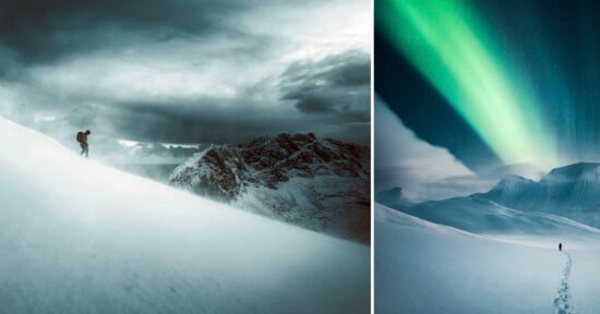
It seems the moody edit trend has been going strong for quite a few years now and it doesn’t appear to be slowing down. There’s probably not a better time of the year to capture moody landscape photos than the winter months.
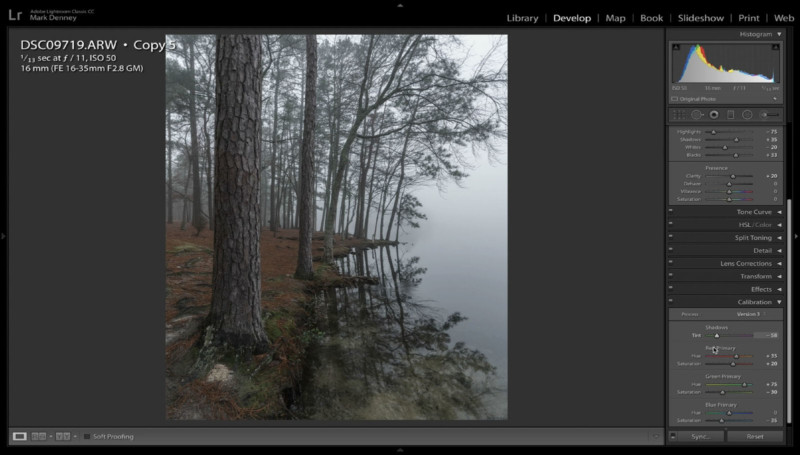
In the 10 minute video above, I review six Lightroom editing tips that I apply to my images to create or enhance the mood of a photo.
1. Reduce Exposure and Cool Down
First, we want to reduce the exposure a bit and cool down the overall color temperature of the image. This step is an easy and straightforward one but it makes a dramatic impact on the feeling of the photo.
2. Tint the Shadows
This is something I don’t hear done very often, but tinting the shadows in the ‘Calibration” section and sliding the tint more towards the green side creates an impressive result that helps achieve that “cinematic” look.
3. Desaturate the Color Palette
There are a few different approaches you can apply here to effectively desaturate an image. I generally like to increase vibrancy while at the same time reducing the saturation or I’ll jump into the HSL panel and individually change the saturation and luminance of each color channel.
4. Adjust Tone Curve
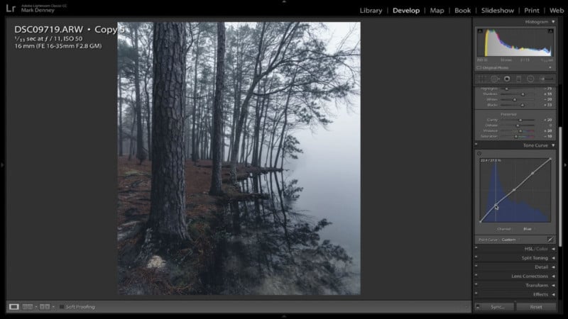
Subtle-Subtle-Subtle! You can get sideways real quick here if you’re not careful. Adjusting the Tone Curve of the blue channel can create an incredibly moody effect when done in an oh so delicate way.
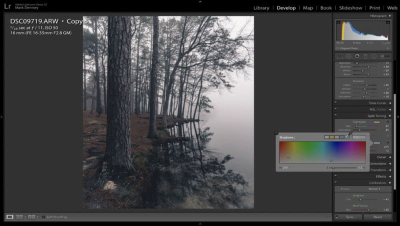
5. Split the Tone
I find that Split Toning is great for creating color contrast or color separation between the highlights and shadow areas of an image. Since we already applied a cool green tint to the shadows in Step 2, I want to apply a bit of warmth to the highlights to better separate the two regions of the photo.
6. Vignette & Texture
And for the finishing touch, I always like to apply a vignette to the image just to darken down the corners a bit to keep the viewer’s eye looking towards the center of the photo. And, apply a touch of grain just to rough the photo up a bit and get away from the perfectly clean digital image appearance.
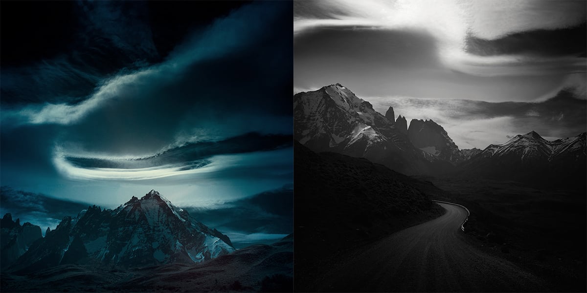
I’m sure there’s a slew of additional ways to apply a moody edit to an image, but these are the six steps I generally follow when creating this look. I’m always amazed at how simply adjusting the colors and color balance of an image can completely change the feeling of a photograph and it’s fun to do as well!
P.S. If you enjoyed this video and article, you can find more by subscribing to my YouTube channel.
About the author: Mark Denney is a landscape photographer based in North Carolina. The opinions expressed in this article are solely those of the author. You can find more of his work on his website, Facebook, Twitter, and Instagram.