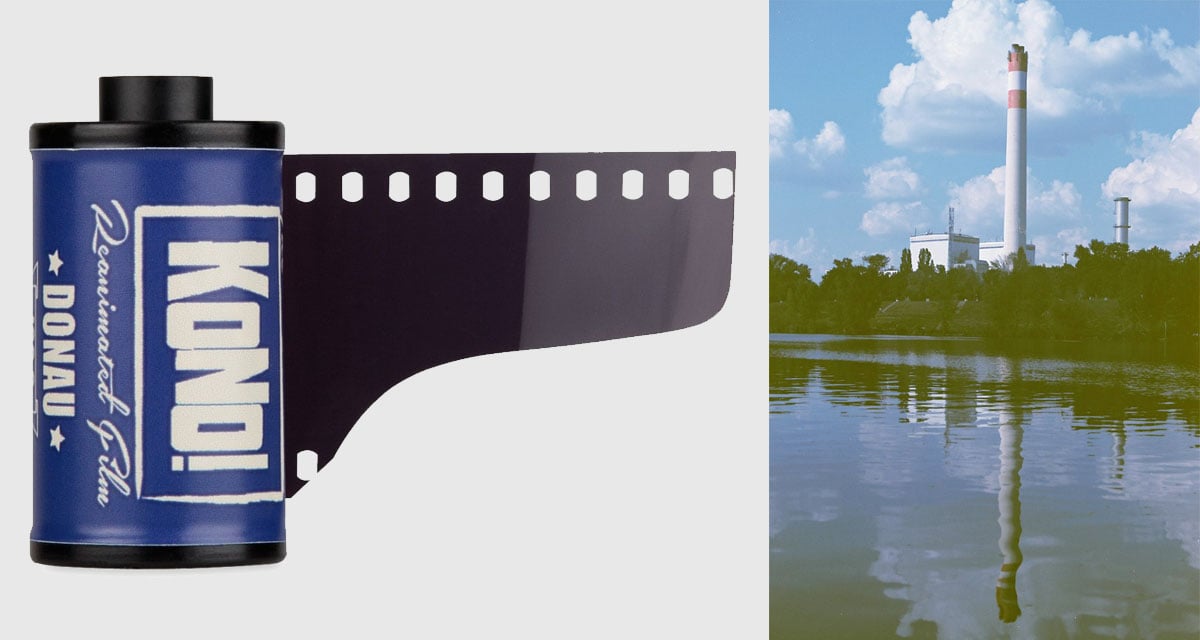
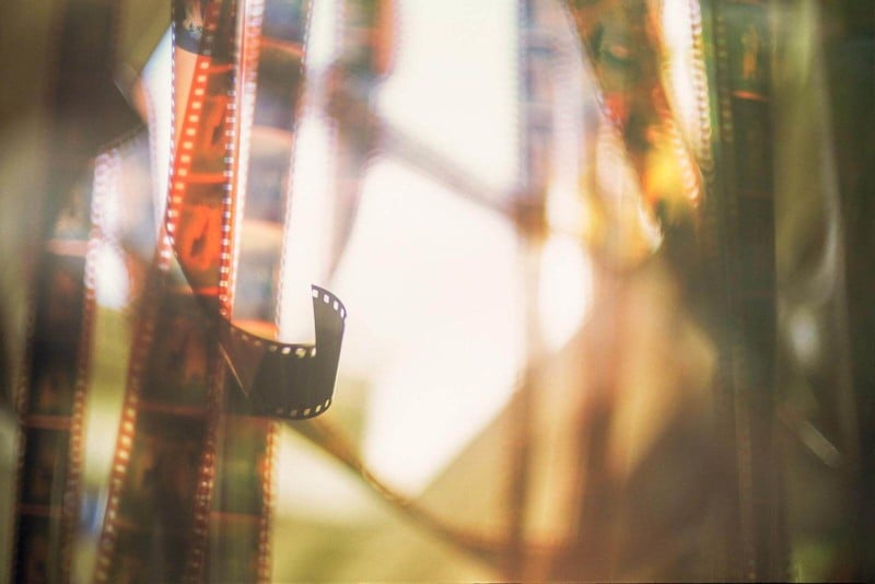
An Ode to 35mm Film
I took some of the best photos of my life on 35mm film. It will always have a special place in my heart, even though I haven’t shot on film in years.
- Film grain looks painterly and artistic;
- The texture gives a focal point to photographs that have a shallow depth of field;
- Negative film is very forgiving of overexposure (digital is not);
- The ability to hold a photograph in your hand makes it less likely that important photos will be discarded by future generations;
- The expense of shooting film, coupled with the lack of seeing a shot in realtime, forces a photographer to plan his or her shots more carefully;
- Getting photos back from a lab (especially by mail) feels like opening a present;
- It’s fun to experiment with the chemistry of film to see what happens. E.g. pushing, pulling, cross-processing, adding salt, microwaving, etc.
But, if you ask me why I stopped shooting film, I could just as easily tell you:
- Each shot is expensive, especially when you add in the cost of processing;
- Negative film is terribly hard to organize if you shoot mixed subjects on the same roll;
- Film scanners are slow. Retouching dust, dirt, scratches and stray hairs is tedious; and
- It can be scary and depressing when a film is discontinued. (Imagine if a painter woke up to discover that oil paints would never be made again. That’s what many photographers felt like when Kodachrome was discontinued. I even wrote an obituary for it.)
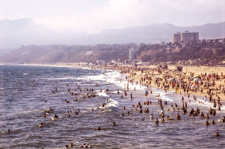
Nevertheless, I look back at my old photographs with nostalgia. Each of my favorite films had its own character. Here is a small collection of photos that speak to how each was wonderful and unique. These images are minimally edited. I used Photoshop to restore the colors to what the original slides or prints looked like.
KODAK GOLD 100

Kodak Gold 100 was a cheap film that you could find behind the counter at pharmacies like CVS and Walgreens. It wasn’t a professional emulsion, but it was distinctive. Reds popped and highlights looked golden. It was the perfect film for capturing “Kodak moments” on a bright, sunny day.
KODAK GOLD 200

Kodak Gold 200 may no longer be a “drugstore film,” but it’s still available for sale. That warms my heart because I loved Kodak 200. It was a dependable travel film that made skin tones look natural without sacrificing color elsewhere.
FUJI SUPERIA REALA 100

Reala was my favorite negative film. It was a jack-of-all-trades that had fine grain, excellent contrast and color rendition, and was forgiving of over- and under-exposure. It was also great for long exposures and it scanned well. Reala would have been my go-to film if I had worked as a photojournalist.
FUJICOLOR 200
I shot a lot of Fuji 200 because it was dirt cheap and looked great in bright sunlight. Reds, white and blues all popped. The film behaved very differently in low light situations, however, producing desaturated photos that looked hand tinted.
KODACHROME 25

Kodachrome 25 was a grainy film despite its ultra-low ISO. It was also brutally unforgiving of under- and over-exposure. Still, there was something magical about Kodachrome. Sadly, I was only able to shoot two rolls of Kodachrome 25. I discovered its charms just before it was discontinued.
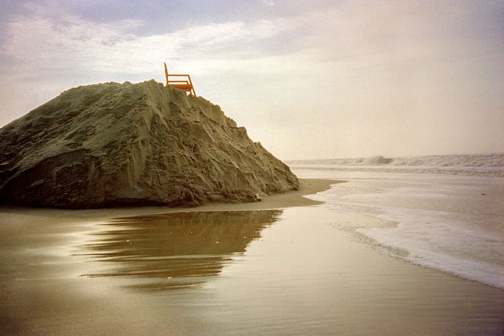
FUJICHROME VELVIA 50
I found Velvia 50 to be more contrasty than colorful. Maybe I never exposed it correctly. Nevertheless, I liked the film because it reminded me of Kodachrome 25 (but I preferred the ISO 100 version of Velvia).
FUJICHROME VELVIA 100

Velvia is famous for producing super-vivid colors. It’s not a portrait film (it makes skin looks sunburnt), but boy does Velvia make landscapes look great. A well-exposed frame can feel like a window into a Technicolor dream world. There’s no other film like it.
FUJICHROME ASTIA 100F

Astia was a slide film that muted colors and rendered skin tones pretty naturally. It was designed for portraits, but it was decent enough for general use. I found that Astia made things look a little sadder than they really were, which was a downer, but a downer that could be used to good effect.
FUJICHROME PROVIA 100F

Provia is Fuji’s most versatile slide film: Colors pop without distorting skin tones. Provia is also the best slide film that I found for cross processing (i.e. developing a slide film like it was a negative film).
KODAK EKTACHROME E100

I didn’t appreciate E100 as much as I should have. If Fuji Astia made everything look a bit sadder, then Ektachrome 100 made everything look happier. Skin tones look warm and natural and it is forgiving of overexposure. Maybe that’s why Astia is discontinued but E100 lives on.
KODAK PORTRA 400UC

Kodak’s “Ultra Color” film looked drab under daylight, but it absolutely popped under studio lighting. It was great for product photography and portraits under tungsten light.
KODAK 100UC

This ISO 100 version of Kodak “Ultra Color” was a strange film when you paired it with a “creamy” lens. It made photographs look like paintings! Contrary to its name, I found this film to have muted colors in natural light.
KODAK BW400CN
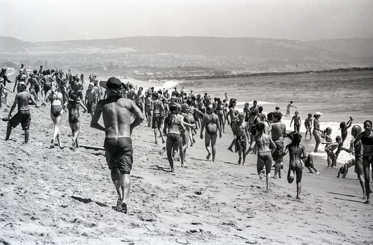
Kodak’s BW400 is the most forgiving black-and-white film that I ever used. It had bright whites, neutral grays and rich blacks that seemed to adjust in proportion if the film was over- or under-exposed. I was sad to see this one go.
For each film that I remember well, there is a film that I remember poorly. Ilford’s black-and-white films looked muddy and always left me disappointed. Agfa’s slide films didn’t resolve details nearly as well as equivalent films from Kodak and Fuji. Kodak’s Portra films (both the “Natural Color” and “Vivid Color” varieties) seemed vulnerable to fogging from X-ray machines. I didn’t like Kodachrome 64 half as much as Kodachrome 25, and many of my shots on Tri-X 400 haven’t aged well because I did a poor job developing it (I was an impatient chemist). That said, my experiences and preferences are no indictment.
I’m grateful that Kodak and Fuji still manufacture 35mm films and equally thankful that stores like Lomography and B&H continue to sell them. Film is an important part of our heritage and I would hate to see the art form lost to history. The world is swimming with wonderful old cameras and lenses; I hope that young artists find inspiration and continue to experiment with the medium.