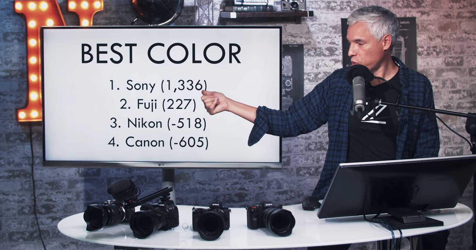
Is Sony’s Color Science Really That Bad?
One of the biggest complaints I hear quite regularly about Sony mirrorless cameras is that their color science is horrible. Many photographers don’t seem to like how Sony interprets colors from any given scene. This it seems, to be especially true for portrait photographers. In stark contrast, color science is one of the major positive points for Canon cameras.
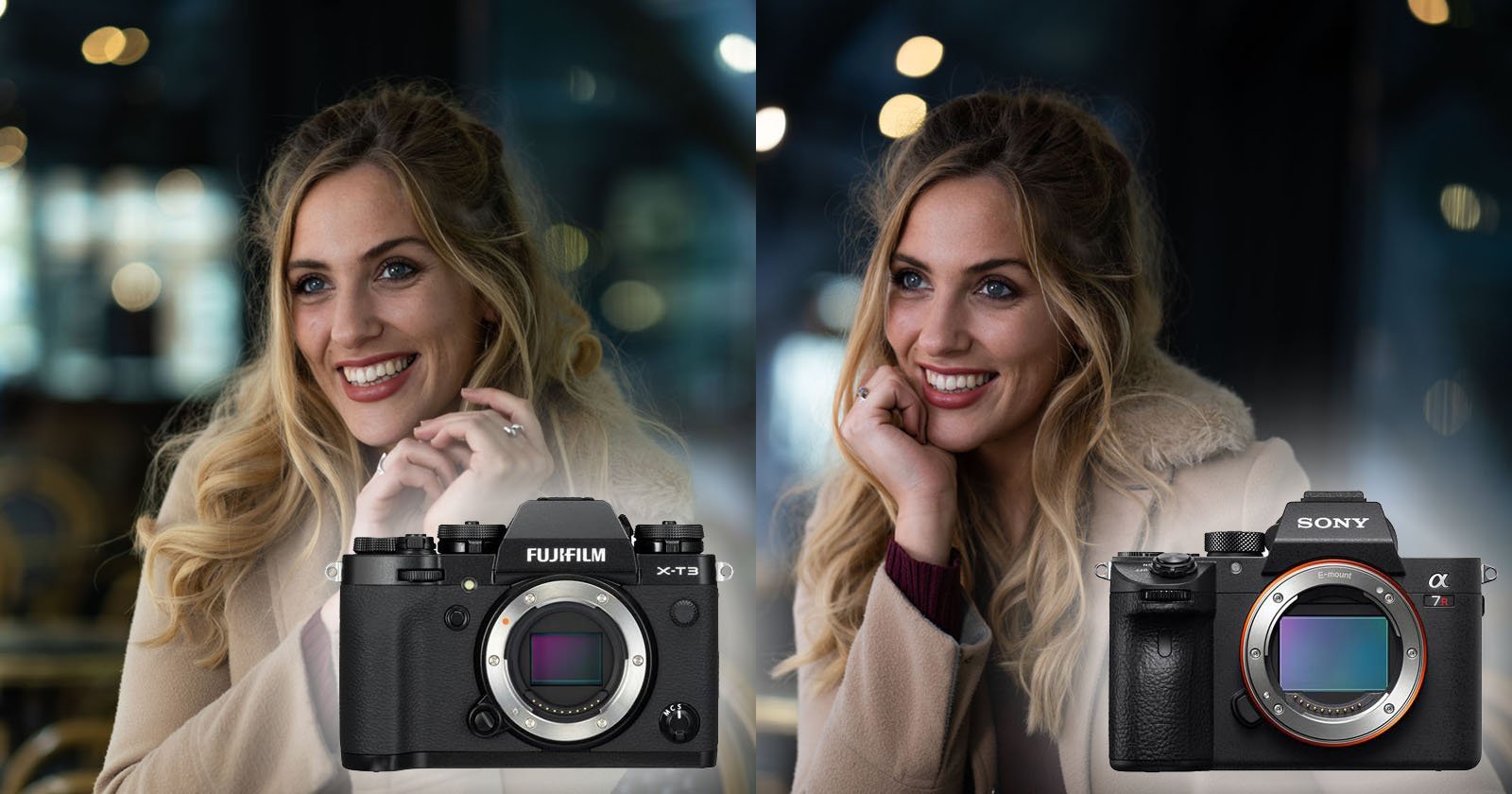
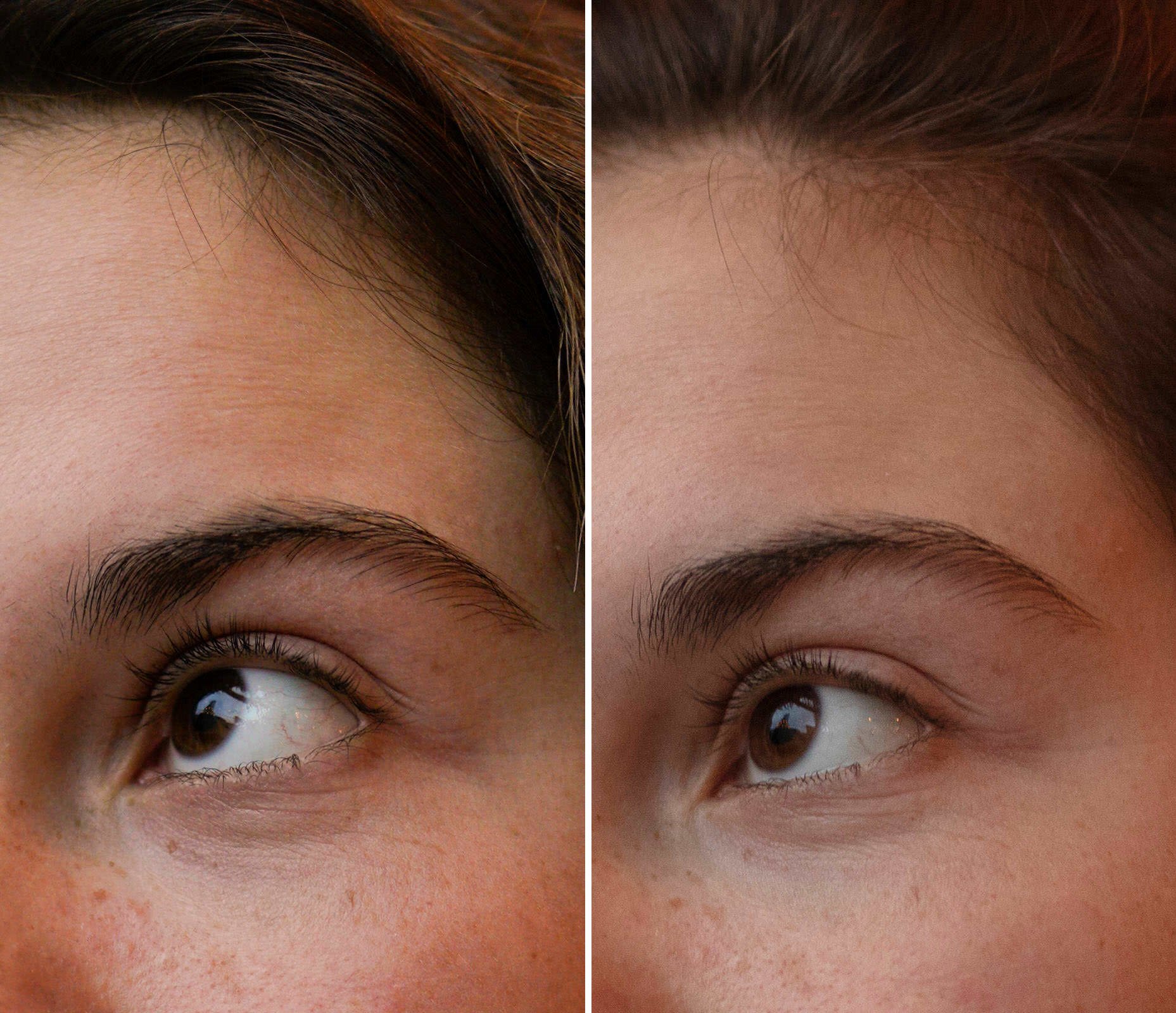
This first comparison was shot indoors with mixed lighting. This is a challenging environment for many cameras and I wanted to see how both the Canon 5DS R and the Sony a7R III managed. The images have not been profiled or edited and only the white balance has been corrected. The lenses I used for this first comparison were the Sigma 50mm f/1.4 Art on the Canon and the Zeiss 55mm f/1.8 on the Sony.
Even without zooming in you may be able to see some distinct differences in the color. The Sony is leaning more into orange for the skin tones. Darker skin tones can be more of a challenge for some cameras, but the Canon seems to be doing a great job. Skin tones in the Canon look far more natural and pleasing. The Sony isn’t doing a great job.
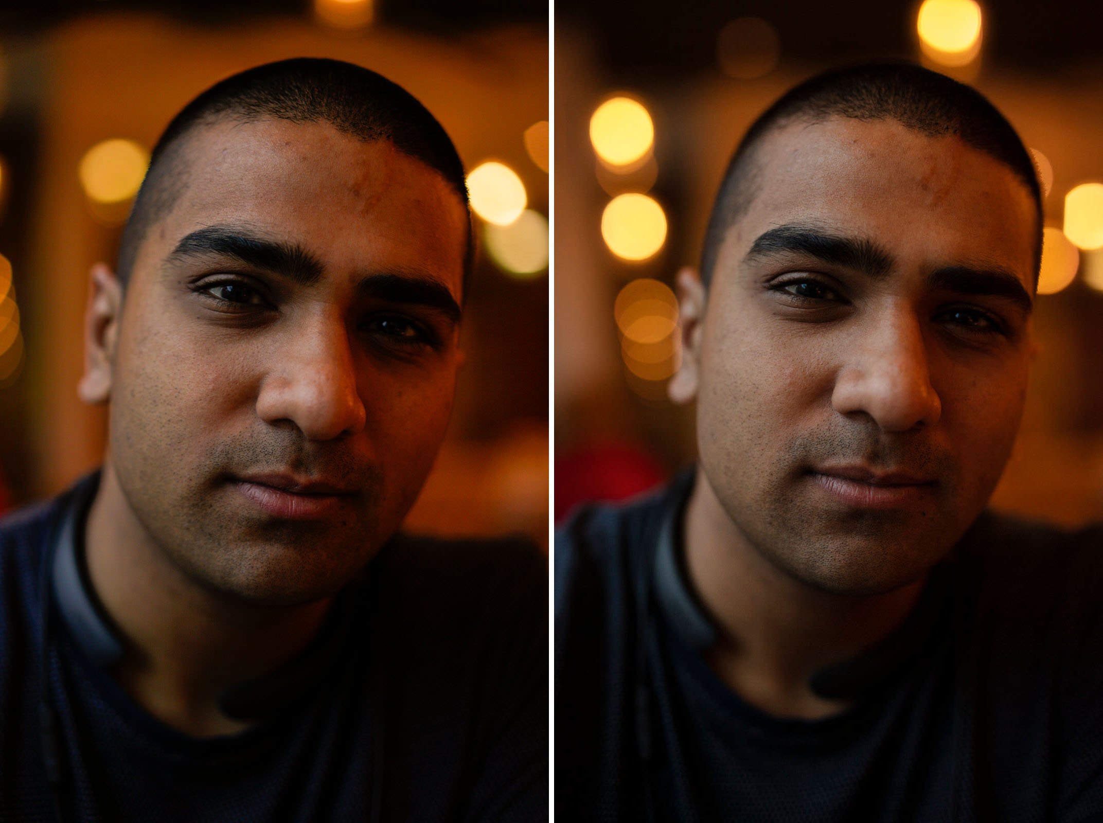
Even when you zoom in to the image you can see some odd green tones that aren’t present in the Canon image. This seems to confirm many of the complaints I’ve heard about Sony’s color science.
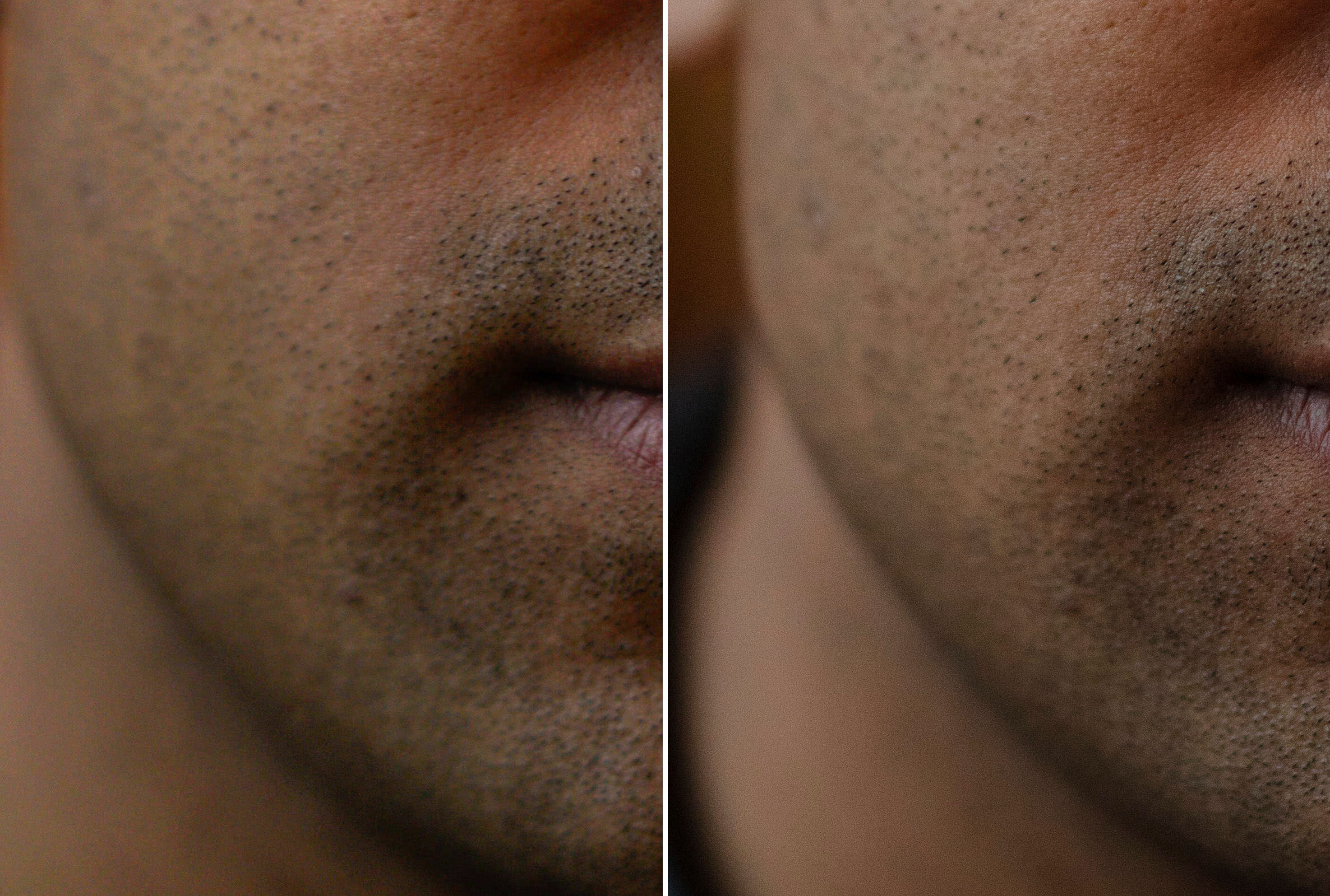
I also compared the Sony with the Sigma 50mm Art too. This is because the lens you choose will also impact the colors and I wanted to prevent any unwanted variables. Looking at the image from Sony that was shot with the Sigma lens, you can see how it actually looks much better. This is with the same white balance too. Much of the odd green and orange tones in the skin have been corrected. The Canon, however, still looks noticeably better. When you zoom in 1:1 you’ll still notice some odd blue and green tones in the skin for the Sony image.

Although I haven’t tested this extensively, it seems that a big contributing factor to Sony’s color science is their lenses. Adapting Canon lenses or using Sigma art lenses seems to correct many of the issues.
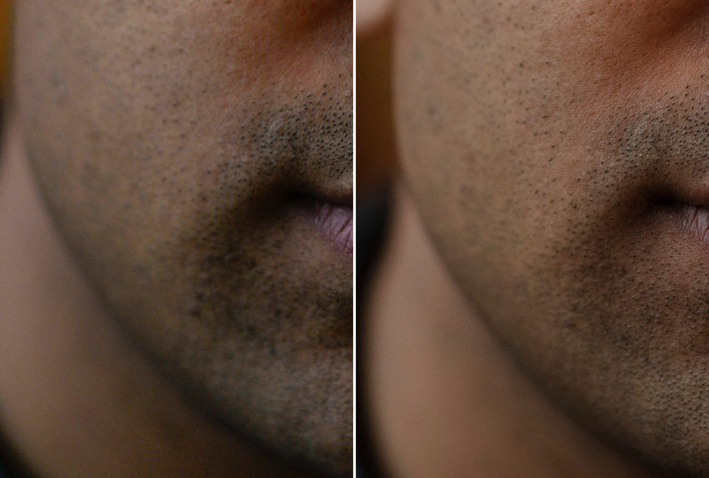
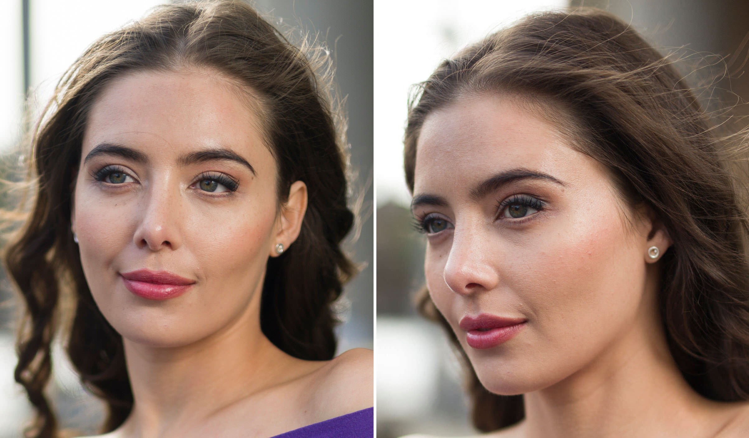
When shooting lighter skin tones in mixed lighting with the same lens on both cameras, the Canon, once again did a much better job. The Sony image does seem to have more contrast however it also has a lot of unpleasant green and yellow tones in the skin.
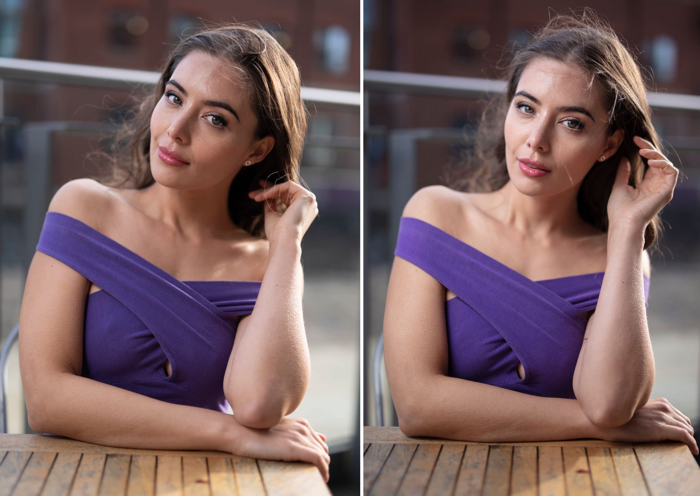
I also photographed a model with flash and profiled/white balanced the images with a Color Checker Passport. Once again, we used the Sigma 50mm art for both cameras. Prior to adding the profile to the images, the Sony images had the same issues in the skin tones. Once profiled, many of the issues were corrected. It’s still not a perfect rendition and not completely accurate but much better than where we started.

For instance, the purple dress in the Sony image is leaning more into blue. Purples can be a difficult color and Canon (once profiled) does a much better job.
The skin tones in the Sony image look much better with the profile, but there are still some odd yellow tones creeping in. There looks to be a band of yellow going around the model’s face.

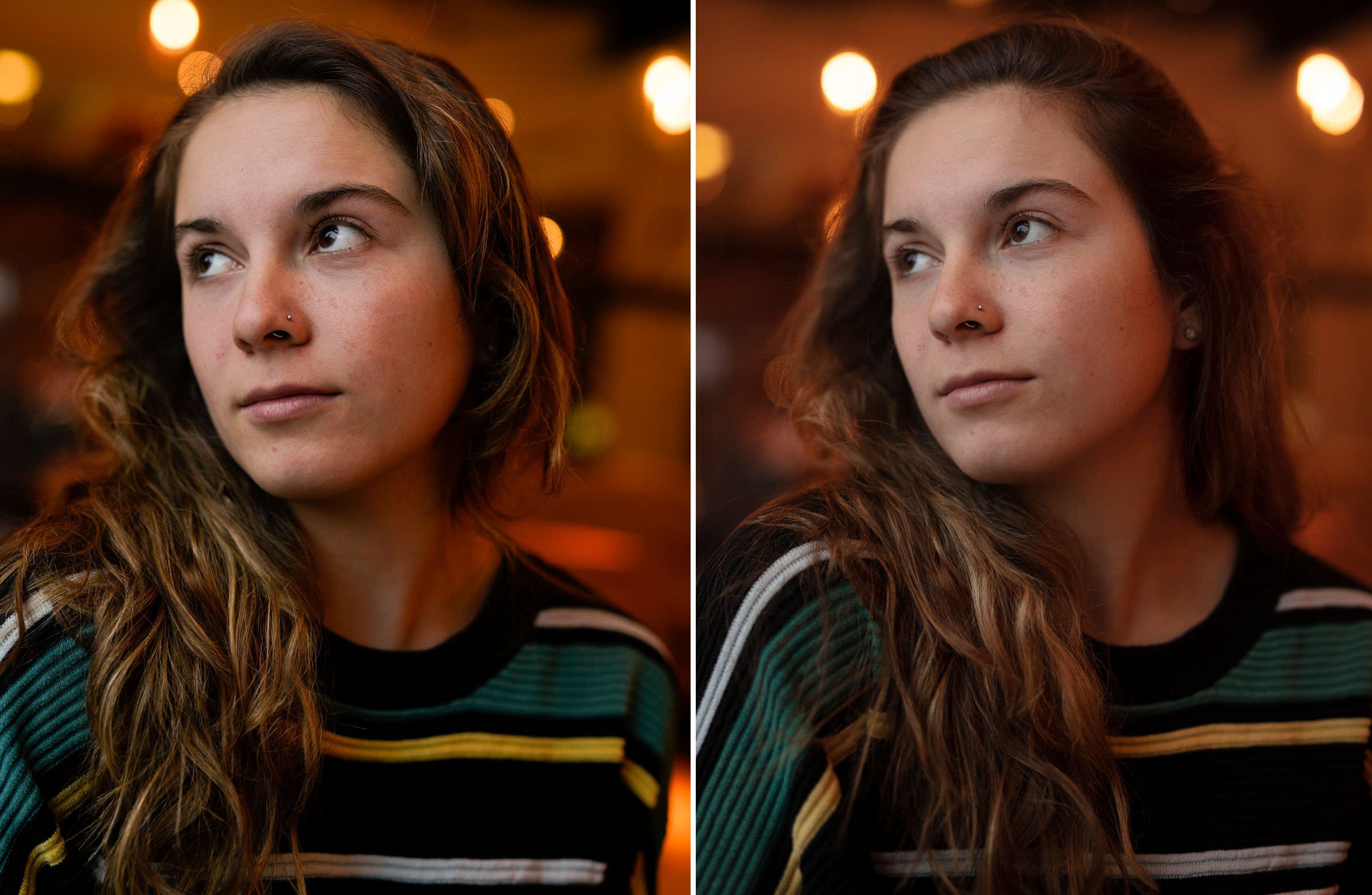
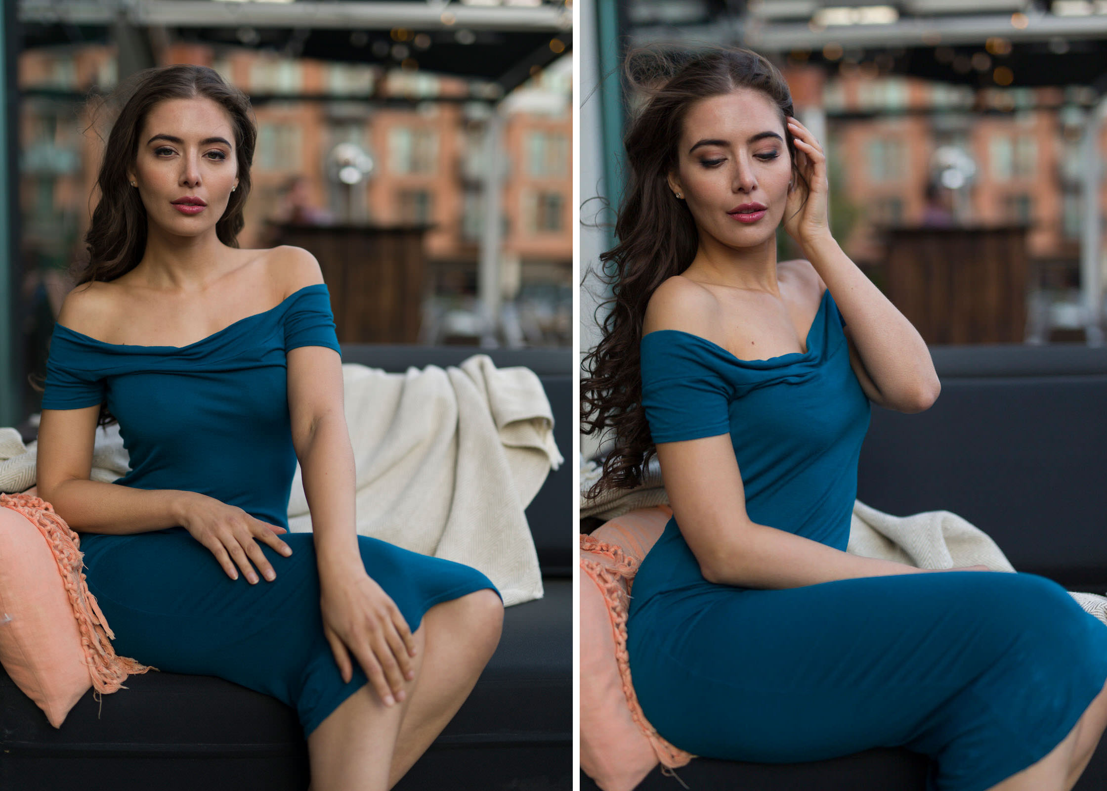
I also wanted to test the colors without any flash and shoot using just natural light outside. As discussed above mixed lighting scenarios can be tricky for cameras. Even still the Canon does a much better job. Once again these images have been profiled and white balanced using a color checker passport. The Sony is leaning more into the greens and yellows both in the dress and skin tones. The Canon, however, is much more accurate in the dress and the skin tones look far more pleasing without any odd shifts.
The comparisons above have all been mostly about skin tones. This is, for the most part, more applicable for portrait photographers. As an architectural photographer, I wanted to see how Sony managed when it came to photographing buildings. Using the Canon 24mm f/3.5 T-SE II on both cameras there are some pretty noticeable differences in color. The red tones in the Sony image lean more into orange and are less accurate. The tall building in the back has a slight yellow shift to it and isn’t as accurate either. The greens, however, look more vibrant in the Sony and more accurate. For architecture, Sony may not be the best choice specifically when it comes to colors.

Finally, I decided to photograph some fruits and vegetables in a controlled environment to see how both cameras compare. These images have not been profiled but have been white balanced with the color checker passport. All the images were shot with the Canon 100mm f/2.8L macro lens.
Looking at the tomatoes below, The Sony once again leans into orange more and is less accurate. The green stems, however, look slightly better in the Sony image.

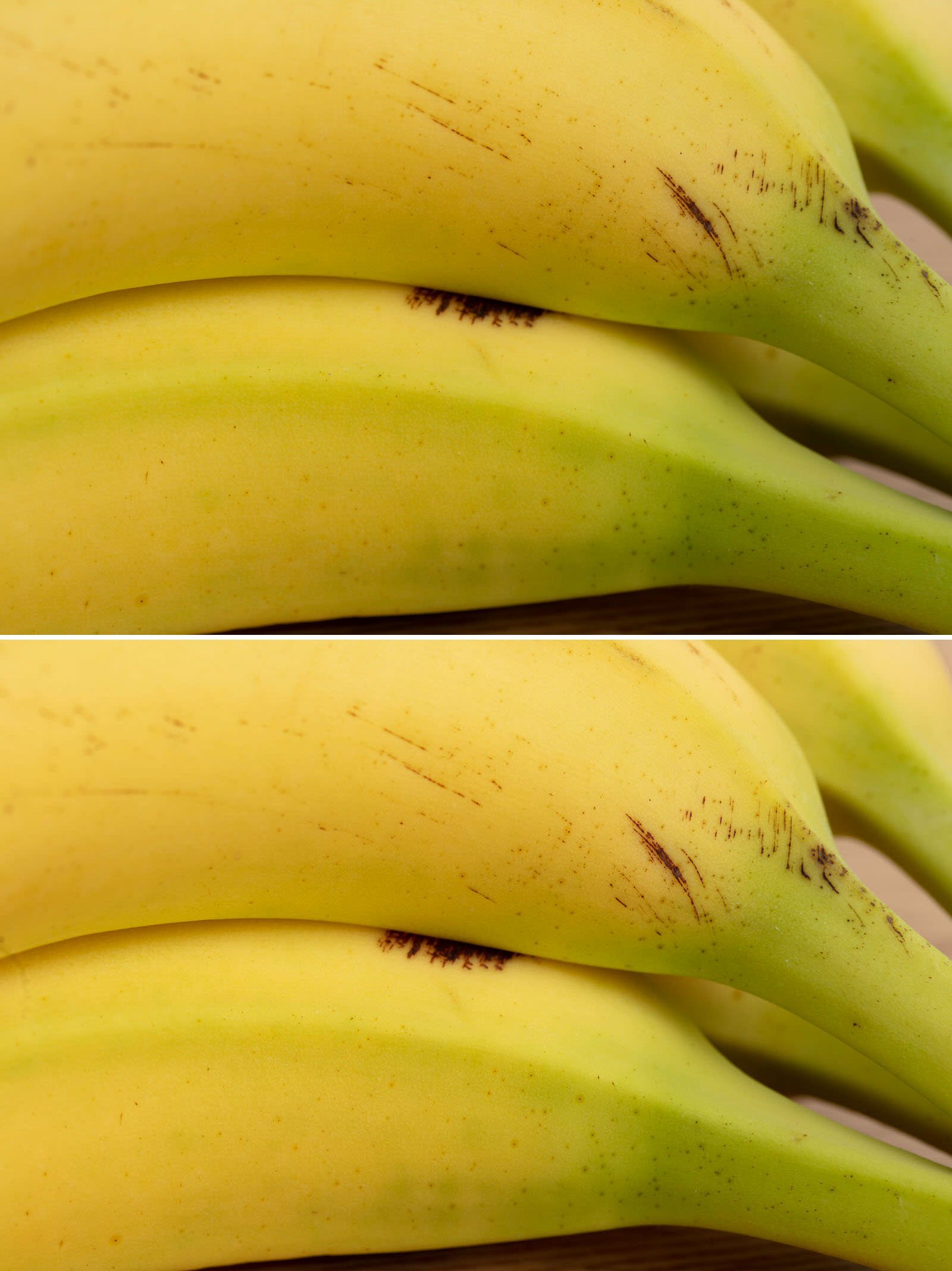
When it comes to yellows in the bananas, Canon does a much better job both in accuracy and tones. The Canon image looks more vibrant too whereas the Sony is leaning more into green and can’t seem to represent the yellow tones effectively.
In the cucumbers below, Sony does a better job with the greens. Canon is less accurate and leans a little into yellow.

Final Thoughts
It seems pretty clear-cut: Sony’s color science really needs some work. Canon does a significantly better job when it comes to skin tones and is overall more accurate too. Even when using the same lenses, Sony seems to be adding a bunch of odd yellow and green tones into skin, which is not very flattering. Using a Color Checker Passport does have a significant impact on the colors and corrects many of the issues. The problem is that even with that, it’s still not as good as Canon.
For the most part, this affects portrait photographers, and other types of photography may be more forgiving to Sony’s color science. For instance, some landscape photographer may prefer the more pronounced green tones from the Sony camera. Other than that it’s difficult to see how Sony’s color science can be useful for most photographers.
Sure, you can edit and correct colors, but being able to edit is not an excuse. This is because having to correct colors increases your workload. Profiling with a Color Checker Passport also doesn’t get you close enough so more time is needed to get things right. Ultimately, colors are more important than resolution and dynamic range. For that reason, I hope that Sony will make their color science a priority and correct these issues.
About the author: Usman Dawood is the lead photographer of Sonder Creative, an architectural and interior photography company. The opinions expressed in this article are solely those of the author. You can find more of his work on his website, Instagram, and YouTube.
Credits: Modeling by Leela Tikadar, and assisting by Darleen Klug.