Trump’s Official Portrait and the Language of Lighting
Nine months after taking office, the White House has finally released official portraits of both President Donald Trump and Vice President Mike Pence. Last month, the Washington Post did a story highlighting the empty walls of some 9,600 federal buildings, all waiting for for an official portrait of the new POTUS.
As a photographer and veteran involved in policy work, I am interested in both the messaging and methodology of Trump’s two official portraits. As a baseline I will compare Trump’s two portraits against a more standard portrait seen with Vice President Pence’s and Congresswoman Stephanie Murphy’s portrait.
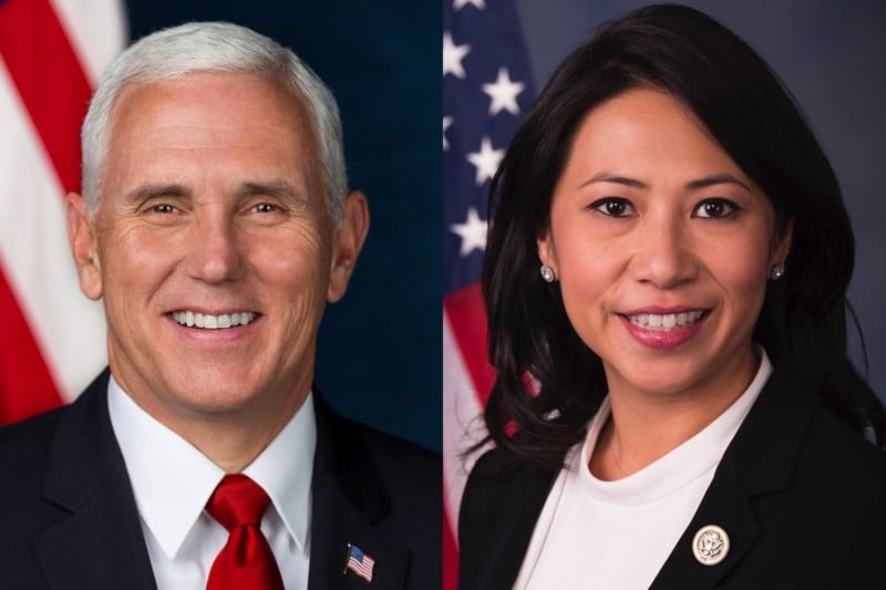
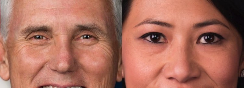
Let us look at our baseline, the standard portrait. Below are two images, one of Vice President Pence and the newly elected member from my district, Congresswoman Murphy. As a whole both are consistent in the obvious ways that matter, so lets go in. Both have multiple catchlights that bring attention to the eyes, giving them a three dimensional quality.
A soft key light is positioned camera left, with a bounce for the fill on camera right. Both appear to have a contrast ratio of 3:1 between the key/fill. Skin tones are excellent on both, white shirts are a true white, though the saturation of the most dominant color (red) seems much more saturated with Mike Pence compared to the Congresswoman.
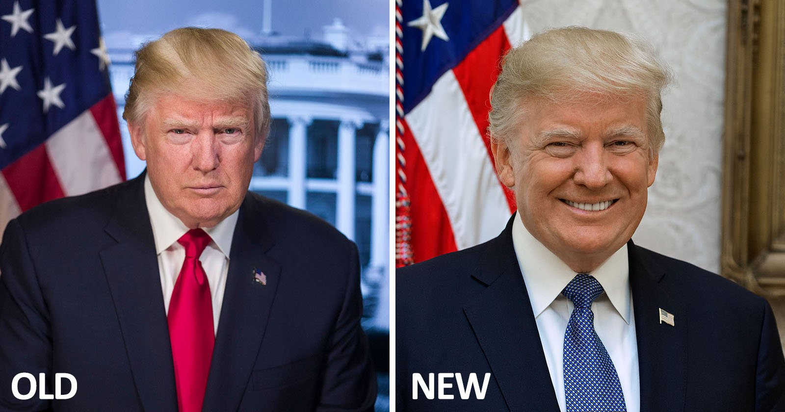
Now, lets look at President Trump’s two official portraits — the similarities between them and then compare against more standard portraits with the examples above.
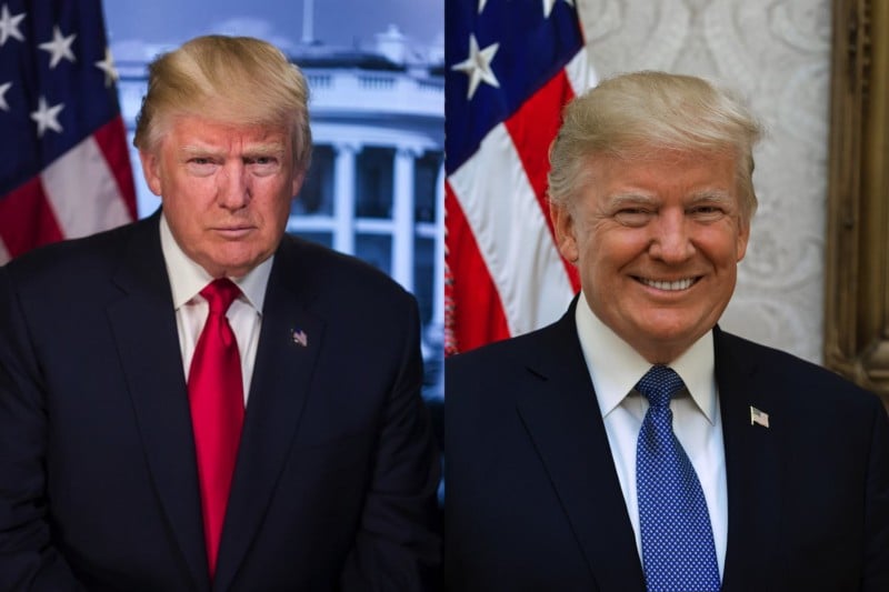
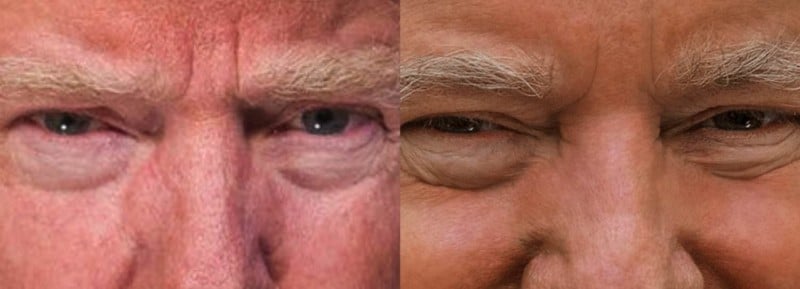
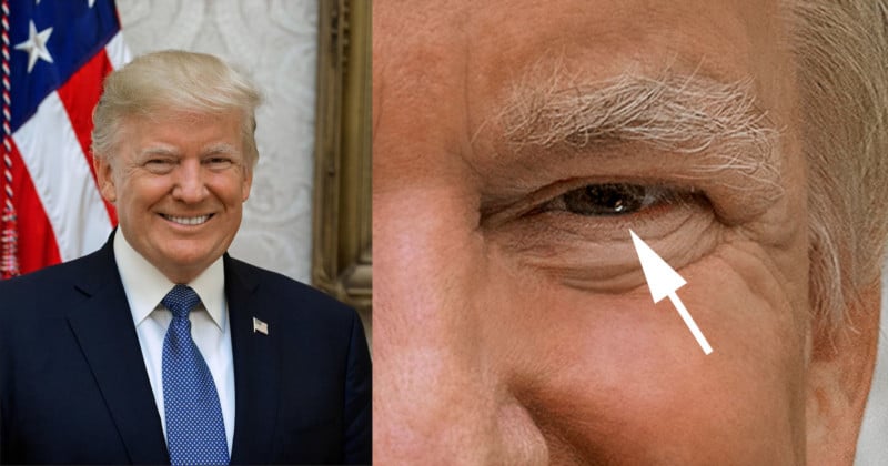
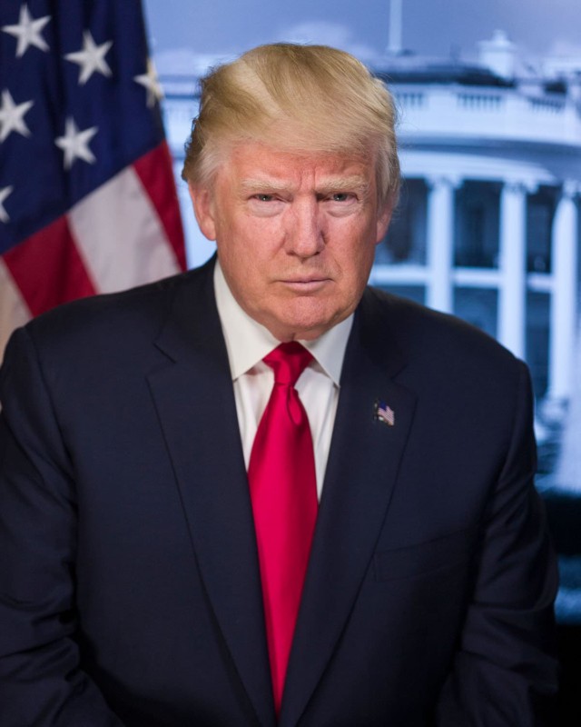
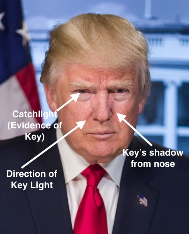
Notice in the catchlight in both images: a single, specular source placed below the subject’s eye line. Normally this is placed at a 10 or 2 o’clock position. Here they are 8 and 4 o’clock – the exact opposite of Pence and Murphy. This placement of a main light source as used in filmmaking usually suggests something rather negative about the subject: that they are sinister, to be feared, or not to be trusted.
In Trump’s previous portrait it is much easier to see the effect of this low angle source – look at the hard shadows created by the subject’s nose on the camera right side of the face.
Looking at President Trump’s portrait vs Vice President Pence’s, there simply isn’t enough light from a controlled source to render his shirt a true white (notice the warm reflected light of Trump’s skin down onto his shirt.)
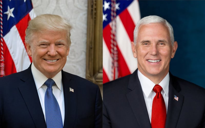
Compare the luminance of Trump’s skin/teeth/hair against that of Mike Pence — there is no comparison. With a portrait, the skin needs a certain amount of light to absorb and then reflect that light back, giving it a sort of glowing quality. In Trump’s new portrait, there simply isn’t enough light hitting the subject.
In the West, we read not only words from left to right, but also movement, contrast, and story. A character walks across the screen from left to right: he is going forward. A character walks from right to left: he is going backward. The direction of movement tells us something often subconsciously. Light hitting the subject from camera left and wrapping around a subject’s face creates visual interest, contrast, AND is in keeping with how we would normally read: from left to right.
In Trump’s new official portrait that story, movement, and contrast as told through the use of light just simply isn’t there. It looks as though most of the light is coming from existing overhead fixtures in the room.
I would agree that Trump’s new portrait is an improvement upon the one previously distributed. But as a photographer and someone involved with policy work, my take is that President Trump’s newly released official portrait is terrible (especially when viewed next to Pence’s). And most curious about both of Trump’s portraits is this intentional, hard light source placed below the subject (sinister lighting technique.) This just strikes me as odd. I cannot help but wonder if Trump himself is insisting that he be photographed this way?
You be the judge.