A Look at Composition in Documentary Photography
In my mind, there are three important elements of a photograph. Lighting, Composition and Moment. Every picture that I love has these elements, in varying amounts. A great picture may have strength in all three areas, or it may be, for example, such an emotional moment that it overpowers poor composition or light.
But for this article I want to take a quick look at composition, and how photographers will be subconsciously considering many compositional elements when making pictures as well as editing and post processing later.
Case Study #1
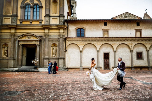
Here’s Lisa and Massimo, after their ceremony at the beautiful Chiesa della Certosa in Florence, Italy. We’ve just finished the family group pictures which took place to the right of the frame, and I shot some portraits whilst their families dispersed.
As they walked back to the Monastery entrance, Massimo, ever the gentleman, picked up Lisa’s train. A quick smile and glance backwards from Lisa has added the ‘moment’ to this picture. The light is pretty dull and overcast, which gives a muted look to the scene, and this works for me as well.
Breaking It Down
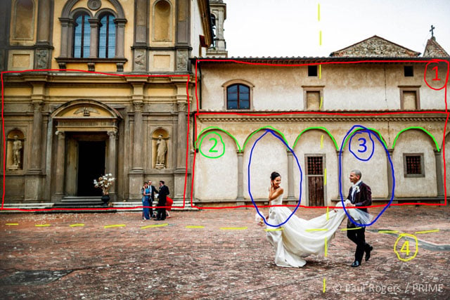
Lets take a look at the compositional elements in this picture:
1. Rectangles and squares form strong geometric shapes, and having them repeat through an image adds to a sense of stability and structure. For this image, it’s important to correct slightly diverging parallels in post processing.
2. Repetition of shape and pattern in an image can be pleasing, and having the arches run across the frame is helpful here.
3. Timing the shot has had a large effect on the composition here. Luckily the relative distance between Lisa and Massimo matches the distance between three arches behind. Had I shot this when they were centred in any of the other arches, the composition wouldn’t have been as strong — a door or window would have broken the shape.
4. Framing on the thirds – a simple and well used technique. I generally like to give the subjects ‘space’ to walk into. Central composition works in a lot of circumstances, especially when using symmetry, but wouldn’t have been as strong for this photograph in my opinion. A tight shot of just Lisa and Massimo framed fully by the arches would also have been a great picture to get, but I like the sense of place that this wider composition has.
Looking at the image as a whole it’s well balanced. In tone – though the sky is a couple of stops brighter, this doesn’t impact the image. In elements – the guests in the background and the flowers in the doorway provide balance against the bride and groom. Imagine this scene without them – it would feel a little too right hand heavy. It also works to lead the eye around the image. Lisa is the first thing I want a viewer to look at, then her interaction with Massimo, then the guests behind and finally the grandeur of the buildings.
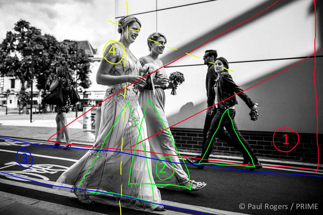
Case Study #2
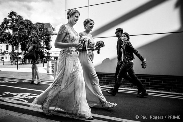
This second example uses some different techniques. It shows Kate and her sister walking from a Hackney Town Hall wedding to their reception on My Fair Lady, a canal boat based nearby. The guests all walked the 10 minutes through Broadway Market to get to the canal, which gave me plenty of great documentary moments taking in some of this wonderful London Borough.
Breaking It Down
Looking specifically at the composition then:
1. Triangles and diagonals play an important part of the appeal of this image for me. Using triangles in composition can lead to more interesting and engaging images than squares and rectangles. Starting with the repetitive triangular shapes formed by the shadows on the wall behind, the shape is repeated numerous times throughout the image, for example the crook of Kate’s arm and the striding legs.
2. By timing the shot to the stride of Kate and her sister, the walking pose gives more elegance to Kate and her stunning Jenny Packham dress. It’s something I used to do when photographing fashion on the catwalk for The Times. You can always hear the rhythm of a models stride mimicked by the chorus of photographer’s shutters at the end of the catwalk, all capturing an image at the same point of each step. It’s lucky for me that it’s echoed in the passerby behind.
3. Leading lines are really important in guiding a viewer around an image. The shadow lines behind are the strongest ones here, but the parallel lines on the bike path crossing the frame work extremely well by bisecting the shadows at the subject.
4. Again I’ve framed the subject on the thirds with space in front for them to walk in to. That’s as second nature to most photographers as breathing – a scene like this and you’ve started adjusting the focus point to the left of the frame before even lifting the camera to your eye. The line between Kate’s eyes, her sisters and the couple in the background gives another bisecting diagonal with the strong shadow line.
This is another well balanced image with interest spread across the frame with the black and white conversion enhancing the effect of the shadows. I’m actually crouching at about waist height to take this, and it’s that lower viewpoint that has brought all these diagonals into alignment.
There’s also a slightly deeper significance to this image. The building they’re walking past is actually an apartment block, and it’s where Kate and her husband first moved in together. They’re from New Zealand, and their entire relationship has been in London for the last 10 years. So although it’s a nondescript building to everyone else, by listening to and remembering earlier conversations with the couple, I’ve managed to build some storytelling into this composition.
Conclusion
Of course, almost none of this is going through my head at the time of shooting this image. It’s a gut reaction that 20 years of experience as a photographer brings you. You just instinctively know that moving a foot to the right will clean up the background behind the main subject, or a lower viewpoint is needed to emphasise some element in the frame. And my clients don’t need to know any of this either, though a lot do as they’re keen photographers and artists themselves.
They might not know why a picture works, they just know that it does.

About the author: Paul Rogers is a photojournalist based out of Hertfordshire, England. He has worked as an editorial photographer for The Times newspaper since 1998, and is also applying his talents to documentary wedding photography. Visit his website here. This article originally appeared here.