Flickr’s New Photo Experience Out of Beta, No More Opting Out

Flickr’s new “photo experience,” which has been in beta for the past few months, is finally live for everyone to see. While this isn’t the full-on redesign that we mentioned might be on the way, this update completely overhauls the photo pages in particular — bringing speed, functionality and aesthetic improvements.
The first point of focus for the Flickr team was speed. The new photo experience is supposedly 20x faster, meaning no more waiting between photos for all of the information to load. Click on over to the next photo and — assuming your Internet speed is sufficient — it’ll likely be loaded before you blink. It’s a dramatic improvement over earlier iterations and although a timeframe isn’t given, the speed improvements are said to be making their way to the rest of Flickr’s experience shortly.
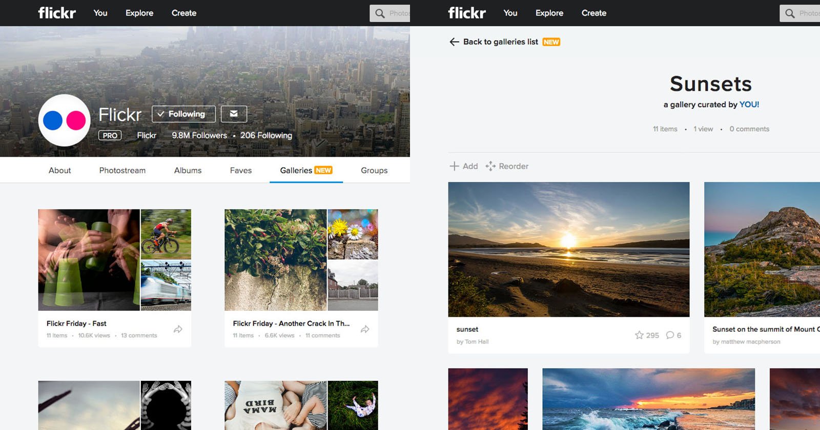
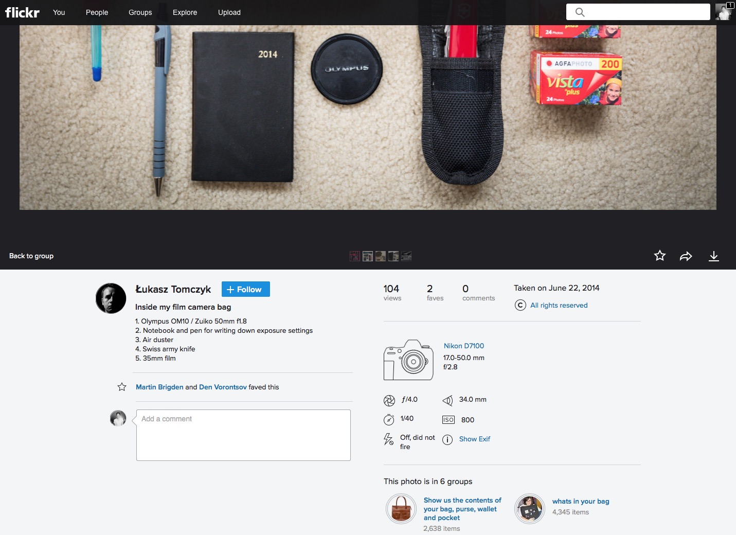
The next point of focus for Flickr was to improve the visual hierarchy in the experience. Whereas before there was a great deal of unneeded text and information on display, the view has since been cleaned up, making sure that the title and description are presented right next to your image, bringing the story and photo together more intuitively than before.
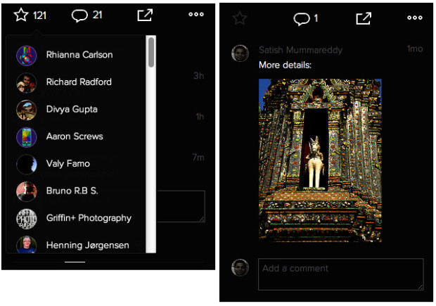
Included below the title and description are the favorites and comments (as usual); however, Yahoo cleaned up the experience.
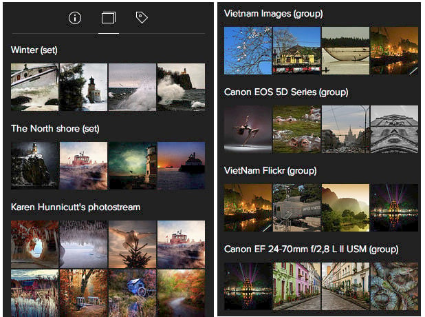
Icons and circular avatars take the place of a great deal of text, making the side-bar experience much cleaner and allowing you to better focus on the content; and below the favorites and comments is a tabbed section that offers you the EXIF data, related photographs and tags. Personally, I think the change in how the EXIF data is displayed is a dramatic improvement.
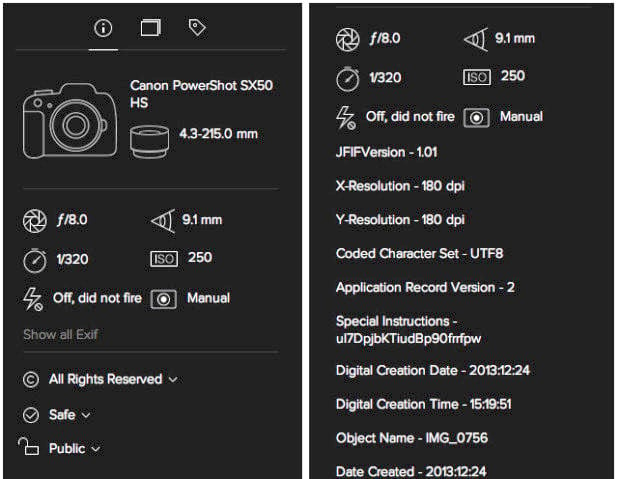
Instead of writing out “aperture,” “shutter speed,” “lens” and so on, Yahoo is using a nice collection of generic icons. Additionally, camera models and lenses have semi-unique icons, giving you a visual of what camera was used at a glance, rather than only the technical name. And information such as the shutter speed, focal length and so on is nicely displayed next to their correlating icons.
Overall, the redesign does a great job of laying down the framework for the more unified experience that Yahoo! is looking to give Flickr down the road. The clean design, focus on content, beautiful iconography and overall aesthetic aren’t perfect, but they’re certainly headed in the right direction.
Solid change is never made over night, especially with a platform as large and encompassing as Flickr. So, while there will without a doubt be plenty of criticism about the new design, because “it’s not [insert complaint here]” or “doesn’t offer [insert complaint here]”, the Flickr team at Yahoo! seems to be on the right track. That being said: cue fear-of-change reaction… NOW!
(via Flickr)