Visualizing the Trends and Patterns of the World Through Instagram
Living smack in the middle of the information age, we’re well acquainted with the incredible amount of data and statistics gathered and thrown around on a daily basis. And with the advent of social networking, the amount of publicly available data about society has only increased.
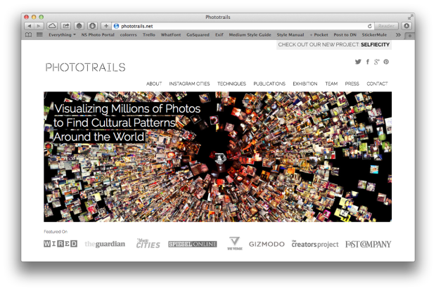
These networks are a treasure trove of information for better understanding the underlying trends and habits of people. Trends that would otherwise go unseen. One research project in particular, called Phototrails, is trying to spot these trends by gathering insights from that photography-oriented social media site many of us love to hate: Instagram.
What is Phototrails? Phototrails is a research project that uses media visualization techniques for exploring visual patterns, dynamics and structures in user-generated photos.
From “planetary-scale” projects, such as their “Montage” series, to very time and location specific projects like their visualization of Instagram photos taken during Hurricane Sandy, the project’s goal is to “show how temporal changes in number of shared photos, their locations and visual characteristics can uncover social, cultural and political insights about people’s activity around the world.”
Tied in tightly with the emerging field of Cultural Analytics, “which uses computational methods for the analysis of massive cultural datasets and flows”, this sort of information is a very efficient method of drawing out patterns.
One of the most helpful — and intriguing — aspects of it all is that all of the information is already present for the Phototrails team. Us, as users of these networks, are so immersed in sharing these images in real-time, that we’re constantly giving insights into minute details about the world around us.
We’re essentially crowdsourcing all of their information for them. All that’s left for them to do — as is the case with most research nowadays — is set up parameters and draw out the dataset they’re wanting to visualize. Where Phototrails really stands out is HOW they visualize it.
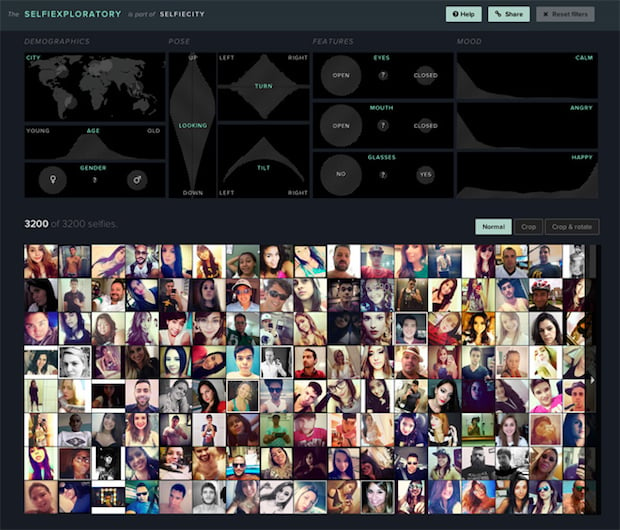
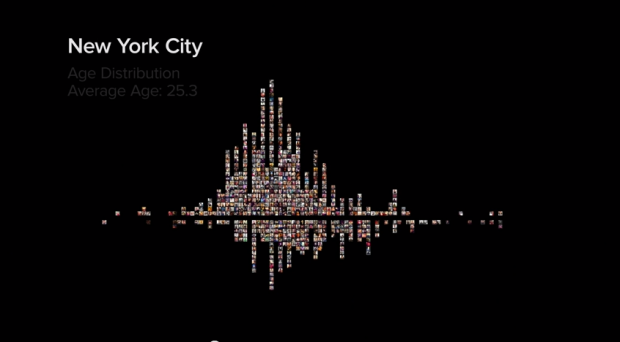
What sets Phototrails apart from most other research endeavors is how they actually go about presenting their findings and data. Rather than percentages and numbers on a Keynote slide, the visualizations they create use the images they’ve gathered to generate immersive and interactive infographics, sorted by both the metadata held within the file (GPS location, upload dates, tags, filters used), as well as the content of the photograph itself (color, subject, composition).
This turns what would be an otherwise static infographic into a three-dimensional space that helps viewers better explore and understand the data at hand.
What’s more, their processes are only getting better as new methods of visualizing processes are constantly being developed, both at the micro and macro levels. And as we share more images, it’s inevitable they’ll continue getting more real-world, real-time data to work with and learn how to make better use of.
Phototrails is a unique approach to the gathering and displaying research, one we can especially appreciate as photographers. Whether it’s a single photo they’re analyzing, or the Instagram habits of an entire city it allows us to better see how the human race as a whole captures the world around us, and how certain events can actually be followed minute-by-minute just by watching a certain region’s Instagram stream.
To read up on how they do what they do or play around with some of the interactive infographics Phototrails has thus far put together, be sure to head on over to the project’s website. And while you’re there, don’t forget to check out the behind the scenes video of their latest project, selfiecity.