Light and Photography: How Light Changes the Colors of Your Photos
Discover how and why controlling color is essential in photography.
What is Color
When light hits a surface, some wavelengths are absorbed while others bounce off. While a black surface absorbs most of the light, reflecting only a small amount of photons, a white sheet of paper does the opposite, absorbing very little. Meanwhile, a green surface absorbs all other colors and reflects only green. That is why leaves appear green and absorb ultraviolet light to photosynthesize. The same principle applies to other colors.

Why Do We See a Limited Range of Colors
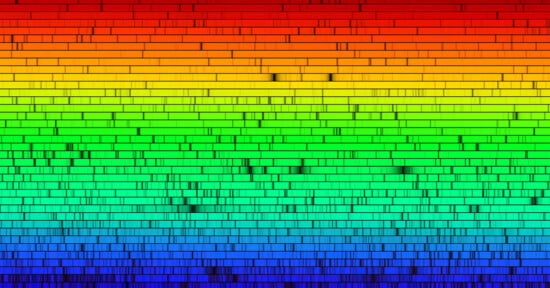
Visible light, for most of us, falls within the range of 400 nanometers (violet) to 700 nanometers (red), which is a tiny slice of the entire electromagnetic spectrum. All the colors we see fall within that range at different frequencies.
It’s a good range for us because if only shorter wavelengths were available to us to see, they would cook us. Microwaves and gamma radiation fall into that category. Thankfully, they are mostly filtered out by the atmosphere, particularly the ozone layer.
Meanwhile, to see longer wavelengths, everything in the structure of our eyes and cameras would need to be much larger. Think of the size of radio telescopes. They detect wavelengths ranging from millimeters to over 10 meters.
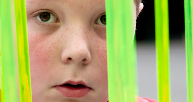
Light’s color affects a photo’s mood. For example, we consider reds, oranges, and yellows to be warm colors and blues and greens to be cold. In physics, it’s the other way around. We can observe this when we heat, say, a metal bar in a furnace. It changes from red to orange, then to yellow, then to a bluish white. If you did chemistry at school, you may remember that a Bunsen burner’s blue flame was hotter than the yellow.
If you have ever owned a red car for a long time, it probably faded in the sun. That is because it reflected low-energy red light but absorbed high-energy ultraviolet frequencies. That energy broke down the paint molecules.
In astronomy, the colors of stars indicate their temperature. Red giant and supergiant stars, such as Aldebaran and Betelgeuse, are not as hot as our sun. They sit between 3,000 and 4,000 Kelvin (K) while our sun is between 5,500 and 6,000 K. Meanwhile, blue B-type stars such as Regulus and Rigel are much hotter, between 12,000 and 14,500 K, much hotter than the sun.

Photography uses Kelvin measurements when applying white balance. In Photolab, Lightroom, and other software, the left-hand blue end of the temperature slider is 2000 K, and the right-hand yellow end is 50,000 K. That might seem the wrong way around, but it is a measure of the correction required to, usually, make whites appear white.
Typical color temperatures are as follows:
- Tungsten / indoor bulbs: ~3000K
- Fluorescent lighting: ~4000K
- Daylight (sunny): ~5500–5600K
- Cloudy: ~6000K
- Shade: ~7000K
The following example shows a photo of an eagle taken during the blue hour. That is when the sun is below the horizon, and the red and orange wavelengths of the spectrum are filtered out by the atmosphere, especially by the ozone layer. To make the snow appear white, I needed to apply a significant amount of correction.


In some circumstances, I am happy with the look the blue hour gives to the photo and do not apply a correction.

Color Affects Mood in Other Ways
In movies, greys and washed-out tones are used to reduce emotional “warmth”. Saving Private Ryan, The Hurt Locker, and Tinker, Taylor, Soldier, Spy are examples of films that used this effect.
On the other hand, highly saturated and bright colors evoke playfulness and excitement. Wes Anderson’s films, Scott Pilgrim vs the World, Amélie, and Barbie are modern examples.
Both monochrome and high saturation were used in The Wizard of Oz, giving the film’s parts two very different moods. Partly shot in Technicolor, it used the three‑strip Technicolor process, which was the most advanced color system available in the 1930s
Color contrasts, such as teal and orange, are used in blockbusters; orange tones make skin tones pop against a teal background. While orange provides warmth, teal suggests coolness, danger, or tension as well as dystopia, sleekness, or technology.
Color is an Illusion
The color we see isn’t real. It’s just the way our brains interpret the signal that comes down the optic nerve from our retinas. It’s an idea, nothing more than that. Our brains interpret what we see as color to more easily understand the different wavelengths of light. Outside our bodies, red as we know it doesn’t exist.
What Different Colors Mean
Although we understand individual colors and color combinations to have particular meanings, these meanings are heavily influenced by our cultures.
Red commonly signals love or warning. But it can also evoke feelings of energy, passion, excitement, danger, and physicality. However, in China, it symbolizes luck, celebration, and prosperity. Meanwhile, in South Africa, it can be associated with mourning.
Orange is associated with enthusiasm, creativity, sociability, and warmth. Cultural variations include national pride in the Netherlands, spiritual devotion in Buddhism, and it can be linked to mourning in some Middle Eastern cultures.
Yellow suggests optimism, clarity, happiness, and intellect. In Western cultures, it can also be associated with cowardice, whereas in Japan, it can represent courage. Meanwhile, in parts of Latin America, it may be associated with death or mourning.
Green represents harmony, growth, nature, calm, and renewal. In Ireland, it’s strongly tied to national identity, and in Islam, it is considered a sacred color. But it can carry connotations of death or illness in some South American cultures.

Blue has common psychological associations with trust, peace, reliability, and stability. It also symbolizes masculinity in some Western cultures, e.g., baby boys are often clothed in blue. That is a fairly recent change, as up until the early 20th Century, pink was for boys and blue for girls. It wasn’t until the 1940s that clothing manufacturers promoted blue for boys.
In Greece, blue is said to ward off the “evil eye”, while in some Eastern cultures, it is connected with immortality.
Indigo represents intuition, inner wisdom, deep thought, and spirituality. In some spiritual traditions, it represents the “third eye” or insight. Yet, historically in India, it was associated with colonial trade and exploitation.
Violet/purple denotes power, sophistication, formality, mystery, and grief. Although in fashion it symbolized elegance and authority, it is also widely associated with mourning in the West. In China and India, it can represent bad luck or negativity.

In many Western cultures, white symbolizes purity. The popularisation of white at weddings began with Queen Victoria’s marriage to Prince Albert. That was the first Royal Wedding to be photographed in Britain. Before then, it wasn’t used. In the Middle East, it often represents purity and peace, but it is the traditional color of mourning in China, Japan, and India.
Black is associated with power, sophistication, formality, mystery, and grief, and is widely associated with mourning in the West. In China and India, it can represent bad luck or negativity.
Gray is a neutral color and has related meanings across many cultures. It can symbolize compromise, restraint, calm, order, impartiality, professionalism, and maturity (e.g., gray hair). Too much grey may feel draining or demotivating, and it is linked to loneliness or muted emotion. It often appears in minimalism, luxury branding, and fashion. Meanwhile, some Eastern traditions may associate it with modesty, humility, and wisdom, as well as the balance between light and dark.
Brown is not a spectral color; it cannot be made from the colors of the spectrum. It is a perceived color that arises from context, contrast, and brightness, as your brain interprets them.
Psychologically, it represents stability, reliability, comfort, and naturalness. It suggests earthiness and wholesomeness. But it can also be boring. In Japan, brown can be associated with modesty and everyday simplicity, and in some cultures, it can be linked with humility or with “plainness.”

Hue, Saturation, and Luminance (HSL)
Your raw development program is likely to have HSL adjustments. Hue is the position on a color wheel. Using the slider, you can alter this towards its neighbouring hues. All the colors on your screen are varying combinations of red, blue, and green pixels at varying brightness levels.
In raw development, you can adjust how those colors are combined. For example, red pixels could be mixed with green to produce yellow, or with blue to produce purple. That is adjusting the hue.
The saturation slider, meanwhile, changes the distance of each pixel’s color from neutral gray. The color loses intensity as it approaches gray.
Luminance is how bright a color is, or how close it is to white or black.
These adjustments should be handled with care. Moving the sliders too far can lead to strange, unwanted effects. What we see in nature rarely consists of a single pure color. Therefore, adjusting one while leaving the other unchanged may produce ugly artefacts in the photo.

Color in Black and White Photography
In monochromatic photography, different hues are mostly irrelevant. Instead, we look at variations in tone.
For example, red berries can blend into green leaves in a black-and-white image because they have similar brightness levels.


However, raw development tools allow one to adjust the tones of the original colors. It may be possible to brighten the reds of the berries and darken the greens and yellows of the leaves, or vice versa. Such adjustments should also be done with care for the same reasons as the HSL sliders.
Color Accuracy
Many photographers aim to make colors in their photos appear as close to how they remember seeing them in real life. Not everyone does that, and it is perfectly acceptable to, say, warm up a landscape if that’s what sails your boat.
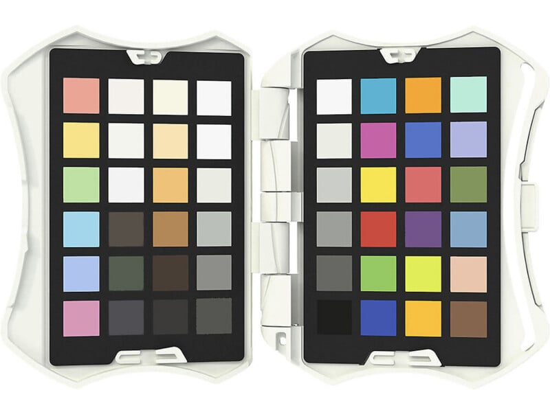
Nevertheless, there are tools to help you with color accuracy. I use a Datacolor Spyder Checkr Photo to match colors. The software that comes with it works as a Lightroom plugin, but I rarely use that program now and get much better results elsewhere. Nevertheless, with my calibrated screens, I can manually match the colors on its charts very accurately.
Color Interactions
Colors interact with each other in different ways. Complementary colors are on opposite sides of the color wheel and stand out against each other, such as red against green. Meanwhile, colors that are contiguous are close together, and their interaction gives a photo a calmer feel.

In Conclusion
Color awareness is clearly an important part of taking better photos. As always, there is a lot more to it than I can include in a short article. So I urge you to do more research. I have previously written about the strangeness of colors, as well as an article about colors in printing and color as one of the elements of art. There are plenty of other articles in the archives that look at each topic here in more depth.