The Problem of Color Contamination in Photography
Whether you’re aware of the correct terminology or not, you have likely experienced color contamination happening in your photographs already. Put simply, color contamination is when one color is affected by the presence of another color in close proximity.

This color contamination effect has nothing specific whatsoever to do with photography as it happens around us all day every day and we are so accustomed to it that most of us never even notice it. So why bring it up? I bring it up because it’s a frustrating effect when it happens in our shots, especially if we aren’t aware of what’s causing it.
We may even just write it off as a white balance issue or other color balance problem as it’s usually so subtle we might not even try to correct it. But when color contamination is at it’s most intense, we have to take note and address it.
Think about doing a portrait shoot in the woods. You’re surrounded by green, the leaves in the trees, some bushes and maybe there’s even green grass on the floor around you. The daylight comes through the trees and bounces around on all the foliage before it hits your subject resulting in some very sick-looking green subjects. Not a great look. Think about how many woodland portraits you’ve seen that have been converted to black and white. Starts to make more sense now right?
Can’t I Just White Balance My Shots?
White balance exists on the Kelvin scale that specifically deals with balancing a certain range of colors, so no matter how hard you try, a lot of these color contamination shots simply can’t be fixed with white balance alone, hence the black and white solution.
But more than that, color contamination is often a localized effect. Let’s go back to that white t-shirt that looks a little pink now because it was next to a red one. We can’t color balance the scene to correct the shirt without affecting the whole image. It’s these factors that make color contamination such a troublesome problem and one that is incredibly overlooked.
What is This ‘Radiosity’ Thing?
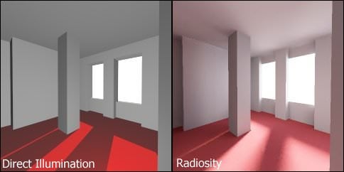
Strangely, radiosity is what I was taught 20 years ago in the film days but you hardly hear the word used in association with photography anymore. Now the word is more related to how light and color act upon one another in computer generated worlds. In fact, one of the greatest leaps forward 3D modeling has made was to accurately model how light affected one surface when in proximity to another.
Without getting too nerdy, 3D modelers ironically love radiosity as it gives their worlds and textures an added depth and realism. We as photographers, specifically portrait photographers hate it and we try and color balance it away where we can. If you’re interested then you can take a look at the Radiosity in Computer Graphics page on Wikipedia, but be warned: there’s a whole lot of maths involved.
Regardless of what you want to call it, this color contamination effect is a very real problem for us photographers if we want to depict objects like people, cars, clothing and so on in the best possible way.
No company wants you to photograph their white car only for it to look a ‘little pink’ on one side, and the same goes for fashion as well. We need to be aware of what colors we’re putting next to one another.
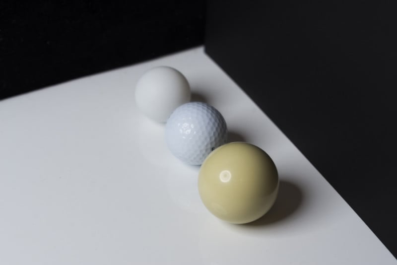
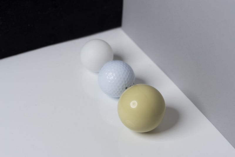
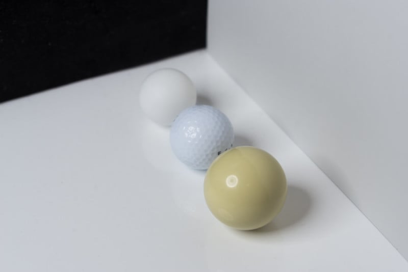
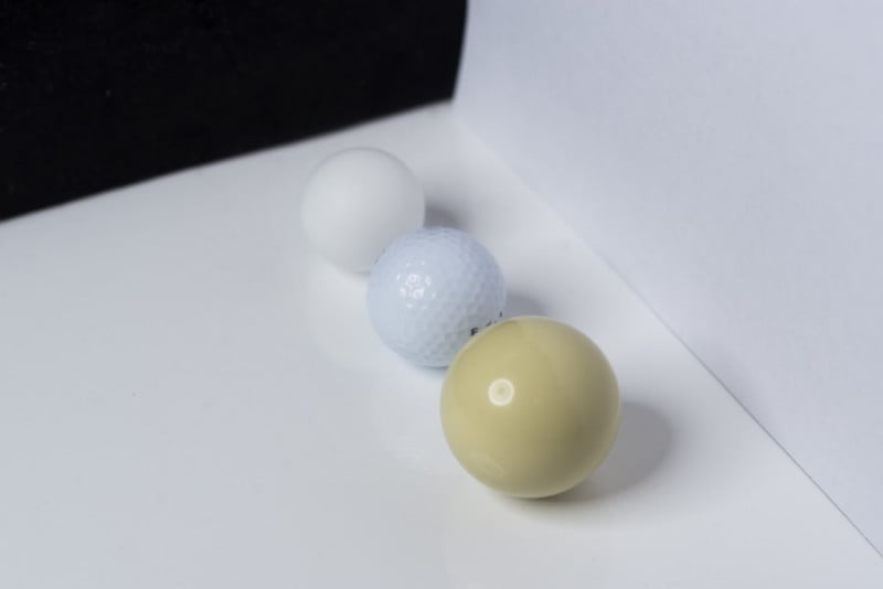
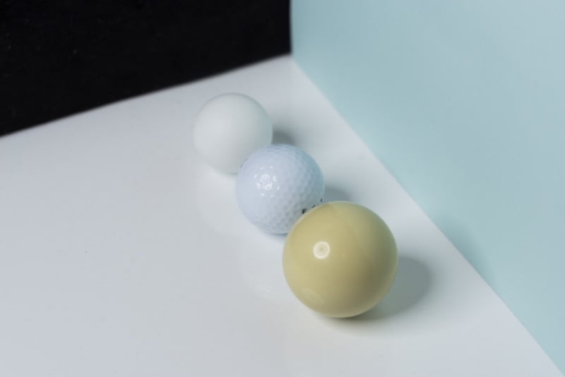
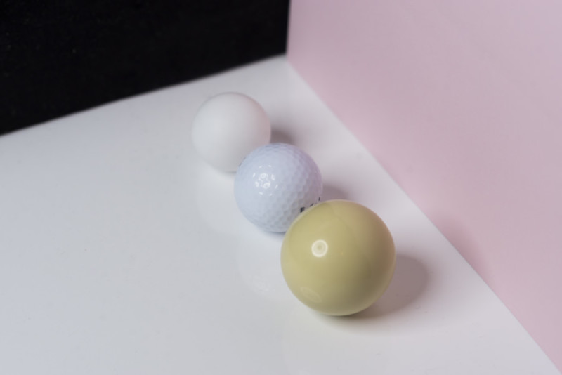
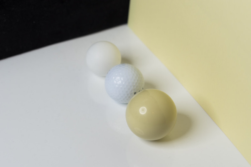
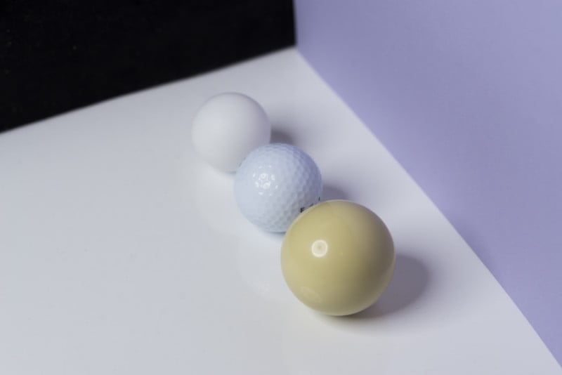
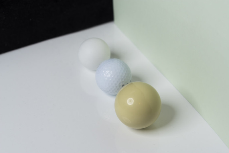
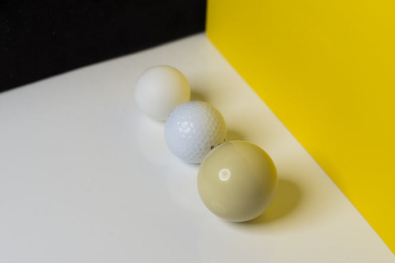
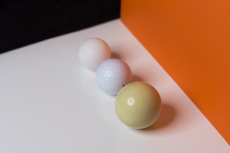
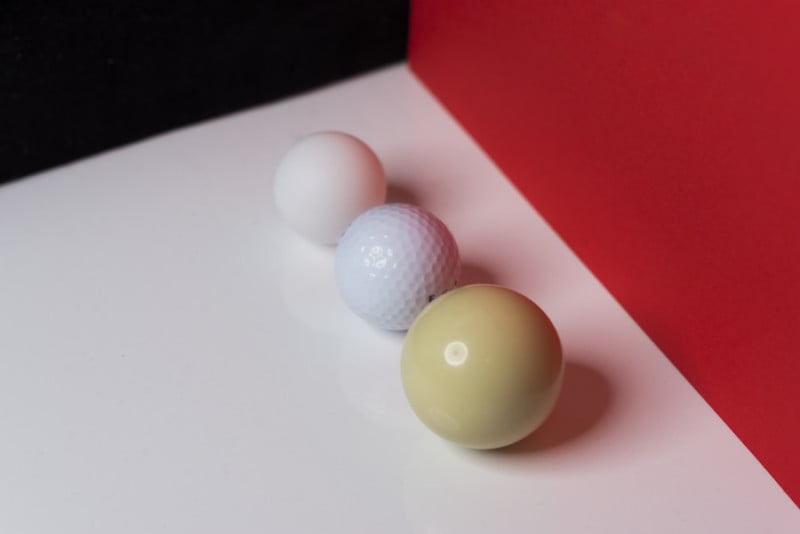
Color Contamination in Action
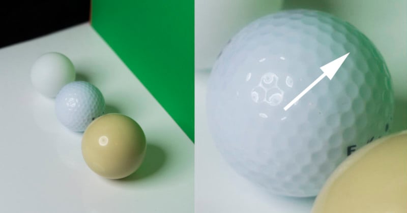
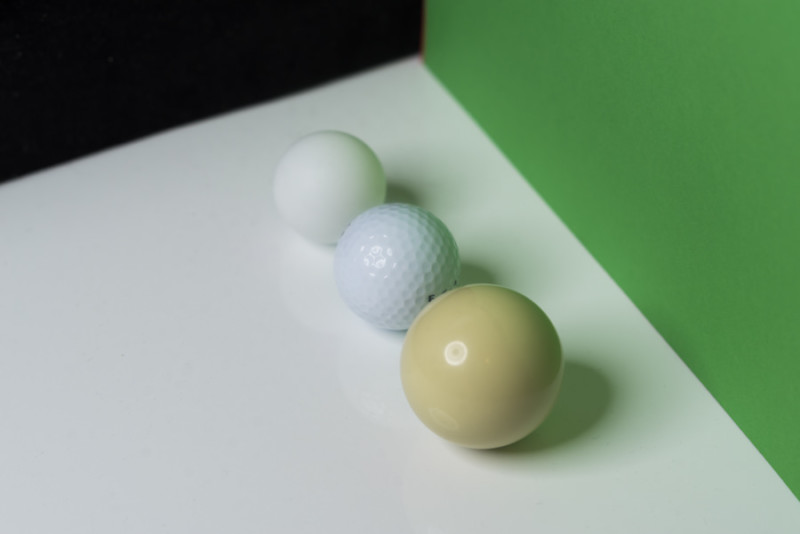
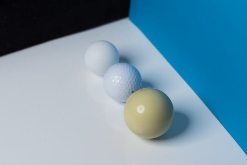
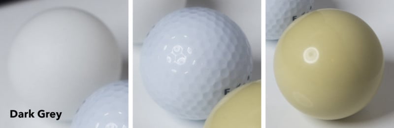
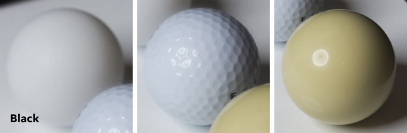
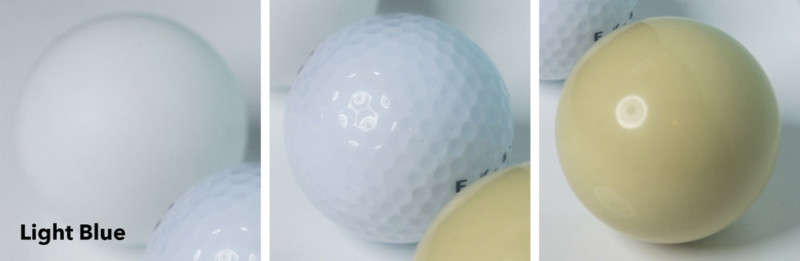
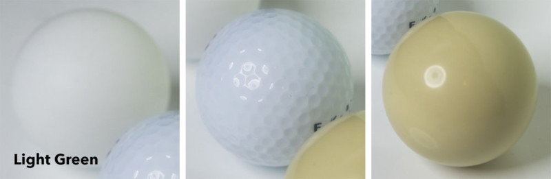
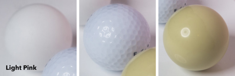
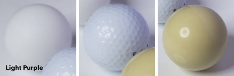
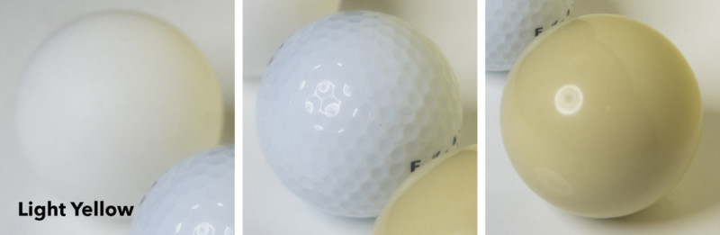
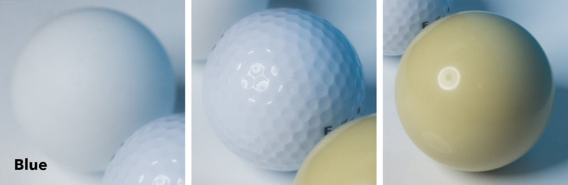
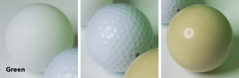
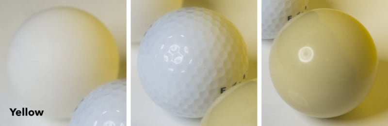
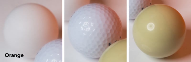
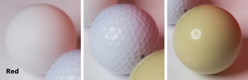
In the images below, I set up a mini set to illustrate the color contamination effect in action. I purchased three spheres, the cue ball with its very shiny surface, the table tennis ball with its very matte surface and the golf ball for its very textured surface. I placed them all on a white surface and shone a single light at them with a variety of colored papers next to them and took shots to document the whole thing.
Look closely at the shots below to see just how the different surfaces and textures are affected by the close proximity of color.
Taking a Closer Look
Upon first impressions you may not think it’s a big deal because our eyes are so accustomed to normalizing color variance when it’s in proximity to similar tones, but as the images change you should be able to see just how dramatic the effect is.
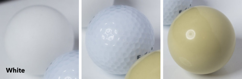
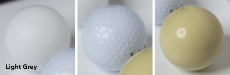
To further cement my point, I’ve isolated the separate spheres in the images below and placed them next to the image of the spheres shot against the white. In isolation like this, the effect is a lot more visible and significant, to say the least.
How Can I Use This Knowledge?
You may look at the images above and think that it’s just a byproduct of taking photos, that there’s no use worrying about something that can’t be helped. Although there are times when this can’t be avoided, color contamination is very real and it is something we can limit a lot if we’re careful.
For example, think twice about photographing the bride right next to a huge bunch of flowers, that green will bounce back onto the face. Consider bringing her slightly forward to avoid that or look at alternatives.
Think about the effect of photographing a model next to a brightly colored car or building. You don’t need to avoid the shot but there are things you can do to limit the effect, like always having the face pointed away from the brightly colored object.
As I documented in the images above, if you can’t avoid the color contamination, always try to have the offending color in the actual shot. The effect is dramatically reduced visually if the eye can see where that color is coming from compared to if you crop it out.
Can I Use This Knowledge to My Advantage?
The good news is that you can use this color contamination effect to your advantage if you’re clever. Remember that this radiosity isn’t exclusive to color — you can use blacks and greys to add dimension to your subjects and objects. You’ll often see studio photographers using black polyboards (large polystyrene boards) either side of the model to control the light, this not only controls the light but also adds a lot of shape through shadow in the process.
I will always carry black velvet sheets with me on location to limit the bounce of light around a subject but I also have sheets of grey card in the studio that are less severe than black to add a little definition to the features where necessary.
In the sphere comparison photos above, look at the light grey and dark grey images compared to the black and white images. See how they shape the spheres differently though shadow? Use this to your advantage either in the studio or on location.
Also, consider taking a white sheet with you on location too. Along with my black velvet, I always have a white sheet with me that I can throw up to either bounce in some light or limit the color contamination of nearby colored surfaces.
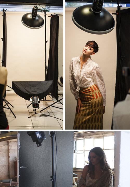
Fire Your Assistant if They Look Trendy!
Many years ago I was photographing fashion in natural light at the beach. A pretty easy job but the issue was that when I got the images back and started working on them I saw a very ugly and insipid looking greenish tinge to some of the clothing and skin. It was only apparent in some of the shots and it was always localized to certain areas.
It took me a very long time to work out what this was until I remembered that my assistant on the day had a bright yellow/green t-shirt on. In some of the shots, he was in very close to the model holding a reflector just out of shot but not only was he bouncing in light from the reflector, he was also bouncing in light from his hideously ugly t-shirt.
People joke about my grey sweatshirt but trust me, if you’ve ever tried to color balance out greenish tinges to skin you’ll switch to looking boring as hell like me in a heartbeat. When I was assisting all those years ago back in London in the film days, black shirts were mandatory on set, no ifs or buts. Now the sets are a kaleidoscope of color balancing nightmares. Take a look at the BTS of the film industry — how many lighting technicians are you seeing wearing day-glo?! Not many.
I know I sound like a grumpy old man, and although it’s a very real problem it actually only affects certain situations like still life shooters with shiny surfaces or macro beauty work etc. Still life shooters who photograph metal or other shiny surfaces nearly always wear all black to avoid this. Either way, it’s very wise to be aware of it and advise assistants on set to dress appropriately where necessary.
Concluding Remarks
I think this color contamination effect is an incredibly overlooked aspect of modern photography due to the “I’ll fix it later in post” mindset. Not only is it very time consuming to fix it in post but it’s also practically impossible in certain situations due to the colors being outside of the white balance spectrum.
If you’re aware of the colors around you when you’re shooting then you can limit the effect or use it to your advantage where necessary.
Points to Remember
- Points to remember
- Think about the color of surfaces around your subject.
- Should I use another area like a white wall nearby instead.
- Look at how multiple subject colors interact with one another when in close proximity.
- Bring a black and white sheet of fabric with you on location to throw over brightly colored objects if you need to.
- Consider getting some dark and light grey card for the studio and use it as a bounce board instead of white. This will give more shape to you subject than just a white bounce board.
- Think about what the people on set are wearing. If assistants are going to be close to the final shot, get them to change any brightly colored outfits.
- Think about what YOU are wearing. If you’re a macro beauty shooter who will be inches away from your subject, you definitely don’t want to be wearing bright colors as it will most certainly have an effect on the shot.
About the author: Jake Hicks is an editorial and fashion photographer based in Reading, UK. He specializes in keeping the skill in the camera and not just on the screen. If you’d like to learn more about his incredibly popular gelled lighting and post-pro techniques, visit this link for more info. You can find more of his work and writing on his website, Facebook, 500px, Instagram, Twitter, and Flickr. This article was also published here.