How the First Five Principles of Art and Design Can Make You a Better Photographer

Understanding the roles of the fundamental elements of art allows photographers to create compelling compositions. These elements are not merely aesthetic choices but tools for creating structure in your photography.
Composition is the structural foundation of all visual arts. How we arrange these elements determines how viewers perceive and interpret our images. Points, lines, shapes, forms, and spaces are five of the fundamental building blocks of our pictures. By guiding the viewer’s eye, they not only make up the visual structure of our images, but they can also create balance and convey meaning.
So, being aware of them and knowing how to apply them when we hold our cameras to our eyes is essential for producing compelling compositions.
Visual Weight
To fully appreciate the value of these elements, it is essential to understand the concept of visual weight. That is the perceived importance or dominance of an element within a composition. It’s a concept used in visual disciplines, describing the degree of attention an object attracts in an image. The greater the weight, the more noticeable it is in a photo.
The four elements increase in visual weight in the following order.
1. Points
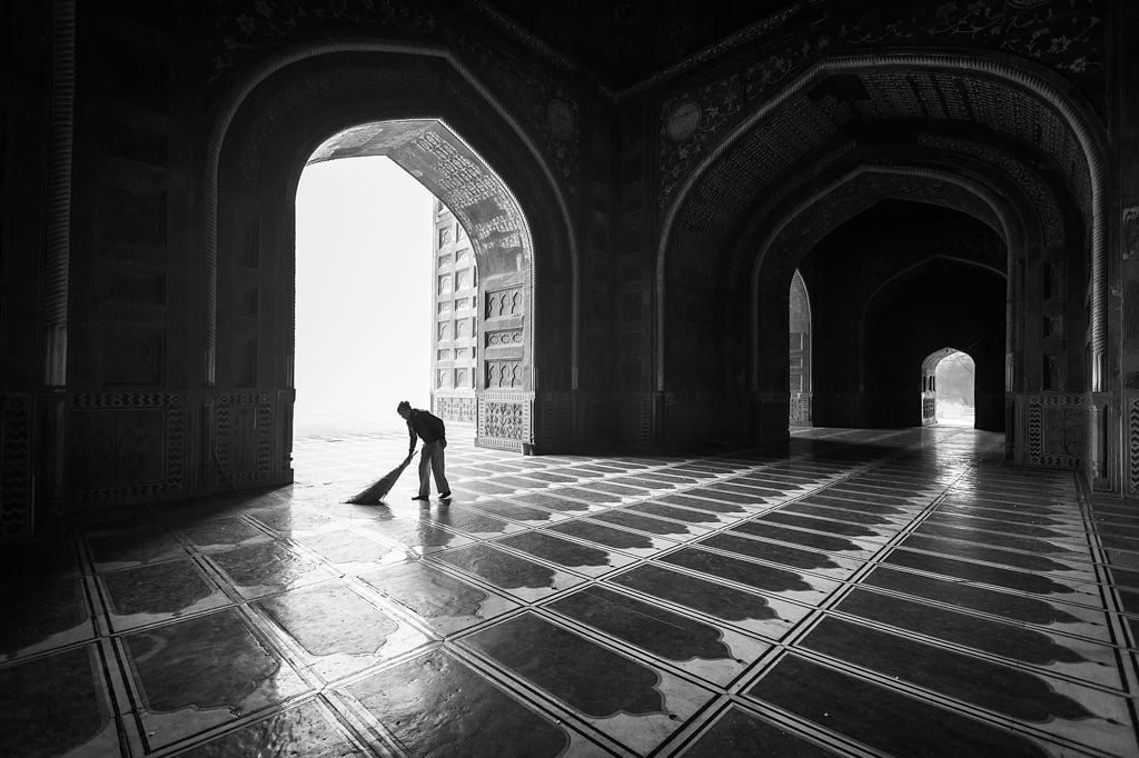
A single point is the most basic unit in composition. It represents a precise location in space and can be used as the main focal element. A point can be literal, for instance, a star in the sky. Alternatively, it can be implied, such as the tip of a triangle. A distant object in a landscape can be considered as a point.

Multiple points can lead our minds to create shapes. Think of the patterns formed by star constellations. Most of those stars are completely disconnected, separated by dozens or hundreds of light-years from each other, but we perceive them as forming shapes in the sky. For example, take the line of Orion’s belt or the square of the Big Dipper. Those are only suggested to us because a line and a square are familiar concepts, and our brains are programmed to look for patterns even if they don’t exist.
Similarly, points that are arranged in a line can suggest a progression through the photograph. Thus, we can use disconnected points as leading lines. For example, these could be rocks, lights, or a row of flowers.
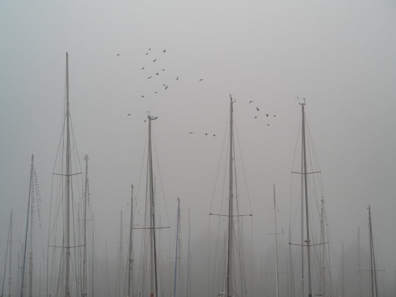
Meanwhile, we may perceive a group of points as a single entity. For example, we perceive a complete flock of birds more than we do the individuals within the flock.
However, one of those points could stand out because it carries more visual weight, drawing our eyes to it. It might differ in size, color, or shape, therefore becoming dominant in the crowd. For example, consider a golden autumnal leaf amongst a canopy of green leaves; it stands out. Steven Spielberg made good use of this effect in the film Schindler’s List with the girl wearing the red coat in an otherwise monochrome film.
Individual points can also be used to establish hierarchy. A large, bright, or high-contrast point draws attention, making it the image’s primary focal point. Furthermore, the placement of points can imply importance. A point situated in the center of the frame will carry more visual weight. Similarly, in most Western societies, a point at the center-top of the image or the top-left-hand corner will carry more weight because of the way we are used to reading.
Those factors that affect the visual weight of points will also apply to the following elements.
2. Lines
A line connects two points, thus introducing direction, movement, and structure. They can be straight, curved, or broken.
Graphically, lines are stronger than points, mainly because they are larger. They also have the power to draw the eye along them. In photography and other visual arts, we use leading lines to guide the viewer’s eye toward the subject or through the frame. Furthermore, their orientation (horizontal, vertical, diagonal) affects the dynamics of a composition.
Our minds expect the world to behave in a certain way. One of those expectations is that gravity will predictably act upon objects, causing them to move from an unstable to a stable state.
If we consider gravity acting on a pole, the pole is most stable when it is lying flat on the ground. Similarly, horizontal lines suggest stability.
On the other hand, vertical lines are less stable than horizontal ones. Consequently, they can form more tension in our minds than horizontals. Nevertheless, we anticipate gravity pulling down along their length, and as long as they are not nudged or tilted, they will remain vertical, so they do have some stability. Often, dominant vertical lines in an image work better with portrait-oriented frames.
Together, horizontal and vertical lines complement each other, creating an equilibrium pleasing to the human eye.

Diagonal lines are unstable. Imagine that pole leaning at an angle: we expect it to fall over. Consequently, diagonals add the most dynamic tension to our photos.
Lines can also form a structural framework by defining the edges, borders, and divisions of areas within a composition.
Furthermore, the physical characteristics of a line convey different emotions and energies: a jagged line evokes a distinctly different feeling from a smooth, wavy line, and a thick line appears heavier than a thin one. Meanwhile, converging lines can create the illusion of depth and three-dimensionality. Imagine the receding edges of a path as they converge into the distance. Just like points, the size and color of a line can affect its visual weight.
3. Shapes
Either lines or contrasts in color, texture, or brightness value form shapes. They are enclosed areas that can be geometric, such as circles and squares, or organic, like a cloud or a person’s shadow. Shapes separate the object from the background. Furthermore, like lines, they can be both stable and unstable. Imagine an inverted triangle standing on its apex, or a circle at the top of a diagonal line.
Moreover, shapes can also suggest meanings. One only needs to look at the shapes displayed on national flags to recognize how they can hold cultural and religious significance. However, that meaning can vary depending on the viewer.

4. Forms
Form refers to three-dimensional shapes, such as cubes, pyramids, cones, cylinders, and spheres.
Of the five elements listed here, forms hold the most visual weight. They are three-dimensional shapes that comprise most of the world around us. Of course, in photography, the forms are flattened into two dimensions. However, our minds recognize their three-dimensionality, usually by the effect light has on them.
Like the other elements, the weight can be increased or decreased by changes in size, color, contrast, and brightness.

5. Space
While shapes are essential for defining areas within an image, space refers to the areas around, between, and within them. When an area is occupied, it is known as positive space. Meanwhile, the empty areas are known as negative space.
In photography, we often get up close to a subject, thus minimizing the negative space. However, that isn’t the only approach. Large areas of negative space can increase the visual weight of a small subject, making it appear more prominent. It’s a technique sometimes used to give the impression of isolation.

An Exercise
This is a summary of the first five elements and their impact on your images. Each of them is worth exploring in more depth. Try working with them to see how they can be incorporated into your pictures. As with all compositional techniques, looking for and photographing each element in turn, and discovering what works for you and what doesn’t, will embed them into your subconscious. This, using them to best effect, will become second nature.
This exercise involves taking your camera out and focusing on one element at a time. Start with points and see how you can employ them in your compositions. Examine the photographs afterward and determine what worked, what didn’t, and why.

In Conclusion
These are not the only elements of art we can use in photography. There are three more that I will include in a future article.