A Simple Four-Step Framework for Better Landscape Photo Compositions
In photography, many aspects can make an image successful, and in my opinion, what defines the bones of a great photo is a good composition. Instead of thinking composition like a series of canonical rules, I much prefer to use principles like connection, tone, colors, shape, relationship, light gestures, and so on.
I would say that the so-called “rules” are often made to be internalized, but selectively broken. In that sense, I think it would be better to call them “guidelines” or “suggestions” rather than hard and fast rules.
Especially for young photographers, composition is a tricky visual principle to implement organically into a workflow, and it’s quite difficult sometimes to find valuable information on how to do this that differs from the canonical rules such as the well-known rule of thirds or other more complex techniques.

In the video above, I discuss a comprehensive and straightforward approach to develop a sort of composition framework based on a four-step sequence. In it, everything centers around the concept of “simplicity.”
I’m not referring to minimalism or minimalistic photography, but rather simplification, where complexity is the input and simplicity is the output.
As the famous businessman, Maurice Saatchi said: “Simplicity is the outcome of technical subtlety. It is the goal, not the starting point.”


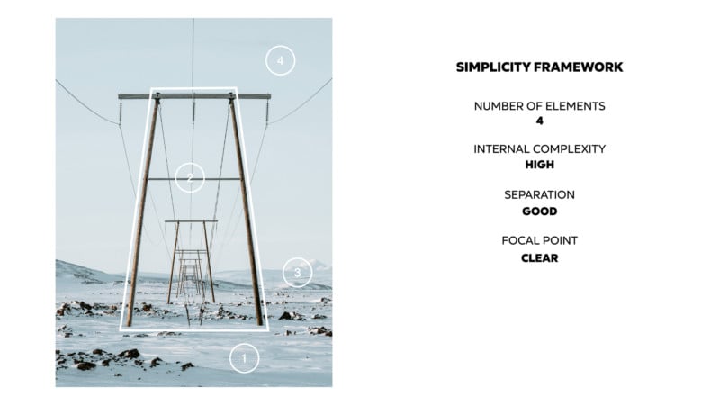
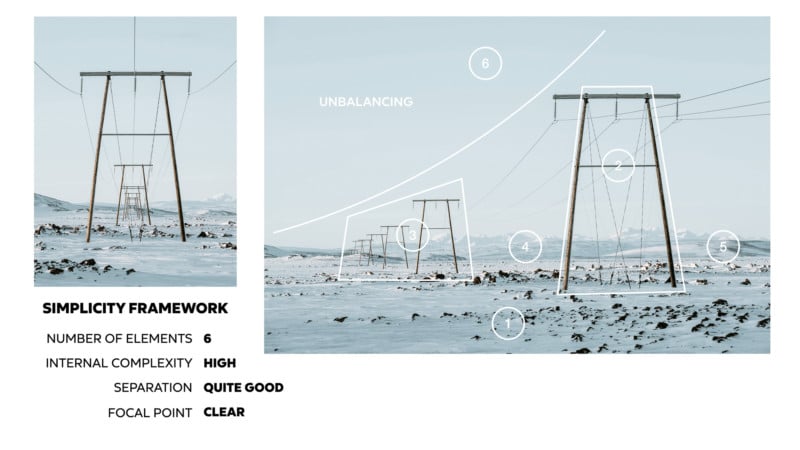
You can easily optimize the strength of your compositions just by taking care of a few aspects of your framing process. The Simplicity-framework is based on this four-step framework:
- How many elements are in the frame? Try to keep them less than or equal to four or five.
- Pay attention to the internal complexity of each of those elements, so the relationship between them is complex and interesting.
- Is there a level of separation between the main subject and the surrounding area? Make sure there is also the separation between the elements in general.
- Is the primary visual element of the photo the focus of the image?
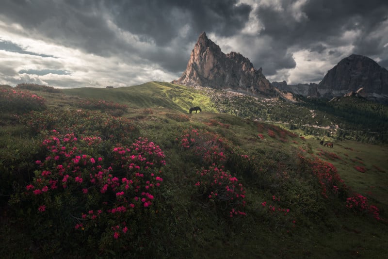
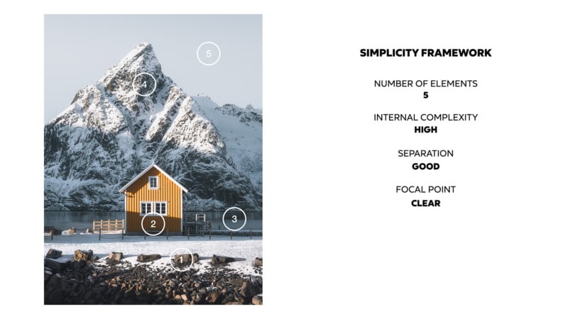
I put in the video ten different successful images I shot and I compared them with other related and less successful images, going through the strengths and the weaknesses of each one. For example:

Looking at the above photo, we can see five elements, a high level of internal complexity, good separation, and a clear focal point.
In contrast, is a different composition of the same scene that is much weaker because it breaks with those four elements:
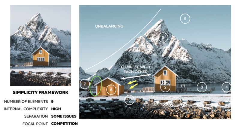
I am conscious that many other factors help to create a compelling image, but this visual framework can be a wonderful tool in your arsenal to take your compositions a step further. It’s simple to apply and crazy powerful. Below are a few more breakdowns of images as examples:
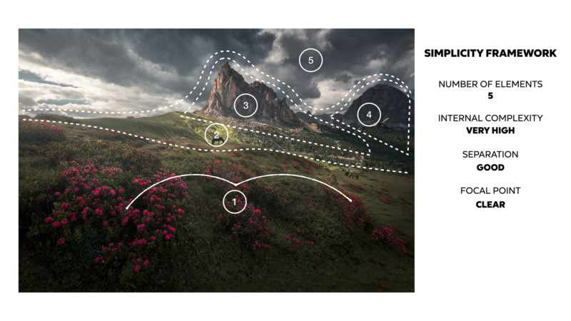
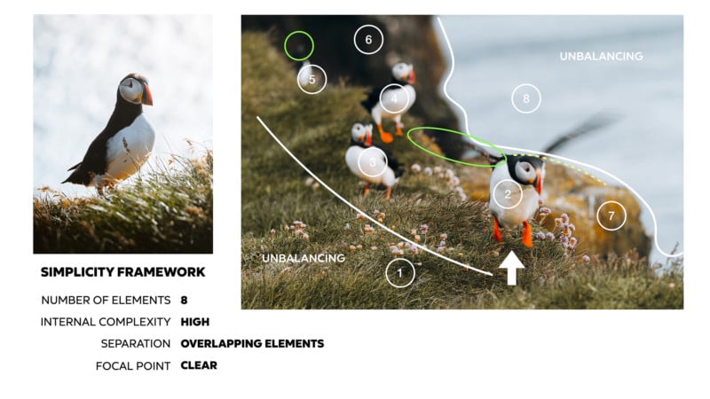
I won’t go so far as to say this is some magic formula, because it is not. It is just a visual structure that works for me and it can be very useful in evaluating the scenarios we want to photograph in order to optimize the arrangements of elements and remove distractions.
The best way to get better is to practice. So, next time you go out to shoot, try to use this framework and visual process. I hope you find these concepts helpful and useful.
Affiliate Disclosure PetaPixel articles may include affiliate links; we may earn a commission if you buy through one.