How to Deal with Extreme Dynamic Range in Landscape Photography
No doubt most of us have found ourselves in the following situation… You’ve discovered a beautiful landscape scene that you’ve carefully composed in your camera’s viewfinder. Your camera is on a tripod and there’s no wind, so you’re feeling confident that you’ll be able to capture everything in one shot with both a small aperture and a slow shutter speed. Things are looking great!
Could any camera ever accurately capture what our eyes and brains are experiencing? We are able to discern details in all the brightest areas of any scene, as well as notice details in all the darkest shadow areas (under most lighting conditions). Our eyes and brains are truly amazing!
Perhaps we’re all experiencing an incorrect perception of reality? Maybe our cameras are all telling the truth and it’s our brains that are deceiving us with an altered sense of what’s real? When we notice the details in a bright sky and then immediately afterwards notice some details in the dark rocks in the foreground – are our brains somehow compensating for the difference in dynamic range, or are we seeing things exactly as they are in reality?
My own personal experience of something might be nothing like yours at all. We all tend to perceive colors slightly differently, so my brain’s interpretation of green might be slightly more (or less) magenta than yours (for instance).
This is why I feel that it is much more important for me to try to edit my photos to replicate what my eyes and brain experienced at the time than exactly how my camera captured these scenes. If my eyes can see the details in all the highlights and shadows, then I’d also like to be able to capture those details in my photos.
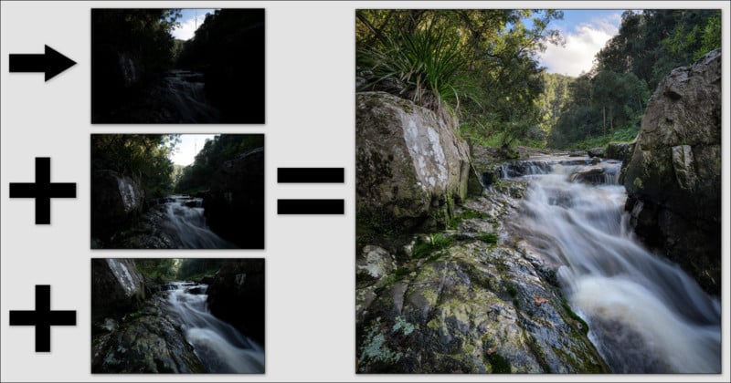
In this article, I will explain how I dealt with one of the most challenging scenes that I’ve ever attempted to photograph. I was hoping to capture a vertical panorama (vertorama) of a small cascade in Jubilee Creek (in the Knysna forest (in South Africa)), but the difference in luminosity between the bright white clouds and the dark shadows (known as dynamic range) was more than even my Nikon D850 was able to capture with one exposure.
There are only two rules in photography that I will always try to adhere to;
1. I never want to find any pure black or pure white pixels in any of my final edited photos. Anything in-between is acceptable, providing that was how my brain interpreted what my eyes saw at the time.
2. I usually only make global adjustments when editing my photos (instead of local adjustments). I do this to retain the relative luminosity between all the objects (elements) in my composition. The clouds and sky will always be much brighter than anything which could reflect that sky, and our photos begin to look weird as soon as that relationship changes.
If you only ever take photos with your phone or if your camera is always set to capture JPEGs on auto, or if you don’t believe that editing your photos afterwards could ever improve them, then please stop reading now. This article is probably not for you.
Although I won’t be attempting to describe the exact workflow that I followed to blend, stitch, and edit my 3 photos, anyone familiar with Photoshop’s “adjustment layers” should have no problem understanding this article.
It is said that there are “many ways to skin a cat”, and I have no doubt that there are shorter routes to achieve some of the steps described in my workflow. I obviously treat every image differently, so my workflow is not exactly the same every time. Some photos will be quick and easy to edit, with minimal adjustments, while others may require much more work to get them looking exactly how I remember seeing that scene at the time. I should add that I love cats and would never consider actually skinning one.
My basic editing workflow is always the same though. First I blend two (or more) images together to recover all highlight and shadow details. Then I stitch the images together (if I’m creating a panorama) and crop my photo. Next, I apply some mid-tone contrast (preserving highlight and shadow details), and then I carefully brighten the image while adjusting the global contrast. The next two steps are selective color and selective saturation adjustments. Then I make some final tweaks (removing dust spots, etc.) before saving my layered image as a 16-bit TIFF file.
Step 1. Capturing the RAW Images
After setting my camera up on my tripod, the first few photos that I take are usually test shots, to determine the ideal settings required to capture all the details in the highlights. Once I’m confident that no highlights are being overexposed, I will take several more shots, each one being one stop brighter than the previous one.
I decided to stop my aperture down to f/22 in this case, as I wanted my shutter speed to be as slow as possible for the moving water, and also because I wanted maximum depth of field. Of course, I realized that my photos wouldn’t be as sharp as they could be (due to diffraction), but my lens was very close to the foreground rock, and I decided to sacrifice some sharpness for a greater depth of field and a slower shutter speed.
I focused my lens on the white spots on the large rock to the left of the cascade, and then I switched off my auto-focus. I never shift my focal point between successive photos in a panorama. That’s just asking for trouble later.
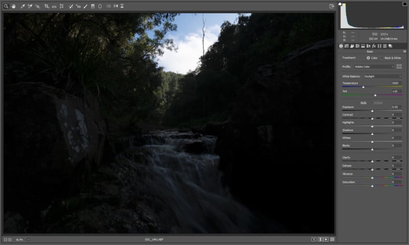
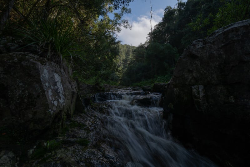
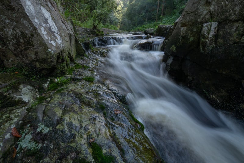
My first photo (shown above) was taken with a 1/13th second exposure. Although this was the perfect exposure for capturing the details in the white clouds, unfortunately most of the rest of the photo was completely underexposed. It’s always easier to recover details from the darkest areas of our RAW files than from the brightest areas, but I realized that no amount of shadow recovery would ever reveal all the details in the darkest areas of my first photo. So I took a few more photos with a slower shutter speed.
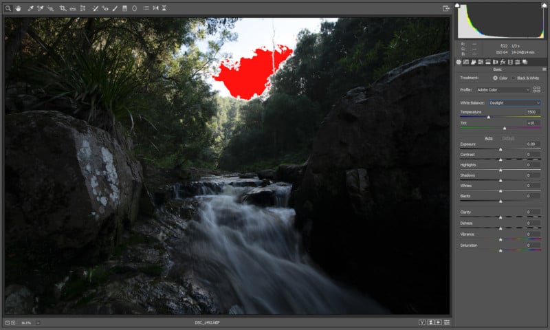
My next photo (shown below) was captured at 1/3rd second and has no details in the clouds (the area shaded red). Although the shadows still seem very dark, I felt fairly confident that I would be able to recover all those details from the RAW file. I could have slowed my shutter speed even further to capture an even brighter image, but my basic luminosity blending technique (described below) works best when the difference in exposure between the two images that are being blended is no more than two stops.
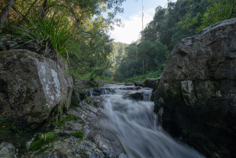
Then I tilted my camera downwards to capture the lower photo for my 2-image vertorama.
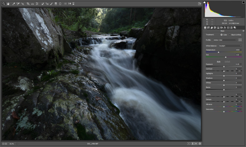
Since most of the dark parts were in the bottom half of the composition, I slowed my shutter speed even further to a 0.6-second exposure and captured the photo shown below. Everything still looked very dark and underexposed at this stage, but I felt confident that I would be able to blend, stitch and edit these three RAW files in a natural and realistic manner.
I opened all three files in Adobe Camera RAW, where I began by making some basic adjustments.
Step 2. Saving the RAW Files as TIFFs
My objective during this step is to use the “Highlights” and “Shadows” sliders to recover as many details as possible without the photos looking unnatural. I usually reduce the highlights to -40 and boost the shadows to +80.
Then I make sure to select the most appropriate white balance for the scene (usually daylight), before saving the images as 16-bit TIFF files.
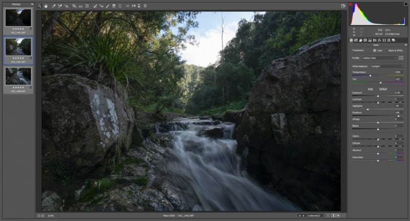
My next step is to increase the exposure by one stop and then save another copy of each image.

So now I have six images to work with – a bright and a dark version of each of my three RAW files. It’s time to start blending and stitching everything together.
Step 3. Basic Luminosity Blending
My objective during this step is to combine the lightest parts of the darker photo with the darkest parts of the lighter photo, for each of the three photos that make up this vertorama. This might all sound very complicated, but it’s actually quite easy. If we’re using Photoshop we can do it in a few simple steps;
- Open both images and then copy and paste the lighter image into the darker one as a new layer.
- Switch to the “Channels” tab and click your mouse on the “RGB” section while holding down the CTRL key.
- Press the “Delete” key to remove all the brightest (selected) pixels from the upper layer.
- Press the CTRL+D keys to end the selection (marching ants).
- Merge the two layers into one with CTRL+E.
- Then press CTRL+S to save.
What we have now is a very flat-looking image (low contrast) which doesn’t look particularly good. But it does contain all the details in both the highlight and shadow areas. I’ll start to add some contrast again a bit later after I’ve blended and stitched everything together.
So why didn’t I create a mask and then brush out only the brightest parts of my luminosity selection, instead of pressing the Delete key (I hear you all ask)? This is because I never want to change the relative luminosity of any of the elements in my composition. When I only darken the sky and clouds, then I run the risk that something which is reflecting that sky might become brighter than the sky itself.
The photo shown below is what my darkest exposure looks like after applying my quick luminosity blend. We can now see a lot more details in both the clouds and the foreground. I don’t mind that the foreground is still very dark, because I will only be using the sky and clouds part of this photo.
The image shown below is what my second photo looks like after applying my luminosity blending technique. Here I’m only interested in recovering all the shadow details. The slightly overexposed highlights don’t concern me at all.
Next, I apply the same luminosity blending technique to combine my first and second photos, as shown below. Now I have an extremely flat-looking image, but one where all the details are clearly visible in a completely realistic way.
Next, I use my luminosity blending technique on the lower image of my vertorama. We are now able to see all the smallest details in every part of the photo. This image could be a lot brighter without compromising the highlights, but it also can’t be too bright, if I’m hoping for a realistic result from my stitching software.
Step 4. Stitching and Cropping
My panorama stitching software of choice is called PTGui. This program produces the most accurate results in the shortest possible time, of all the stitching software that I’ve ever used. It managed to stitch my two images together seamlessly in only a few seconds. I saved the results as a merged 16-bit TIFF file.
The next steps in my workflow are to crop the final panorama and then to remove any obvious distractions. I decided to crop this vertorama perfectly square. I also decided to remove the dead tree poking out into the sky, since that was a bit too eye-catching and distracting for me. Although I might occasionally clone out some of the most distracting elements from my compositions, I will never add anything that wasn’t there when I took the photos. That’s where I draw my line.
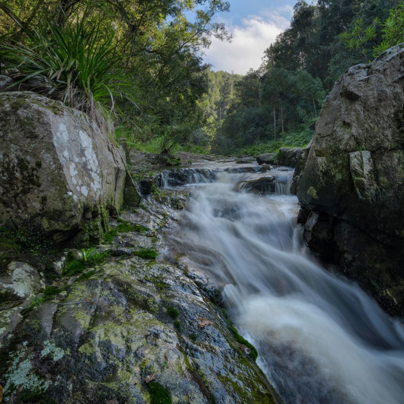
The photo below shows the final stitched, cropped, and cloned vertorama. It still looks very dark, flat, and not at all like I remember seeing the scene, but I’ll begin to address those issues next.
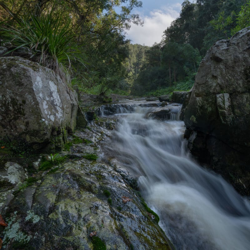
Besides the obvious need for more contrast, I also wanted to brighten the image further without overexposing anything. At this stage, my vertorama also had a slightly blueish color cast, which I definitely wanted to fix later.
Step 5. Adding Mid-Tone Contrast
Adding global contrast to an image effectively brightens all the highlights and darkens all the shadows. But since I’ve spent so much time and effort trying to preserve those details, it seems completely counterproductive to now start increasing the global contrast again.
Adding mid-tone contrast allows us to preserve the shadows and highlights, while only applying contrast to the mid-tones. That was exactly what I needed in this particular situation.
An easy way to adjust the mid-tone contrast using Photoshop is with a “Curves” adjustment layer. An even easier way is to use the “Pro Contrast” filter offered in the “Nik Color Efex Pro” Photoshop plug-in. Although I don’t use a fraction of the filters that are available in this amazing plug-in, the few that I do use, I tend to use all the time. The “Pro Contrast” filter is definitely one of those.
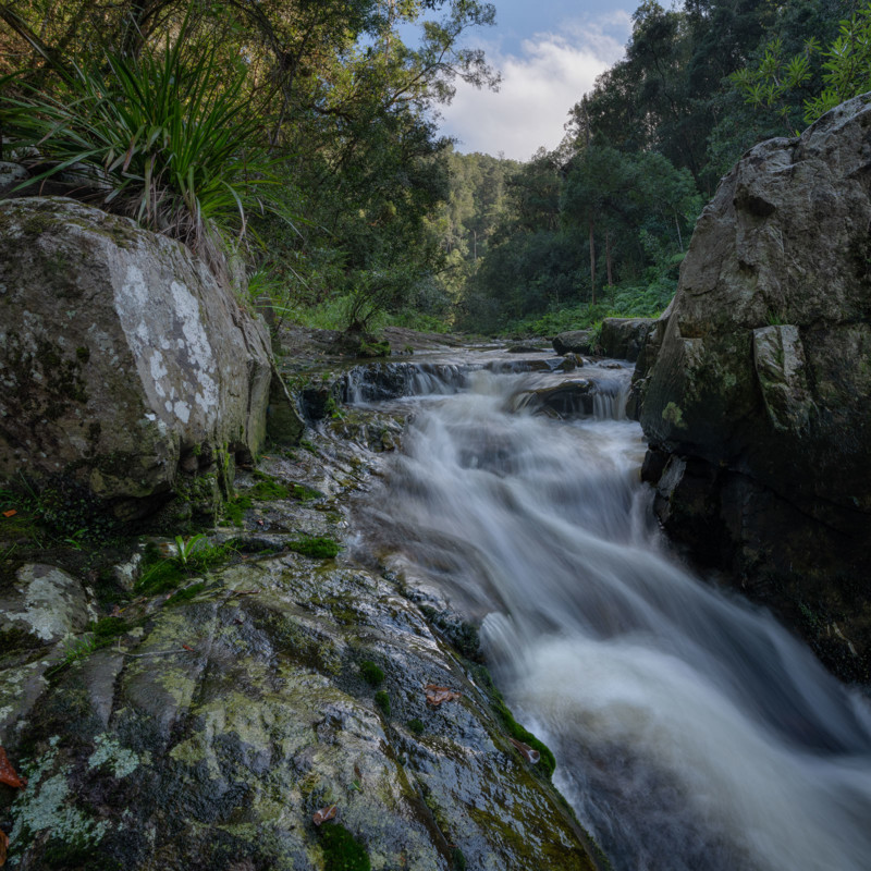
At this stage, my image still looks much too dark and also too flat – anyone can see that. The highlights could still be quite a bit brighter without blowing anything out, but now I would need to keep a very close eye on the histogram to prevent that from happening.
Step 6. Adding more Brightness and Contrast
Next, I might use either a “Brightness/Contrast” or a “Curves” adjustment layer to tweak the final exposure and contrast. In this particular case, I only brightened the image a little, without adjusting the contrast.
Now that my photo was as bright as possible without blowing out any highlights, I could proceed to step 7.
Step 7. Selective Color Adjustments
Increasing the brightness and contrast of an image always increases the saturation. Some of the colors in my photo were starting to appear slightly oversaturated and unrealistic – particularly the yellows and greens. It was time for me to address those issues. I always do this selectively, but also completely globally (to every part of my image).
Although I was fairly confident that most of the colors were accurate representations of my experienced reality, I now felt that the greens were a bit too green and also a bit too bright. The yellows, on the other hand, were neither yellow enough nor bright enough.
My favorite tool for this purpose is Photoshop’s “Selective Color” adjustment layers. I always use a new adjustment layer for every color that I change, in case I later decide to lower the opacity of that layer or to use the mask to brush out specific parts which didn’t require that particular adjustment.
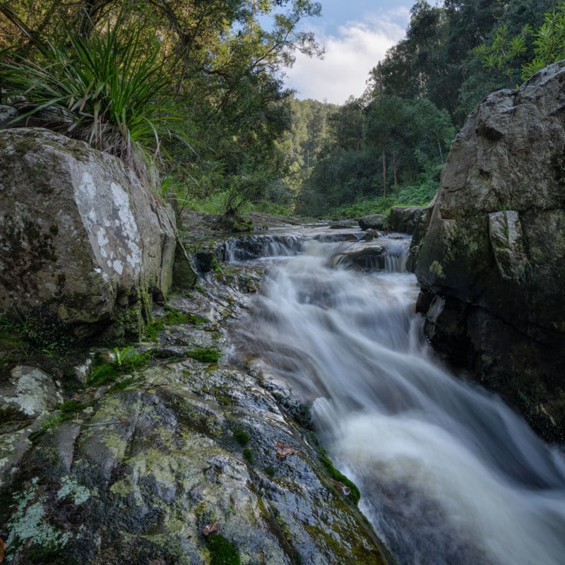
The photo below shows what things looked like after I brightened the yellows and made them more yellow, and then darkened the greens and made them a bit less green. The other colors are exactly as they were before.
Now that the exposure and colors roughly matched what my brain cells recalled seeing at the time, some of those colors still seemed a bit too oversaturated for my taste.
Step 8. Selective Saturation Adjustments
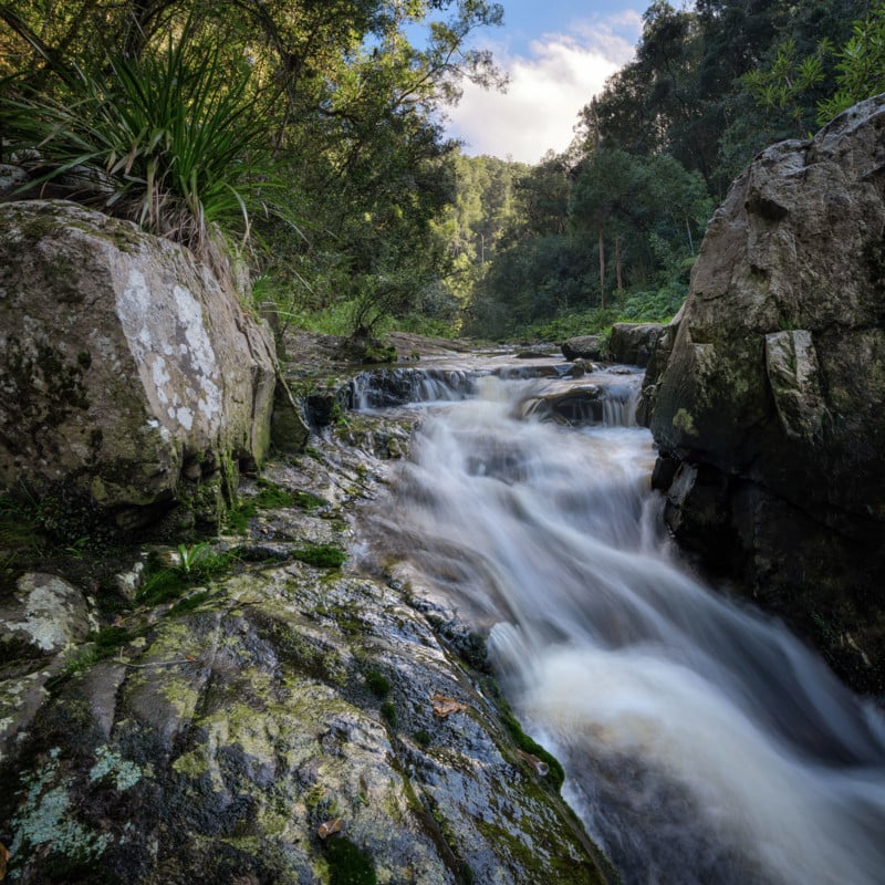
I always adjust the color saturation with a number of different “Hue/Saturation” adjustment layers, using a new adjustment layer for every color that I adjust. The image below shows what things look like after slightly reducing the saturation of the yellows, greens, and blues.
This is always a good time for me to step away from my computer for a few minutes (or have a good night’s sleep) and review everything later with much fresher eyes. Only then will I sometimes notice the smallest distractions and inaccuracies that went completely unnoticed before. This is a very important part of my editing workflow.
Step 9. Final Touches
Now that I’m 100% happy with the exposure, colors, and saturation, it’s time to zoom the image to 200%, and then remove anything that doesn’t belong where it is (dust spots, litter, etc.). Extreme shadow recovery can also often introduce some unwelcome noise to our photos. This is something that I’m always aware of and try to reduce whenever possible.
At this stage I do a final check to ensure that I haven’t clipped any highlights or shadows (I did mention that I’m rather anal about that), adjusting the highlights and/or shadows recovery sliders in Adobe Camera Raw to tweak those. During this final stage, I might also make some small last-minute adjustments to the white balance.
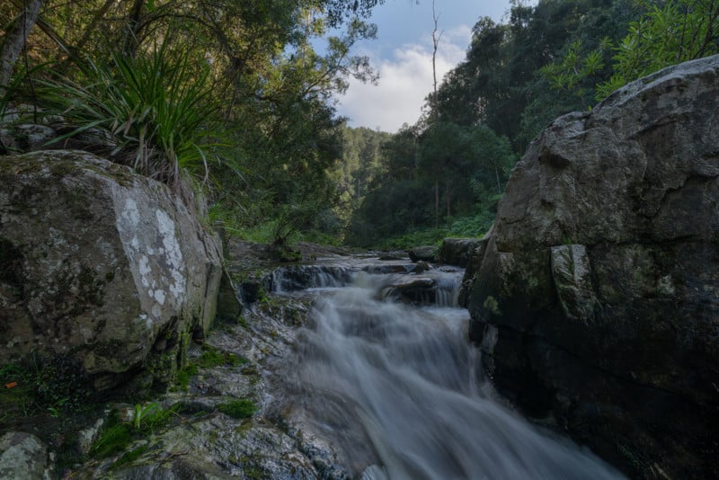
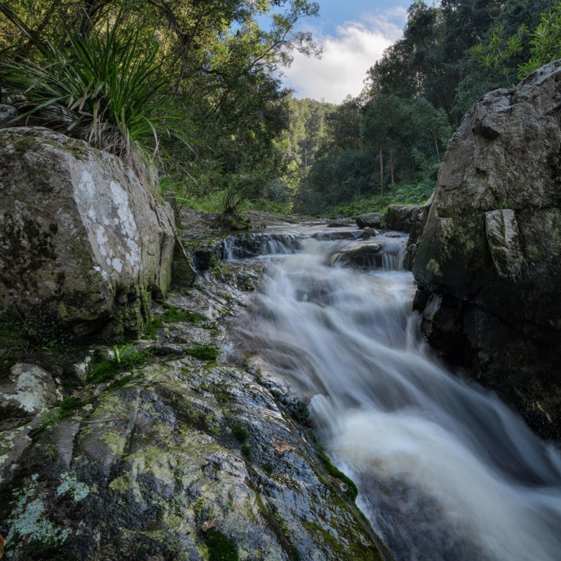
The photo shown below is what my photo looks like after some noise and dust-spot removal, and also after a small white balance adjustment to warm everything up just a fraction further.
So that’s how I skin my cat (metaphorically speaking). These are the only steps that I take to edit my photos. I usually only make minor adjustments, and I usually only apply those adjustments globally. None of the steps in my editing workflow are so drastic that a non-believer should ever ask me: “Did you edit this in Photoshop?”
This is very similar to how a woman might apply her facial makeup. I would never attempt to define what a woman is, nor would I ever suggest that only women should use makeup. However, if you did decide to apply makeup to your face (or anywhere else), then it might be a bit more flattering if you did it subtly so that nobody could notice that you aren’t who/what you appear to be. But that’s just my opinion, best taken with a pinch of salt.
Image creditsAll photographs by Paul Bruins.