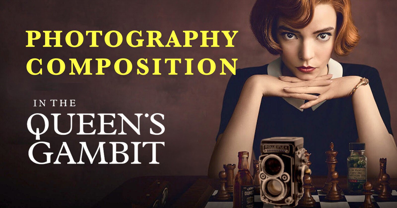
The Brilliant Use of Complementary Colors in The Queen’s Gambit
What many photographers aspire to do is to be able to tell a story with their images — to create pictures that make the viewer keep looking as they dig deeper and deeper into layers of the photograph.
They make you not only look at the characters in the scene but your eyes often wander amazed by the beautiful color combinations and shapes of the art deco interiors. This is especially interesting for color photographers, so let’s take a look at the brilliant use of complementary colors in The Queen’s Gambit.

Color is an interesting element in arts like photography and painting. But why should we really use colors when the black and white photographs look more “classy” and “art-like.”
In his book The Grammar of Painting and Engraving, Charles Blanc wrote: “Supposing the painter had only ideas to express, he would perhaps need only drawing and the monochrome of chiaroscuro [an effect of contrasted light and shadow].”
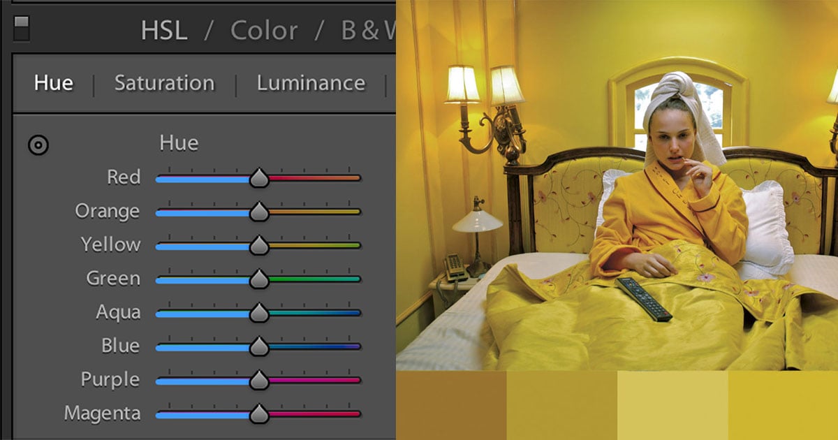
Color is a powerful mood changer and it can be expressed based on a photo’s color scheme. Cold tones can elicit feelings of sadness or loneliness, while warmer tones might suggest tenderness or joy.
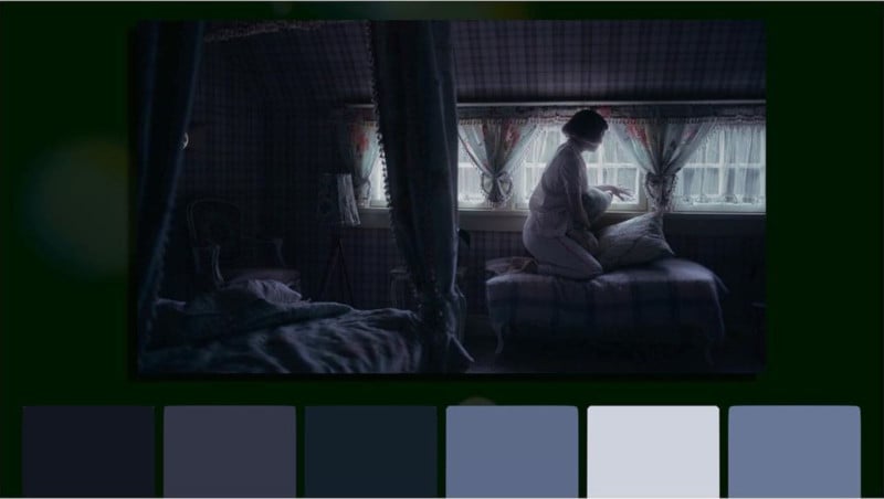
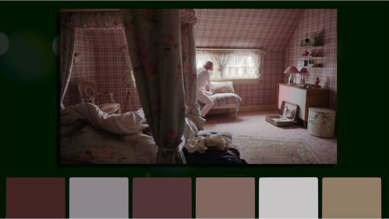
Let me show you two very similar monochromatic scenes from the show.
In the first one, Elizabeth just woke up in her room after the first night she spent in her new home. After you have a chance to see both, which one do you think suggest she is sad and depressed? Even when I show you two stills from the scene side by side, you are definitely able to tell which one is more joyful. It is all thanks to the different color schemes used in those shots.
This thing is not unique to the movies, since a movie is really just a bunch of stills.
Now let’s look at both scenes converted into black and white. Suddenly the emotion is gone. But, this can also be a good thing. It all depends on what you want to achieve with your picture.

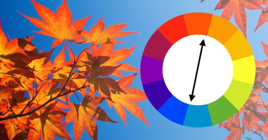
Let’s take a brief look at the history. It was in 1830 in Paris when Eugene Delacroix, who later became one of the greatest colorists of all times, ordered a carriage on his way to Louvre. It was painted in bright yellow.
About to step in, he saw something that quite surprised him: the yellow color carriage produced violet shadows. The phenomenon he just saw was “the law of complementary colors.” By combining two primary colors, yellow and blue for example, we create a secondary color, in this case, green. This green color is then complementary to the red color, meaning it reaches its maximum intensity if we place it next to a red.
Now that we know that, we can take great advantage of that. When you look at Elizabeth Harmon in the show, what is her color? The color that defines her, that makes her stand out? It is red and her red hair. So knowing that, it would seem logical to somehow use the green in the same frame as Elizabeth, and that is exactly what they did.
I am not talking about those green pills, by the way. You can notice a lot of green environments around her that create a great contrast with her hair. Like in this shot.

But what I like most is the choice of her dress. Especially those pieces centered around green, like this one:
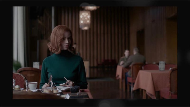
In his book, Blanc proposed an idea. Is the color (in that shadow) produced by the eye? When I first saw the scenes in the series, I immediately thought to myself, what a nice green dress. But knowing my eyes are a little less color-unreliable, I also asked my friends. Interestingly, some saw green and some did not.
That being said I think it’s important to keep in mind that everyone’s eyes are different and that how we perceive colors is on us. But ultimately, when we theoretically understand how the colors work, it means we can then implement it into our photography to make our shots even better.
It, of course, is a very complicated subject and I am by no means an expert in this topic I just thought this might be interesting food for thought and inspiration on how you can constantly work on improving your photography or cinematography skills even when you just watching TV.