What is the ‘Orange & Teal Look’ and Why is it So Popular?
Many a blockbuster movie and several popular travel photo/video creators out there use something called the ‘Orange and Teal look’ when they color grade their work. Today, Parker Walbeck of Fulltime Filmmaker will explain what that look is, why it’s used, and how to apply it to your creations.
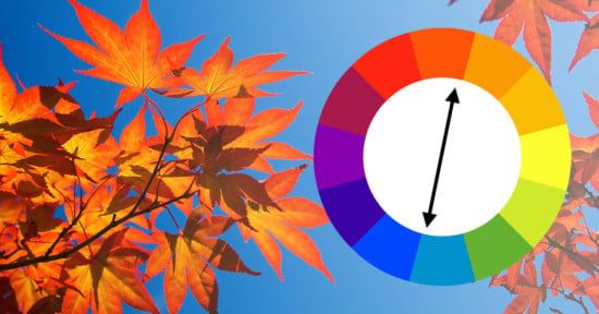
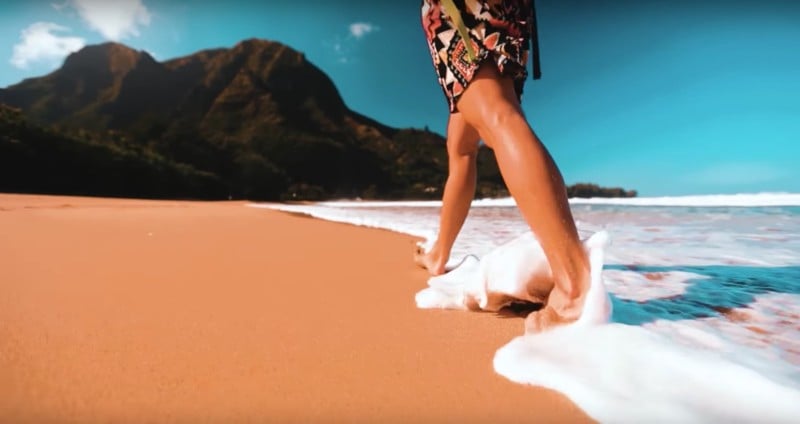
On the surface, the ‘Orange and Teal look’ is easy enough to get: you simply push Blues/Teals into the shadows and Oranges/Yellows into the highlights, creating contrast by using these complementary colors to add depth to your shot. But why Orange and Teal? Why not another set of complementary colors?
There are a few reasons.
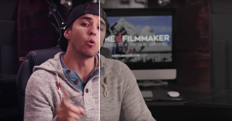
The first has everything to do with skin tones. Parker explains that skin tones (with some obvious exceptions) typically “sit somewhere in the orange spectrum,” so pushing teals into the shadows will help skin tones stand out from the rest of the image. It’s a different way to create depth, separating your subject from the background using color instead of depth of field or light.
The second has to do with contrast. This grading technique/style is all about creating color contrast, and Teal and Orange have the highest contrast between their exposure values of any pair of complementary colors on the color wheel. Again: we’re adding depth.
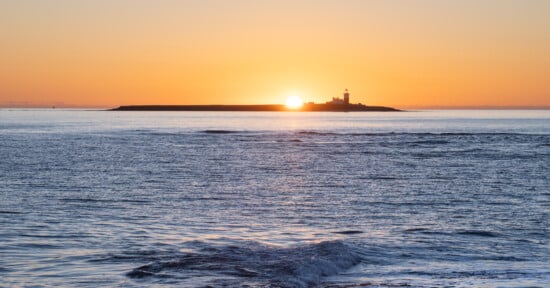
Lastly, the third and final reason is more of a speculation. Parker believes Orange and Teal are used at least in part because they replicate golden hour: warm orange light against a blue sky.
The theory portion of the tutorial is pretty much over by 2 minutes in, where Parker changes gears and explains how to install something called a color look up table or LUT in Premier Pro and use it to quickly and easily color grade footage in this “Blockbuster” or “Orange and Teal” style.
That last bit is more of a sales pitch for a great LUT package he found online, and more applicable to filmmakers unless you’re a big fan of LUTs in Photoshop, but if you’re interested it’s there for you and could potentially come in very handy.
So check out the full breakdown up top. And good luck not noticing this golor grading look everywhere from now on…