5 Facts About Vision that Will Change the Way You Take Pictures
One of the best ways to broaden your horizons and inject a little inspiration into your photography is to explore subjects outside the world of photography. To study painting or take a course in graphic design, for example. But I recently discovered a fount of photographic inspiration in an unusual place: a neuroscience lab.
About 4 months ago, I took a job as a research assistant in a vision sciences lab at the University of Washington, where we’re studying the mechanisms underlying color vision. One textbook and about a hundred research papers later, I feel like I’m just barely starting to scratch the surface of the neuroscientific miracle that is vision.
One unexpected consequence of this foray into vision sciences is that it’s completely changed—or, rather, deepened—the way I think about photography. There are too many interesting insights to list here, but I wanted to share 5 of the most significant things I’ve learned in the hopes that maybe it will inspire some of you to see your photography in a new light… pun intended.
Author’s Note: Before we dive in, a warning: to the best of my knowledge, the neuroscience described here is solid and backed up by current vision research; however, the connections to photography are my own and not to be found in any textbook. Do me a favor and take it all with a grain of salt and a spirit of curiosity.

1. Color Opponency
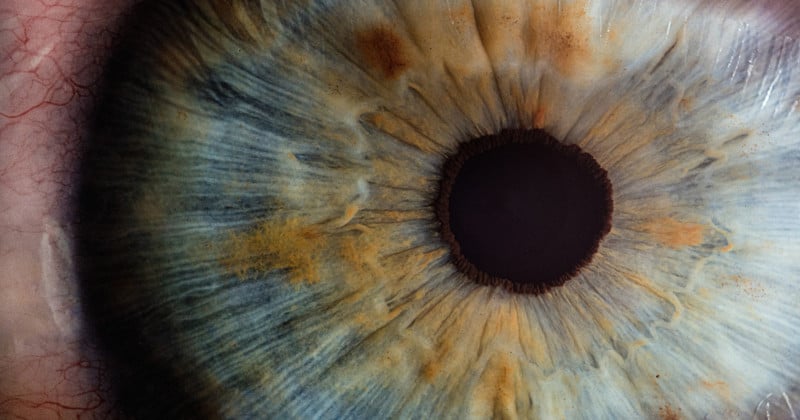
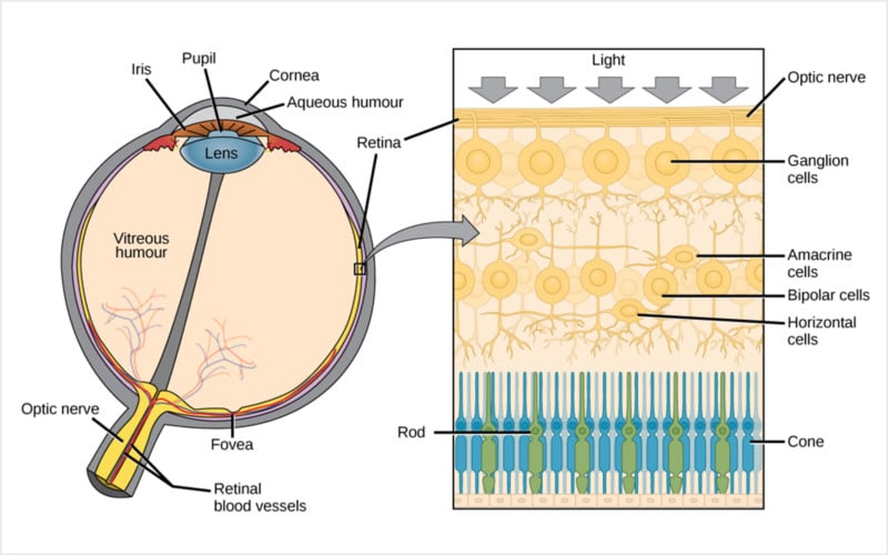
You may already know that color vision is based on three photoreceptors, called cones, in your retina: one tuned for long wavelengths (AKA the “red” or “L” cone), one for medium wavelengths (AKA the “green” or “M” cone), and one for short wavelengths (AKA the “blue” or “S” cone). This is the biological basis of so-called trichromatic vision.
However, color vision does not work by adding these three inputs together and sending a complete signal to the brain that says “this color you’re looking at is 20% red, 50% green, and 30% blue.” Instead, what we experience seems to be based on two opposing dichromatic systems that, taken together, define the color experiences we can (and can’t) have: red vs green and blue vs yellow. This is called color opponency or opponent process theory.
Opponent theory explains why we don’t ever experience “reddish green” or “blueish yellow.” This perception can be forced using a very specific scientific protocol, but generally speaking, activating the red “channel” will suppress the green, activating blue will suppress yellow, and visa versa.
How these opponent systems are wired in the retina and processed in the visual cortex is always being refined and redefined—this is part of what we’re trying to unravel in the lab—but you get the general idea.
Photography Connection
For me, this basic principle totally redefined my understanding of the “primary colors” along color opponent lines. In other words, we don’t live in an RGB or RYB world; our vision is instead tuned to experience hue as R vs G and B vs Y, without being able to mix these pairs in any perceivable way.
I now find myself paying close attention to these combinations any time I see an image with beautifully clean lines or sharp color contrast: the line of a bright yellow building against a cerulean blue sky, or streaks of bright red hair standing out against a green backdrop. It has me thinking more carefully about how I compose the colorful elements in an image to get the most “pop.”

2. The Trouble with Green
Another consequence of color opponency is the existence of the “unique hues.” Where each of these color opponent systems is perfectly balanced, at their neutral point, you should see one color and only one color: the spectral null point of the blue/yellow system is unique green, while the spectral null point of the red/green system is unique yellow. (I’m ignoring unique blue and unique red for the sake of simplicity).
There’s some debate around how and where in the visual system these unique hues actually arise, but for our purposes, just know that while unique yellow seems to be remarkably consistent across people, unique green varies a lot. Research shows that people’s perception of unique green varies from as low as 490nm all the way up to 555nm—that means one person may see pure green where another sees pure blue, and visa versa.
It’s one of the most striking examples of how the perception of color can vary from person to person among otherwise “normally sighted” individuals.
Photography Connection
Maybe it’s a silly connection to make, but this has made me more aware of the greens in my own images. I have no idea where I sit on this spectrum—though I’d love to get tested and find out—but I pay a lot more attention now to how much blue or yellow is in a particular shade of green that I’m looking at.
It hasn’t really changed the way I shoot, but it’s made me more aware of the variability in my viewer. What they see may not line up exactly with my own perception, especially where green is concerned. It makes me want to ask everyone I meet: “what color is this?”

3. Color Constancy
Our visual system is extremely good at identifying color correctly regardless of lighting conditions. This is something you probably take for granted, but think about it for a moment: how incredible is it that you can tell that a blue tablecloth is all the same color, even when half the table is bathed in yellowish light or shrouded in shadow?
If your eyes were just reflectance detection machines, you would see and perceive the tablecloth as two different colors, but your brain compensates on the fly, correcting for variations in lighting. Of course, you can trick this system—this lightness illusion is the most famous example—but in general, your brain does a bang-up job.
Photography Connection:
For me, this highlights the critical importance of calibrating your displays, taking frequent breaks from the screen, and relying on digital tools whenever I’m post-processing an image. Some people have perfect pitch, but nobody has “perfect” color perception, no matter how many hours they’ve spent editing photos professionally.
Our vision is constantly adjusting the “gain” to normalize to some version of white based on the current lighting conditions and the known quality of the object or subject you’re looking at. This is by design, and it serves us well in the real world, but it can really screw you up if you’re editing your photos on an uncalibrated monitor or you never take a break to rest and “reset” your eyes to the real world. Compensate accordingly.
4. Vision in Motion
Here’s a “fun fact” about vision that you can test for yourself right now at your computer. Hold one finger out at arm’s length and move it across your visual field, tracking it as you go. You have no problem at all smoooooothly shifting your gaze as you track your finger (or any other object for that matter). Now try the same thing, but without anything to track; try to smooooothly move your gaze from an object on one side of your visual field to an object on the other.
Can you do it?
If you’re paying close attention, you’ll notice that it’s impossible. Without an object (real or imagined) to track, we can only voluntarily change our direction of gaze by “jumping” from one point of fixation to another. During this little experiment you may have made many smaller jumps as you tried to move your eyes smoothly, but it will feel markedly different than the smooth uninterrupted motion of tracking a moving object.
This is called “saccadic” eye movement—as opposed to “smooth pursuit” movement—and there is no in-between when it comes to voluntarily shifting your gaze… you’re either jumping from point to point or smoothly following a target.
Photography Connection:
Unless you’re a master of the cinemagraph, your photos are usually (read: always) totally static. There is no object there that a viewer can follow from place to place. Their only option, the only way that anyone will ever experience one of a still photograph, is by jumping from focal point to focal point.
For portraits this takes care of itself—it’s well established that we scan faces naturally by jumping from eye to eye, with occasional forays to the nose and mouth—but for landscapes and other types of imagery, this knowledge has me thinking more deliberately about focal points. Ideally, I think it’s best to include two or more focal points as part of a natural visual “path” that lends itself well to this jumping from spot to spot. It also provides a solid argument for integrating some natural leading lines that can act as connections between these points.

5. More Like Film than Digital
Under bright light conditions—scientifically referred to as “photopic” vision as opposed to “scotopic” low-light vision—your sight is driven almost entirely (if not entirely) by your cone photoreceptors. And here’s the thing about cones… in at least one important way they act more like film than a digital sensor.
Just like film uses silver halide grains that are converted to metallic silver by incoming light, your cones use a chromophore called cis-retina, which is converted to all-trans-retinal when it’s excited by the appropriate photon. This produces a “roll off” effect, similar to film, where the more cis-retinal/silver halide is converted, the less there is left to respond to the incoming light.
Unlike film, no matter how much light you throw at them, your cones can never truly “blow out.” That’s because, while a film emulsion can’t produce more silver halide when it’s running low, your photoreceptors can (and do) replenish their cis-retinal, eventually reaching an equilibrium.
Photography Connection:
I’ll admit it, this has very little impact on how I actually take pictures. It has, however, inspired my personal theory as to why film is generally more “pleasing” to the eye than digital. There’s an organic element that’s missing from the ones and zeroes of digital photography, making film look inherently more natural because it’s similar to our own vision.
Of course, this may just be pseudoscientific nostalgia, but it’s an interesting thought all the same.
Final Thoughts
In retrospect, it’s obvious that studying vision would have major connections back to photography. But for all the emphasis on understanding light, and color, and composition, I don’t think I’ve ever heard any photography teacher telling their students to study vision itself.
Something tells me that’s a missed opportunity.
So do yourself a favor and spend some time this weekend nerding out about vision science. Dive into the subtleties of eye movement; explore the wonders of perceptual filling-in; or look up a few popular lightness and color constancy illusions. You may be surprised by how much you learn, and how applicable it is to the art of photography.