This is How Scientists Colorize Hubble Photos of Deep Space
Every mind-blowing deep space photograph captured by the Hubble space telescope that you’ve ever seen started out black-and-white. So how do we get those amazing technicolor images of the Pillars of Creation or the Bubble Nebula? This short video explains how scientists manage this feat.
The video was put together as part of VOX Video Lab, and anybody with a working knowledge of color photography can probably skip over the first couple of minutes. At first, the video explains the basics of the visible light spectrum, and how the first color images were composites of three black-and-white photographs captured through a red, green, and blue filter, respectively.
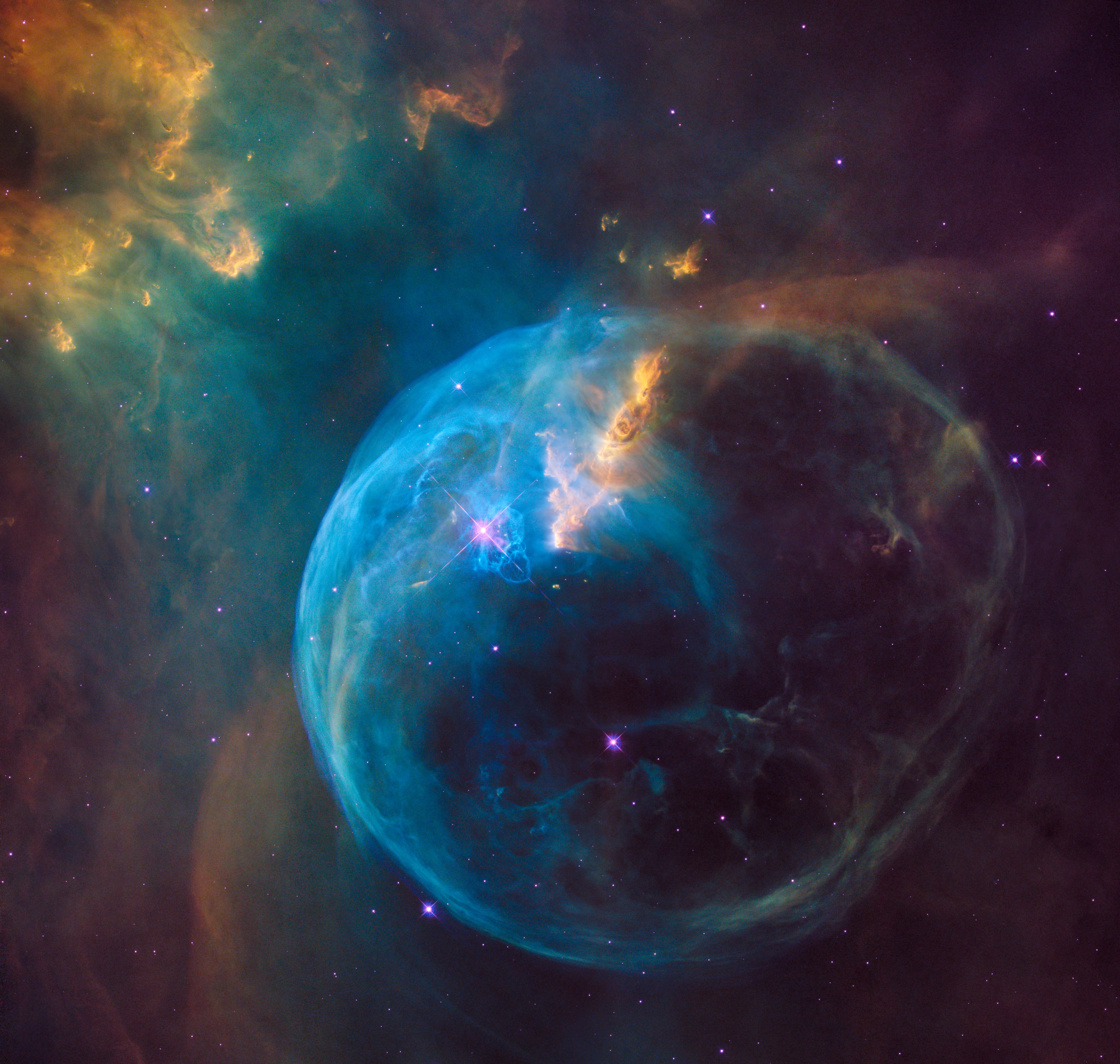
But around the 1:50 mark, VOX takes this knowledge and dives into the science behind colorizing Hubble’s deep space photographs like this iconic shot of the bubble nebula:
Hubble’s main function, explains VOX, isn’t to capture color images, it’s to measure the brightness of light reflecting off of objects in space. In order to produce a color image, Hubble captures images using “broadband filtering” that captures a general range of red, green, and blue light in a black-and-white image. Those are then combined to create a true-color image.
But the scientists who colorize Hubble often go beyond true color, in order to show us portions of the image that would never have been visible to our eyes in the first place. For example: turning certain gasses into visible color in a photograph.
Hubble does this using “narrowband filtering.” This filters extremely narrow wavelengths of the visible light spectrum that correspond to individual elements like oxygen and hydrogen, then shifting the color of each image to correspond to red, green and blue. That’s how the famous Pillars of Creation image was created:
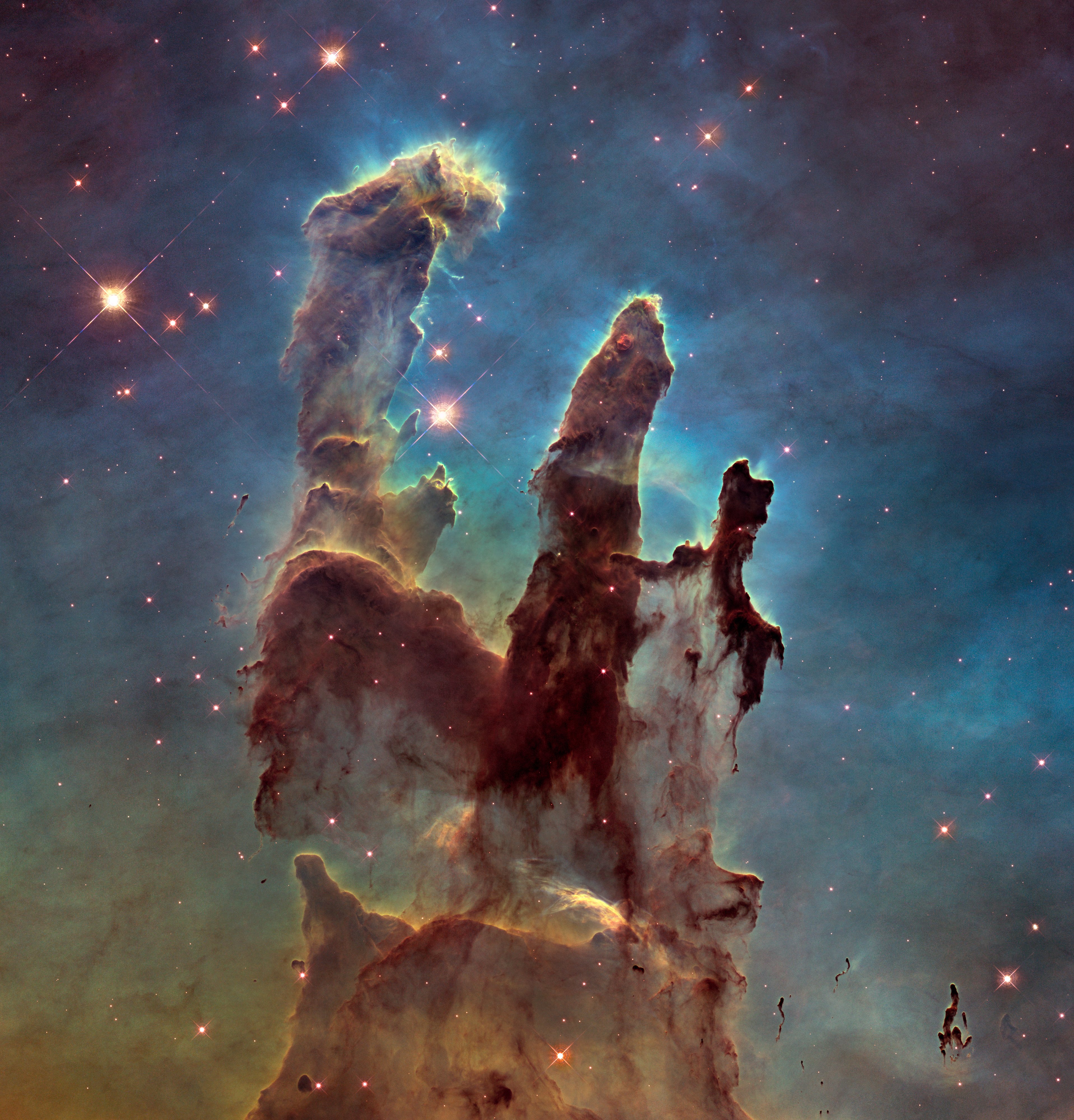
In this image, sulfur is represented by the color red, hydrogen by the color green, and oxygen by the color blue, which is not where they actually sit on the visible spectrum. But when you shift each element over so they correspond to either red, green or blue, and put them all together, you get what VOX calls “a colorized map” that is much more useful for analysis… and just plain pretty as well.
This is how we get most of the amazing images of deep space nebulas that you see on the Hubble website. True color images would skew significantly to one color—in the case of the Pillars of Light, it would be mostly red in “true color”—but by using narrowband filtering, scientists are able to generate useful data and amaze the public at the same time.
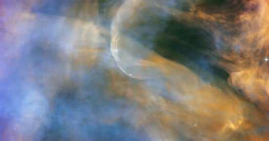
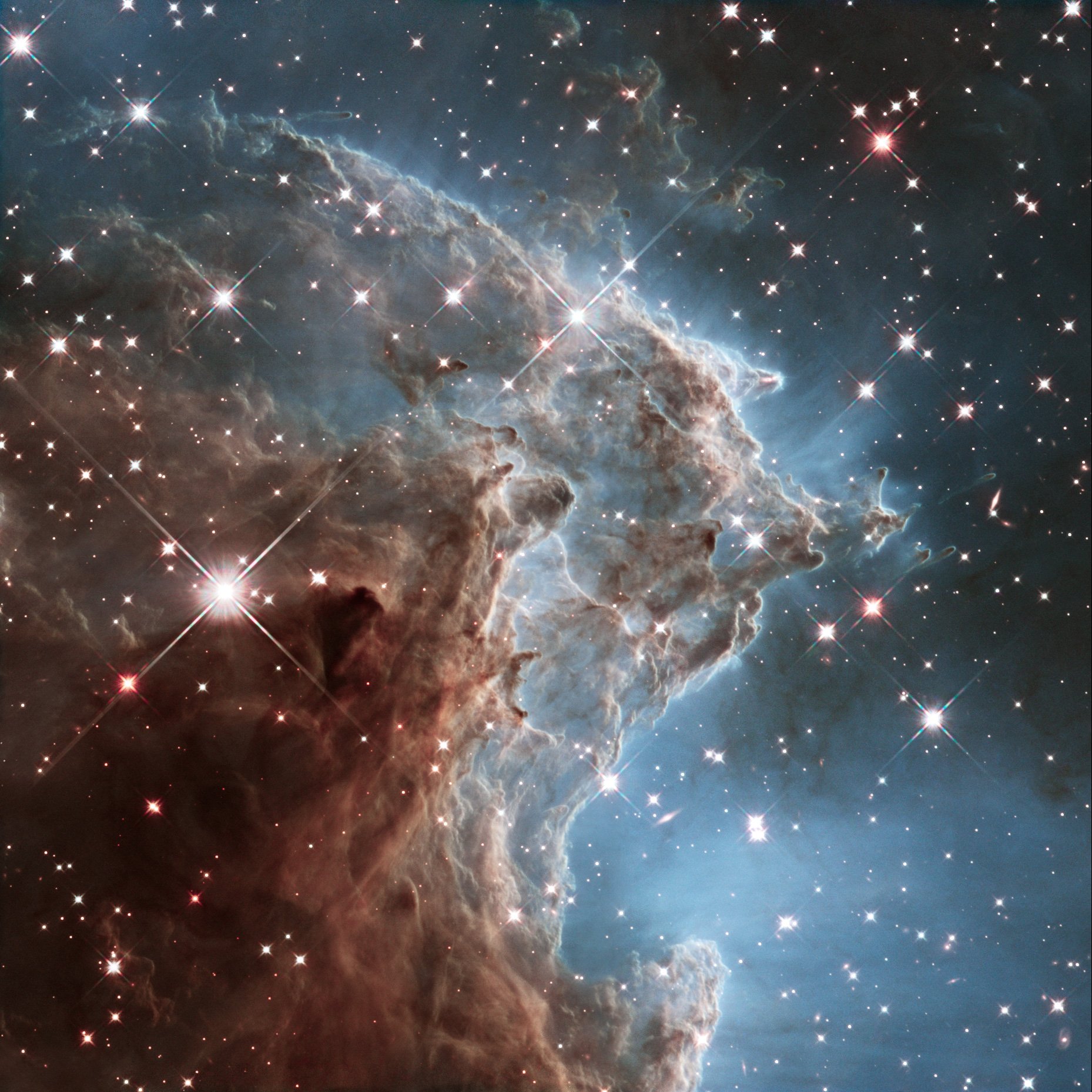
Finally, VOX also covers how Hubble handles color images made from light outside the visible spectrum—namely, ultraviolet and near-infrared. That’s how we get this close-up image of the Monkey Head Nebula, which is made up entirely of wavelengths in the infrared spectrum, but we’ll let VOX explain how that’s done:
Check out the full video above for a deep dive on how all of these modes of colorizing space photography work, with plenty of animated demonstrations so you can see each technique in action. It’s a fascinating look at how NASA and the ESA have created some of the most iconic space imagery of our time.
Credits: All images courtesy of NASA, ESA, and the Hubble Heritage Team.