sRGB vs Adobe RGB vs ProPhoto RGB: Color Spaces Explained
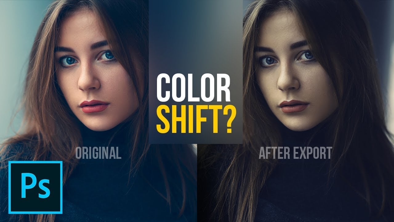
Have you ever exported a photo, uploaded it to the Web, and then noticed that the colors looked off on your monitor? The reason is likely the color space of your photo. Here’s a helpful 15-minute video by PHLEARN that provides a crash course on color spaces and how to use them.
Here are the things covered in the video and when they’re found:
00:57 Brief Background on Color Spaces
01:37 Common Color Spaces
03:04 Color Space Uses
04:32 Color Settings in Photoshop
09:32 Assigning Color Profiles to RAW
12:50 Color Settings from Lightroom to Photoshop
14:08 Color Settings for Export from Lightroom
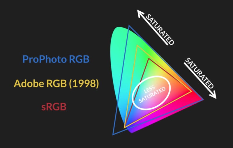
LAB Color is ever possible color the human eye can perceive, so it’s the standard by which all other color spaces are compared.
ProPhoto RGB is a newer color space that has a much wider gamut than Adobe RGB and is more in line with modern digital cameras.
Adobe RGB 1998 features a wide gamut and compatibility with many software programs and displays.
sRGB has a relatively narrow gamut but is designed for consistency and compatibility. For this reason, you should make sure all the photos you share on the Web are sRGB.
If you found the video above helpful, you can find more of PHLEARN’s videos by subscribing to its popular YouTube channel.
P.S. You can download the sample photo seen in the video here if you’d like to tinker with it yourself.